These last two sizes look fine, but you need to re-import the army numbers into the file, so that they will be the proper size.
When you are starting a map with so many small territs, use the small version to work on, but only for getting things to fit. Then when you are sure that you have that, jump over to the large version, and work on it exclusively until the end. After that you can scale that file down for the small version. It does not work well if you try to do it the other way around. Picture quality will suffer if you scale up.
Thailand
Moderator: Cartographers
Re: Thailand
![]() by Victor Sullivan on Fri Sep 10, 2010 5:35 am
by Victor Sullivan on Fri Sep 10, 2010 5:35 am
Practically all of your territories are abbreviated. This needs to be fixed.
Beckytheblondie: "Don't give us the dispatch, give us a mustache ride."
Scaling back on my CC involvement...
Scaling back on my CC involvement...
-

 Victor Sullivan
- Posts: 6010
- Joined: Mon Feb 08, 2010 8:17 pm
- Location: Columbus, OH


Re: Thailand
![]() by grifftron on Fri Sep 10, 2010 7:51 am
by grifftron on Fri Sep 10, 2010 7:51 am
Victor Sullivan wrote:Practically all of your territories are abbreviated. This needs to be fixed.
You know Thai "states" have pretty long names right? We could put them all in Thai lang. that would be shorter
-griff

-

grifftron
- SoC Training Adviser
- Posts: 3280
- Joined: Thu Jul 09, 2009 6:11 am


Re: Thailand
![]() by grifftron on Fri Sep 10, 2010 12:24 pm
by grifftron on Fri Sep 10, 2010 12:24 pm
small 640x640

large 800x800
large 800x800
- Click image to enlarge.
-
grifftron
- SoC Training Adviser
- Posts: 3280
- Joined: Thu Jul 09, 2009 6:11 am
Re: Thailand
![]() by Victor Sullivan on Fri Sep 10, 2010 2:14 pm
by Victor Sullivan on Fri Sep 10, 2010 2:14 pm
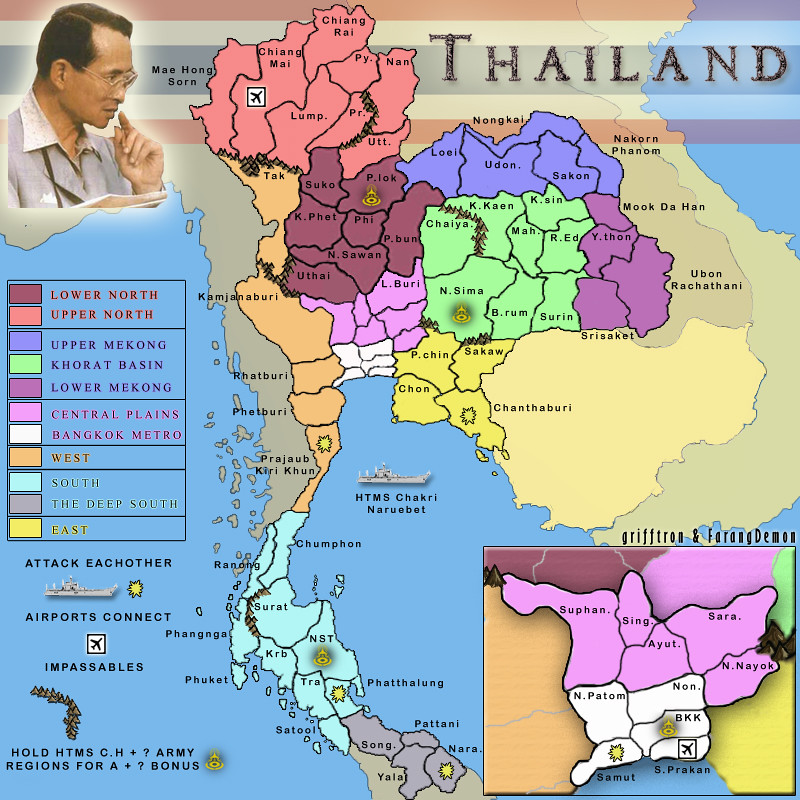
The territories with the yellow symbol could be auto-deploy 1's, though you'll have to explain to me why they're there. The HTMS could also be an auto-deploy 2 or maybe just a plain-ol' +1 bonus area. The legend's kinda messy, but that's prolly more of a Graphics thing.
Beckytheblondie: "Don't give us the dispatch, give us a mustache ride."
Scaling back on my CC involvement...
Scaling back on my CC involvement...
-
Victor Sullivan
- Posts: 6010
- Joined: Mon Feb 08, 2010 8:17 pm
- Location: Columbus, OH
Re: Thailand
![]() by Industrial Helix on Fri Sep 10, 2010 3:06 pm
by Industrial Helix on Fri Sep 10, 2010 3:06 pm
Uh, what do all the abbreviations mean?
Sketchblog [Update 07/25/11]: http://indyhelixsketch.blogspot.com/
Living in Japan [Update 07/17/11]: http://mirrorcountryih.blogspot.com/
Russian Revolution map for ConquerClub [07/20/11]: viewtopic.php?f=241&t=116575
Living in Japan [Update 07/17/11]: http://mirrorcountryih.blogspot.com/
Russian Revolution map for ConquerClub [07/20/11]: viewtopic.php?f=241&t=116575
-

Industrial Helix
- Posts: 3462
- Joined: Mon Jul 14, 2008 6:49 pm
- Location: Ohio


Re: Thailand
![]() by natty dread on Fri Sep 10, 2010 3:36 pm
by natty dread on Fri Sep 10, 2010 3:36 pm
You might as well put L.Buri in the inset, it's a bit odd when a part of the bonus area is in different place than the rest...

-

natty dread
- Posts: 12877
- Joined: Fri Feb 08, 2008 8:58 pm
- Location: just plain fucked


Re: Thailand
![]() by grifftron on Fri Sep 10, 2010 8:21 pm
by grifftron on Fri Sep 10, 2010 8:21 pm
Victor Sullivan wrote:The territories with the yellow symbol could be auto-deploy 1's, though you'll have to explain to me why they're there. The HTMS could also be an auto-deploy 2 or maybe just a plain-ol' +1 bonus area. The legend's kinda messy, but that's prolly more of a Graphics thing.
Farang has something special planned for the HTMS & the army regions (that is what those symbols are)... I will work on the key in the game play forum.. i thought that was how it worked... maybe i was wrong.
Industrial Helix wrote:Uh, what do all the abbreviations mean?
what do abbreviations mean? they are short / cut down names of long names that do not fit into the territory. Do you have any suggestion of what to do if you wanted to see the full names? We were thinking of just putting the abbrev. along with the full name under the map with the xml. Maybe you have a diff suggestion?
natty_dread wrote:You might as well put L.Buri in the inset, it's a bit odd when a part of the bonus area is in different place than the rest...
I thought it looked cool like that, I have seen maps with connected bonuses outside the inset before.. if more do not like this, i could make a change.
-griff
-
grifftron
- SoC Training Adviser
- Posts: 3280
- Joined: Thu Jul 09, 2009 6:11 am
Re: Thailand
![]() by grifftron on Fri Sep 10, 2010 11:15 pm
by grifftron on Fri Sep 10, 2010 11:15 pm
natty_dread wrote:You might as well put L.Buri in the inset, it's a bit odd when a part of the bonus area is in different place than the rest...
Does this really look better then it NOT in the inset? let me know what you guys think... (L.Buri AKA Lop Buri)
- Click image to enlarge.

-griff
-
grifftron
- SoC Training Adviser
- Posts: 3280
- Joined: Thu Jul 09, 2009 6:11 am
Re: Thailand
![]() by Victor Sullivan on Sat Sep 11, 2010 1:02 am
by Victor Sullivan on Sat Sep 11, 2010 1:02 am
Nice effect(s) on the pic of the guy who's name escapes me... 
Beckytheblondie: "Don't give us the dispatch, give us a mustache ride."
Scaling back on my CC involvement...
Scaling back on my CC involvement...
-
Victor Sullivan
- Posts: 6010
- Joined: Mon Feb 08, 2010 8:17 pm
- Location: Columbus, OH
Re: Thailand
![]() by FarangDemon on Sat Sep 11, 2010 1:09 am
by FarangDemon on Sat Sep 11, 2010 1:09 am
Victor Sullivan wrote:The territories with the yellow symbol could be auto-deploy 1's, though you'll have to explain to me why they're there. The HTMS could also be an auto-deploy 2 or maybe just a plain-ol' +1 bonus area. The legend's kinda messy, but that's prolly more of a Graphics thing.
The yellow icons represent the locations of the Army Region Headquarters (numbered 1-4) of the Royal Thai Army.
They are located in Bangkok, Nakhon Ratchasima, Nakhon Sri Thammarat, and Phitsanulok.
Hold HTMS Chakri Naruebet + x Army Region HQs = x army bonus
This makes the Army Region HQs interesting only if you have the ship, and makes the ship a much more sought after prize.
This means as long as the ship starts neutral, nobody can drop this bonus. I prefer this to making those four provinces start out as neutrals, which would be necessary if they were auto-deploys themselves, to prevent someone dropping them.
I agree with you about making the ship a +1 auto-deploy. However we can revisit that issue later in gameplay after we have other bonuses defined.
grifftron wrote:The Bison King wrote:Whose this weirdo? I miss the boys.
Your joking right? One of the most famous pictures in Thailand, you might see this picture 4 out of every 5 houses you go into... and would for sure see this mans picture in every Thai person's house here in the land of Thai's... except for in Farang's house.. not sure about that...*I might bring back the cute boys, Farang misses them too

The peoples king.
I will refrain from making political statements about the monarchy
as I'm not living in a civil society that tolerates complete freedom of expression.
I miss those boys as much as the next guy - save for perhaps expats living in Cambodia - however the map does look a lot classier now.
grifftron wrote:porkenbeans wrote:Also you can stretch the width of the image a bit, so as to increase the land area some. So long as it remains recognizable as Thailand, you can get away with it.
Thanks Pork for the comments, i will keep that in mind as we move on, also i think (if possible) we will keep Thailand the size that it is now (unless there are some real problems with fitting stuff in), i already made it 33% wider, the more i pull the boarders the more freaky it looks and the less it looks like real Thailand... in the image that you widened Phaak Isaan (or the NE) looks very bad..
I agree with the stretching idea in theory, but in practice with this particular map, I agree with grifftron that Thailand doesn't look good stretched that way. We are more willing to combine her provinces (as we've done already) than to sacrifice her indescribably sexy Thai proportions.
- Click image to enlarge.

"He came dancin across the water.... FarangDemon, FarangDemon.... mmmhh....what a killer..."
-
FarangDemon
- Posts: 700
- Joined: Wed Apr 23, 2008 1:36 am


Re: Thailand
![]() by Industrial Helix on Sat Sep 11, 2010 9:32 am
by Industrial Helix on Sat Sep 11, 2010 9:32 am
Yeah, i really don't have any better suggestions for the names cause I know Thai words can get pretty long... maybe the XML thing would work out.
My other advice is not to get overzealous with the symbols. What's the point of the army bases? I think this map is strong enough to stand on its own as a classic gameplay map without complicated symbols and such.
My other advice is not to get overzealous with the symbols. What's the point of the army bases? I think this map is strong enough to stand on its own as a classic gameplay map without complicated symbols and such.
Sketchblog [Update 07/25/11]: http://indyhelixsketch.blogspot.com/
Living in Japan [Update 07/17/11]: http://mirrorcountryih.blogspot.com/
Russian Revolution map for ConquerClub [07/20/11]: viewtopic.php?f=241&t=116575
Living in Japan [Update 07/17/11]: http://mirrorcountryih.blogspot.com/
Russian Revolution map for ConquerClub [07/20/11]: viewtopic.php?f=241&t=116575
-
Industrial Helix
- Posts: 3462
- Joined: Mon Jul 14, 2008 6:49 pm
- Location: Ohio
Re: Thailand
![]() by grifftron on Sat Sep 11, 2010 10:04 am
by grifftron on Sat Sep 11, 2010 10:04 am
Industrial Helix wrote:Yeah, i really don't have any better suggestions for the names cause I know Thai words can get pretty long... maybe the XML thing would work out.
My other advice is not to get overzealous with the symbols. What's the point of the army bases? I think this map is strong enough to stand on its own as a classic gameplay map without complicated symbols and such.
OK. Farang like the army bases... but we also have another set of bonuses coming out soon with the cultural symbols that will be scattered around Thailand, we will see how it looks, if its too crowded we can prob make some cuts... We are moving some of the mtn ranges around too, and we are trying to get most of the names that are on the coasts spelled out full
-griff
-
grifftron
- SoC Training Adviser
- Posts: 3280
- Joined: Thu Jul 09, 2009 6:11 am
Re: Thailand
![]() by Americanpigdog on Sat Sep 11, 2010 11:36 am
by Americanpigdog on Sat Sep 11, 2010 11:36 am
I am no expert on Thailands geography, but is Isaan Province too big or too small to be a region? Also, is there no better name than west, south, deep south, east? It's not that bad to have a few directional names I suppose, but there has to be a more historical or formal name for at least one or two of those four. Other than that I think it is an awesome idea/map.
-

Americanpigdog
- Posts: 3
- Joined: Mon Aug 25, 2008 7:42 pm
Re: Thailand
![]() by porkenbeans on Sat Sep 11, 2010 1:06 pm
by porkenbeans on Sat Sep 11, 2010 1:06 pm
I agree with IH. This map has difficulty as it is, with fitting in all of those long names. So, I would keep the icons to a minimum.Industrial Helix wrote:Yeah, i really don't have any better suggestions for the names cause I know Thai words can get pretty long... maybe the XML thing would work out.
My other advice is not to get overzealous with the symbols. What's the point of the army bases? I think this map is strong enough to stand on its own as a classic gameplay map without complicated symbols and such.

-

porkenbeans
- Posts: 2546
- Joined: Mon Sep 10, 2007 4:06 pm


Re: Thailand
![]() by grifftron on Sat Sep 11, 2010 9:05 pm
by grifftron on Sat Sep 11, 2010 9:05 pm
Americanpigdog wrote:I am no expert on Thailands geography, but is Isaan Province too big or too small to be a region? Also, is there no better name than west, south, deep south, east? It's not that bad to have a few directional names I suppose, but there has to be a more historical or formal name for at least one or two of those four. Other than that I think it is an awesome idea/map.
Phaak Isaan was pretty big, that is why we cut it into 3 diff bonuses... as for the names on the key, these will more then likely change as we continue to update.
porkenbeans wrote:I agree with IH. This map has difficulty as it is, with fitting in all of those long names. So, I would keep the icons to a minimum.Industrial Helix wrote:Yeah, i really don't have any better suggestions for the names cause I know Thai words can get pretty long... maybe the XML thing would work out.
My other advice is not to get overzealous with the symbols. What's the point of the army bases? I think this map is strong enough to stand on its own as a classic gameplay map without complicated symbols and such.
Yeah i see it getting pretty crowded myself, Farang suggested to take off the explosion icons so I will remove those and just make a direct path to the terts they attack... We will see about the army icons, i will let Farang comment on that one.
-griff
-
grifftron
- SoC Training Adviser
- Posts: 3280
- Joined: Thu Jul 09, 2009 6:11 am
Re: Thailand
![]() by FarangDemon on Sun Sep 12, 2010 5:33 am
by FarangDemon on Sun Sep 12, 2010 5:33 am
Americanpigdog wrote:I am no expert on Thailands geography, but is Isaan Province too big or too small to be a region? Also, is there no better name than west, south, deep south, east? It's not that bad to have a few directional names I suppose, but there has to be a more historical or formal name for at least one or two of those four. Other than that I think it is an awesome idea/map.
Very good points. Isaan or Isan (seems Isan is official and has 5 times the google hits, though not as phonetic) will be represented as a super region made up of the three subregions: Upper Mekong, Lower Mekong, and Khorat Basin. As such, the bonus for Isan will be more than the sum of the parts. We will change the legend to give a name for each super region (because we'll also need to display how many armies they are worth).
So the actual map portion won't have the word Isan written on it, but it will be listed in the legend and also if you have all 3 subregions, the xml will state this when you take your turn and claim the bonus armies.
Bonus Super Regions (with subregions)
North East - Phak Isan (Khorat Basin, Lower Mekong, Upper Mekong)
North - Phak Neua (Lower North, Upper North)
South - Phak Tai (South, Deep South)
Center - Phak Klang (Central Plains, Bangkok Metro
Bonus regions that are not part of super bonus regions
West - Phak Tawan-Tok
East - Phak Tawan-Ok
"Phak" means region. If we don't like looking at this word 6 times, we can just lop them off.
Maybe we need to change the bonus regions' colors a bit to make it more obvious that subregions belong to the same bonus region (like in NYC)
porkenbeans wrote:I agree with IH. This map has difficulty as it is, with fitting in all of those long names. So, I would keep the icons to a minimum.Industrial Helix wrote:Yeah, i really don't have any better suggestions for the names cause I know Thai words can get pretty long... maybe the XML thing would work out.
My other advice is not to get overzealous with the symbols. What's the point of the army bases? I think this map is strong enough to stand on its own as a classic gameplay map without complicated symbols and such.
Let's see how it looks first. I think the icons could add a lot of Thai cultural/agricultural flavor that is completely absent from most maps. We will implement the simplest rule possible for determining bonus amounts based on icons (ala state capitals bonus in USA Great Lakes), and we can always tweak it such that the standard contiguous bonus regions are still the path most players will follow.
If it comes down to it, based on visual/gameplay overcomplexity concerns, and I had to choose between having the army base icons or the cultural icons, I would pick the cultural icons because they convey so much more interesting cultural/geographical information about Thailand.
- Click image to enlarge.
"He came dancin across the water.... FarangDemon, FarangDemon.... mmmhh....what a killer..."
-
FarangDemon
- Posts: 700
- Joined: Wed Apr 23, 2008 1:36 am
Re: Thailand
![]() by grifftron on Sun Sep 12, 2010 10:14 am
by grifftron on Sun Sep 12, 2010 10:14 am
- Click image to enlarge.

Yeah, with all the icons on there now it is starting to get a little crowded... see what Farang says, i know the key is sloppy, i just wanted everyone to see what it looks like first with the icons, if they stay then i will figure something out for the key.
-griff
-
grifftron
- SoC Training Adviser
- Posts: 3280
- Joined: Thu Jul 09, 2009 6:11 am
Re: Thailand
![]() by The Bison King on Sun Sep 12, 2010 3:04 pm
by The Bison King on Sun Sep 12, 2010 3:04 pm
I think the culture icons are a little much. I would cut them.

-

The Bison King
- Posts: 1957
- Joined: Thu Aug 27, 2009 5:06 pm
- Location: the Mid-Westeros


Re: Thailand
![]() by porkenbeans on Sun Sep 12, 2010 3:12 pm
by porkenbeans on Sun Sep 12, 2010 3:12 pm
The labels are starting to look very good. There are only a name or two that could stand to be relocated. Like Surate thani. Because of those little islands off its coast, I would put the label within its borders. There is plenty of room, and it would eliminate that marker line.
About the icons. The silhouettes actually look good, But the drop shadow on the Army Regions is not harmonious. That goes for the outer glow on the airports as well. The ship can be the only icon that is in relief, or you could just go ahead and do it in silhouette also.
The sea routes should be blue. Either lighter, or darker than the water. This way they will blend into to background, instead of standing out so much.
That photo of the guy picking his nose, feels out of place as well. I would look for a line drawing, or painting, of the dude.
-
porkenbeans
- Posts: 2546
- Joined: Mon Sep 10, 2007 4:06 pm
Re: Thailand
![]() by grifftron on Sun Sep 12, 2010 9:54 pm
by grifftron on Sun Sep 12, 2010 9:54 pm
porkenbeans wrote:The labels are starting to look very good. There are only a name or two that could stand to be relocated. Like Surate thani. Because of those little islands off its coast, I would put the label within its borders. There is plenty of room, and it would eliminate that marker line.
About the icons. The silhouettes actually look good, But the drop shadow on the Army Regions is not harmonious. That goes for the outer glow on the airports as well. The ship can be the only icon that is in relief, or you could just go ahead and do it in silhouette also.
The sea routes should be blue. Either lighter, or darker than the water. This way they will blend into to background, instead of standing out so much.
That photo of the guy picking his nose, feels out of place as well. I would look for a line drawing, or painting, of the dude.
Done. I just took the picture of the King off for now, I will try to find something different later on, perhaps if it makes it to the graphics forum, then maybe during that time... too many people focusing on that picture
- Click image to enlarge.
-
grifftron
- SoC Training Adviser
- Posts: 3280
- Joined: Thu Jul 09, 2009 6:11 am
Re: Thailand
![]() by Industrial Helix on Sun Sep 12, 2010 10:16 pm
by Industrial Helix on Sun Sep 12, 2010 10:16 pm
This map is becoming way too overburdened with symbols and icons. Can't we all be happy with a standard map?
Sketchblog [Update 07/25/11]: http://indyhelixsketch.blogspot.com/
Living in Japan [Update 07/17/11]: http://mirrorcountryih.blogspot.com/
Russian Revolution map for ConquerClub [07/20/11]: viewtopic.php?f=241&t=116575
Living in Japan [Update 07/17/11]: http://mirrorcountryih.blogspot.com/
Russian Revolution map for ConquerClub [07/20/11]: viewtopic.php?f=241&t=116575
-
Industrial Helix
- Posts: 3462
- Joined: Mon Jul 14, 2008 6:49 pm
- Location: Ohio
Re: Thailand
![]() by Industrial Helix on Mon Sep 13, 2010 8:23 pm
by Industrial Helix on Mon Sep 13, 2010 8:23 pm
Ok, the big things holding this map from moving on are:
Tentative bonus values.
The four corner border in the pink region
More names need to fit onto the territories they represent, if only partially fit on there
I'd like to get an idea of how well the small map is going to look and whether things will likely fit or not
Things I'd like to see but not necessary to move this map on:
Ditch the cultural icons. This map is tough to comprehend already with the unfamiliar names and the cultural icons unnecessarily complicate things.
Sketchblog [Update 07/25/11]: http://indyhelixsketch.blogspot.com/
Living in Japan [Update 07/17/11]: http://mirrorcountryih.blogspot.com/
Russian Revolution map for ConquerClub [07/20/11]: viewtopic.php?f=241&t=116575
Living in Japan [Update 07/17/11]: http://mirrorcountryih.blogspot.com/
Russian Revolution map for ConquerClub [07/20/11]: viewtopic.php?f=241&t=116575
-
Industrial Helix
- Posts: 3462
- Joined: Mon Jul 14, 2008 6:49 pm
- Location: Ohio
Re: Thailand
![]() by natty dread on Mon Sep 13, 2010 10:05 pm
by natty dread on Mon Sep 13, 2010 10:05 pm
Industrial Helix wrote:

One more reason to use imageshack
-
natty dread
- Posts: 12877
- Joined: Fri Feb 08, 2008 8:58 pm
- Location: just plain fucked
Who is online
Users browsing this forum: No registered users
|
|||||||
| Conquer Club is not associated with RISK online in any way. Copyright © 2006-2025 by Big Wham LLC | |||||||