Sugg. for meatwagons etc. cars: since your map uses a top-down perspective, IMO it would be good to portray the vehicles in this perspective as well. It would be consistent with the choppers, too.
Also, could you give the streets a more asphalt-like texture? With some cracks and stuff as well, it looks a bit too clean for a zombocalyptic city...
[Abandoned] - Zombie Invasion!
Moderator: Cartographers
Forum rules
Please read the Community Guidelines before posting.
Please read the Community Guidelines before posting.
-
natty dread

- Posts: 12876
- Joined: Fri Feb 08, 2008 8:58 pm
- Location: just plain fucked

-
MarshalNey

- Posts: 781
- Joined: Mon Sep 28, 2009 9:02 pm
- Gender: Male
- Location: St. Louis, MO
Re: Zombie Invasion- Version 3.0
Whoa, thanks... although I think the most difficult part is about to begin.Victor Sullivan wrote:Congrats on the stamp! Not far from beta testing...
hmmm.... yes. My legend jumble and the clutter-factor... it's like being told to clean up your room as a kid. Any suggestions?RjBeals wrote:now get to work on those graphics !
Yeah it pretty much occurred to me immediately after I made the icon 2 months ago that the Wheels were at a non-happy perspective, but a top-down will be difficult to make distinct as a car, rather than a rectangle and a smaller rectangle... it'll go on the To-Do List.natty_dread wrote:Sugg. for meatwagons etc. cars: since your map uses a top-down perspective, IMO it would be good to portray the vehicles in this perspective as well. It would be consistent with the choppers, too.
heh, not dreary enough for you? Well I never! I'm trying to stress a misty, swirling look, just to keep the background from becoming uber-distracting to the gameplay icons. But asphalt texture poking through here and there might work, just not everywhere.natty_dread wrote:Also, could you give the streets a more asphalt-like texture? With some cracks and stuff as well, it looks a bit too clean for a zombocalyptic city...
Thanks everyone for the support, I'll need a lot in this forum as it is not my forte, so sock it to me.
-
Evil DIMwit

- Posts: 1616
- Joined: Thu Mar 22, 2007 1:47 pm
- Gender: Male
- Location: Philadelphia, NJ
Re: Zombie Invasion- Version 3.0
So this is a graphical comment I guess: The objective is apart from the legend, not very prominent -- kind of easy to miss. Don't want to have players suddenly lose or win without knowing why.


-
MarshalNey
- Posts: 781
- Joined: Mon Sep 28, 2009 9:02 pm
- Gender: Male
- Location: St. Louis, MO
Re: Zombie Invasion- Version 3.0
I did it long ago for fear of not having the space, but it appears that I have the space (barely) after all... so yes, into the legend it shall go.Evil DIMwit wrote:So this is a graphical comment I guess: The objective is apart from the legend, not very prominent -- kind of easy to miss. Don't want to have players suddenly lose or win without knowing why.
-
Industrial Helix

- Posts: 3462
- Joined: Mon Jul 14, 2008 6:49 pm
- Gender: Female
- Location: Ohio
Re: Zombie Invasion- Version 3.0
Those little zombies around the numbers... I'm not sure they're identifiable as zombies and I think the only reason I take them as zombies is because I read about it. Not sure, any other opinions on this?
Anyway, I'd like to see more zombies in the street, even if they're not territories.
Anyway, I'd like to see more zombies in the street, even if they're not territories.
Sketchblog [Update 07/25/11]: http://indyhelixsketch.blogspot.com/
Living in Japan [Update 07/17/11]: http://mirrorcountryih.blogspot.com/
Russian Revolution map for ConquerClub [07/20/11]: http://www.conquerclub.com/forum/viewto ... 1&t=116575
Living in Japan [Update 07/17/11]: http://mirrorcountryih.blogspot.com/
Russian Revolution map for ConquerClub [07/20/11]: http://www.conquerclub.com/forum/viewto ... 1&t=116575
Re: Zombie Invasion- Version 3.0
I could pick 'em out as zombies personally but I dunno... So marshal you got any immediate concerns on the to-do list? just to give us an idea of what we can expect to be tweaked 
High Score: 1384 w/ 42% games won
-
MarshalNey
- Posts: 781
- Joined: Mon Sep 28, 2009 9:02 pm
- Gender: Male
- Location: St. Louis, MO
Re: Zombie Invasion- Version 3.0
Well, the work is going to be slow, I'm not gonna lie. Right now I'm working mainly on creating a better perspective for the map (not a true, 3D perspective, but something good enough). I also modified the Wheels item icon to be top-down, as per natty's suggestion.
This is the work in progress, the Church is done, the Mall is in the works and the other 6 buildings are untouched:
As for Helix's thought about the zombies around the numbers well... this is something he didn't like very early in the Melting Pot, some suggestions were bandied about but I'm just not going to make this map look like Monsters! That look is busy as it is, and with this map it would just be too much.
If others don't like the little zombielings, speak up and give me a suggestion and I'll see what I can do.
This is the work in progress, the Church is done, the Mall is in the works and the other 6 buildings are untouched:
- Click image to enlarge.

If others don't like the little zombielings, speak up and give me a suggestion and I'll see what I can do.
Re: Zombie Invasion- Version 3.0
Lookin' good... I think we understand it moving along slowly... just make sure to have it done before Dec. 2012!!!
High Score: 1384 w/ 42% games won


Re: Zombie Invasion- Version 3.0
I believe the zombies are the black figures with the white (glowing) eyes around the zombie locations.

Re: Zombie Invasion- Version 3.0
ender516 wrote:I believe the zombies are the black figures with the white (glowing) eyes around the zombie locations.
-griff

-
thenobodies80

- Posts: 5401
- Joined: Wed Sep 05, 2007 4:30 am
- Gender: Male
- Location: Milan
Re: Zombie Invasion- Version 3.0
First of all I want to apologize for the long wait, I was convinced that I had already commented this map at some point, but it seems i'm wrong  .... shame on me
You're probably gone ahead with the graphic development so if you have already changed something listed here below, please do not take it into account, we will discuss it again when you'll post your next update
But let's talk about the map:
Nobodies
You're probably gone ahead with the graphic development so if you have already changed something listed here below, please do not take it into account, we will discuss it again when you'll post your next update
But let's talk about the map:
- The legend scared me at the first look, it took a while before i realized how some things on the map work....i think you should try to sort out things differently and maybe try to use the same font everywhere. The title could be done better, there are several fonts online about the zombie/horror topic.
- The objective is really hidden, you should try to make it more visible on the map and i suggest you to add "for one turn" to better clarify things.
- Some doors are small, almost invisibles on the small version, for example Halls-Fire Escape
- How are placed numbers into the circles? Like gas pump or cafe? Remember that 888 aren't "auto-centered"
- Fonts on the small version seem used randomly
Nobodies
-
thenobodies80
- Posts: 5401
- Joined: Wed Sep 05, 2007 4:30 am
- Gender: Male
- Location: Milan
Re: Zombie Invasion- Version 3.0
It passed a while since the latest update, should we consider this map project stalled?
Do you need a vacation?
Do you need a vacation?
-
thenobodies80
- Posts: 5401
- Joined: Wed Sep 05, 2007 4:30 am
- Gender: Male
- Location: Milan
On Vacation till Early December
MarshalNey is a bit short with time, so he wants to put this project on vacation till the early december, period in which he should get the next update.
[On Vacation]
[On Vacation]
Re: Zombie Invasion- Version 3.0 [VACATION]
That's a really neat map. I'd like to see it revived!
-
-=- Tanarri -=-

- Posts: 884
- Joined: Wed Jul 08, 2009 2:02 pm
- Location: The Underworld
Re: Zombie Invasion- Version 3.0 [VACATION]
I'm still looking forward to it as well and also hoping it gets revived
-
AndyDufresne

- Posts: 24919
- Joined: Fri Mar 03, 2006 8:22 pm
- Location: A Banana Palm in Zihuatanejo
- Contact:
Re: Zombie Invasion- Version 3.0 [VACATION]
I had completely forgot about this map. I remember now how much I wanted to see it done!
--Andy
--Andy
-
MarshalNey
- Posts: 781
- Joined: Mon Sep 28, 2009 9:02 pm
- Gender: Male
- Location: St. Louis, MO
Re: Zombie Invasion- Version 3.0 [VACATION]
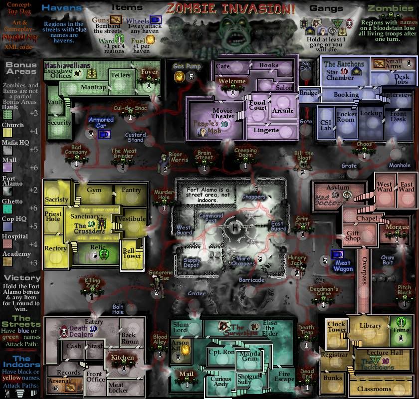
I've had a bit of trouble with uploading to photobucket, so Top Dog was kind enough to upload my latest effort. I'll update the 1st post shortly, but I wanted to get this out here as soon as I could to get some feedback.
If any followers of this map are left (it has been just over a year on vacation!), they will notice some significant 'tweaks' to the gameplay, but largely all of the elements are still there. The biggest difference is the mechanic for the Gangs (formerly called Factions but changed for space considerations), which no longer provide a +2 autodeploy but instead start with 10 troops and are part of a losing condition- a player must hold at least 1 gang at all times or lose immediately.
This is the large map only for the moment, in case I've gone in the completely wrong direction with the look of the map (the small map is not difficult but it is tedious to do).
One other major alteration to note about the gameplay- the Items that are indoors are now in a separate room for purposes of clarity, and likewise the gangs now occupy their own space. The rooms that the Items occupy are colored to show that they are not a part of any bonus area, while the Gangs have been changed so that they are part of the bonus area. The number of regions per bonus area is unchanged, however, because I removed a room from each bonus area in order to give the Gangs their own space.
A fair number of indoor connections have been fiddled with, as space and artistic rendering required. I don't think that the gameplay has been significantly impacted, I tried to make sure that the number of borders per bonus area would remain the same.
Some map followers might think that the 'Havens' are a new addition to the gameplay, however this is not so. I simply defined the phrase "non-zombie street region" that was used in ealier versions of the map. This helped save space where it was needed under the explanation of the Item powers.
Finally, the values for the bonus areas have been modified a little. Fort Alamo has been lowered from +3 to +2, and the Mall and Ghetto have both been lowered from +7 to +6.
As far as graphics go, I hope that I'm zeroing in on a more finished look for the legend, and that the playable part of the map has more 3D depth. My primary bad feeling about it is that the legend is a bit cramped, but I've stared at this thing way too long to have a completely objective opinion anymore.
Thoughts?
If any followers of this map are left (it has been just over a year on vacation!), they will notice some significant 'tweaks' to the gameplay, but largely all of the elements are still there. The biggest difference is the mechanic for the Gangs (formerly called Factions but changed for space considerations), which no longer provide a +2 autodeploy but instead start with 10 troops and are part of a losing condition- a player must hold at least 1 gang at all times or lose immediately.
- Click image to enlarge.
One other major alteration to note about the gameplay- the Items that are indoors are now in a separate room for purposes of clarity, and likewise the gangs now occupy their own space. The rooms that the Items occupy are colored to show that they are not a part of any bonus area, while the Gangs have been changed so that they are part of the bonus area. The number of regions per bonus area is unchanged, however, because I removed a room from each bonus area in order to give the Gangs their own space.
A fair number of indoor connections have been fiddled with, as space and artistic rendering required. I don't think that the gameplay has been significantly impacted, I tried to make sure that the number of borders per bonus area would remain the same.
Some map followers might think that the 'Havens' are a new addition to the gameplay, however this is not so. I simply defined the phrase "non-zombie street region" that was used in ealier versions of the map. This helped save space where it was needed under the explanation of the Item powers.
Finally, the values for the bonus areas have been modified a little. Fort Alamo has been lowered from +3 to +2, and the Mall and Ghetto have both been lowered from +7 to +6.
As far as graphics go, I hope that I'm zeroing in on a more finished look for the legend, and that the playable part of the map has more 3D depth. My primary bad feeling about it is that the legend is a bit cramped, but I've stared at this thing way too long to have a completely objective opinion anymore.
Thoughts?
Re: Zombie Invasion!- Back From the Dead Version 24 [page 12
Glad to see this back!
The blue colour of the Havens is not very noticeable. The only names that seemed blue at first glance are the Wheels, so the legend seemed to suggest that they one-way attacked each other. Reexamining the map, I see that the Havens are the street regions other than Wheels which are not on a bloodstain. I was about to suggest that the Havens use a colour a bit more in contrast to the street grey, like a pale green, when I realized that the Zombie street regions were using a green.
  A more saturated blue might be more obvious, but it might lose contrast. Of course, the Wheels looked blue to me immediately. Would it confuse anything if the Wheels and Havens used the same text colour? The Wheels are distinguished by the truck icon.
Forgive me for not reading back, but the legend doesn't make it crystal clear: how do the Wards work? Holding one gives you an additional +1 for every 4 regions held overall? Will holding both give +2 for every 4 regions held overall? (There are only two, right, the Relic and the Tome?)
The blue colour of the Havens is not very noticeable. The only names that seemed blue at first glance are the Wheels, so the legend seemed to suggest that they one-way attacked each other.
Forgive me for not reading back, but the legend doesn't make it crystal clear: how do the Wards work? Holding one gives you an additional +1 for every 4 regions held overall? Will holding both give +2 for every 4 regions held overall? (There are only two, right, the Relic and the Tome?)
-
MarshalNey
- Posts: 781
- Joined: Mon Sep 28, 2009 9:02 pm
- Gender: Male
- Location: St. Louis, MO
Re: Zombie Invasion!- Back From the Dead Version 24 [page 12
Thanks for the quick comments Ender, you're one of the best there isender516 wrote:Glad to see this back!
The blue colour of the Havens is not very noticeable. The only names that seemed blue at first glance are the Wheels, so the legend seemed to suggest that they one-way attacked each other.
I hear ya about the blue for the Havens... I'll go for something more obvious, more saturated or a different color altogether.
The Wards give +1 for every 4 regions held overall, like a weaker version of the territory bonus.ender516 wrote:Forgive me for not reading back, but the legend doesn't make it crystal clear: how do the Wards work? Holding one gives you an additional +1 for every 4 regions held overall? Will holding both give +2 for every 4 regions held overall? (There are only two, right, the Relic and the Tome?)
Yes, every Item works independently, so two of a type that provide a bonus would provide it twice overall. I thought about including this in the legend, but given that it's not specified in other maps and I don't think I have the space, I left it out... poor excuse, I know. I keep wondering if I shouldn't ask for another 40 pixels horizontally, to let the legend frame the map and provide plenty of room.
And yes, there are only 2 of every type of Item- one in the general vicinity of each bonus area.
Re: Zombie Invasion!- Back From the Dead Version 24 [page 12
Welcome back Marshal!! Glad you're bringing this one back to the living dead!! 
-
koontz1973
- Posts: 6960
- Joined: Thu Jan 01, 2009 10:57 am
Re: Zombie Invasion!- Back From the Dead Version 24 [page 12
This is a great map and cannot wait. Please no more vacationsisaiah40 wrote:Welcome back Marshal!! Glad you're bringing this one back to the living dead!!

Re: Zombie Invasion!- Back From the Dead Version 24 [page 12
I agree with ender, First thing I thought when I saw this was the blue "havens" not really looking blue... could you just swap the colors from the armored car/meat wagon to the street territories??
High Score: 1384 w/ 42% games won
-
Victor Sullivan

- Posts: 6010
- Joined: Mon Feb 08, 2010 8:17 pm
- Gender: Male
- Location: Columbus, OH
- Contact:
Re: Zombie Invasion!- Back From the Dead Version 24 [page 12
Totally psyched to see this back in action!  Some comments (they're a mix of gameplay and graphics, forgive me if my thoughts aren't entirely organized):
-Sully
- I kinda liked the term "cabal" over "gang". A church "gang" seems a bit oxymoronic, no? Even "faction" would be better IMO.
- The gangs shouldn't be tied to their respective bonus areas, given the losing conditions. IMO you should make it so that anyone can hold any bonus area, regardless of which gang(s) they start with.
- Not fond of the Comic Sans-esque font used for the street regions, it certainly doesn't scream "Aaah!! Zombies!! They're gonna eat my brains!!"
- Under the "Gangs" section of the legend, you could use those blood splotches like you have for the zombie regions for "you will die" to add some extra oomph.
- The largest zombie at the top of the map - there is a line going over the middle finger of his right hand.
- Avoid putting gangs at the edge of their bonus area. They should be sufficiently protected, methinks.
-Sully
Beckytheblondie: "Don't give us the dispatch, give us a mustache ride."
Scaling back on my CC involvement...
Scaling back on my CC involvement...
-
MarshalNey
- Posts: 781
- Joined: Mon Sep 28, 2009 9:02 pm
- Gender: Male
- Location: St. Louis, MO
Re: Zombie Invasion!- Back From the Dead Version 24 [page 12
Gotcha, Dog, I'll do just that I thinkTop Dog wrote:I agree with ender, First thing I thought when I saw this was the blue "havens" not really looking blue... could you just swap the colors from the armored car/meat wagon to the street territories??
Obsessed with the gangs I see.Sully wrote: kinda liked the term "cabal" over "gang". A church "gang" seems a bit oxymoronic, no? Even "faction" would be better IMO.
The gangs shouldn't be tied to their respective bonus areas, given the losing conditions. IMO you should make it so that anyone can hold any bonus area, regardless of which gang(s) they start with.
Under the "Gangs" section of the legend, you could use those blood splotches like you have for the zombie regions for "you will die" to add some extra oomph.
Avoid putting gangs at the edge of their bonus area. They should be sufficiently protected, methinks.
Hrmmm, well I'll have to think upon what you're saying, particularly with tying the gangs to the bonus areas. It felt like a breakthrough for clarity's sake when I simply made the Gang and the room it was in into one region- much less clutter, and no need to say anything special in the legend.
As for the name Gang, well I changed it for space purposes, but in its current state there is plenty of space to change the name back to "Faction".
As for the Gang placement, I feel that there could be an equitable tradeoff between attacking options and defense even when certain Gangs are more isolated (fewer borders) than others. Could a Gang be taken in the very first round? The dice make anything possible, but I'm hoping that 10 is a sufficient deterrent for making the attempt. If it becomes too much of a hassle, I might abandon the idea of a losing condition altogether.
It's not Comic Sans-esque. It's actually the much-reviled Comic Sans in the flesh. And it was meant to convey more of a light-hearted edge to what could otherwise become a very grisly map. Still, perhaps the region names convey enough of a campy "Army of Darkness" mood without the font. I hate font-shopping... grumble...Sully wrote:Not fond of the Comic Sans-esque font used for the street regions, it certainly doesn't scream "Aaah!! Zombies!! They're gonna eat my brains!!"
Got it, it shall be eaten away.Sully wrote:The largest zombie at the top of the map - there is a line going over the middle finger of his right hand.
Two questions:
Is it possible to have an "OR" losing condition- e.g., hold at least 1 gang OR hold more than 6 regions in order to survive?
Would you (or Ender) be willing to do the XML for this map?