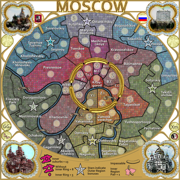
yesterday I read anything about Moscows regions on russian sites. but was tired, so now I write you my founds:
the name region/square/county of Moscow is "rajon" ("j" pronounced as "y" in day). I will use Basmannyj rajon as example.
it is Basmannyj rajon and Basmannoe is self-administration. this is clear. but it seems that maybe Basmannoe is municipal corporation under federal goverment rule. but this is not clear for me...
what is clear - if you can be exact use "rajon" or english name for it where it is mentioned after rajon name. so Basmannoe would be Basmannyj rajon.
here is map after my research. it is a little larger as yours. the names needs any work, for example I used "j" not "y" in the end of name. I do not know if it is fine in english, but it is close to russian "й"
- Click image to enlarge.

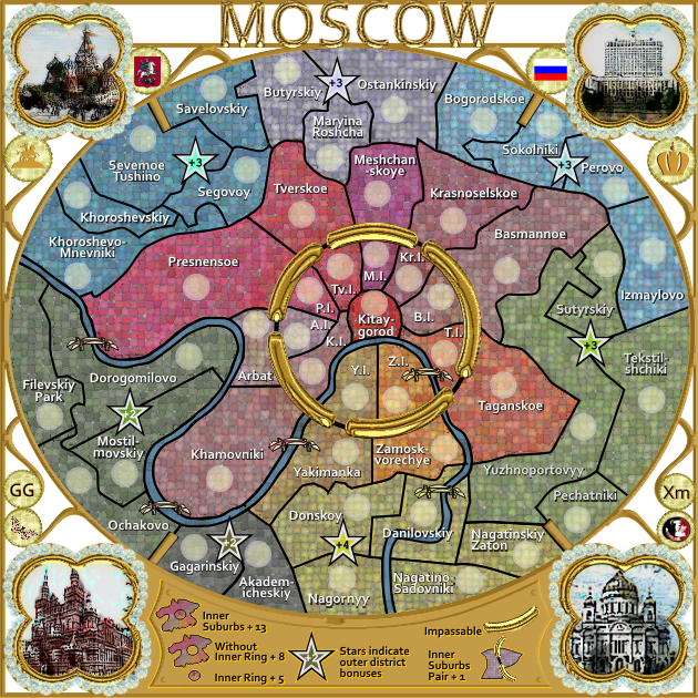
Oneyed
EDIT: please take this as a help. I do not mean this that you need to redrawn all your map.