4 Star Meats [Quenched]
Moderator: Cartographers
Forum rules
Please read the Community Guidelines before posting.
Please read the Community Guidelines before posting.

Re: 4 Star Meats [10 March 2013] v28 pg39
You're not "carp" whatever that means (maybe crap?). You're a damn fine artist. I think you can do better on matching the star to the font. The star is not as crisp as the font. It's acceptable as is for sure, but now that so much attention has been brought on, I think you should work on matching it. Maybe just "smart sharpen" it some. As for the rest of the map - looks great!


Re: 4 Star Meats [10 March 2013] v28 pg39
I'm a "carp" too, pretty much, but here's a shot at the star:

I believe it technically matches the shadow on the font as both drop down 7 pixels and shift over 4.
Somebody else could probably do it better, but if it's useful and you want the original I could pass you the file. If you're using Gimp what file format does it use? Photobucket doesn't seem to accept Photoshop psd files.
I copied the star behind itself, shifted it over the same number of pixels as the shadow is dropped on the font, and filled in with the right color. Had to sort of draw in the fill, so a pro would know what to do there, but maybe it worked.
Also used a thinner border on the star to imitate the font and I think it came out a bit sharper too.
In any case I think the shadow will look a bit odd on the star even if it's technically correct because of the angles.

-
ironmanbravo

- Posts: 38
- Joined: Thu Dec 01, 2011 5:20 pm
- Location: Official Pooper Scooper


Re: 4 Star Meats [10 March 2013] v28 pg39
to be clear, i don't think your carp  i am merely pointing out things so you can make the best map you can for us to play on.
looking at the star without the shadow i get the feeling the bottom 2 points are not the same angle, not symmetrical? you should be able to fold the star in half from the top point and have it match.
looking at the star without the shadow i get the feeling the bottom 2 points are not the same angle, not symmetrical? you should be able to fold the star in half from the top point and have it match.
Re: 4 Star Meats [10 March 2013] v28 pg39
I agree with Rj. Get that star on the map so we can get this stamped!
Re: 4 Star Meats [10 March 2013] v28 pg39
I cleaned up the points of the star a bit. The rendering was making them a little too "pointy"... especially the lower right.

Are you talking about this last star greenoaks?
Are you talking about this last star greenoaks?
-
AndyDufresne

- Posts: 24919
- Joined: Fri Mar 03, 2006 8:22 pm
- Location: A Banana Palm in Zihuatanejo
- Contact:
Re: 4 Star Meats [10 March 2013] v28 pg39
Agreed, it certainly isn't carp.RjBeals wrote:wow. that's pixel perfect
--Andy

Re: 4 Star Meats [10 March 2013] v28 pg39
Thanks Jono I really appreciate it, I'll put your star on my map when I get a chance.
-
BlackKnight_6
- Posts: 337
- Joined: Wed Apr 15, 2009 12:17 pm


Re: 4 Star Meats [10 March 2013] v28 pg39
Did you say...Pixel Perfect?RjBeals wrote:wow. that's pixel perfect
I agree
-Shape

Re: 4 Star Meats [10 March 2013] v28 pg39
*psst* put the new star on the map and update... *hint-hint-nudge-nudge*


Re: 4 Star Meats [17 March 2013] v29 pg40
OK, here it is, fingers crossed.
I have an XML file, not sure the best way to upload it.
Best Wishes,
Dana
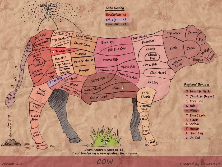
- Click image to enlarge.

- Click image to enlarge.

- Click image to enlarge.

I have an XML file, not sure the best way to upload it.
Best Wishes,
Dana


-
koontz1973
- Posts: 6960
- Joined: Thu Jan 01, 2009 10:57 am
Re: 4 Star Meats [17 March 2013] v29 pg40
dana, xml file, use the attachments in this thread to upload it here. You need to have it in a new post and the first post. With it, you need to include both the large and small maps, map with any neutrals coded in and the value of those neutrals, another one showing the 888 placements. Last thing, and you already have this done, repost the CB maps. You can put all the funny maps (CB and 888 placements + neutral map) into spoiler tags. Get all this into te first post and the xml checking thread. After that, sit back and wait for any last little adjustments needed.

Re: 4 Star Meats [17 March 2013] v29 pg40
OK I posted the XML file on the XML thread.
http://www.conquerclub.com/forum/viewto ... 1#p4100761
Hopefully I did it correctly.
Best Wishes,
Dana
http://www.conquerclub.com/forum/viewto ... 1#p4100761
Hopefully I did it correctly.
Best Wishes,
Dana
-
ironmanbravo
- Posts: 38
- Joined: Thu Dec 01, 2011 5:20 pm
- Location: Official Pooper Scooper

-
ManBungalow
- Posts: 3431
- Joined: Sun Jan 13, 2008 7:02 am
- Location: On a giant rock orbiting a star somewhere
Re: 4 Star Meats [17 March 2013] v29 pg40
I feel that this map has developed particularly well over time, while being very loyal to the initial gameplay draft.
Just look at this sequence of images:
Bravo Dana.
Just look at this sequence of images:
- Click image to enlarge.
- Click image to enlarge.
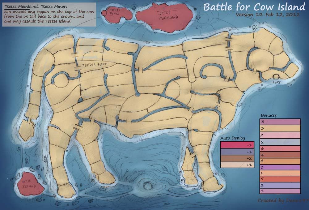
- Click image to enlarge.
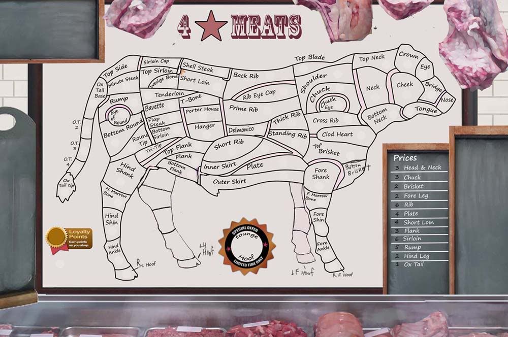
- Click image to enlarge.

- Click image to enlarge.

-
mcshanester29

- Posts: 8662
- Joined: Tue Sep 07, 2010 3:09 pm
- Gender: Male
- Location: ID, USA
Re: 4 Star Meats [17 March 2013] v29 pg40
Well done Dana!!! Been looking forward to playing this one!!
-
MoB Deadly

- Posts: 2381
- Joined: Sun Jan 11, 2009 2:07 am
- Gender: Male


Re: 4 Star Meats [17 March 2013] v29 pg40
not sure..I posted the XML file, so I'm not sure what happens now.

Re: 4 Star Meats [17 March 2013] v29 pg40
After I checking Spanish Armada XML I will start this one. I can expect that to be finished within the week, or so.dana1971 wrote:not sure..I posted the XML file, so I'm not sure what happens now.
