Another map I posted was received with dirty names and rotten tomatoes hurled at me.
But in the hope that eventually something will be liked I have attempted again. "To hell with the nay sayers."
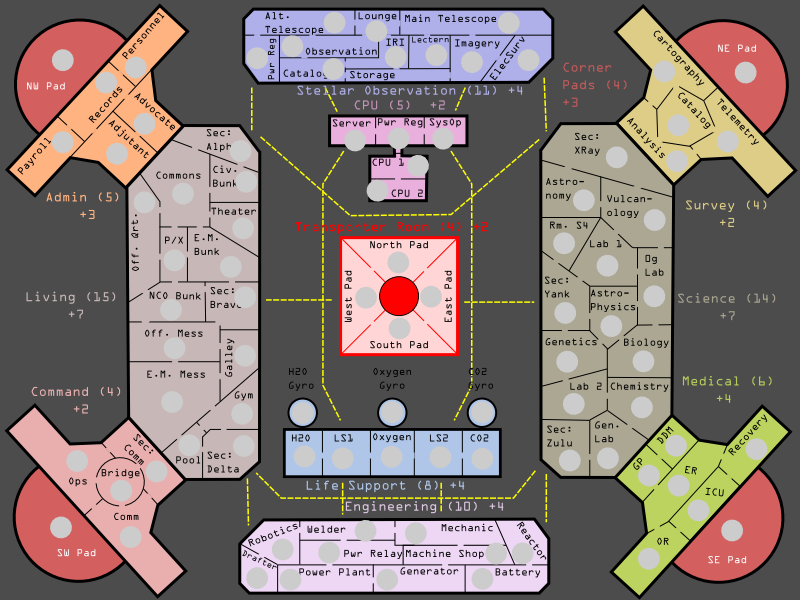
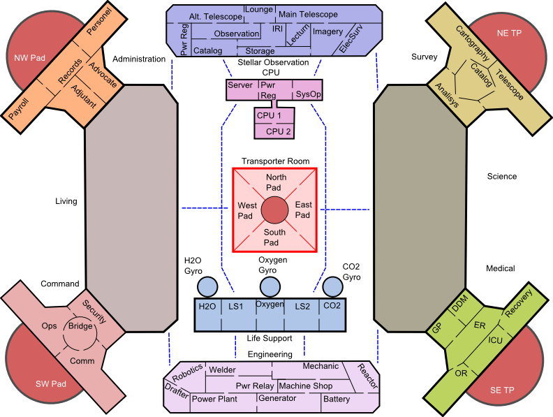
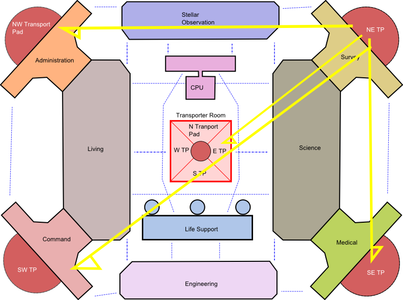
This is a very rough first draft of the Star Base Trinity.
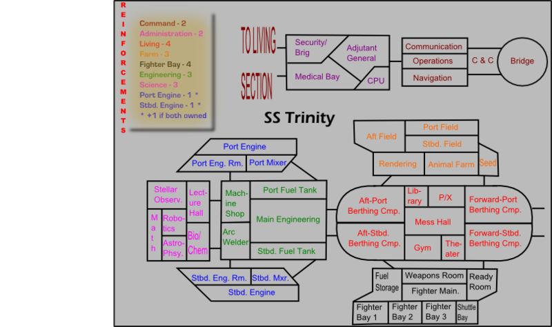
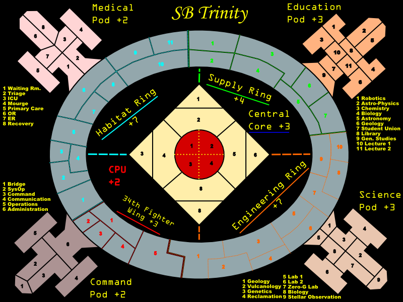
Third Draft v3.1 -- SEE POST BELOW
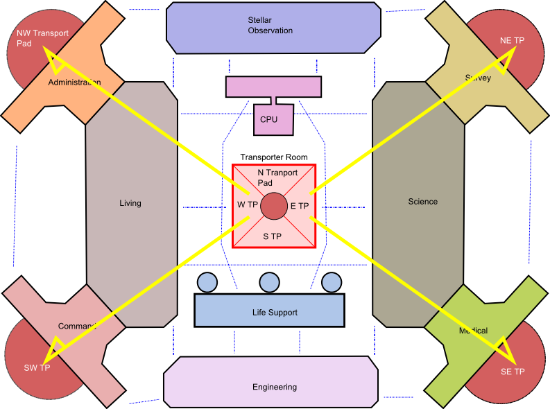
v3.0
v2.1
http://i142.photobucket.com/albums/r118/jupitersking/trinity7.png
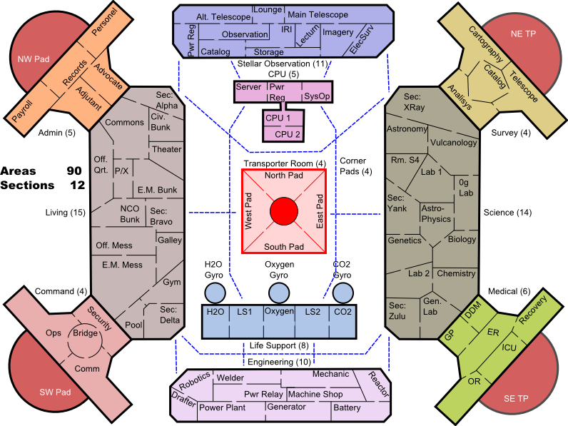
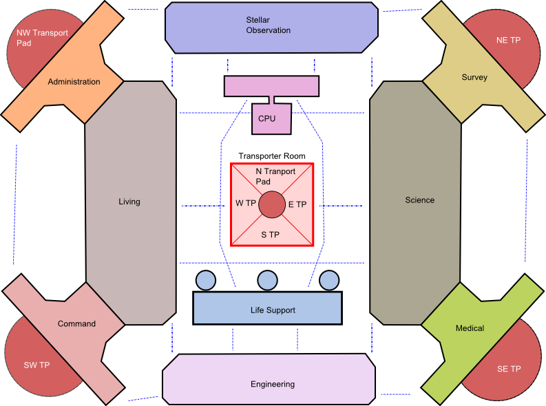
Version 2.0
http://i142.photobucket.com/albums/r118/jupitersking/trinity6.png
First Draft: SB Trinity
It is divided into 78 SPACES in 10 SECTIONS.
http://i142.photobucket.com/albums/r118/jupitersking/trinity1.png
It looks symmetrical until you look at the divisions and see that no two Sections are the same.
I need feedback on bonuses and borders.
Also, if anyone with graphic skill is interested in helping out with a background template, basically the station, it would be a big help (On a graphic design scale of 1-10 I score a -3) and would let me finish the rest of the work but save me that headache. Having a crisper image would also help make the area of the map seem bigger.
Let me know what you think.
JK
PS To garner feedback I am now going to extremes.

EDIT NOTE: I lightly edited and changed AREA into SECTION to be inline with naval jargon.


](./images/smilies/eusa_wall.gif "Brick wall")


