[Official] Canada REVAMP [Quenched]
Moderator: Cartographers
Forum rules
Please read the Community Guidelines before posting.
Please read the Community Guidelines before posting.

-
WidowMakers
- Posts: 2774
- Joined: Mon Nov 20, 2006 9:25 am
- Gender: Male
- Location: Detroit, MI
I would rather you be honest then a suck up. I am glad you will tell it like it is.hulmey wrote:I think we have taken a set back wards rather than step forwards with this horrid map. sorry Wm bu ttim a honest guy. The current canada map is much better!!!
I agree this map is very different. That was what I was going for.


-
reverend_kyle

- Posts: 9250
- Joined: Tue Mar 21, 2006 4:08 pm
- Location: 1000 post club
- Contact:
-
reverend_kyle
- Posts: 9250
- Joined: Tue Mar 21, 2006 4:08 pm
- Location: 1000 post club
- Contact:
-
DiM

- Posts: 10415
- Joined: Wed Feb 14, 2007 6:20 pm
- Gender: Male
- Location: making maps for scooby snacks
i can only say i'm disappointed. this is probably your ugliest design ever. sorry but that's my opinion. it looks but ugly.
the earth is blurry, the borders aren't true to the image behind them, the title is stupid in it's design, the army circles are horrible and the overall look is very unpleasant and unclear. unfortunatelly this is how the revamping goes and i guess there's nothing that can be done about it. unfortunatelly a poll where people vote on a first impression was decided as the right thing. too bad. from all the revamps done so far the canada revamp meant a lot to me since my very first win was on this map and i was actually planning to play this map once the revamp is over. but i'll never do it again.
congrats on winning hopefully some people are happy because so far i see lots of disappointed people.
“In the beginning God said, the four-dimensional divergence of an antisymmetric, second rank tensor equals zero, and there was light, and it was good. And on the seventh day he rested.”- Michio Kaku


-
WidowMakers
- Posts: 2774
- Joined: Mon Nov 20, 2006 9:25 am
- Gender: Male
- Location: Detroit, MI
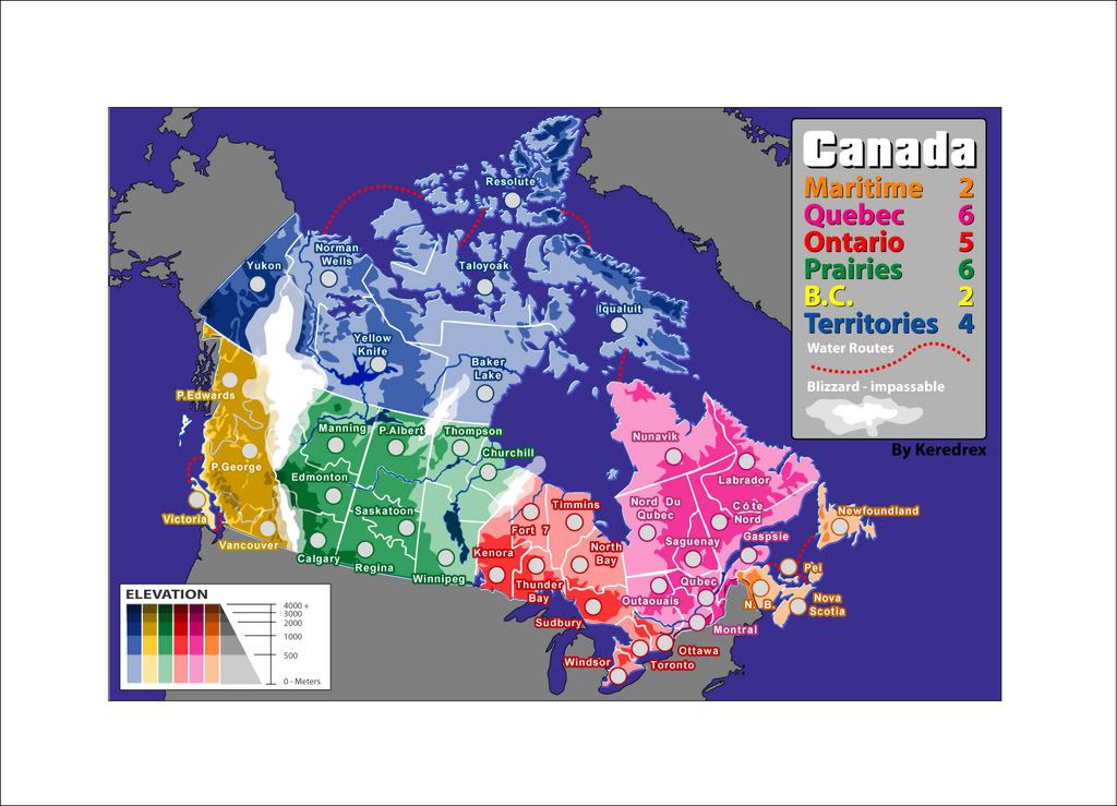
I know. Maritimes and B.C. are also switched.nagerous wrote:you've got quebec and ontario the wrong way round.
I know the above quote is not really a quote but you get the idea. I can see many people are not happy with the style of map I made. My intention was not to try and ruin the map. I too really like the Canada map gameplay (probably not as much as DiM). When the revamp started I wanted to try and make something different that had never been seen or done before. That is why I chose the earth, space, sun and moon. Plus this is probably the map I have spent the least amount of time on. I rushed at the end and I knew that if I won the community would tear me a new one on how "bad" it looked.This map looks ugly, it is a step backward, I don't like it, etc, etc
Based on this style the map is a darker map. I wanted to go for a satellite style picture map.
I understand what you mean about the earth and army circles.DiM wrote:the earth is blurry, the borders aren't true to the image behind them, the title is stupid in it's design, the army circles are horrible and the overall look is very unpleasant and unclear
I don't understand your issue with the borders. I took the current Canada map and overladed it on the globe. Some of the borders changed (NOT XML borders just graphical borders) because the current map was wrong. Such as the location of the mountains int he west.
Some people love the title and some hate it.mibi wrote:The title treatment however is first rate, well done.
DiM wrote:i can only say i'm disappointed. this is probably your ugliest design ever. sorry but that's my opinion. it looks but ugly.
Well I was bound to make someone unhappy eventually. I have made or revamped 7 different maps. Circus Maximus(RV), Great Lakes, Indochina(RV), King Of The Mountains, Montreal(RV), Rail USA, 8 Thoughts and now Canada(currently being revamped).mibi wrote:yeah that map isnt really top notch WM or anything.
Each map has a different and unique style. I have tried to not fall into the mold of one man, one map style.
So to my critics who say this map is bad, what could I do to make it better and still keep this style? There have already been some suggestions and I will work on those. As both DiM and mibi know, when you set out to break the rules (graphics, size, XML) you are going to make people mad. I set out to make this map different in every way than the original. I know we have a long way to go (no 32 minute quench here, huh DiM?) I just wanted everyone to know I will do my best and appreciate the support both positive and negative.


there are some differences in the large and small maps, such as the color and glare of the sun... is this intentional?
And I know this is a geeky complaint, but the face of the moon facing the image's point of view wouldn't be full given its position relative to the sun. Feel free to tell me to shove it on this one, wid.
And I know this is a geeky complaint, but the face of the moon facing the image's point of view wouldn't be full given its position relative to the sun. Feel free to tell me to shove it on this one, wid.

-
unriggable

- Posts: 8036
- Joined: Thu Feb 08, 2007 9:49 pm
Eh, I dont know...a lot of good space is wasted on making sure it looks planetary. Unnecessary IMHOColeman wrote:I was as well, but our final decision was not to do a revote or anything of that nature. I am confident WidowMakers can transform his version into something we all would like.Gilligan wrote:I was really hoping for D.


-
eternal_sunshine
- Posts: 2
- Joined: Tue Sep 18, 2007 11:33 pm
Keredrex
FWIW, I really like your map!
Keredrex wrote:Good job Widow Had a feeling that was yours.... I Still think All submissions should of gotten a second go Based on feedback it might of made the COMPETITION a bit more interesting
Here was My 2nd go after what was said in the posts....
http://i239.photobucket.com/albums/ff11 ... KREXv2.jpg
And I would like to know who made all the maps since the decision has been made Why Not it might help for future collaborations
-
cena-rules

- Posts: 9740
- Joined: Sat Apr 28, 2007 2:27 am
- Gender: Male
- Location: Chat
-
MR. Nate

- Posts: 951
- Joined: Tue Dec 19, 2006 10:59 am
- Gender: Male
- Location: Locked in the warehouse.
- Contact:
You've succeeded. I would never guess that the same author did both this map and KoTM.WidowMakers wrote: I have tried to not fall into the mold of one man, one map style.
By the way, Screw everyone who doesn't like it. It's your second best map ever. (I am still madly in love w/ Great Lakes)
AAFitz wrote:There will always be cheaters, abusive players, terrible players, and worse. But we have every right to crush them.
End the Flame Wars.MeDeFe wrote:This is a forum on the internet, what do you expect?
-
reverend_kyle
- Posts: 9250
- Joined: Tue Mar 21, 2006 4:08 pm
- Location: 1000 post club
- Contact:
thanks.. I was wondering who voted it because I didn't.cairnswk wrote:For the record...i voted E.
if this was quenched right now it would be the hardest map on CC to read the numbers on. I would hate to see it quenched without being able to read the numbers because then i'd never be able to play it.then get glasses.
DANCING MUSTARD FOR POOP IN '08!
-
reverend_kyle
- Posts: 9250
- Joined: Tue Mar 21, 2006 4:08 pm
- Location: 1000 post club
- Contact:
http://i1.tinypic.com/5ywic2c.jpgKeredrex wrote:Good job Widow Had a feeling that was yours.... I Still think All submissions should of gotten a second go Based on feedback it might of made the COMPETITION a bit more interesting
Here was My 2nd go after what was said in the posts....
http://i239.photobucket.com/albums/ff11 ... KREXv2.jpg
And I would like to know who made all the maps since the decision has been made Why Not it might help for future collaborations
this was mine based on input.
DANCING MUSTARD FOR POOP IN '08!
-
DiM
- Posts: 10415
- Joined: Wed Feb 14, 2007 6:20 pm
- Gender: Male
- Location: making maps for scooby snacks
never seen or done before is not exactly how i'd say it. satelite image with color overlays has been done in san francisco map and has also been attempted in other maps that got abandoned.WidowMakers wrote:I know the above quote is not really a quote but you get the idea. I can see many people are not happy with the style of map I made. My intention was not to try and ruin the map. I too really like the Canada map gameplay (probably not as much as DiM). When the revamp started I wanted to try and make something different that had never been seen or done before. That is why I chose the earth, space, sun and moon. Plus this is probably the map I have spent the least amount of time on. I rushed at the end and I knew that if I won the community would tear me a new one on how "bad" it looked.This map looks ugly, it is a step backward, I don't like it, etc, etc
Based on this style the map is a darker map. I wanted to go for a satellite style picture map.
as for the fact you spent little time, well, this type o design actually requires little time. all you had to do is draw the borders and add a fill. the hard part is done by the background image. i don't like this style, never liked it in san francisco and will never like it here. to me it looks like something from landgrab or lux delux. they take all sorts of images and draw overlays o transparent coloring. in my opinion this is a style that requires little work and skill and it isn't something a map should look like. if i remember corectly the author of plasagna map did something along these lines (with overlays) of course in a much crappier way but still it gives an idea on the design.
the borders you drew don't correspond with the borders on the satellite image. if you look closely the borders don't follow the landscape in some areas.WidowMakers wrote:I understand what you mean about the earth and army circles.DiM wrote:the earth is blurry, the borders aren't true to the image behind them, the title is stupid in it's design, the army circles are horrible and the overall look is very unpleasant and unclear
I don't understand your issue with the borders. I took the current Canada map and overladed it on the globe. Some of the borders changed (NOT XML borders just graphical borders) because the current map was wrong. Such as the location of the mountains int he west.
i don't hate it i would actually like it a lot. i just find it stupid since there's only one maple leaf in the title replacing an A why are the other 2 As not replaced? usually when you do a replacement like that you do it on all the letters that are the same.WidowMakers wrote:Some people love the title and some hate it.mibi wrote:The title treatment however is first rate, well done.
make it better and keep the style? in my opinion whatever you do will not improve it because as i said the style is crap.WidowMakers wrote:DiM wrote:i can only say i'm disappointed. this is probably your ugliest design ever. sorry but that's my opinion. it looks butt ugly.Well I was bound to make someone unhappy eventually. I have made or revamped 7 different maps. Circus Maximus(RV), Great Lakes, Indochina(RV), King Of The Mountains, Montreal(RV), Rail USA, 8 Thoughts and now Canada(currently being revamped).mibi wrote:yeah that map isnt really top notch WM or anything.
Each map has a different and unique style. I have tried to not fall into the mold of one man, one map style.
So to my critics who say this map is bad, what could I do to make it better and still keep this style? There have already been some suggestions and I will work on those. As both DiM and mibi know, when you set out to break the rules (graphics, size, XML) you are going to make people mad. I set out to make this map different in every way than the original. I know we have a long way to go (no 32 minute quench here, huh DiM?) I just wanted everyone to know I will do my best and appreciate the support both positive and negative.
but if you still want to keep it then make the image more clear. redraw the borders to follow the exact landscape in the background, move the view to be more top-down rather than this perspective skew. and i guess that's about it.
as i said this style doesn't leave too much to do. it's basically the easiest way to make a map but at the same time the least modifyable. other than colors there's basically no artwork no texture no gradients no fill no nothing. it leaves no room for artistical expression.
compare it to indochina revamp. that map oozes with feeling with art with everything and it's a pleasure to look at it. now move your eyes on this one. no feeling no nothing.
i have only one hope. that no more maps like this are produced. since san francisco was made there have been a few attempts but they all died and i was glad but if this one gets quenched i'm afraid people will start taking satellite images putting transparent colors and voila we have maps.
“In the beginning God said, the four-dimensional divergence of an antisymmetric, second rank tensor equals zero, and there was light, and it was good. And on the seventh day he rested.”- Michio Kaku
-
unriggable
- Posts: 8036
- Joined: Thu Feb 08, 2007 9:49 pm

I completely agree. Widowmakers, I dig most of your maps. But this one...I can't really find anything positive to say except the font is nice.hulmey wrote:I think we have taken a set back wards rather than step forwards with this horrid map. sorry Wm bu ttim a honest guy. The current canada map is much better!!!
Also something to ponder...by replacing all these maps with new versions we are also losing a bit of Conquer Club history in the process. That being said, the ones that have been revamped so far desperately needed it. I just don't think that is the case here. Think of the original Canada map as an old historic house. It might not have all the amenities of today's maps but it does have a certain charm which is completely lost in this new map.
Hulmey, we can start the CC Map Preservationist Society.
