New update, complete with finished xml:
Large:
- Click image to enlarge.
Small:

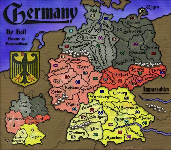
Large 88's XML Test:
- Click image to enlarge.

Small 88's XML Test:
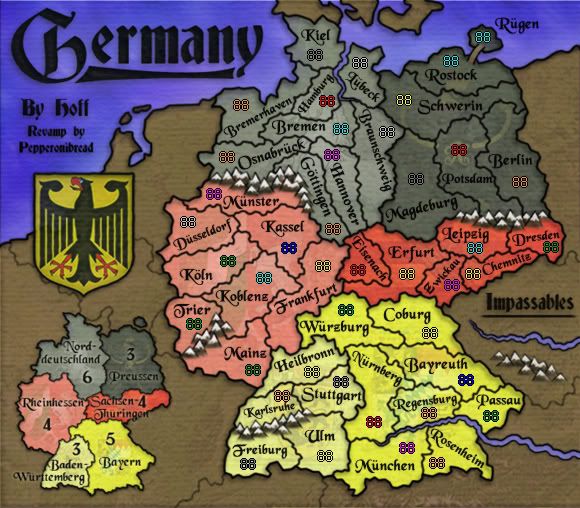
Large 888's XML Test:
- Click image to enlarge.

Small 888's XML Test:

XML Link:
http://h1.ripway.com/pepperonibread/Germany.xmlChanges:
-Scooched a couple mountains around.
-Darkened the coats of arms on the six continents. I think these are basically set - as whenever I bold them, there are complaints about the map being too busy, and whenever I dull the arms down, people say they're too hard to identify. It's more of an aesthetics thing anyway, looking at the Great Lakes map you can see the same effect with flags, and many of those are certainly not easy to see.
-Thinned down the bridge between Rugen and Rostock.
-Completed the XML. So those army # tests above are the real deal now, not just 88's that I pasted on. I posted the 888's tests as well.
To do:
-Fix 88's, if any are off-center or misplaced.
-Comments?