[Abandoned] - Treasure Map
Moderator: Cartographers
Re: [Adv] Treasure Map v20 pgs.1&20 [GP DISCUSSION]
![]() by LED ZEPPELINER on Wed Mar 04, 2009 3:47 pm
by LED ZEPPELINER on Wed Mar 04, 2009 3:47 pm
i am going to ponder over the gameplay for a while. I am thinking making X start with 5 (just an idea) neutrals, and all other start with 1 but be killer. also moving the attack route between the boats and grendelia from Ramble to Juno that way nobody is isolated. I am glad that you think the graphics are good, and as for sailoseals comments about the opacity of territories: most of them, the opacity is between 20-40%
-
 LED ZEPPELINER
- Posts: 1088
- Joined: Tue Nov 25, 2008 10:09 pm


Re: [Adv] Treasure Map v20 pgs.1&20 [GP DISCUSSION]
![]() by john9blue on Wed Mar 04, 2009 3:55 pm
by john9blue on Wed Mar 04, 2009 3:55 pm
Graphics:
I really like them. It looks genuine. A few parts don't fit in, though:
- The glow off the bottom text and territory names.
- The second to last word ("treasrue") is spelled wrong.
- The ships look like they came from a copy machine.
Fantastic graphics overall.
Gameplay:
- Shreinfeld should be +5.
- Why do the ports have 3 neutrals? Those should be on Grendelia, imo.
- Does Grendelia get a bonus? I'm thinking not...
- There are territories called "The Glue", "Dead", and "End". You might want to rename them...
- Instead of "next to the treasure" you should specifically say "On the dead man's neck", because I thought you meant X.
Nice job so far. This is better than some of the maps in the Foundry.
natty_dread wrote:Do ponies have sex?
(proud member of the Occasionally Wrongly Banned)Army of GOD wrote:the term heterosexual is offensive. I prefer to be called "normal"
-
john9blue
- Posts: 1268
- Joined: Mon Aug 20, 2007 6:18 pm
- Location: FlutterChi-town


Re: [Adv] Treasure Map v20 pgs.1&20 [GP DISCUSSION]
![]() by LED ZEPPELINER on Wed Mar 04, 2009 4:18 pm
by LED ZEPPELINER on Wed Mar 04, 2009 4:18 pm
This is the new wording for my riddle, so far. I hope you can tell the change in gameplay by reading it, if not i will post a sample of the actual map. by making the riddle shorter, i do not need the glow as much because most of it is over the lighter parts of the background.
-
LED ZEPPELINER
- Posts: 1088
- Joined: Tue Nov 25, 2008 10:09 pm
Re: [Adv] Treasure Map v20 pgs.1&20 [GP DISCUSSION]
![]() by thenobodies80 on Wed Mar 04, 2009 4:18 pm
by thenobodies80 on Wed Mar 04, 2009 4:18 pm
The map looks great ,I love the theme of your map could be interesting if well developed
Agree with Benn about gameplay:
I'd like to see the border of your map more similar to a old paper map. (only the border)
Add something similar (sorry for the 5 minutes quality ) to this:
Agree with Benn about gameplay:
MrBenn wrote:In short, the map looks good for this stage of development, but I think the gameplay is seriously flawed as it stands.
I'd like to see the border of your map more similar to a old paper map. (only the border)
Add something similar (sorry for the 5 minutes quality

-

thenobodies80
- Posts: 5400
- Joined: Wed Sep 05, 2007 4:30 am
- Location: Milan


Re: [Adv] Treasure Map v20 pgs.1&20 [GP DISCUSSION]
![]() by LED ZEPPELINER on Wed Mar 04, 2009 4:21 pm
by LED ZEPPELINER on Wed Mar 04, 2009 4:21 pm
ok i'll try it, if you would be so kind as to tell me how you went about doing that, i might also put a sort of wood table under it
-
LED ZEPPELINER
- Posts: 1088
- Joined: Tue Nov 25, 2008 10:09 pm
Re: [Adv] Treasure Map v20 pgs.1&20 [GP DISCUSSION]
![]() by thenobodies80 on Wed Mar 04, 2009 4:44 pm
by thenobodies80 on Wed Mar 04, 2009 4:44 pm
LED ZEPPELINER wrote:ok i'll try it, if you would be so kind as to tell me how you went about doing that, i might also put a sort of wood table under it
i used gimp
here the direct link:
http://docs.gimp.org/en/plug-in-pagecurl.html
add other graphic elements,try to do your map similar to this on borders:

-
thenobodies80
- Posts: 5400
- Joined: Wed Sep 05, 2007 4:30 am
- Location: Milan
Re: [Adv] Treasure Map v20.5 pgs.1&21 [GP DISCUSSION]
![]() by LED ZEPPELINER on Wed Mar 04, 2009 6:00 pm
by LED ZEPPELINER on Wed Mar 04, 2009 6:00 pm
-
LED ZEPPELINER
- Posts: 1088
- Joined: Tue Nov 25, 2008 10:09 pm
Re: [Adv] Treasure Map v20.5 pgs.1&21 [GP DISCUSSION]
![]() by bryguy on Wed Mar 04, 2009 6:13 pm
by bryguy on Wed Mar 04, 2009 6:13 pm
The wood doesn't look right, maybe try again? heres a VERY good tutorial (used it a couple times, and I love the look!): http://www.webdesign.org/cat/photoshop/ ... p.489.html
-
bryguy
- Posts: 4381
- Joined: Tue Aug 07, 2007 8:50 am
- Location: Lost in a Jigsaw

Re: [Adv] Treasure Map v20.5 pgs.1&21 [GP DISCUSSION]
![]() by MrBenn on Wed Mar 04, 2009 6:15 pm
by MrBenn on Wed Mar 04, 2009 6:15 pm
I think your time would be better spent thinking about the gameplay right now, rather than fiddling around with the graphics.

PB: 2661 | He's blue... If he were green he would die | No mod would be stupid enough to do that
-

MrBenn
- Posts: 6880
- Joined: Wed Nov 21, 2007 9:32 am
- Location: Off Duty


Re: [Adv] Treasure Map v20.5 pgs.1&21 [GP DISCUSSION]
![]() by LED ZEPPELINER on Wed Mar 04, 2009 6:24 pm
by LED ZEPPELINER on Wed Mar 04, 2009 6:24 pm
MrBenn wrote:I think your time would be better spent thinking about the gameplay right now, rather than fiddling around with the graphics.
i did change the gameplay: X starts with 5, all of the territs on Grendelia are killer except X, and the ports on grendelia start with 3, just wondering what people thought. Also if the gameplay matched the riddle
-
LED ZEPPELINER
- Posts: 1088
- Joined: Tue Nov 25, 2008 10:09 pm
Re: [Adv] Treasure Map v20.5 pgs.1&21 [GP DISCUSSION]
![]() by the.killing.44 on Wed Mar 04, 2009 6:29 pm
by the.killing.44 on Wed Mar 04, 2009 6:29 pm
the main point here is that there is no point to killer neutrals, as they only take effect if the person doesn't make it to X and the numerical value isn't changed, unless the player going for it has a great number of troops and leaves more than 1 behind as he makes his way to X. although making the ports deteriorating/killer isn't that bad of an idea.
.44
.44
-

the.killing.44
- Posts: 4724
- Joined: Thu Oct 23, 2008 7:43 pm
- Location: now tell me what got two gums and knows how to spit rhymes


Re: [Adv] Treasure Map v20.5 pgs.1&21 [GP DISCUSSION]
![]() by MrBenn on Wed Mar 04, 2009 6:32 pm
by MrBenn on Wed Mar 04, 2009 6:32 pm
Here's another random observation... The 'treasure island' is covered in neutrals and fills roughly 1/3 to 1/2 of the map. For most of the game, people are going to be playing in the section of the map that has been squeezed into the rest of the map, and feels like an afterthought 
PB: 2661 | He's blue... If he were green he would die | No mod would be stupid enough to do that
-
MrBenn
- Posts: 6880
- Joined: Wed Nov 21, 2007 9:32 am
- Location: Off Duty
Re: [Adv] Treasure Map v20.5 pgs.1&21 [GP DISCUSSION]
![]() by LED ZEPPELINER on Wed Mar 04, 2009 6:38 pm
by LED ZEPPELINER on Wed Mar 04, 2009 6:38 pm
MrBenn wrote:Here's another random observation... The 'treasure island' is covered in neutrals and fills roughly 1/3 to 1/2 of the map. For most of the game, people are going to be playing in the section of the map that has been squeezed into the rest of the map, and feels like an afterthought
i'll try changing around with the land size to make the island smaller and then make the main playing area bigger
-
LED ZEPPELINER
- Posts: 1088
- Joined: Tue Nov 25, 2008 10:09 pm
Re: [Adv] Treasure Map v20.5 pgs.1&21 [GP DISCUSSION]
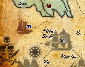
![]() by RjBeals on Wed Mar 04, 2009 7:07 pm
by RjBeals on Wed Mar 04, 2009 7:07 pm
- Click image to enlarge.

You've come a long way - this map is a great example of how one starts with a really rough idea, accepts and incorporates feedback, and not giving up. Nice work.
* It's been mentioned before, but your ships still do not look good. They do not fit the style of this map. This looks like it's supposed to be a hand drawn map (pirate treasure style), but the ships look like photographs. Maybe try something that's just black, like it was drawn in ink:

* What Benn said earlier is true. I know it's a big deal now to change, but the map looks unbalanced. People will spend most of their time over on the right side, where the territories are all squeezed in together. This is a fictional map, so the region/territory placement could have been much better mapped out. I don't know what you can do at this point, but I thought it should be mentioned.
* Your background looks great. The bonus region color choices look great also.
* Font style is okay. It might be a little crisp & black for a pirate map. It works as is, but it could be better. Also you have too much vertical space between words. They should be closer together.
* The red "X" looks bad also. You should put more work into making it cooler, and blend it with the map better. Maybe even take your brush took and paint it. Now I can see you just used the same font and upped the font size.
Good Luck LZ.

-

RjBeals
- Posts: 2506
- Joined: Mon Nov 20, 2006 5:17 pm
- Location: South Carolina, USA


Re: [Adv] Treasure Map v20.5 pgs.1&21 [GP DISCUSSION]
![]() by tlane on Wed Mar 04, 2009 7:20 pm
by tlane on Wed Mar 04, 2009 7:20 pm
I really like the idea of wood in the background but i think Bryguy's might be a bit better.
On another note, MrBenn is right, the game play is currently more important then the graphics. One idea I have is fully changing the whole killer neutral thing. There, in my mind, are too many killers right now and I think instead of killers you should just add more neutrals to the territories around the X (like strong hold, the Horn, the out skirts, dead man's neck).
This could be done by having:
3 on all ports (on grendelia)
4 on New cove, Treasure Cove, The Horn
5 on Strong Hold, The Out Skirts
6 or 7 on Dead Mans neck
and something like 10 on the X
If you did go through with this idea you could have it like before and each territory will lose one man every round(something like that).
This map is looking great!
tlane
p.s. will be back soon
bryguy wrote:The wood doesn't look right, maybe try again? heres a VERY good tutorial (used it a couple times, and I love the look!): http://www.webdesign.org/cat/photoshop/ ... p.489.html
On another note, MrBenn is right, the game play is currently more important then the graphics. One idea I have is fully changing the whole killer neutral thing. There, in my mind, are too many killers right now and I think instead of killers you should just add more neutrals to the territories around the X (like strong hold, the Horn, the out skirts, dead man's neck).
This could be done by having:
3 on all ports (on grendelia)
4 on New cove, Treasure Cove, The Horn
5 on Strong Hold, The Out Skirts
6 or 7 on Dead Mans neck
and something like 10 on the X
If you did go through with this idea you could have it like before and each territory will lose one man every round(something like that).
This map is looking great!
tlane
p.s. will be back soon
-
tlane
- Posts: 309
- Joined: Wed Oct 22, 2008 7:11 pm
- Location: NYC - sint maarten(sometimes)
Re: [Adv] Treasure Map v20.5 pgs.1&21 [GP DISCUSSION]
![]() by The Neon Peon on Wed Mar 04, 2009 7:23 pm
by The Neon Peon on Wed Mar 04, 2009 7:23 pm
RjBeals wrote:* What Benn said earlier is true. I know it's a big deal now to change, but the map looks unbalanced. People will spend most of their time over on the right side, where the territories are all squeezed in together. This is a fictional map, so the region/territory placement could have been much better mapped out. I don't know what you can do at this point, but I thought it should be mentioned.
My suggestion as to what to do is to combine several squished territories.
Some Examples of small territories that seems squished into the map:
Skull Beach
FE
Dead
The Glue
LZ
While I generally oppose to making the territory count smaller, I think that doing something like that would greatly improve the map. You might get rid of the river running inland by "Far West." and extend the purple territories to it. That way they are larger.
P.S. If you want more territories, easy way is to add more ships and make the current ones a little smaller so you can do so. (although you are planning on changing ships either way, I hope.
Move the riddle text down a bit so there is not the wasted space at the bottom of the map.
Your name can be placed in a better location, I would think.
The title is bland and could use more work as well.
Vertical text should be closer together. "Skull Beach" is a good example.
Black Dog should connect to Okapogo in my opinion.
Sorry about commenting primarily on graphics.
-

The Neon Peon
- Posts: 2342
- Joined: Sat Jun 14, 2008 12:49 pm


Re: [Adv] Treasure Map v20.5 pgs.1&21 [GP DISCUSSION]
![]() by the.killing.44 on Wed Mar 04, 2009 7:37 pm
by the.killing.44 on Wed Mar 04, 2009 7:37 pm
tlane wrote:3 on all ports (on grendelia)
4 on New cove, Treasure Cove, The Horn
5 on Strong Hold, The Out Skirts
6 or 7 on Dead Mans neck
and something like 10 on the X
That's wayyy too much. I say 1's everywhere but the ports and Dead Man's Neck (and X) is 1n, dead man's neck is 2n, deteriorating -1. Ports are 2-3n, and X is 6n.
.44
-
the.killing.44
- Posts: 4724
- Joined: Thu Oct 23, 2008 7:43 pm
- Location: now tell me what got two gums and knows how to spit rhymes
Re: [Adv] Treasure Map v20.5 pgs.1&21 [GP DISCUSSION]
![]() by tlane on Wed Mar 04, 2009 8:03 pm
by tlane on Wed Mar 04, 2009 8:03 pm
the.killing.44 wrote:tlane wrote:3 on all ports (on grendelia)
4 on New cove, Treasure Cove, The Horn
5 on Strong Hold, The Out Skirts
6 or 7 on Dead Mans neck
and something like 10 on the X
That's wayyy too much. I say 1's everywhere but the ports and Dead Man's Neck (and X) is 1n, dead man's neck is 2n, deteriorating -1. Ports are 2-3n, and X is 6n.
.44
I was just giving one idea, I like both
Also mine was just an example of some form of neutrals so the closer you get to the treasure the harder it is to get their(because of the neutrals)
tlane
-
tlane
- Posts: 309
- Joined: Wed Oct 22, 2008 7:11 pm
- Location: NYC - sint maarten(sometimes)
Re: [Adv] Treasure Map v20.5 pgs.1&21 [GP DISCUSSION]
![]() by LED ZEPPELINER on Thu Mar 05, 2009 5:28 pm
by LED ZEPPELINER on Thu Mar 05, 2009 5:28 pm
bryguy wrote:The wood doesn't look right, maybe try again? heres a VERY good tutorial (used it a couple times, and I love the look!): http://www.webdesign.org/cat/photoshop/ ... p.489.html
this was very helpful, the wood has been changed, as for the gameplay, i may open a poll, but i am waiting so see what the majority of peiople would like out of the gameplay
-
LED ZEPPELINER
- Posts: 1088
- Joined: Tue Nov 25, 2008 10:09 pm
Re: [Adv] Treasure Map v20.5 pgs.1&21 [GP DISCUSSION]
![]() by LED ZEPPELINER on Thu Mar 05, 2009 6:35 pm
by LED ZEPPELINER on Thu Mar 05, 2009 6:35 pm
RjBeals wrote:* It's been mentioned before, but your ships still do not look good. They do not fit the style of this map. This looks like it's supposed to be a hand drawn map (pirate treasure style), but the ships look like photographs. Maybe try something that's just black, like it was drawn in ink:
i tried something like that before, but i will try it again.

-
LED ZEPPELINER
- Posts: 1088
- Joined: Tue Nov 25, 2008 10:09 pm
Re: [Adv] Treasure Map v20.5 pgs.1&21 [GP DISCUSSION]
![]() by The Neon Peon on Thu Mar 05, 2009 6:38 pm
by The Neon Peon on Thu Mar 05, 2009 6:38 pm
Except this time... don't fade them out as much and use the same ship for all of them.
Any thoughts on my graphics comments?
Any thoughts on my graphics comments?
-
The Neon Peon
- Posts: 2342
- Joined: Sat Jun 14, 2008 12:49 pm
Re: [Adv] Treasure Map v20.5 pgs.1&21 [GP DISCUSSION]
![]() by Qwert on Thu Mar 05, 2009 7:03 pm
by Qwert on Thu Mar 05, 2009 7:03 pm
First,why everybody start with large images?
Second-you have to big army circles, put to be 22 or 24 px.
3-your borders in map is bad,because its not same(East peninsula,Far east,New cove)(Nbhone,s bhone-Midvaj issles-do you see diferences)
You need to do something with these text style,for me its a little unreadabile.
Attack from Creeks to black dog-you can do better then these.
What these symbol doing bettwen these three ships?
I think that you realy need to work more to bring map in some order,now its to much things who not standing good.

-

Qwert
- SoC Training Adviser
- Posts: 9262
- Joined: Tue Nov 07, 2006 5:07 pm
- Location: VOJVODINA


Re: [Adv] Treasure Map v20.5 pgs.1&21 [GP DISCUSSION]
![]() by LED ZEPPELINER on Thu Mar 05, 2009 7:22 pm
by LED ZEPPELINER on Thu Mar 05, 2009 7:22 pm
qwert wrote:First,why everybody start with large images?
Second-you have to big army circles, put to be 22 or 24 px.
3-your borders in map is bad,because its not same(East peninsula,Far east,New cove)(Nbhone,s bhone-Midvaj issles-do you see diferences)
You need to do something with these text style,for me its a little unreadabile.
Attack from Creeks to black dog-you can do better then these.
What these symbol doing bettwen these three ships?
I think that you realy need to work more to bring map in some order,now its to much things who not standing good.
First off, my army circles are 22px they just have a 2 px stroke
second off, the image u are looking at is an older version, my newer version is on pg 1 or 21
-
LED ZEPPELINER
- Posts: 1088
- Joined: Tue Nov 25, 2008 10:09 pm
Re: [Adv] Treasure Map v20.5 pgs.1&21 [GP DISCUSSION]
![]() by RjBeals on Thu Mar 05, 2009 7:23 pm
by RjBeals on Thu Mar 05, 2009 7:23 pm
the ships look better - but I'm not sold yet. Howabout something like this?
-
RjBeals
- Posts: 2506
- Joined: Mon Nov 20, 2006 5:17 pm
- Location: South Carolina, USA
Re: [Adv] Treasure Map v20.5 pgs.1&21 [GP DISCUSSION]
![]() by LED ZEPPELINER on Thu Mar 05, 2009 7:24 pm
by LED ZEPPELINER on Thu Mar 05, 2009 7:24 pm
RjBeals wrote:the ships look better - but I'm not sold yet. Howabout something like this?
yes, that would be good, how exactly did u do that, what effects (if any
-
LED ZEPPELINER
- Posts: 1088
- Joined: Tue Nov 25, 2008 10:09 pm
Who is online
Users browsing this forum: No registered users
|
|||||||
| Conquer Club is not associated with RISK online in any way. Copyright © 2006-2025 by Big Wham LLC | |||||||