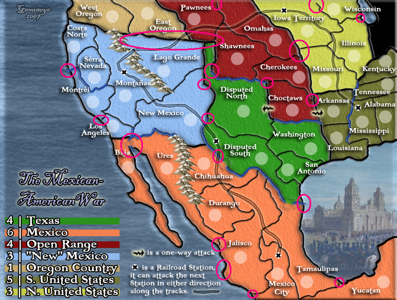
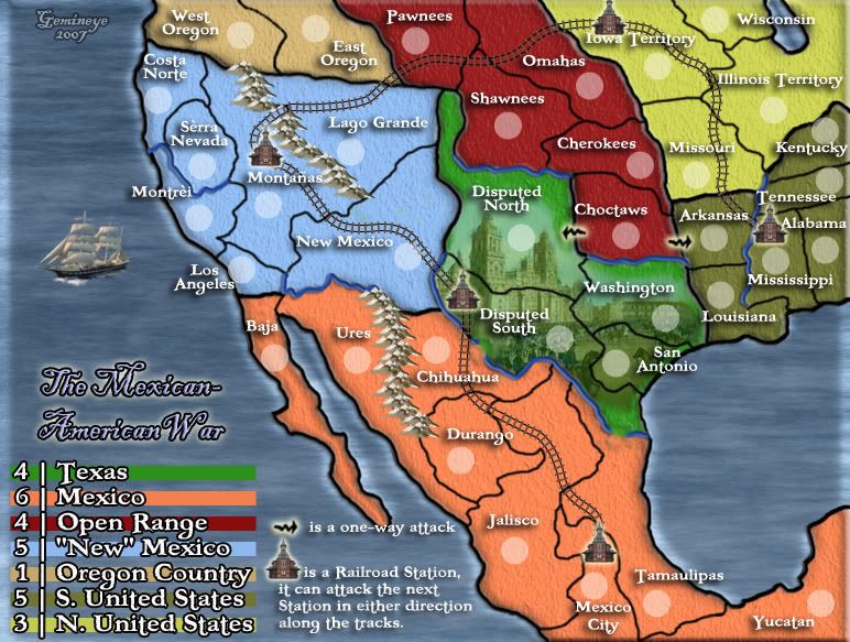
AndyDufresne wrote:The water on the west side of the map...just doesn't look like it fits. I'm not sure why, but it doesn't seem to have the right feel, at least just yet. I'd play around with different textures or perhaps even colors and shades. As for the image in the east area, I understand the idea behind using it, but I don't think it really adds much to the map, and could simply be replaced with water.
On it.
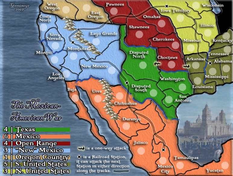
AndyDufresne wrote:What is the idea behind the one way attacks for the Choctaws? I'm curious.
My thought on this is that if it wasnt a only one way attack out, it would be all borders. i assume i could just put in some impassible border there to help. I like the idea of one way attacks, but i will do what the majority of the Foundry deems appropriate.
AndyDufresne wrote:I like the railroad idea you have, it actually improves flow on the map wonderfully. I'd maybe consider using a different graphic other than the current X you have.
I will be glad to, what are your thoughts, or anyone else's for that matter, on what i should use...that wouldnt distract from the map too much?
AndyDufresne wrote:What is the dark black area? Could you simply add that to either of the land areas near it? Or make it something that goes with the map rather than a black hole? Maybe gray would be better.
I think i will just adjoin it to "Illinois" to keep confusion down. Thanks.
AndyDufresne wrote:Regarding the continent of new mexico, are there 5 borders? If so, 3 seems a little low. And I'd consider making Texas and N. US the same value. Open Range seems like a tough continent, with all borders.
New Mexico: Good call, i forgot to take that into account when i added "Oregon Country" to the map.
Texas/N.US": well, these are my thoughts...
N.US has 4 territories, 3 borders. those 3 borders are attackable from 4 adjacent territories and 1 railroad.
Texas has 5 territories, 3 borders. those 3 borders are attackable from 7 adjacent territories, and 1 railroad.
when you look at it like this, i think that Texas should have AT LEAST 1 more man bonus, but if the common consensus is to lower Texas' bonus, i will.
AndyDufresne wrote:Hm, I'd like to comment more on playability, but I'm going to think over a few things first.
thank you, and i look forward to it.
AndyDufresne wrote:How many countries do you have on the map?
Gemineye wrote:Newest update:
3 player- 12 each no neutral
4 player- 9 each no neutral
5 player- 7 each 1 neutral
6 player- 6 each no neutral
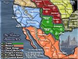
36 territories-7 regions