Conquer Club

Pangea new thread - Triassic New Version!

Have an idea for a map? Discuss ideas and concepts here.

Moderator: Cartographers

Forum rules
Please read the Community Guidelines before posting.

Postby Marvaddin on Tue Mar 06, 2007 11:24 am

Why its so difficult get some feedback to my maps??? People start to complain about the borders, then when you change it, no one to comment if its better. Ok, I think then I can decide about use the old ones, huh?

Wisse wrote:don't make thick borders with the bonusses it looks ugly

Strangely, when Arctic map was being made, people complained about a thick border to the legend, but then saw it was better than a very thinner one or no border. I think I will keep this.

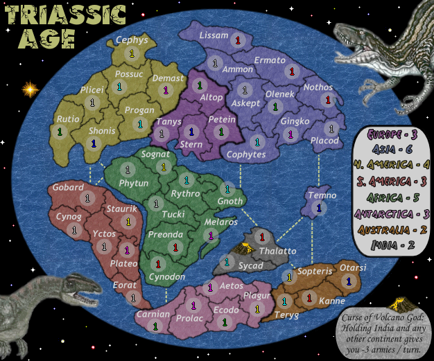
Wisse wrote:why did you make the pictures gray again? i liked them colored

I assume you are refering to the dinos. I got previous opinions prefering them gray... but in fact, I was not happy with the gray ones. These are coloured, but I used a low saturation, just this.

Wisse wrote:the water texture doesn't fit here, try not to use a real picture but use a texture

Its not a real picture, its a texture. And I love it.

Wisse wrote:don't put a picture in the legend, its fine without it

Ok, I will post a version without the pictures in the background, but I think it will be no good.

Wisse wrote:make the universium not just black, try to make it looks like the real universium

Im intending to do that. Do you have a good starfield texture to lend?
Image
User avatar
Major Marvaddin
 
Posts: 2545
Joined: Thu Feb 09, 2006 5:06 pm
Location: Belo Horizonte, Brazil

Postby Wisse on Tue Mar 06, 2007 11:43 am

ok i can live with that, here some textures:

this one is the best, but it looks a bit strange to the eyes to focus on the rest of the map:
Image

how to make it:
select bevel and emboss,
than go to texture,
choose with the pattern sets, "patterns 2" and select "streaks"
then set the depht on -1000%


this one is also a good one but less than the other one:
Image

how to make it:
select pattern overlay,
choose with the pattern sets, "patterns 2" and select "streaks"
than set the opacity to 46%
Image Image
User avatar
Sergeant Wisse
 
Posts: 4448
Joined: Fri Oct 13, 2006 2:59 pm
Location: The netherlands, gelderland, epe

Postby Marvaddin on Tue Mar 06, 2007 11:12 pm

I dont really like these options, these are not stars. The 1st one is like a huge meteors rain, and the 2nd is another dimension, Im sure :wink:

Anyway, in what program you were doing this?
Image
User avatar
Major Marvaddin
 
Posts: 2545
Joined: Thu Feb 09, 2006 5:06 pm
Location: Belo Horizonte, Brazil

Postby Wisse on Wed Mar 07, 2007 1:56 am

Marvaddin wrote:I dont really like these options, these are not stars. The 1st one is like a huge meteors rain, and the 2nd is another dimension, Im sure :wink:

Anyway, in what program you were doing this?

photoshop
Image Image
User avatar
Sergeant Wisse
 
Posts: 4448
Joined: Fri Oct 13, 2006 2:59 pm
Location: The netherlands, gelderland, epe

Postby Marvaddin on Sat Mar 17, 2007 7:48 pm

I dont have photoshop, so I need to work with the free tools...

Image

In this one, we have already the stars background, in its first try... Opinions please.

Im also testing:
- Legend without background (I dislike it).
- New sea routes, with small gaps in the lines (pretty irrelevant to me, but I would like opinions).
- Numbers readability (I see no problem here).
- Coordinates (please point non-centered ones).

So, comments please.
Image
User avatar
Major Marvaddin
 
Posts: 2545
Joined: Thu Feb 09, 2006 5:06 pm
Location: Belo Horizonte, Brazil

Postby wicked on Sat Mar 17, 2007 8:08 pm

Marv, for the bonuses, it's hard to see which country is which. Most of your colors are too similar to distinguish which bonus goes with which continent.

Also, on the map, the really similiar colors are bordering each other too. perhaps rearrange some of the colors, especially the upper two on the right.
User avatar
Major wicked
 
Posts: 15787
Joined: Thu Jan 26, 2006 1:23 pm

Postby unriggable on Sat Mar 17, 2007 11:06 pm

wicked wrote:Marv, for the bonuses, it's hard to see which country is which. Most of your colors are too similar to distinguish which bonus goes with which continent.

Also, on the map, the really similiar colors are bordering each other too. perhaps rearrange some of the colors, especially the upper two on the right.


Maybe you should see an eye doctor, the colors are fine for me.
User avatar
Cook unriggable
 
Posts: 8037
Joined: Thu Feb 08, 2007 9:49 pm

Postby joystickgenie on Sat Mar 17, 2007 11:14 pm

well I think Europe and Antarctica at least should be changed a bit those two colors are too close.
Image

Shinobi Nations
Comments are greatly appreciated.
User avatar
Cadet joystickgenie
 
Posts: 62
Joined: Fri Feb 09, 2007 9:25 pm

Postby cenamom on Sat Mar 17, 2007 11:28 pm

I like it!!!
User avatar
Corporal cenamom
 
Posts: 114
Joined: Thu Jan 26, 2006 9:03 pm
Location: Chicago

Postby Gozar on Sat Mar 17, 2007 11:53 pm

Otarsi and Carnian look off centered.

Gozar
User avatar
Lieutenant Gozar
 
Posts: 2534
Joined: Wed Jan 31, 2007 3:15 pm
Location: Nova Scotia (G1)

Postby Marvaddin on Sun Mar 18, 2007 12:16 am

^^ Good eyes, I will correct that.

And I will correct the legend colours, but first we need to decide if there will be an image background or not (Im up to it).

About colours:
- I was not wanting to use a brownish, redish, yellowish colour, lol. I like colours we can refer to in a word. I tried brown, but it would be alike to orange, unless it was too dark, so I didnt pick it. If someone wants, can suggest another colour.
- About the colours positions, I was no wanting to put alike colours together, so I didnt put orange near red, etc. The single double that is a bit alike to me is purple-blue, but they are still different enough, in my opinion...

So, if you want suggest another colour scheme, and a reason to use it, do it. I tested already other schemes, and this one was the better in my opinion, but Im open to suggestion.
Image
User avatar
Major Marvaddin
 
Posts: 2545
Joined: Thu Feb 09, 2006 5:06 pm
Location: Belo Horizonte, Brazil

Postby Molacole on Sun Mar 18, 2007 12:39 am

I know you weren't to fond of brown, but I figured it might look good with a golden tint.

Image
User avatar
Lieutenant Molacole
 
Posts: 552
Joined: Fri Jun 23, 2006 8:19 am
Location: W 2.0 map by ZIM

Postby ParadiceCity9 on Sat May 26, 2007 9:11 pm

this reminds me of discworld with dinosaurs
Corporal 1st Class ParadiceCity9
 
Posts: 4239
Joined: Thu Feb 15, 2007 4:10 pm

Postby unriggable on Sun May 27, 2007 3:49 pm

ParadiceCity9 wrote:this reminds me of discworld with dinosaurs


You remind of peewee herman.
Image
User avatar
Cook unriggable
 
Posts: 8037
Joined: Thu Feb 08, 2007 9:49 pm

triassic map

Postby Suntzu on Sun May 27, 2007 9:14 pm

8) i love it.SUNTZU
User avatar
Private Suntzu
 
Posts: 140
Joined: Fri Feb 03, 2006 11:27 pm
Location: Northwest Florida Tates Hell Swamp

Postby Spockers on Sun May 27, 2007 9:16 pm

by what means are the sea attacks made?
User avatar
Private 1st Class Spockers
 
Posts: 390
Joined: Mon Oct 02, 2006 11:11 pm

Postby unriggable on Sun May 27, 2007 9:17 pm

Why can't we successfully make a pangaea map?
Image
User avatar
Cook unriggable
 
Posts: 8037
Joined: Thu Feb 08, 2007 9:49 pm

Postby Sargeant_Pepper on Mon Jun 18, 2007 2:23 pm

This map lacks clarity, and purpose. First, the colours are bland and unattractive. Secondly, the black background is pointless, because it should be the same colour as the sea.

Another poster didn't like the fact that this 'world' appears flat. Well the rest of the world is covered in OCEAN. This is the only land available on Earth (during this time) and so crossing from the N. America into Asia via water is highly improbable. The volcano idea is probably a weak one. perhaps it could exchanged for adding topography to the map, lakes, mountains...etc.
Visit Felipe Alvarez's website.
User avatar
Private 1st Class Sargeant_Pepper
 
Posts: 58
Joined: Mon Jan 01, 2007 8:03 pm

Re: Pangea new thread - Triassic New Version!

Postby rutherfoo on Sun Jan 31, 2010 9:44 pm

It's too bad this map died... I really want to see a triassic map, or maybe jurassic or cretaceous so you could throw real dinosaurs in it.
Image
User avatar
Sergeant 1st Class rutherfoo
 
Posts: 117
Joined: Mon Jul 14, 2008 11:58 pm

Previous

Return to Melting Pot: Map Ideas

Who is online

Users browsing this forum: No registered users