well no wonder the foundry is dead,
now that i have time to finish the map no-one comments even the people who make maps themself dont!
Netherlands [Quenched]
Moderator: Cartographers
![]() by Coleman on Wed Jan 02, 2008 4:42 pm
by Coleman on Wed Jan 02, 2008 4:42 pm
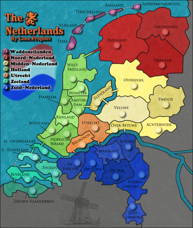
Here's an idea. There is a whole page full of concerns on page 70. Go take care of some then post the images again. The dashes in the legend looking like = signs is pressing to me, maybe make them not so thick.
If you did update this, post the update as a reply back here. I don't think anyone wants to go hunting for an edit in an earlier post.
If you did update this, post the update as a reply back here. I don't think anyone wants to go hunting for an edit in an earlier post.
Warning: You may be reading a really old topic.
-

 Coleman
- Posts: 5402
- Joined: Tue Jan 02, 2007 10:36 pm
- Location: Midwest


![]() by Lone.prophet on Thu Jan 03, 2008 5:56 am
by Lone.prophet on Thu Jan 03, 2008 5:56 am
Coleman wrote:Here's an idea. There is a whole page full of concerns on page 70. Go take care of some then post the images again. The dashes in the legend looking like = signs is pressing to me, maybe make them not so thick.
If you did update this, post the update as a reply back here. I don't think anyone wants to go hunting for an edit in an earlier post.
WTF are you talking about i fixed the things that were possible the others are just way to precise wanna be things,
and those things are all on the last post i gave images in which now is a page back
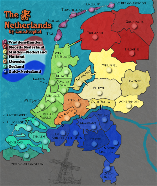
now here they are again


-
Lone.prophet
- Posts: 1467
- Joined: Thu Oct 12, 2006 4:37 pm
- Location: Your basement Muahaha


![]() by gimil on Thu Jan 03, 2008 8:06 am
by gimil on Thu Jan 03, 2008 8:06 am
A few minor things,
1. Ths white stroke used for the legends is pixalated. I would suggest either reducing the opacity or putting a small white outerglow around the words to softenthe pixalation.
2. Dull the orange of the title a little to match Utrecht.
3. I still dont like not having a black outline on the river but you said its been discussed so i suppose i can live with it.
4. Im not sure about the flag theres something about it i dont like. But i suppose it can stay until i say something more constructive about it
looking at it i think this map will be a big hit, simople, crisp and clean. Something that hasent been produced in a while.
What do you know about map making, bitch?
Top Score:2403
natty_dread wrote:I was wrong
Top Score:2403
-

gimil
- Posts: 8599
- Joined: Sat Mar 03, 2007 12:42 pm
- Location: United Kingdom (Scotland)


![]() by Lt. Strike on Thu Jan 03, 2008 10:33 am
by Lt. Strike on Thu Jan 03, 2008 10:33 am
i also think its to dark and that the collers of the same province should look more a like
-
Lt. Strike
- Posts: 49
- Joined: Mon Oct 08, 2007 4:52 am


![]() by Coleman on Thu Jan 03, 2008 1:15 pm
by Coleman on Thu Jan 03, 2008 1:15 pm
That's kind of what happens back here. Until people run out of those or you post something shutting them down and why you are shutting them down.Lone.prophet wrote: the others are just way to precise wanna be things,
Warning: You may be reading a really old topic.
-
Coleman
- Posts: 5402
- Joined: Tue Jan 02, 2007 10:36 pm
- Location: Midwest
![]() by Lone.prophet on Thu Jan 03, 2008 1:44 pm
by Lone.prophet on Thu Jan 03, 2008 1:44 pm
what i meant he want the geogreaphy so precise that the overview of the map gets messed up IMO
-
Lone.prophet
- Posts: 1467
- Joined: Thu Oct 12, 2006 4:37 pm
- Location: Your basement Muahaha
![]() by gimil on Thu Jan 03, 2008 2:32 pm
by gimil on Thu Jan 03, 2008 2:32 pm
the glow is much better but just a little strong. reduce opacity a little?
also can i get feedback on my other points
also can i get feedback on my other points
What do you know about map making, bitch?
Top Score:2403
natty_dread wrote:I was wrong
Top Score:2403
-
gimil
- Posts: 8599
- Joined: Sat Mar 03, 2007 12:42 pm
- Location: United Kingdom (Scotland)
![]() by Lone.prophet on Thu Jan 03, 2008 2:53 pm
by Lone.prophet on Thu Jan 03, 2008 2:53 pm
Gimil ill reduce opacity next time and on your other points
i did do the orange thing of the title guess not good enoguh yet
and the other 2 points
i dunno what you dont like about the flag
and the dark outline for the river has already been discussed
i did do the orange thing of the title guess not good enoguh yet
and the other 2 points
i dunno what you dont like about the flag
and the dark outline for the river has already been discussed
-
Lone.prophet
- Posts: 1467
- Joined: Thu Oct 12, 2006 4:37 pm
- Location: Your basement Muahaha
![]() by gimil on Thu Jan 03, 2008 2:55 pm
by gimil on Thu Jan 03, 2008 2:55 pm
Lone.prophet wrote:Gimil ill reduce opacity next time and on your other points
i did do the orange thing of the title guess not good enoguh yet
and the other 2 points
i dunno what you dont like about the flag
and the dark outline for the river has already been discussed
on the river point could i maybe get a draft with the river outlined?
even if you jsut PM me it
What do you know about map making, bitch?
Top Score:2403
natty_dread wrote:I was wrong
Top Score:2403
-
gimil
- Posts: 8599
- Joined: Sat Mar 03, 2007 12:42 pm
- Location: United Kingdom (Scotland)
![]() by Lone.prophet on Thu Jan 03, 2008 2:58 pm
by Lone.prophet on Thu Jan 03, 2008 2:58 pm
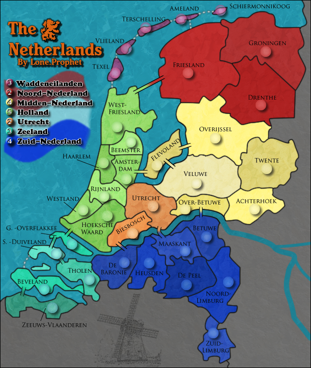
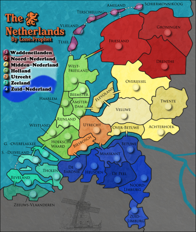
here is the large with river outline everybody post if you like it better plz
also the glow has been fixed i hope
also the glow has been fixed i hope
-
Lone.prophet
- Posts: 1467
- Joined: Thu Oct 12, 2006 4:37 pm
- Location: Your basement Muahaha
![]() by gimil on Thu Jan 03, 2008 3:04 pm
by gimil on Thu Jan 03, 2008 3:04 pm
smells tasty
Now you dont have to do this but ill put it out there anyway.
Would you consider rotating the whole image CCW a bit so that zuidlimburg sat in the bottom right corner. This ill allow you to elimenate alot of the dead space and maybe even reduce te iamge size?
no a real suggestion, jsut something for hte extra brownie points if your intrested
What do you know about map making, bitch?
Top Score:2403
natty_dread wrote:I was wrong
Top Score:2403
-
gimil
- Posts: 8599
- Joined: Sat Mar 03, 2007 12:42 pm
- Location: United Kingdom (Scotland)
![]() by Lone.prophet on Thu Jan 03, 2008 3:09 pm
by Lone.prophet on Thu Jan 03, 2008 3:09 pm
well i liked how north was just on top here so i guess i wont change that
and for the river i will wait for some replies from others before i see what will be done.
now are there other points you dont like?
and for the river i will wait for some replies from others before i see what will be done.
now are there other points you dont like?
-
Lone.prophet
- Posts: 1467
- Joined: Thu Oct 12, 2006 4:37 pm
- Location: Your basement Muahaha
![]() by gimil on Thu Jan 03, 2008 3:10 pm
by gimil on Thu Jan 03, 2008 3:10 pm
Lone.prophet wrote:well i liked how north was just on top here so i guess i wont change that
and for the river i will wait for some replies from others before i see what will be done.
now are there other points you dont like?
probably, i could nit pick for you if your not busy
What do you know about map making, bitch?
Top Score:2403
natty_dread wrote:I was wrong
Top Score:2403
-
gimil
- Posts: 8599
- Joined: Sat Mar 03, 2007 12:42 pm
- Location: United Kingdom (Scotland)
![]() by Lone.prophet on Thu Jan 03, 2008 3:11 pm
by Lone.prophet on Thu Jan 03, 2008 3:11 pm
no i am not right now if you make some serious remarks ill see what i can do 
-
Lone.prophet
- Posts: 1467
- Joined: Thu Oct 12, 2006 4:37 pm
- Location: Your basement Muahaha
![]() by gimil on Thu Jan 03, 2008 3:17 pm
by gimil on Thu Jan 03, 2008 3:17 pm
1. move Flevoland and tershelling terr name off the boarder
2. THe water texture is a little to strong and sticks out, could you reduce the effect without changing the texture?
3. Move Drenthe and beemster up a touch so ifs off the army circle
4. Maybe darken the grey a little (but im not to bothered by this)
2. THe water texture is a little to strong and sticks out, could you reduce the effect without changing the texture?
3. Move Drenthe and beemster up a touch so ifs off the army circle
4. Maybe darken the grey a little (but im not to bothered by this)
What do you know about map making, bitch?
Top Score:2403
natty_dread wrote:I was wrong
Top Score:2403
-
gimil
- Posts: 8599
- Joined: Sat Mar 03, 2007 12:42 pm
- Location: United Kingdom (Scotland)

![]() by Lone.prophet on Thu Jan 03, 2008 3:39 pm
by Lone.prophet on Thu Jan 03, 2008 3:39 pm
gimil wrote:oii
where did the river putline go?
hide layer
-
Lone.prophet
- Posts: 1467
- Joined: Thu Oct 12, 2006 4:37 pm
- Location: Your basement Muahaha
![]() by gimil on Thu Jan 03, 2008 3:41 pm
by gimil on Thu Jan 03, 2008 3:41 pm
Lone.prophet wrote:gimil wrote:oii
where did the river putline go?
hide layer
well scurry along and unhide it
What do you know about map making, bitch?
Top Score:2403
natty_dread wrote:I was wrong
Top Score:2403
-
gimil
- Posts: 8599
- Joined: Sat Mar 03, 2007 12:42 pm
- Location: United Kingdom (Scotland)
Who is online
Users browsing this forum: No registered users
|
|||||||
| Conquer Club is not associated with RISK online in any way. Copyright © 2006-2025 by Big Wham LLC | |||||||