The top pic. above in Yeti's post is of an abandoned map that hadn't reached final forge standard yet (hope this makes it easier for people to see where i was coming from in my recent post. That's the kind of minimum standard this map should be aiming for - it should be at least matching that one and preferably exceeding it to be in final forge - so clearly you guys have a lot of work to do but I see by your responses to my posts and others you are willing to give it a go.
Don't now why people on here don't like being cooks, remember under siege: A former SEAL, now cook, is the only person who can stop a gang of terrorists when they sieze control of a US Navy battleship.
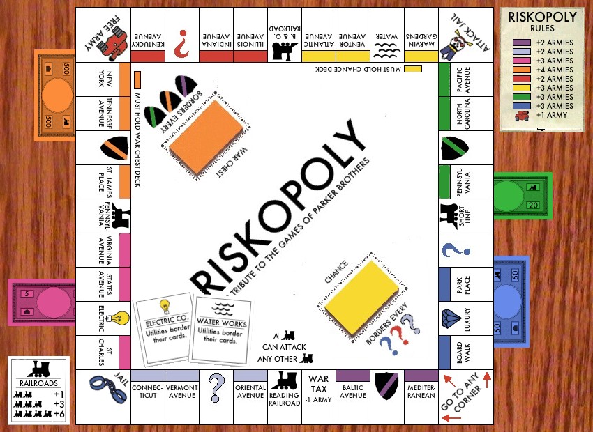
The reason the first one froze in development is that it was directly taking monopoly. In which case hasbro (parker brothers, whoever owns it right now) could jump down our throats. The reason you see so many versions where they can't do anything about it is a rule or two is changed and all the space names (and sometimes colors) are changed.
So in that respect, the new map is the only viable one. However it could borrow somethings people liked about the old one.
What I'd suggest. Take those extra pixels and make it 840 by 800. Don't change the play area size. Make it look like it is on a table. Add some money for ascetics, you don't need to play on them like the old one. Maybe make the goofy blue legend look more like a rule card sitting on the table.
Last edited by Coleman on Thu Jan 03, 2008 12:28 pm, edited 1 time in total.
gimil wrote:are you guys crazy? I think te image quality of bad spelers versions is much crisp, cleaner and legiable. Graphically superior.
Legibility is the only thing that the new version has superior...
Evilotto's is brilliant with a) strategy, b) LnF, c) Namings, d) Images
C.
I mspeaking of graphical competance nothing else
Well I SOOOOOOOOO disagree...
In fact you're the one who's crazy... Otto's is much nicer.
C.
Yeti, there is an obvious explanation for gimil's views he and bad speler are clearly multis, (check any of gimil's posts or early map drafts for proof of this )
Don't now why people on here don't like being cooks, remember under siege: A former SEAL, now cook, is the only person who can stop a gang of terrorists when they sieze control of a US Navy battleship.
gimil wrote:are you guys crazy? I think te image quality of bad spelers versions is much crisp, cleaner and legiable. Graphically superior.
Legibility is the only thing that the new version has superior...
Evilotto's is brilliant with a) strategy, b) LnF, c) Namings, d) Images
C.
I mspeaking of graphical competance nothing else
Well I SOOOOOOOOO disagree...
In fact you're the one who's crazy... Otto's is much nicer.
C.
Yeti, there is an obvious explanation for gimil's views he and bad speler are clearly multis, (check any of gimil's posts or early map drafts for proof of this )
havent you got some "serious" modding to do somewhere . . .
Coleman wrote:the new map is the only viable one. However it could borrow somethings people liked about the old one.
What I'd suggest. Take those extra pixels and make it 840 by 800. Don't change the play area size. Make it look like it is on a table. Add some money for ascetics, you don't need to play on them like the old one. Maybe make the goofy blue legend look more like a rule card sitting on the table.
I like that idea.
The graphics (especially the background) are much better in the previous trial, but the relanvence to conquer club is much better in the second.
Took many of the suggestions...havent gotten around to some of them yet. Tried a new wooden background. Having trouble making the legend look like paper, but I'm still working at it.
Highest Score: 2532
Highest Position: 69 (a long time ago)
This already looks far better i can post further comments now but it might help if you posted your to do list so i don't bring up items you are due to be tackling anyway.
Don't now why people on here don't like being cooks, remember under siege: A former SEAL, now cook, is the only person who can stop a gang of terrorists when they sieze control of a US Navy battleship.
Bad Speler wrote:Took many of the suggestions...havent gotten around to some of them yet. Tried a new wooden background. Having trouble making the legend look like paper, but I'm still working at it.
just a few comments
1) on the ships if there is a blue on ship 1 it will be hard to see etc
2) are you having army circles can you put them on please


)