Would you play this map? (14 day poll)
Yes, I love it how it is! 35% [ 13 ]
Yes, with some tweaking of bonuses 21% [ 8 ]
Yes, if you completely change everything about it 2% [ 1 ]
No, unless you completely change everything about it 18% [ 7 ]
No, unless you tweak the bonuses 2% [ 1 ]
No, I hate it, and everything about it... And you. 18% [ 7 ]
Total Votes : 37
QWERTY Keyboard - Brand New Design [vacation]
Moderator: Cartographers
![]() by gimil on Wed Feb 20, 2008 7:19 am
by gimil on Wed Feb 20, 2008 7:19 am
What do you know about map making, bitch?
Top Score:2403
natty_dread wrote:I was wrong
Top Score:2403
-

 gimil
gimil
- Posts: 8599
- Joined: Sat Mar 03, 2007 12:42 pm
- Location: United Kingdom (Scotland)


![]() by Tieryn on Fri Feb 22, 2008 11:14 pm
by Tieryn on Fri Feb 22, 2008 11:14 pm
Well, I count everything except the "no I hate it and you" as a positive, in some way, so that's 30/37 as far as I'm concerned 
For those who were slightly -less- positive, any advice on where I need to go from here?
Current tasks:
Colour green chipboard in like rest of keyboard - Done
Remove wires - Done
Add in paperclips or other connectors across smaller parts of the function family - To do, suggestions on types of connectors wanted.
-

Tieryn
- Posts: 781
- Joined: Mon May 28, 2007 7:30 am
- Location: Generation One


![]() by lord voldemort on Sat Feb 23, 2008 6:26 am
by lord voldemort on Sat Feb 23, 2008 6:26 am
honestly i like the mpa and the idea...however i dont like the colours atm

-

lord voldemort
- Posts: 9596
- Joined: Sat Oct 20, 2007 4:39 am
- Location: Launceston, Australia


![]() by oaktown on Sat Feb 23, 2008 1:09 pm
by oaktown on Sat Feb 23, 2008 1:09 pm
Alright, I've looked at the bonuses and I have to say that... well... I'm going to take your word on this one. There are so many bonuses there's just no way of knowing how this map will play until you play it.
I'm also concerned about the colors - both from a graphics point of view and mechanics point of view. My eyes have trouble figuring out what is what, and since so much of this map is color-dependent it would be hard for me to play it.
Of course, color-blindness comes in many shapes and sizes; what I can't see will be completely different than what somebody else can't see, so I generally won't hold a map up based onmyown color issues. But if there are other concerns about the colors (which it looks like there may be) I'd like to see what you can come up with and maybe this map can be pushed in a direction that makes it look better and play more easily.
As for what colors to aim for... what if you tried using colors that one might actually find ona keyboard? Greys, silvers, white, etc. It might look less out of place than blue and red, which I haven't seen on keyboards since Apple's unprofitable, psychadelic days.
-

oaktown
- Posts: 4451
- Joined: Sun Dec 03, 2006 9:24 pm
- Location: majorcommand


![]() by jakejake on Sat Feb 23, 2008 1:51 pm
by jakejake on Sat Feb 23, 2008 1:51 pm
the colours are a bit dark for me...but thats my opinion! great map! how about doing the WSAD keys? sorry if im repeating things, i only scanned through the post...and with the Shortcuts that can give you a bonus, does the Ctrl button have to be a particular one? e.g the left or can it be either?
sorry again if i repeat anything
sorry again if i repeat anything
like my crappy banner? 


-

jakejake
- Posts: 100
- Joined: Thu Jan 17, 2008 11:31 am
- Location: england baby!
![]() by Tieryn on Sat Feb 23, 2008 10:34 pm
by Tieryn on Sat Feb 23, 2008 10:34 pm
It can be either control, which again makes bonuses a bit harder to hold on to, as whoever has a control will be going for those letters, similarly with start, and some of the overlap buttons...
I'll look at colours and see what I can do, might have to cut back to the original map and restart, but now that I'm getting the hang of this that shouldn't take -too- long (tho again, this is a slow process now I'm back at work)
I'll have a version with more "apt" colours out in a little while... (possibly closer to "while" than "little")
Gameplay wise, I agree oak, it's going to be hard to get a feel for the balance until it's been played a few times and some criticism recieved. I've followed a consistent formula tho, so if it's unfair, it'll be consistently unfair and we can look to revise that as it hopefully moves forwards.
I'll look at colours and see what I can do, might have to cut back to the original map and restart, but now that I'm getting the hang of this that shouldn't take -too- long (tho again, this is a slow process now I'm back at work
I'll have a version with more "apt" colours out in a little while... (possibly closer to "while" than "little")
Gameplay wise, I agree oak, it's going to be hard to get a feel for the balance until it's been played a few times and some criticism recieved. I've followed a consistent formula tho, so if it's unfair, it'll be consistently unfair
-
Tieryn
- Posts: 781
- Joined: Mon May 28, 2007 7:30 am
- Location: Generation One
![]() by Tieryn on Sun Feb 24, 2008 1:44 am
by Tieryn on Sun Feb 24, 2008 1:44 am
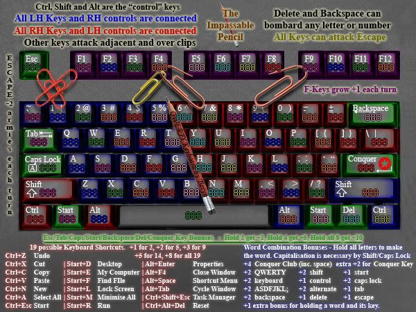
Updated with paperclip connections (and fewer) up top.
Also changed bonuses to reduce them, I was getting an overwhelming bonus feel with so many options, so I've pulled them back quite considerably (halved rounded down) or so.
Do people prefer the new levels of bonuses? I really think you'll hve to play a few rounds to get the feel, but I think less is better than more in this case, with so many options.
Also reworded a few things, to try and make colour the less defining rule in being able to understand the map. (although the colour will add to this). The reason I'm still sticking with the red/blue/green is well, a) these are base computer colours... RGB... b) with the connections from left control/alt/shift to right keys, you need identifiable colours (although hopefully this is explained in the directions above too) and peopel will also pick it up with BOB (although this obviously isn't necessary to playing the map).
Comments?
-
Tieryn
- Posts: 781
- Joined: Mon May 28, 2007 7:30 am
- Location: Generation One
![]() by Ogrecrusher on Sun Feb 24, 2008 9:46 am
by Ogrecrusher on Sun Feb 24, 2008 9:46 am
It doesn't look anything like a keyboard, that's my main issue with it. The colours make it look very wrong.
-
Ogrecrusher
- Posts: 250
- Joined: Thu Aug 16, 2007 2:55 pm

![]() by Tieryn on Sun Feb 24, 2008 10:12 am
by Tieryn on Sun Feb 24, 2008 10:12 am
Do you think it would look better if I had a solid shaped outline around the keyboard part, to define it from the area where bonuses/rules are written?
Perhaps!!! (an idea) I could make all the keys back to the grey colour, and the thing that could change would be the colour of the -LETTERS- on the keys? would that make people happier about the colouring???
Response please - I'll try do up a draft for this but it's going to be basically a restart. Not that I mind, but it'll take a bit of time to get it up to scratch.
-
Tieryn
- Posts: 781
- Joined: Mon May 28, 2007 7:30 am
- Location: Generation One
![]() by laci_mae on Sun Feb 24, 2008 9:17 pm
by laci_mae on Sun Feb 24, 2008 9:17 pm
Hi Tieryn,
I love love love the paperclips. Very nicely done!!
I think an outline might make it look more like a keyboard. Additionally, you could make a monitor with all the instructions/bonuses on it.
Just a thought,
Laci
I love love love the paperclips. Very nicely done!!
I think an outline might make it look more like a keyboard. Additionally, you could make a monitor with all the instructions/bonuses on it.
Just a thought,
Laci
-

laci_mae
- Posts: 404
- Joined: Tue Jan 08, 2008 6:08 pm
- Location: Arkansas


![]() by Night Strike on Mon Feb 25, 2008 2:06 am
by Night Strike on Mon Feb 25, 2008 2:06 am
tenio wrote:looks good! a like the bonus idea and is the Enter key the conquer key?
You're going to have to change the "Alt + Enter" bonus since there is no Enter key.

-
Night Strike
- Posts: 8512
- Joined: Wed Apr 18, 2007 2:52 pm


![]() by whitestazn88 on Mon Feb 25, 2008 5:54 am
by whitestazn88 on Mon Feb 25, 2008 5:54 am
i like the paperclips, and the wording seems to be good.
but did you remove the ability to attack any letter on the same hand?
but did you remove the ability to attack any letter on the same hand?
-
whitestazn88
- Posts: 3128
- Joined: Mon Feb 05, 2007 2:59 pm
- Location: behind you


![]() by Tieryn on Mon Feb 25, 2008 7:55 am
by Tieryn on Mon Feb 25, 2008 7:55 am
I don't think so... "All LH keys and RH controls are connected"... up the top. It's just better defined, without using "blue" or "red" as component parts.
I'm going to change the layout soon anyway, back to the original keyboard, and just colour the letters I think. Next weeks project..
I'm going to change the layout soon anyway, back to the original keyboard, and just colour the letters I think. Next weeks project..
-
Tieryn
- Posts: 781
- Joined: Mon May 28, 2007 7:30 am
- Location: Generation One
![]() by Tieryn on Mon Feb 25, 2008 9:00 am
by Tieryn on Mon Feb 25, 2008 9:00 am
Okay, Major graphics overhaul and restart... Got a few things to add still, like letters, but how is this looking? size is 600x523 for small map... is that okay?
I'm sure I can take some out of the top if necessary... I'm really liking this much better already, just easier on the eyes. Tho with that top space I was going to do a "QWERTY Keyboard" banner of sorts. Not sure how yet.

I'm sure I can take some out of the top if necessary... I'm really liking this much better already, just easier on the eyes. Tho with that top space I was going to do a "QWERTY Keyboard" banner of sorts. Not sure how yet.
-
Tieryn
- Posts: 781
- Joined: Mon May 28, 2007 7:30 am
- Location: Generation One
![]() by Tieryn on Mon Feb 25, 2008 10:37 am
by Tieryn on Mon Feb 25, 2008 10:37 am
Ta, It still needs some touching up, but I think the wood/table background gives a better layering for where to put the bonuses. It provides some distinction between the game territory and the instructions. I'll finish touching this up during the week sometime....
-
Tieryn
- Posts: 781
- Joined: Mon May 28, 2007 7:30 am
- Location: Generation One
![]() by FreeMan10 on Mon Feb 25, 2008 10:44 am
by FreeMan10 on Mon Feb 25, 2008 10:44 am
The glow behind the "f-keys grow..." text is OK, and readable, but the glow makes the other text on the keyboard itself tough to read. I don't know if it's because of the color combinations, or that the text is a point or two too small. Otherwise, the new colors look MUCH, much better!! I can't imagine that the colored letters on the grey keys will be anywhere near as hard on the eyes and the whole colored background thing was.
The paper clips are a nice improvement, but they're a bit unclear.
--I'd assume that esc-1 and `-F1 are the attack combos described by the red clips, but it could be seen to include esc-` and f1-1 as well.
--The yellow clip is pretty clearly 4-f4.
--I think the first brown/pink clip is 7-f4 and f4-f5, but it could also include 6-f4
--I believe the second brown/pink clip is 9-f9 and f9-f8, but could also include 9-f8.
The clips are pretty cool, maybe just make the bends at the ends a little skinnier so they hit only one key, just for clarity.
Also, the pencil looks like one of my kids cut it out of a magazine and dropped it on the screen. The paper clips look like they're blended in and a part of the picture. Maybe do a bit more blending on the pencil to get it to 'fit' into the picture a bit better. That and I keep wanting to get the stupid pencil off my keyboard so I can type!
Overall, Great work! Keep it up.
-

FreeMan10
- Posts: 152
- Joined: Wed Jan 23, 2008 12:48 pm
- Location: On The Road

![]() by Night Strike on Mon Feb 25, 2008 10:47 am
by Night Strike on Mon Feb 25, 2008 10:47 am
Much improved graphically.
Alt + Conquer is fine if you want to leave that bonus.
You will have to have room for the map's title as well as your signature.
Looks. like you are fine on size.
Alt + Conquer is fine if you want to leave that bonus.
You will have to have room for the map's title as well as your signature.
1. SMALL MAP: WIDTH up to 600 px; HEIGHT 600 px
Looks. like you are fine on size.
-
Night Strike
- Posts: 8512
- Joined: Wed Apr 18, 2007 2:52 pm
![]() by Tieryn on Mon Feb 25, 2008 11:40 am
by Tieryn on Mon Feb 25, 2008 11:40 am
Next update:
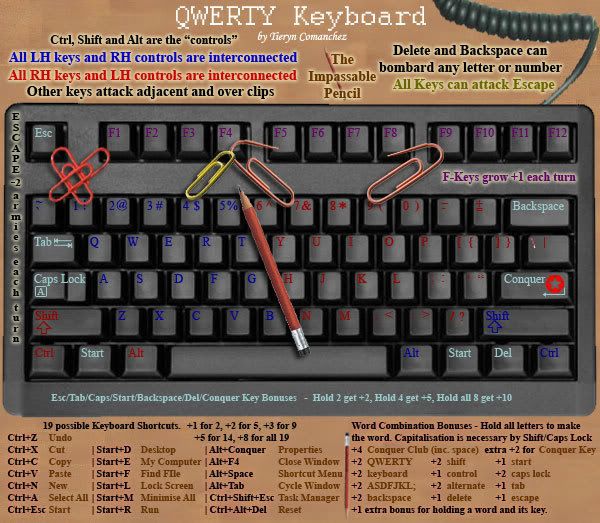
Comment on how these colours read? are they hard to see? brighter didn't look any good. Wouldn't want to go much over this.
My thoughts on paperclips atm is : `, 1, Esc and F1 are all connected via the clip. You can jump from one clip to another (need to state this better somewhere)
4-F4
6&7 to F4, then F4 to F5 Not sure how I can do this graphically.. unless I just connect up everything that touches a paperclip (still much less than it was before)
and finally 9 - F9 then F9 - F8... but again, might make this all interconnected. Seems to be the word of the month...
-
Tieryn
- Posts: 781
- Joined: Mon May 28, 2007 7:30 am
- Location: Generation One
![]() by FreeMan10 on Mon Feb 25, 2008 1:39 pm
by FreeMan10 on Mon Feb 25, 2008 1:39 pm
I think you'll need to lighten up the red, blue & purple, or put some glow behind them. They're readable, but I have to squint a bit to make 'em out. Still think this is a huge improvement over the prior color combo, though.
Thanks for the clarification on the paper clips - you'll probably want to put something on the legend about it, though. Maybe something like, "All keys touched by paper clip attack each other".
Keep up the good work, and grab a nap here and there!
Thanks for the clarification on the paper clips - you'll probably want to put something on the legend about it, though. Maybe something like, "All keys touched by paper clip attack each other".
Keep up the good work, and grab a nap here and there!
-
FreeMan10
- Posts: 152
- Joined: Wed Jan 23, 2008 12:48 pm
- Location: On The Road
![]() by whitestazn88 on Mon Feb 25, 2008 3:01 pm
by whitestazn88 on Mon Feb 25, 2008 3:01 pm
its a little hard to get the colors with the black keys, i'd lighten it up a little
-
whitestazn88
- Posts: 3128
- Joined: Mon Feb 05, 2007 2:59 pm
- Location: behind you
Return to Melting Pot: Map Ideas
Who is online
Users browsing this forum: No registered users
|
|||||||
| Conquer Club is not associated with RISK online in any way. Copyright © 2006-2025 by Big Wham LLC | |||||||