concerns
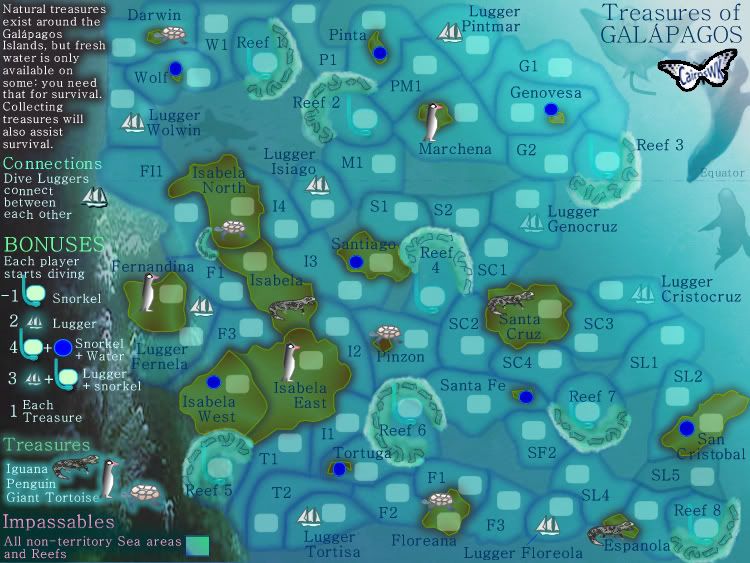
1. reef 1 (red 10) is all by itself. Do you think there's big advantage there? There's two routes to it though.
2. There's quite a few borders I'd like to be cleared up.
Fernandina - F1 - F11 (tiny strip of F1 not clear enough in my opinion also the impassable water above F1 by Isabela North could be confusing. Maybe put some reef there)
Santiago - Reef4 (border?)
Santiago - Lugger Isiago (I don't think the impassable water here is clear enough. Maybe put some reef there)
Santa Fe - SC4 - SF2 (not quite sure what borders what in that area by the reef)
T1 - Isabela West (border or not?)
3. I talked about the impassable water in a couple places above. But, I think it could be confusing in a few areas where it is quite small. It just doesn't jump out at you enough whereas small pieces of reef would be very definite and not ambiguous.
Treasures of Galápagos [Quenched]
Moderator: Cartographers


![]() by cairnswk on Thu Mar 20, 2008 6:45 pm
by cairnswk on Thu Mar 20, 2008 6:45 pm
edbeard wrote:concerns
1. reef 1 (red 10) is all by itself. Do you think there's big advantage there? There's two routes to it though.
2. There's quite a few borders I'd like to be cleared up.
Fernandina - F1 - F11 (tiny strip of F1 not clear enough in my opinion also the impassable water above F1 by Isabela North could be confusing. Maybe put some reef there)
Santiago - Reef4 (border?)
Santiago - Lugger Isiago (I don't think the impassable water here is clear enough. Maybe put some reef there)
Santa Fe - SC4 - SF2 (not quite sure what borders what in that area by the reef)
T1 - Isabela West (border or not?)
3. I talked about the impassable water in a couple places above. But, I think it could be confusing in a few areas where it is quite small. It just doesn't jump out at you enough whereas small pieces of reef would be very definite and not ambiguous.
Thanks for all that edbeard...I don't want to end up with reef all over this as i think it is quite balanced now. i did add some reef to F1 - F11 around Fernandina. But the others i have simply adjusted the tert boundaries.
I think this works better.
Version 11.


* Pearl Harbour * Waterloo * Forbidden City * Jamaica * Pot Mosbi
-

 cairnswk
- Posts: 11510
- Joined: Sat Feb 03, 2007 8:32 pm
- Location: Australia


Re: Treasures of Galápagos V11(P13) [I] - Gameplay Discussion
![]() by cairnswk on Sun Mar 30, 2008 1:07 pm
by cairnswk on Sun Mar 30, 2008 1:07 pm
I guess if there are no more comments...i can start writing the xml....???
* Pearl Harbour * Waterloo * Forbidden City * Jamaica * Pot Mosbi
-
cairnswk
- Posts: 11510
- Joined: Sat Feb 03, 2007 8:32 pm
- Location: Australia
Re: Treasures of Galápagos V11(P9) [I] - Further Comments???
![]() by gimil on Sun Mar 30, 2008 1:12 pm
by gimil on Sun Mar 30, 2008 1:12 pm
I got a comment for you.
These graphics are beautiful, some of your best
These graphics are beautiful, some of your best
What do you know about map making, bitch?
Top Score:2403
natty_dread wrote:I was wrong
Top Score:2403
-

gimil
- Posts: 8599
- Joined: Sat Mar 03, 2007 12:42 pm
- Location: United Kingdom (Scotland)


Re: Treasures of Galápagos V11(P9) [I] - Further Comments???
![]() by cairnswk on Sun Mar 30, 2008 1:18 pm
by cairnswk on Sun Mar 30, 2008 1:18 pm
gimil wrote:I got a comment for you.
These graphics are beautiful, some of your best
Thanks gimil.
Do I get a star
* Pearl Harbour * Waterloo * Forbidden City * Jamaica * Pot Mosbi
-
cairnswk
- Posts: 11510
- Joined: Sat Feb 03, 2007 8:32 pm
- Location: Australia
Re: Treasures of Galápagos V11(P9) [I] - Further Comments???
![]() by gimil on Sun Mar 30, 2008 1:21 pm
by gimil on Sun Mar 30, 2008 1:21 pm
What the hell here you go:

What do you know about map making, bitch?
Top Score:2403
natty_dread wrote:I was wrong
Top Score:2403
-
gimil
- Posts: 8599
- Joined: Sat Mar 03, 2007 12:42 pm
- Location: United Kingdom (Scotland)
Re: Treasures of Galápagos V11(P9) [I] - Further Comments???
![]() by cairnswk on Sun Mar 30, 2008 1:26 pm
by cairnswk on Sun Mar 30, 2008 1:26 pm
gimil wrote:What the hell here you go:
Now are u sure you can afford that, I wouldn't want to be seen to be twisting you arm, simply because i'm in rehab.
* Pearl Harbour * Waterloo * Forbidden City * Jamaica * Pot Mosbi
-
cairnswk
- Posts: 11510
- Joined: Sat Feb 03, 2007 8:32 pm
- Location: Australia
Re: Treasures of Galápagos V11(P9) [I,Gr] - Further Comments???
![]() by gimil on Sun Mar 30, 2008 1:31 pm
by gimil on Sun Mar 30, 2008 1:31 pm
I dont see many major changes being needed and I dont see big gamepaly chnages casung major changes. And your doing so well in rehad I thought what the hell 
What do you know about map making, bitch?
Top Score:2403
natty_dread wrote:I was wrong
Top Score:2403
-
gimil
- Posts: 8599
- Joined: Sat Mar 03, 2007 12:42 pm
- Location: United Kingdom (Scotland)
Re: Treasures of Galápagos V11(P9) [I,Gr] - Further Comments???
![]() by cairnswk on Sun Mar 30, 2008 1:41 pm
by cairnswk on Sun Mar 30, 2008 1:41 pm
gimil wrote:I dont see many major changes being needed and I dont see big gamepaly chnages casung major changes. And your doing so well in rehad I thought what the hell
Just for that....aren't i good to you!!!?
Small

LargeIt's no use imaging large at the moment, as it doesn't display fully on new format...please click the link below
http://i155.photobucket.com/albums/s282 ... s_V12L.jpg
* Pearl Harbour * Waterloo * Forbidden City * Jamaica * Pot Mosbi
-
cairnswk
- Posts: 11510
- Joined: Sat Feb 03, 2007 8:32 pm
- Location: Australia
Re: Treasures of Galápagos V11(P9) [I,Gr] - Further Comments???
![]() by Tieryn on Mon Mar 31, 2008 9:46 am
by Tieryn on Mon Mar 31, 2008 9:46 am
1: Just looking at it now.. I initially didn't see the luggers, and still find it hard to find them quickly...
While I suspect that would grow with play of the map, I wonder if you could not make them a dark blue, or maybe a brown, to make them stand out from the page more... They kind of blend in a bit at the moment, I'd like for them to feel sharper.
2: is it possible/does it look any good to move the word penguin to the right under the iguana, expand the glow make it cover that gap, and perhaps extend the glow out along to the edge of that whole piece? not sure exactly what I'm wanting here, but that hole just jumps at me... (maybe irrevelant, I dunno, if it's not to hard to take a look and change it back if not... I'll take your word if you say it's not (note this one is mostly irrelevant, but I'd still like to see a lugger colour update)
The rest is looking real nice Congrats on the stamp!
While I suspect that would grow with play of the map, I wonder if you could not make them a dark blue, or maybe a brown, to make them stand out from the page more... They kind of blend in a bit at the moment, I'd like for them to feel sharper.
2: is it possible/does it look any good to move the word penguin to the right under the iguana, expand the glow make it cover that gap, and perhaps extend the glow out along to the edge of that whole piece? not sure exactly what I'm wanting here, but that hole just jumps at me... (maybe irrevelant, I dunno, if it's not to hard to take a look and change it back if not... I'll take your word if you say it's not
The rest is looking real nice
-

Tieryn
- Posts: 781
- Joined: Mon May 28, 2007 7:30 am
- Location: Generation One


Re: Treasures of Galápagos V11(P9) [I,Gr] - Further Comments???
![]() by cairnswk on Mon Mar 31, 2008 4:05 pm
by cairnswk on Mon Mar 31, 2008 4:05 pm
* Pearl Harbour * Waterloo * Forbidden City * Jamaica * Pot Mosbi
-
cairnswk
- Posts: 11510
- Joined: Sat Feb 03, 2007 8:32 pm
- Location: Australia
Re: Treasures of Galápagos V11(P9) [I,Gr] - Further Comments???
![]() by cairnswk on Mon Mar 31, 2008 4:07 pm
by cairnswk on Mon Mar 31, 2008 4:07 pm
Tieryn wrote:1: Just looking at it now.. I initially didn't see the luggers, and still find it hard to find them quickly...[q/uote]
even with them named on the map????While I suspect that would grow with play of the map, I wonder if you could not make them a dark blue, or maybe a brown, to make them stand out from the page more... They kind of blend in a bit at the moment, I'd like for them to feel sharper.
2: is it possible/does it look any good to move the word penguin to the right under the iguana, expand the glow make it cover that gap, and perhaps extend the glow out along to the edge of that whole piece? not sure exactly what I'm wanting here, but that hole just jumps at me... (maybe irrevelant, I dunno, if it's not to hard to take a look and change it back if not... I'll take your word if you say it's not
The rest is looking real nice
i'll see what i can do
* Pearl Harbour * Waterloo * Forbidden City * Jamaica * Pot Mosbi
-
cairnswk
- Posts: 11510
- Joined: Sat Feb 03, 2007 8:32 pm
- Location: Australia
Re: Treasures of Galápagos V11(P9) [I,Gr] - Further Comments???
![]() by TaCktiX on Wed Apr 02, 2008 2:03 pm
by TaCktiX on Wed Apr 02, 2008 2:03 pm
I like the resource-based idea of the map, we need more of those maps. Really don't know what's holding this map back, it's that "something" I can't put my finger on yet.
-

TaCktiX
- Posts: 2392
- Joined: Mon Dec 17, 2007 8:24 pm
- Location: Rapid City, SD


Re: Treasures of Galápagos V11(P9) [I,Gr] - Further Comments???
![]() by cairnswk on Wed Apr 02, 2008 3:25 pm
by cairnswk on Wed Apr 02, 2008 3:25 pm
TaCktiX wrote:I like the resource-based idea of the map, we need more of those maps. Really don't know what's holding this map back, it's that "something" I can't put my finger on yet.
ah probably like i stated in your map,,,commenting in general is slow at the mo...and the number of maps in development has grown considerably so less people commenting plus more maps equals fewer poeple for each map.
* Pearl Harbour * Waterloo * Forbidden City * Jamaica * Pot Mosbi
-
cairnswk
- Posts: 11510
- Joined: Sat Feb 03, 2007 8:32 pm
- Location: Australia
Re: Treasures of Galápagos V11(P9) [I,Gr] - Further Comments???
![]() by oaktown on Wed Apr 02, 2008 9:00 pm
by oaktown on Wed Apr 02, 2008 9:00 pm
I'm alright with pretty much everything about this map. The luggers stand out to me - though some are brighter than others on the page 10 post - and the bonuses seem fine.
Forgive me if I've missed this in the thread, but what's the plan for naming the territories? Right now you have two sets of "F" territories, and one wierd "Fl1" territory. And i would avoid using "I" for any territory names unless you come up with a font in which the I looks entirely different than a 1.
Forgive me if I've missed this in the thread, but what's the plan for naming the territories? Right now you have two sets of "F" territories, and one wierd "Fl1" territory. And i would avoid using "I" for any territory names unless you come up with a font in which the I looks entirely different than a 1.

-

oaktown
- Posts: 4451
- Joined: Sun Dec 03, 2006 9:24 pm
- Location: majorcommand


Re: Treasures of Galápagos V11(P9) [I,Gr] - Further Comments???
![]() by cairnswk on Thu Apr 03, 2008 4:44 am
by cairnswk on Thu Apr 03, 2008 4:44 am
oaktown wrote:I'm alright with pretty much everything about this map. The luggers stand out to me - though some are brighter than others on the page 10 post - and the bonuses seem fine.
Forgive me if I've missed this in the thread, but what's the plan for naming the territories? Right now you have two sets of "F" territories, and one wierd "Fl1" territory. And i would avoid using "I" for any territory names unless you come up with a font in which the I looks entirely different than a 1.
thanks oaktown...just the type of feedback i was fishing for.
I take all that on baord and c what i can produce.
* Pearl Harbour * Waterloo * Forbidden City * Jamaica * Pot Mosbi
-
cairnswk
- Posts: 11510
- Joined: Sat Feb 03, 2007 8:32 pm
- Location: Australia
Re: Treasures of Galápagos V11(P9) [I,Gr] - Further Comments???
![]() by mibi on Thu Apr 03, 2008 8:44 am
by mibi on Thu Apr 03, 2008 8:44 am
I dont get what the water icon denotes. Isn't there water everywhere? The water icons are only on land too, huh?
-

mibi
- Posts: 3350
- Joined: Thu Mar 01, 2007 8:19 pm
- Location: The Great State of Vermont

Re: Treasures of Galápagos V11(P9) [I,Gr] - Further Comments???
![]() by yeti_c on Thu Apr 03, 2008 10:48 am
by yeti_c on Thu Apr 03, 2008 10:48 am
mibi wrote:I dont get what the water icon denotes. Isn't there water everywhere? The water icons are only on land too, huh?
Fresh water - for drinking... to maintain your Treasure hunting activities...
C.

Highest score : 2297
-

yeti_c
- Posts: 9624
- Joined: Thu Jan 04, 2007 9:02 am


Re: Treasures of Galápagos V11(P9) [I,Gr] - Further Comments???
![]() by mibi on Thu Apr 03, 2008 6:55 pm
by mibi on Thu Apr 03, 2008 6:55 pm
yeti_c wrote:mibi wrote:I dont get what the water icon denotes. Isn't there water everywhere? The water icons are only on land too, huh?
Fresh water - for drinking... to maintain your Treasure hunting activities...
C.
for real? thats a bit silly. what about food. maybe thats what the puffins are for.
-
mibi
- Posts: 3350
- Joined: Thu Mar 01, 2007 8:19 pm
- Location: The Great State of Vermont
Re: Treasures of Galápagos V11(P9) [I,Gr] - Further Comments???
![]() by cairnswk on Fri Apr 04, 2008 5:04 am
by cairnswk on Fri Apr 04, 2008 5:04 am
mibi wrote:yeti_c wrote:mibi wrote:I dont get what the water icon denotes. Isn't there water everywhere? The water icons are only on land too, huh?
Fresh water - for drinking... to maintain your Treasure hunting activities...
C.
for real? thats a bit silly. what about food. maybe thats what the puffins are for.
well regardless of your thoughts that it might be a bit silly, it was put there because the Galapagos Islands actually have very little water on them, so it is at a premium, which is why players are going to grapple over it.
As for food, i'm sure the sea provides plentiful bounty.
* Pearl Harbour * Waterloo * Forbidden City * Jamaica * Pot Mosbi
-
cairnswk
- Posts: 11510
- Joined: Sat Feb 03, 2007 8:32 pm
- Location: Australia
Re: Treasures of Galápagos V11(P9) [I,Gr] - Further Comments???
![]() by mibi on Fri Apr 04, 2008 8:06 am
by mibi on Fri Apr 04, 2008 8:06 am
cairnswk wrote:mibi wrote:
for real? thats a bit silly. what about food. maybe thats what the puffins are for.
well regardless of your thoughts that it might be a bit silly, it was put there because the Galapagos Islands actually have very little water on them, so it is at a premium, which is why players are going to grapple over it.
As for food, i'm sure the sea provides plentiful bounty.
ok gotcha, maybe you should denote thats its fresh water, since there is water everywhere which makes it a bit confusing.
-
mibi
- Posts: 3350
- Joined: Thu Mar 01, 2007 8:19 pm
- Location: The Great State of Vermont
Re: Treasures of Galápagos V11(P9) [I,Gr] - Further Comments???
![]() by yeti_c on Fri Apr 04, 2008 8:25 am
by yeti_c on Fri Apr 04, 2008 8:25 am
mibi wrote:cairnswk wrote:mibi wrote:
for real? thats a bit silly. what about food. maybe thats what the puffins are for.
well regardless of your thoughts that it might be a bit silly, it was put there because the Galapagos Islands actually have very little water on them, so it is at a premium, which is why players are going to grapple over it.
As for food, i'm sure the sea provides plentiful bounty.
ok gotcha, maybe you should denote thats its fresh water, since there is water everywhere which makes it a bit confusing.
It does say "fresh water" in the legend on the top left...
C.
Highest score : 2297
-
yeti_c
- Posts: 9624
- Joined: Thu Jan 04, 2007 9:02 am
Re: Treasures of Galápagos V11(P9) [I,Gr] - Further Comments???
![]() by gimil on Fri Apr 04, 2008 9:41 am
by gimil on Fri Apr 04, 2008 9:41 am
The white text in the top left seems to be a little hard to read, probably because of the white black contrast on such a thin font. Would you be able to add more beef to the font? or consider redusing the back intensity a little?
What do you know about map making, bitch?
Top Score:2403
natty_dread wrote:I was wrong
Top Score:2403
-
gimil
- Posts: 8599
- Joined: Sat Mar 03, 2007 12:42 pm
- Location: United Kingdom (Scotland)
Re: Treasures of Galápagos V11(P9) [I,Gr] - Further Comments???
![]() by cairnswk on Fri Apr 04, 2008 2:46 pm
by cairnswk on Fri Apr 04, 2008 2:46 pm
gimil wrote:The white text in the top left seems to be a little hard to read, probably because of the white black contrast on such a thin font. Would you be able to add more beef to the font? or consider redusing the back intensity a little?
Sure gimil.....i'll look at that for you.
* Pearl Harbour * Waterloo * Forbidden City * Jamaica * Pot Mosbi
-
cairnswk
- Posts: 11510
- Joined: Sat Feb 03, 2007 8:32 pm
- Location: Australia
Who is online
Users browsing this forum: No registered users
|
|||||||
| Conquer Club is not associated with RISK online in any way. Copyright © 2006-2025 by Big Wham LLC | |||||||