Conquer Club

Famine V.19.3 pg1+35 [I] [Reworking]

Have an idea for a map? Discuss ideas and concepts here.

Moderator: Cartographers

Forum rules
Please read the Community Guidelines before posting.

Continue, vacation, or abandon?

Poll ended at Wed Nov 12, 2008 2:23 pm

 
Total votes : 0

Re: Empire Builder V.15 pg1+23 [I]

Postby bryguy on Thu May 15, 2008 9:06 am

zimmah wrote:
bryguy wrote: Also, I could remove the river/lake thats at zim'mah to nav (or bir to teh if u prefer) and also put mud there.


shit, you'll throw mud at me :evil:

just kidding :lol:

btw, taking out a couple of territories won't be too bad, there are a lot already anyways


im having trouble making my mountain (cause i forgot and my tutorial doesnt make it look exactly the same) but ill keep working on it!


also, how about maybe just replacing the river with mud?
Corporal bryguy
 
Posts: 4381
Joined: Tue Aug 07, 2007 8:50 am
Location: Lost in a Jigsaw

Re: Empire Builder V.15 pg1+23 [I]

Postby bryguy on Wed May 21, 2008 7:19 am

ok gonna be a little while, not long enough to vacation this but a little while while i come up with some good color scheming, also im gone from the 26-28
Corporal bryguy
 
Posts: 4381
Joined: Tue Aug 07, 2007 8:50 am
Location: Lost in a Jigsaw

Re: Empire Builder V.15 pg1+23 [I]

Postby t-o-m on Wed May 21, 2008 6:14 pm

change the name "cen'a'rul'es" into something better, like To'me :D lol only joking, but that name doesnt fit in and needs changing into something that is shorter like ce'ules lol
also its out of proportional size to the rest of the map
User avatar
Major t-o-m
 
Posts: 2918
Joined: Sat Mar 22, 2008 2:22 pm

Re: Empire Builder V.15 pg1+23 [I]

Postby bryguy on Wed May 21, 2008 8:33 pm

t-o-m wrote:change the name "cen'a'rul'es" into something better, like To'me :D lol only joking, but that name doesnt fit in and needs changing into something that is shorter like ce'ules lol
also its out of proportional size to the rest of the map


very true, how about one of these:

Ce'rul
Cen'rul
Ce'nar
Ce'ules
Cen'om (cena and tom :lol: )
To'ce'na (tom and cena :lol: )
Corporal bryguy
 
Posts: 4381
Joined: Tue Aug 07, 2007 8:50 am
Location: Lost in a Jigsaw

Re: Empire Builder V.15 pg1+23 [I]

Postby cena-rules on Fri May 23, 2008 4:21 am

bryguy wrote:
t-o-m wrote:change the name "cen'a'rul'es" into something better, like To'me :D lol only joking, but that name doesnt fit in and needs changing into something that is shorter like ce'ules lol
also its out of proportional size to the rest of the map


very true, how about one of these:

Ce'rul
Cen'rul
Ce'nar
Ce'ules
Cen'om (cena and tom :lol: )
To'ce'na (tom and cena :lol: )


Id take Ce'na
19:41:22 ‹jakewilliams› I was a pedo
User avatar
Lieutenant cena-rules
 
Posts: 9740
Joined: Sat Apr 28, 2007 2:27 am
Location: Chat

Re: Empire Builder V.15 pg1+23 [I]

Postby bryguy on Fri May 23, 2008 12:39 pm

cena-rules wrote:
bryguy wrote:
t-o-m wrote:change the name "cen'a'rul'es" into something better, like To'me :D lol only joking, but that name doesnt fit in and needs changing into something that is shorter like ce'ules lol
also its out of proportional size to the rest of the map


very true, how about one of these:

Ce'rul
Cen'rul
Ce'nar
Ce'ules
Cen'om (cena and tom :lol: )
To'ce'na (tom and cena :lol: )


Id take Ce'na


Ce'na works

Also, this isnt an update yet, but i just want to see if colors like these look good for famine:
Click image to enlarge.
image


edit: also, its basically 3 different layers above the grass with 3 different colors and 3 different layer settings, i forget the settings/opacity, but 2 of the colors are brown, and one is blue, but the blue has something like grain extract
Corporal bryguy
 
Posts: 4381
Joined: Tue Aug 07, 2007 8:50 am
Location: Lost in a Jigsaw

Re: Empire Builder V.15 pg1+23 [I] *cough* need oppinion page 24

Postby bryguy on Thu May 29, 2008 4:01 pm

expect an update sometime soon. Also, im having trouble thinking of a resource for in the area of the new castles, maybe potatoes?
Corporal bryguy
 
Posts: 4381
Joined: Tue Aug 07, 2007 8:50 am
Location: Lost in a Jigsaw

Re: Empire Builder V.15 pg1+23 [I] *cough* need oppinion page 24

Postby cairnswk on Thu May 29, 2008 4:06 pm

bryguy wrote:expect an update sometime soon. Also, im having trouble thinking of a resource for in the area of the new castles, maybe potatoes?


Beets are an old crop.
Also Flax.
Image
* Pearl Harbour * Waterloo * Forbidden City * Jamaica * Pot Mosbi
User avatar
Private cairnswk
 
Posts: 11510
Joined: Sat Feb 03, 2007 8:32 pm
Location: Australia

Re: Empire Builder V.15 pg1+23 [I] *cough* need oppinion page 24

Postby bryguy on Thu May 29, 2008 4:26 pm

cairnswk wrote:
bryguy wrote:expect an update sometime soon. Also, im having trouble thinking of a resource for in the area of the new castles, maybe potatoes?


Beets are an old crop.
Also Flax.


oh of course! ill probably do beets. TY so much for telling me about those 2!


oh and also, the resource area of the new castle is looooooooooooong and narrow, leaving not much place to put it, so i might have to cut into the desert a little (or a lot, if i do a lot, then ill expand the desert down some) so that i have more room to place it
Corporal bryguy
 
Posts: 4381
Joined: Tue Aug 07, 2007 8:50 am
Location: Lost in a Jigsaw

Re: Empire Builder V.16 pg1+24 [I]

Postby bryguy on Fri May 30, 2008 10:17 am

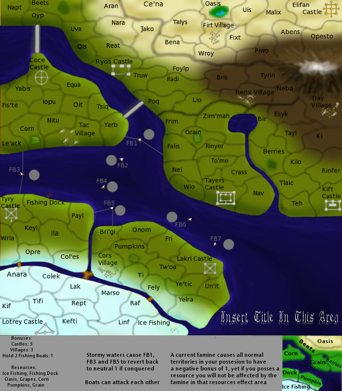
V.16
V16 [clicky]
Click image to enlarge.
image


Things You Need To Know

7 Continents
8 Starting Points
(I think) 105 Territories

Changes:

Modified the resources
Changed the grass colors
Added Beets
Made some lines simpler
Took a sharpen tool over the territory names so that they arent blurry
Changed Cenarules to Ce'na
Added a bigger line to show where the effect ends for oasis
Cut into the desert slightly to have some more room for the beets effect area
Modified the mini-map/effect area so that it (mostly) corresponds with the main map
Think thats it


Points of Discussion:

Got any good ideas for a new title?
Is the beets effect area ok?
Are the new colors better?
Do the resources look ok?
Are beets fine?
and of course, anything else u want to discuss :D
Corporal bryguy
 
Posts: 4381
Joined: Tue Aug 07, 2007 8:50 am
Location: Lost in a Jigsaw

Re: Empire Builder V.16 pg1+24 [I]

Postby bryguy on Sat May 31, 2008 2:26 pm

REAL! V.16
V16 [clicky]
Click image to enlarge.
image


Things You Need To Know

7 Continents
8 Starting Points
(I think) 105 Territories

Changes:

Modified the resources
Changed the grass colors
Added Beets
Made some lines simpler
Took a sharpen tool over the territory names so that they arent blurry
Changed Cenarules to Ce'na
Added a bigger line to show where the effect ends for oasis
Cut into the desert slightly to have some more room for the beets effect area
Modified the mini-map/effect area so that it (mostly) corresponds with the main map
MOUNTAIN!!!!
Think thats it


Points of Discussion:

Got any good ideas for a new title?
Is the beets effect area ok?
Are the new colors better?
Do the resources look ok?
Are beets fine?
Mountain good?
And of course, anything else u want to discuss :D
Corporal bryguy
 
Posts: 4381
Joined: Tue Aug 07, 2007 8:50 am
Location: Lost in a Jigsaw

Re: Empire Builder V.16 pg1+25 [I] MOUNTAIN!!!

Postby t-o-m on Sat May 31, 2008 2:37 pm

i think you over did it with the terit names sharpening on some places, they look too pixelly on some places
also the mountain doesnt look fixed on the ground
User avatar
Major t-o-m
 
Posts: 2918
Joined: Sat Mar 22, 2008 2:22 pm

Re: Empire Builder V.16 pg1+25 [I] MOUNTAIN!!!

Postby t-o-m on Sat May 31, 2008 3:01 pm

this map seems to me like a cross between AoR (with the resource pairs) and feudal (with castles).
the mountain looks slightly realistic but it seems randomly placed and not on the ground - it looks like it is floating
the boats are a rip off from cairnswk's egypt map's dows.
the font youre using for "insert title here" is completely wrong for the style of your map
the colour of the land looks like someone has been sick all over it - if there is famine then why is there so much water? wouldnt people go and grow crops with that? maybe have a graduated famine form the water - or have the water level lower and less blue.
getting onto the water it looks streeky - i understand that youre trying to make it look wavey but it really isnt working in my opinion
the terit font need looking at
the font colou needs looking at
why is there so much shadow around the mountain that is a really weird shape and doesnt fit the actual mountain's shape.
maybe the mountain is bigger and is half off screen so it looks like tis coming from another region?
are the things connecting the pieces of land bridges or what?
the terit name "teh" just looks like it is a typo
the miini-map doesnt look like the land at all
there is no point having boats if there are bridges anyway
is it meant to be the case that Le'ack can get to falis with taking 2 terits?
the terit names overall are quite un-orignial and the cont names...pumpkin!? :lol: are you serious!?
the terit lines just look like blurey squiglly lines
the resources are not clear that they are resources
FB1 and things are no use going back to one neutral per turn as they are too easily conquerable so ther is no point
what does tray village do? (in fact all villages?)

anyway - when are you starting on the high graphics version?
User avatar
Major t-o-m
 
Posts: 2918
Joined: Sat Mar 22, 2008 2:22 pm

Re: Empire Builder V.16 pg1+25 [I] MOUNTAIN!!!

Postby bryguy on Sat May 31, 2008 3:34 pm

t-o-m wrote:this map seems to me like a cross between AoR (with the resource pairs) and feudal (with castles).
the mountain looks slightly realistic but it seems randomly placed and not on the ground - it looks like it is floating
the boats are a rip off from cairnswk's egypt map's dows.
the font youre using for "insert title here" is completely wrong for the style of your map
the colour of the land looks like someone has been sick all over it - if there is famine then why is there so much water? wouldnt people go and grow crops with that? maybe have a graduated famine form the water - or have the water level lower and less blue.
getting onto the water it looks streeky - i understand that youre trying to make it look wavey but it really isnt working in my opinion
the terit font need looking at
the font colou needs looking at
why is there so much shadow around the mountain that is a really weird shape and doesnt fit the actual mountain's shape.
maybe the mountain is bigger and is half off screen so it looks like tis coming from another region?
are the things connecting the pieces of land bridges or what?
the terit name "teh" just looks like it is a typo
the miini-map doesnt look like the land at all
there is no point having boats if there are bridges anyway
is it meant to be the case that Le'ack can get to falis with taking 2 terits?
the terit names overall are quite un-orignial and the cont names...pumpkin!? :lol: are you serious!?
the terit lines just look like blurey squiglly lines
the resources are not clear that they are resources
FB1 and things are no use going back to one neutral per turn as they are too easily conquerable so ther is no point
what does tray village do? (in fact all villages?)

anyway - when are you starting on the high graphics version?


TY tom that has been mentioned time and time again :roll:

Yea i realized that now. The reason why I think is because that the rest of the map seems sort of.... flat... compared to the mountain

Oh yea right! Check the date of when I started this map, then check the date that cairns started the egypt map! anyways im drawing the boats the same way ive ALWAYS drawn it.

Yea i know, the font will be different when we finally have a title......

True, there is a whole lot of water. Ill have to take some out/make it smaller/lower level/maybe less blue.

Yea thats because DiM taught me that way, i might have a way to change that.....

Sure, what font do u suggest?

Why the color?

Could u explain more? i dont exactly get your meaning

Yea have of it is off the screen

Yes some are land, some are connections to boats and then a different section of land

Whats a typo? sorry ive never heard of "typos"

Yea ive been trying to fix that, but been running into some problems

Yes there is a point for boats. The bridges connect the thinner sections of the giant river, and the boats connect the wider sections

Oh i didnt realize that...

Its not cont names, its resource effect areas. And I could use an online generator to create different names

Yes they are blurry on purpose, u completely missed that poll a while back...... and ive simplified some on occasion

Yea thats been something ive been having problems with

Ive been considering having fb1, 3, and 5 being 6 neutral, and reverting back to that

The villages give u an extra bonus


hmmm.... didnt know i was starting on one, but do you guys think this needs another revamp? from Empire Builder to Famine?
Corporal bryguy
 
Posts: 4381
Joined: Tue Aug 07, 2007 8:50 am
Location: Lost in a Jigsaw

Re: Empire Builder V.16 pg1+25 [I] MOUNTAIN!!!

Postby t-o-m on Sat May 31, 2008 3:39 pm

can you quote the questions for answering - i cant give suggestions if i dont know what im suggesting to or about.
User avatar
Major t-o-m
 
Posts: 2918
Joined: Sat Mar 22, 2008 2:22 pm

Re: Empire Builder V.16 pg1+25 [I] MOUNTAIN!!!

Postby ZeakCytho on Sat May 31, 2008 3:39 pm

bryguy wrote:hmmm.... didnt know i was starting on one, but do you guys think this needs another revamp? from Empire Builder to Famine?


YES.

The graphics on this are not visually pleasing at all. It's blurry, the colors are wrong, the borders seem haphazardly laid down with the same sort of curves, the water level is much too high, but most of all, the land just isn't pretty to look at. Your land masses are flat blobs with depth-effects near the coastlines. I really can't explain any better than this: it looks fake. It's clearly not meant to be realistic looking, but right now it doesn't have a fantasy feel to it either.
User avatar
Captain ZeakCytho
 
Posts: 1251
Joined: Wed Sep 12, 2007 4:36 pm

Re: Empire Builder V.16 pg1+25 [I] MOUNTAIN!!!

Postby bryguy on Sat May 31, 2008 3:41 pm

ZeakCytho wrote:
bryguy wrote:hmmm.... didnt know i was starting on one, but do you guys think this needs another revamp? from Empire Builder to Famine?


YES.

The graphics on this are not visually pleasing at all. It's blurry, the colors are wrong, the borders seem haphazardly laid down with the same sort of curves, the water level is much too high, but most of all, the land just isn't pretty to look at. Your land masses are flat blobs with depth-effects near the coastlines. I really can't explain any better than this: it looks fake. It's clearly not meant to be realistic looking, but right now it doesn't have a fantasy feel to it either.


yea with trying to modify it to famine it lost all good looks.... eh ill put up a poll
Corporal bryguy
 
Posts: 4381
Joined: Tue Aug 07, 2007 8:50 am
Location: Lost in a Jigsaw

Re: Empire Builder V.16 pg1+25 [I] MOUNTAIN!!!

Postby t-o-m on Sat May 31, 2008 3:42 pm

im sorry i had to critisize the map so much, but it seemed that no1 else was doing so :?
User avatar
Major t-o-m
 
Posts: 2918
Joined: Sat Mar 22, 2008 2:22 pm

Re: Empire Builder V.16 pg1+25 [I] MOUNTAIN!!!

Postby bryguy on Sat May 31, 2008 3:45 pm

t-o-m wrote:im sorry i had to critisize the map so much, but it seemed that no1 else was doing so :?


its ok, half of what u stated i had been bugging at me slightly


and my poll machine is broken....


oh well, if u want yes, just vote PUDDING!!!!

edit: oops tried to fix it and everything went haywire.... oh well vote again!
Corporal bryguy
 
Posts: 4381
Joined: Tue Aug 07, 2007 8:50 am
Location: Lost in a Jigsaw

Re: Empire Builder V.16 pg1+25 [I] Revamp Poll! Vote Now!

Postby hulmey on Sat May 31, 2008 8:57 pm

youve changed your maps style and gameplay from the beginning. So im pretty sure your gameplay passed shouldnt count or at least should be re looked at.

Secondly your not using photoshop for the graphics which i think is a no no, unless they changed the rules.

And finally i think graphically this map has got worserather than better. The only thing i really like on it is the blue sea, it loooks real and hass a nice depth to it :D
[img]http://img801.imageshack.us/img801/9761/41922610151374166770386.jpg[/mg]
User avatar
Lieutenant hulmey
 
Posts: 3742
Joined: Fri Nov 03, 2006 7:33 am
Location: Las Vegas

Re: Empire Builder V.16 pg1+25 [I] Revamp Poll! Vote Now!

Postby Kaplowitz on Sat May 31, 2008 9:11 pm

They say not to judge a book by it's cover. Unfortunately, most people do. Although I know how this map operates, most people will look at this and think "An ugly version of AoR". I know that's not what you are looking for!

Some people reel you in with graphics, others with gameplay, and others with theme. If your graphics arent as good as AoR or Feudal, then you need a good theme and good gameplay.

Your gameplay is fine, but not necessarily better than AoR. Its just different.

Your theme on the other hand.... Famine is a great idea, and should be able to sell this map-- but the graphics still dont represent famine. I think you're right, you can edit this to death--and you'll be making horizontal changes. In the end, to reflect the theme you want, this is gonna need a revamp.

The things i said in my last lengthy post still mostly apply. I still hate the borders, and although i still think the graphics are good--they dont make me think of starving, innocent people dying for their king's greed.

This is getting there... :)
Last edited by Kaplowitz on Sun Jun 01, 2008 9:25 am, edited 1 time in total.
Image
User avatar
Private 1st Class Kaplowitz
 
Posts: 3088
Joined: Tue May 01, 2007 5:11 pm

Re: Empire Builder V.16 pg1+25 [I] Revamp Poll! Vote Now!

Postby Kaplowitz on Sat May 31, 2008 9:11 pm

hulmey wrote:youve changed your maps style and gameplay from the beginning. So im pretty sure your gameplay passed shouldnt count or at least should be re looked at.

Secondly your not using photoshop for the graphics which i think is a no no, unless they changed the rules.

And finally i think graphically this map has got worserather than better. The only thing i really like on it is the blue sea, it loooks real and hass a nice depth to it :D

1) he doesnt have GP stamp yet
2) Photoshop is not needed
Image
User avatar
Private 1st Class Kaplowitz
 
Posts: 3088
Joined: Tue May 01, 2007 5:11 pm

Re: Empire Builder V.16 pg1+25 [I] Revamp Poll! Vote Now!

Postby bryguy on Sun Jun 01, 2008 9:17 am

Kaplowitz wrote:
hulmey wrote:youve changed your maps style and gameplay from the beginning. So im pretty sure your gameplay passed shouldnt count or at least should be re looked at.

Secondly your not using photoshop for the graphics which i think is a no no, unless they changed the rules.

And finally i think graphically this map has got worserather than better. The only thing i really like on it is the blue sea, it loooks real and hass a nice depth to it :D

1) he doesnt have GP stamp yet
2) Photoshop is not needed


thanks kap


and yes hulmey, i dont have the gp, and i dont have photoshop. But ive been figuring out how to do stuff in GIMP just as well as you could do it in photoshop (with an exception for bevel & emboss)
Corporal bryguy
 
Posts: 4381
Joined: Tue Aug 07, 2007 8:50 am
Location: Lost in a Jigsaw

Re: Empire Builder V.16 pg1+25 [I] Revamp Poll! Vote Now!

Postby bryguy on Mon Jun 02, 2008 9:27 am

OK looks like a revamp is in order now since the vote says yes basically only.... ok ill get to work on it and put up a poll for a new name soon
Corporal bryguy
 
Posts: 4381
Joined: Tue Aug 07, 2007 8:50 am
Location: Lost in a Jigsaw

Re: Empire Builder V.16 pg1+25 [I] Name Change Poll! Vote Now!

Postby bryguy on Thu Jun 05, 2008 1:44 pm

ok name change poll up! choose now!

edit: oops, its still broken... oh well, these are the choices basically, u can just post which u want, or if u can think of any more good ones, then tell me

Famine!
Eight Kings Crisis
Clash of Kings
Eight Kingdoms
Famine Crisis

or any of the above, just with Famine on the end, like my favorite,

Eight Kings Crisis: Famine!

cause then I could do more Eight Kings Crisis maps :mrgreen:


edit 2: oh, and right now (im still working on it, its really pixely) but this is what its starting to turn to look like:
Click image to enlarge.
image
Corporal bryguy
 
Posts: 4381
Joined: Tue Aug 07, 2007 8:50 am
Location: Lost in a Jigsaw

PreviousNext

Return to Melting Pot: Map Ideas

Who is online

Users browsing this forum: No registered users