
What? You prefer those green and red blobs to these treees?AndyDufresne wrote:Agreed. **Weeps for trees.**(Wonderful use of double e's, yes?)
--Andy
The Citadel [Quenched]
Moderator: Cartographers
Forum rules
Please read the Community Guidelines before posting.
Please read the Community Guidelines before posting.
Re: The Citadel V19 (Pg1+20) [I,Gp,Gr] XML Written


Re: The Citadel V19 (Pg1+20) [I,Gp,Gr] XML Written
I agree with that. And I agree with Andy that something can be done to make the trees better...I really can't put my finger on what I don't like, but I don't like them. They seem really blurry right now, and the perspective is really throwing me off.RjBeals wrote:1px looks much better - i even think the sidewalks should go down to 1px also so they are not so bold.
-
AndyDufresne

- Posts: 24919
- Joined: Fri Mar 03, 2006 8:22 pm
- Location: A Banana Palm in Zihuatanejo
- Contact:
Re: The Citadel V19 (Pg1+20) [I,Gp,Gr] XML Written
Oh no, I despise those and these with the same gusto.RjBeals wrote:What? You prefer those green and red blobs to these treees?AndyDufresne wrote:Agreed. **Weeps for trees.**
--Andy
--Andy

Re: The Citadel V19 (Pg1+20) [I,Gp,Gr] XML Written
I can fix the centering issues easily, and I can also fix the 1px easily. Since most people are perfectly fine with the trees (including me), they're not changing. Weep all you want.
-
gimil

- Posts: 8599
- Joined: Sat Mar 03, 2007 12:42 pm
- Gender: Male
- Location: United Kingdom (Scotland)
Re: The Citadel V19 (Pg1+20) [I,Gp,Gr] XML Written
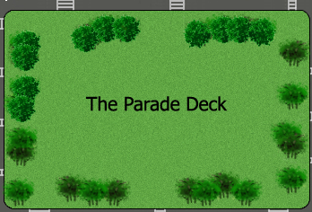
Perhaps putting opacity to 5-10% will help the trees sit a little better on the map. I like the trees but now that I think about it they stand out a little to much on the light coloured grass.
What do you know about map making, bitch?
Top Score:2403natty_dread wrote:I was wrong
-
Ditocoaf
- Posts: 1054
- Joined: Wed Feb 27, 2008 9:17 pm
- Location: Being eaten by the worms and weird fishes
Re: The Citadel V19 (Pg1+20) [I,Gp,Gr] XML Written
The trees are viewed from the side, yet the buildings are viewed from straight above?
It gives me a headache.
It gives me a headache.

>----------✪ Try to take down the champion in the continuous IPW/GIL tournament! ✪----------<
Note to self: THINK LESS LIVE MORE
-
gimil
- Posts: 8599
- Joined: Sat Mar 03, 2007 12:42 pm
- Gender: Male
- Location: United Kingdom (Scotland)
Re: The Citadel V19 (Pg1+20) [I,Gp,Gr] XML Written
Maybe jsut take the wood out the tree and it will look more top down?Ditocoaf wrote:The trees are viewed from the side, yet the buildings are viewed from straight above?
It gives me a headache.
What do you know about map making, bitch?
Top Score:2403natty_dread wrote:I was wrong

Re: The Citadel V19 (Pg1+20) [I,Gp,Gr] XML Written
I think top-down looks better -
-
gimil
- Posts: 8599
- Joined: Sat Mar 03, 2007 12:42 pm
- Gender: Male
- Location: United Kingdom (Scotland)
Re: The Citadel V19 (Pg1+20) [I,Gp,Gr] XML Written
I think that could work, what say you tack?grayhawke wrote:I think top-down looks better -
What do you know about map making, bitch?
Top Score:2403natty_dread wrote:I was wrong
Re: The Citadel V19 (Pg1+20) [I,Gp,Gr] XML Written
That begs the question "how'd you do that?" I'm not kidding when I don't know what else to do.
Re: The Citadel V19 (Pg1+20) [I,Gp,Gr] XML Written
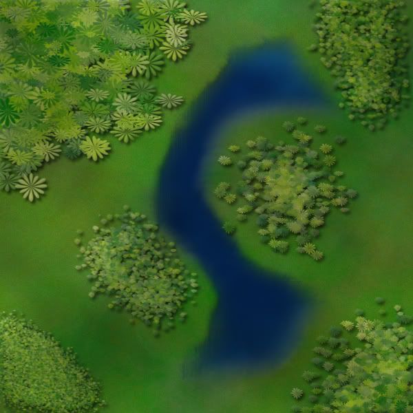
I made this tree graphicTaCktiX wrote:That begs the question "how'd you do that?" I'm not kidding when I don't know what else to do.
 , starting with a grey-scale gimp brush to which I applied a colour gradient and a gimp texture then finally changing some pixels. I then pasted and arranged copies of this graphic to produce the top-down illustration postedd above.
Re: The Citadel V19 (Pg1+20) [I,Gp,Gr] XML Written
I like those trees. Did you decide what to do with the sidewalk borders, Tac?
-
DiM

- Posts: 10415
- Joined: Wed Feb 14, 2007 6:20 pm
- Gender: Male
- Location: making maps for scooby snacks
Re: The Citadel V19 (Pg1+20) [I,Gp,Gr] XML Written
not sure if this works with gimp but it should at least give you a general idea:TaCktiX wrote:That begs the question "how'd you do that?" I'm not kidding when I don't know what else to do.
DiM wrote:never underestimate the power of personalized brushes. create a shape of how you think a tree looks from above. let's say a star shape. now take that brush and set the background and foreground to 2 foliage colours (dark green and yellowy green) then do the following:
shape dynamics>
> size jitter 100%
> minimum diameter 0%
> angle jitter 0%
> roundness jitter 68%
> min roundness 25%
scatter> adjust as you please dependng on what you need
colour dynamics>
>fore/back 100%
> saturation 50%
the rest at 0%
and check smoothing.
then go ahead and paint what you need adjusting the brush size according to the height of the viewpoint.
after you paint put on some drop shadow and even bevel if it suits your need. but keep the bevel at a minimum.
here's a quick example. i didn't bother making a custom shape so i used a flower one. it looks rather bad on large trees but it works for small ones as the details are hard to spot.
and here's the file http://www.sendspace.com/file/9g965g
“In the beginning God said, the four-dimensional divergence of an antisymmetric, second rank tensor equals zero, and there was light, and it was good. And on the seventh day he rested.”- Michio Kaku
Re: The Citadel V19 (Pg1+20) [I,Gp,Gr] XML Written
I did exactly that twice, with the previous 2 iterations of trees. People didn't like the results. The present one I will be slightly modifying to force the top-down perspective. I'm not exactly interested in copying grayhawke's trees, as they have far too much clarity for the true-scale trees seen from a few hundred feet in the air (perspective of campus).
-
DiM
- Posts: 10415
- Joined: Wed Feb 14, 2007 6:20 pm
- Gender: Male
- Location: making maps for scooby snacks
Re: The Citadel V19 (Pg1+20) [I,Gp,Gr] XML Written
TaCktiX wrote:I did exactly that twice, with the previous 2 iterations of trees. People didn't like the results. The present one I will be slightly modifying to force the top-down perspective. I'm not exactly interested in copying grayhawke's trees, as they have far too much clarity for the true-scale trees seen from a few hundred feet in the air (perspective of campus).
the only top down trees i saw were in v15 but those weren't looking like trees, more like green blobs of alien goo
“In the beginning God said, the four-dimensional divergence of an antisymmetric, second rank tensor equals zero, and there was light, and it was good. And on the seventh day he rested.”- Michio Kaku
-
Ditocoaf
- Posts: 1054
- Joined: Wed Feb 27, 2008 9:17 pm
- Location: Being eaten by the worms and weird fishes
Re: The Citadel V19 (Pg1+20) [I,Gp,Gr] XML Written
but the crosswalks, for instance, are perfectly clear and sharp.TaCktiX wrote:I did exactly that twice, with the previous 2 iterations of trees. People didn't like the results. The present one I will be slightly modifying to force the top-down perspective. I'm not exactly interested in copying grayhawke's trees, as they have far too much clarity for the true-scale trees seen from a few hundred feet in the air (perspective of campus).
>----------✪ Try to take down the champion in the continuous IPW/GIL tournament! ✪----------<
Note to self: THINK LESS LIVE MORE
Re: The Citadel V19 (Pg1+20) [I,Gp,Gr] XML Written
Because they are required for the map's gameplay. With exception to crosswalks in the corners (Capers/Museum, Jenkins/Canteen, McAlister/LeTellier, Duckett/Battery), none of them exist.
Re: The Citadel V19 (Pg1+20) [I,Gp,Gr] XML Written
This looks promising. I see the need for top-down view.gimil wrote:I think that could work, what say you tack?grayhawke wrote:I think top-down looks better -
Re: The Citadel V19 (Pg1+20) [I,Gp,Gr] XML Written
I'm presently working on a tree solution, but general demotivation about having to redo the trees from scratch is making it a procrastination-fest. Version 20 should be out by the end of the weekend regardless.
Re: The Citadel V19 (Pg1+20) [I,Gp,Gr] XML Written
Version 20
Updates:
- Redid the trees again (and if you complain about these, you need to be taken out behind the shed and shot)
- Centered Bond and Mark Clark Halls
- 1Pxed the attack routes on the Large
- Fixed the attack route examples on the Large
Small version (600x461)
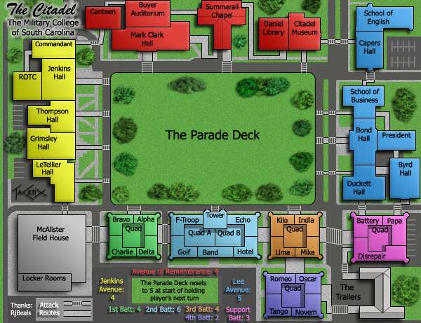
Large version (700x538)
Point of Discussion:
Is this Forge-worthy? If not, why?
Updates:
- Redid the trees again (and if you complain about these, you need to be taken out behind the shed and shot)
- Centered Bond and Mark Clark Halls
- 1Pxed the attack routes on the Large
- Fixed the attack route examples on the Large
Small version (600x461)
Large version (700x538)
- Click image to enlarge.
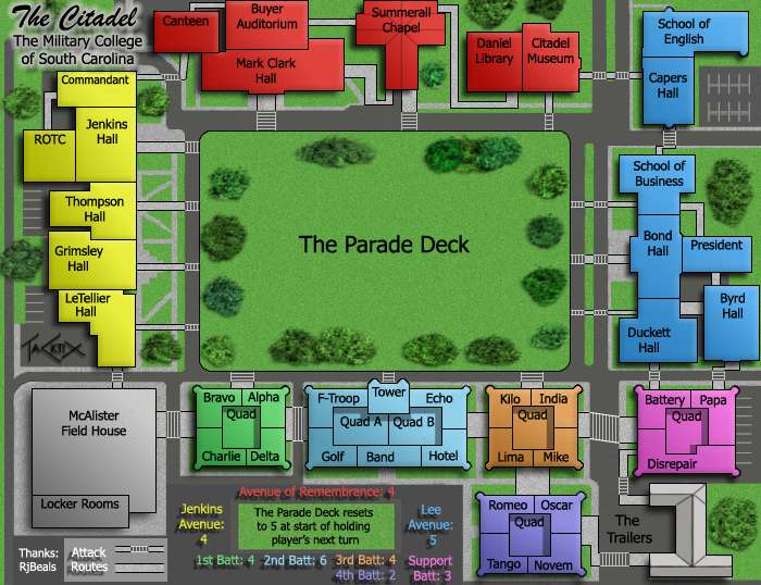
Is this Forge-worthy? If not, why?
Re: The Citadel V20 (Pg1+22) [I,Gp,Gr] XML Written
This seems ready for the final forge to me 
Re: The Citadel V20 (Pg1+22) [I,Gp,Gr] XML Written
I think it's forge-worthy.
Reputation cleared.  Never let it be said that Team CC don't investigate fairly.
Although they take bloody forever to do it...
Although they take bloody forever to do it...

Re: The Citadel V20 (Pg1+22) [I,Gp,Gr] XML Written
I'm not sure I like the legend grey next to the pathway grey... is there any need for them to be a different colour?
C.
C.

Highest score : 2297
Re: The Citadel V20 (Pg1+22) [I,Gp,Gr] XML Written
Side effect of me adding the minimap in there. The asphalt down there is a duplicate of the shade around the rest of the map, whilst the other gray is a 50% saturated with black white (dark gray, i.e.). Crafting a fix to that shouldn't be that hard, and can be done in the Forge with ease.

Re: The Citadel V20 (Pg1+22) [I,Gp,Gr] XML Written
Nice update overall! Love the new trees. I would like to see the legend background match the parking lot/sidewalk surface as well. Also, can the box behind RJ's name be the darker gray road color?yeti_c wrote:I'm not sure I like the legend grey next to the pathway grey... is there any need for them to be a different colour?
C.
LMR