Halloween Hollows [Quenched]
Moderator: Cartographers
Re: HALLOWEEN HOLLOWS V12 (P9) - New colours
![]() by Juan_Bottom on Sat Aug 23, 2008 11:35 pm
by Juan_Bottom on Sat Aug 23, 2008 11:35 pm
Well, three actually....
-

 Juan_Bottom
- Posts: 1110
- Joined: Mon May 19, 2008 4:59 pm
- Location: USA RULES! WHOOO!!!!


Re: HALLOWEEN HOLLOWS V12 (P9) - New colours
![]() by cairnswk on Sun Aug 24, 2008 12:02 am
by cairnswk on Sun Aug 24, 2008 12:02 am
Juan_Bottom wrote:Well, three actually....
Nah, you must not be getting the refresh browser properly to load....there is only one grey contintent now....or do you have CB issues?

* Pearl Harbour * Waterloo * Forbidden City * Jamaica * Pot Mosbi
-

cairnswk
- Posts: 11510
- Joined: Sat Feb 03, 2007 8:32 pm
- Location: Australia


Re: HALLOWEEN HOLLOWS V12 (P9) - New colours
![]() by gimil on Sun Aug 24, 2008 7:46 am
by gimil on Sun Aug 24, 2008 7:46 am
[adv. idea]
Maybe get it by halloween this year, eh?
Maybe get it by halloween this year, eh?
What do you know about map making, bitch?
Top Score:2403
natty_dread wrote:I was wrong
Top Score:2403
-

gimil
- Posts: 8599
- Joined: Sat Mar 03, 2007 12:42 pm
- Location: United Kingdom (Scotland)


Re: HALLOWEEN HOLLOWS V12 (P9) - New colours
![]() by Androidz on Sun Aug 24, 2008 8:17 am
by Androidz on Sun Aug 24, 2008 8:17 am
(unless your a girl then its.) Your the Girl!!!! Your the GIRL you know!! The Girl is you! Dont ever forget.
But i need to bitch about one thing tough, the legend i want you to change back to the stone sign you had before. The brown dont fitt at all.
Also the Dragon might be a little abscent of the map right now:O
And instead of use * cant you try like rjbeals did with diffrent armycircle? He used some sort of X. or something.
And your Carinswk signature fitts perfectly in the legend at the emeyspace. I think it will fitt better there..
Last edited by Androidz on Sun Aug 24, 2008 11:40 am, edited 3 times in total.

-

Androidz
- Posts: 1046
- Joined: Mon Dec 03, 2007 11:03 am


Re: HALLOWEEN HOLLOWS V12 (P9) - New colours
![]() by RjBeals on Sun Aug 24, 2008 11:20 am
by RjBeals on Sun Aug 24, 2008 11:20 am
- castle looks fine to me.
- moon & witch & graveyard look great.
- I don't care for the texture underneath the colors. Looks to "shiny" or something. I would prfer a grainy dirt texture.
- Sky should be darker blue
- I don't think purple should be a color choice. Why not brown instead? or dark green?
- I think the spider web should look more like a web, now it's just an oval.
- Could the ocean not come to a point at the land? Maybe add some foam or wave crashes?
- I like this legend better. I would vote keep it, just maybe add a slight texture behind the solid brown. or maybe a tiny gradient.
- Maybe add a dark outline to the cauldron bubble instead of white. dunno though. Would have to see it.
- If you really want to wow me, add a zombie grabbing and peeking from behind a tombstone
 - but I won't hold you to that one.
 - What about this - have the map brighter in the center where the moon is, then fade out darker around the edges where the moonlight would be dimmer?

-

RjBeals
- Posts: 2506
- Joined: Mon Nov 20, 2006 5:17 pm
- Location: South Carolina, USA


Re: HALLOWEEN HOLLOWS V12 (P9) - New colours
![]() by cairnswk on Sun Aug 24, 2008 12:19 pm
by cairnswk on Sun Aug 24, 2008 12:19 pm
RjBeals wrote:Looking good carins.
- castle looks fine to me.
- moon & witch & graveyard look great.
- I don't care for the texture underneath the colors. Looks to "shiny" or something. I would prfer a grainy dirt texture.
- Sky should be darker blue
- I don't think purple should be a color choice. Why not brown instead? or dark green?
- I think the spider web should look more like a web, now it's just an oval.
- Could the ocean not come to a point at the land? Maybe add some foam or wave crashes?
- I like this legend better. I would vote keep it, just maybe add a slight texture behind the solid brown. or maybe a tiny gradient.
- Maybe add a dark outline to the cauldron bubble instead of white. dunno though. Would have to see it.
- If you really want to wow me, add a zombie grabbing and peeking from behind a tombstone
- What about this - have the map brighter in the center where the moon is, then fade out darker around the edges where the moonlight would be dimmer?
Rj...would you like to take this map and do it yourself?
* Pearl Harbour * Waterloo * Forbidden City * Jamaica * Pot Mosbi
-
cairnswk
- Posts: 11510
- Joined: Sat Feb 03, 2007 8:32 pm
- Location: Australia
Re: HALLOWEEN HOLLOWS V12 (P9) - New colours
![]() by Androidz on Sun Aug 24, 2008 12:25 pm
by Androidz on Sun Aug 24, 2008 12:25 pm
cairnswk wrote:RjBeals wrote:Looking good carins.
- castle looks fine to me.
- moon & witch & graveyard look great.
- I don't care for the texture underneath the colors. Looks to "shiny" or something. I would prfer a grainy dirt texture.
- Sky should be darker blue
- I don't think purple should be a color choice. Why not brown instead? or dark green?
- I think the spider web should look more like a web, now it's just an oval.
- Could the ocean not come to a point at the land? Maybe add some foam or wave crashes?
- I like this legend better. I would vote keep it, just maybe add a slight texture behind the solid brown. or maybe a tiny gradient.
- Maybe add a dark outline to the cauldron bubble instead of white. dunno though. Would have to see it.
- If you really want to wow me, add a zombie grabbing and peeking from behind a tombstone
- What about this - have the map brighter in the center where the moon is, then fade out darker around the edges where the moonlight would be dimmer?
Rj...would you like to take this map and do it yourself?
-
Androidz
- Posts: 1046
- Joined: Mon Dec 03, 2007 11:03 am
Re: HALLOWEEN HOLLOWS V12 (P9) - New colours
![]() by cairnswk on Sun Aug 24, 2008 12:33 pm
by cairnswk on Sun Aug 24, 2008 12:33 pm
RjBeals wrote:
- castle looks fine to me.
- moon & witch & graveyard look great.
Thanks Christ
Too bad.I don't care for the texture underneath the colors. Looks to "shiny" or something. I would prfer a grainy dirt texture.
I know. it's not finished yet.Sky should be darker blue
I don't think purple should be a color choice. Why not brown instead? or dark green?
Dark brown is not a Halloween colour and Dark Green has already been used. Purple is an aceepted Halloween colour.
Will work on that.I think the spider web should look more like a web, now it's just an oval.
Could the ocean not come to a point at the land? Maybe add some foam or wave crashes?
I think it is fine as it is otherwise it will look too much in that area.
That i can work on.I like this legend better. I would vote keep it, just maybe add a slight texture behind the solid brown. or maybe a tiny gradient.
No leave it as it is, the grey outline shows the border clearly.Maybe add a dark outline to the cauldron bubble instead of white. dunno though. Would have to see it.
I don't wan to wow you, the zombie is for the zombie map that natewolfman wants to do...you can perahps work on that with him.If you really want to wow me, add a zombie grabbing and peeking from behind a tombstone
I can accept that one.What about this - have the map brighter in the center where the moon is, then fade out darker around the edges where the moonlight would be dimmer?
I'll work to see some of those through.
* Pearl Harbour * Waterloo * Forbidden City * Jamaica * Pot Mosbi
-
cairnswk
- Posts: 11510
- Joined: Sat Feb 03, 2007 8:32 pm
- Location: Australia
Re: HALLOWEEN HOLLOWS V12 (P9) - New colours
![]() by cairnswk on Sun Aug 24, 2008 12:37 pm
by cairnswk on Sun Aug 24, 2008 12:37 pm
Androidz wrote:=D> Cairnswk i love it!!!Your the man!!!Your The MAN you know!! The man is you! Dont ever forget.
(unless your a girl then its.) Your the Girl!!!! Your the GIRL you know!! The Girl is you! Dont ever forget.
But i need to bitch about one thing tough, the legend i want you to change back to the stone sign you had before. The brown dont fitt at all.
Also the Dragon might be a little abscent of the map right now:O
And instead of use * cant you try like rjbeals did with diffrent armycircle? He used some sort of X. or something.
And your Carinswk signature fitts perfectly in the legend at the emeyspace. I think it will fitt better there..
Yes well lets forget about the girl eh!
Some of those things i will work on. The legend is staying as is but the brown texture will probably be altered.
The dragon will go.
The symbols can change.
Signature stays in the web.
Thanks.
* Pearl Harbour * Waterloo * Forbidden City * Jamaica * Pot Mosbi
-
cairnswk
- Posts: 11510
- Joined: Sat Feb 03, 2007 8:32 pm
- Location: Australia
Re: HALLOWEEN HOLLOWS V12 (P9) - New colours
![]() by willis on Sun Aug 24, 2008 12:39 pm
by willis on Sun Aug 24, 2008 12:39 pm
i think that the text in the purple areas is a little too light and not the easiest to read
-

willis
- Posts: 3469
- Joined: Thu Jan 25, 2007 10:25 am
- Location: Nipples and Tits


Re: HALLOWEEN HOLLOWS V12 (P9) - New colours
![]() by Androidz on Sun Aug 24, 2008 12:39 pm
by Androidz on Sun Aug 24, 2008 12:39 pm
cairnswk wrote:Androidz wrote:=D> Cairnswk i love it!!!Your the man!!!Your The MAN you know!! The man is you! Dont ever forget.
(unless your a girl then its.) Your the Girl!!!! Your the GIRL you know!! The Girl is you! Dont ever forget.
But i need to bitch about one thing tough, the legend i want you to change back to the stone sign you had before. The brown dont fitt at all.
Also the Dragon might be a little abscent of the map right now:O
And instead of use * cant you try like rjbeals did with diffrent armycircle? He used some sort of X. or something.
And your Carinswk signature fitts perfectly in the legend at the emeyspace. I think it will fitt better there..
Yes well lets forget about the girl eh!
Some of those things i will work on. The legend is staying as is but the brown texture will probably be altered.
The dragon will go.
The symbols can change.
Signature stays in the web.
Thanks.
ok Np:D
-
Androidz
- Posts: 1046
- Joined: Mon Dec 03, 2007 11:03 am
Re: HALLOWEEN HOLLOWS V12 (P9) - New colours
![]() by cairnswk on Sun Aug 24, 2008 12:50 pm
by cairnswk on Sun Aug 24, 2008 12:50 pm
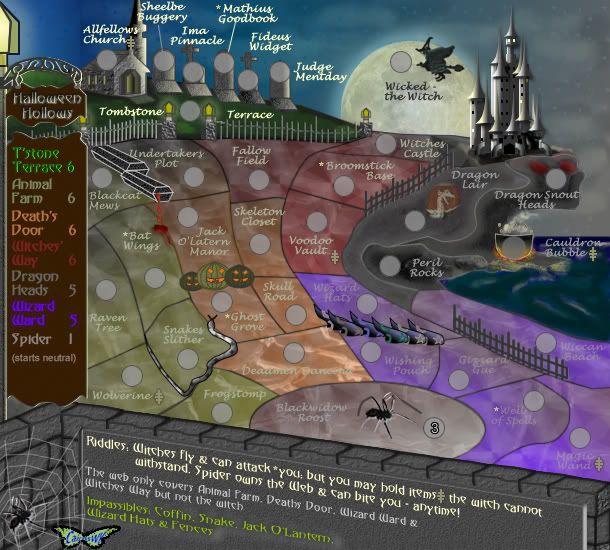
Current Verson 12
* Pearl Harbour * Waterloo * Forbidden City * Jamaica * Pot Mosbi
-
cairnswk
- Posts: 11510
- Joined: Sat Feb 03, 2007 8:32 pm
- Location: Australia
Re: HALLOWEEN HOLLOWS V12 (P9) - New colours
![]() by Androidz on Sun Aug 24, 2008 12:55 pm
by Androidz on Sun Aug 24, 2008 12:55 pm
Hmm, i think the sig need a bit revamp since its a bit over overpixalted or something.
-
Androidz
- Posts: 1046
- Joined: Mon Dec 03, 2007 11:03 am
Re: HALLOWEEN HOLLOWS V12 (P9) - New colours
![]() by RjBeals on Sun Aug 24, 2008 2:09 pm
by RjBeals on Sun Aug 24, 2008 2:09 pm
cairnswk wrote:Rj...would you like to take this map and do it yourself?
no.
but you want feedback don't you.
-
RjBeals
- Posts: 2506
- Joined: Mon Nov 20, 2006 5:17 pm
- Location: South Carolina, USA
Re: HALLOWEEN HOLLOWS V12 (P9) - New colours
![]() by Juan_Bottom on Sun Aug 24, 2008 3:01 pm
by Juan_Bottom on Sun Aug 24, 2008 3:01 pm
Ok, now you guys are messing with me.... what's purple?
Also, glad to hear about the sky.
Some what ifs, cause CAIRNSWK has the skill, I believe.
Could the Black Widow Roost be turned into a spider web? Maybe by turning the circle into a well or something, with the web in the middle of it. Then you could even put a 'hidden' messege in the web's silk like "Happy Holloween" or something. I don't know, I'm not a mapmaker. And I'm sure that you would have thought of this already.
Maybe then Deaths Door could become a sidewalk to the Graveyard?
I agree that the Moon could use some texture.
I like the new legend also, I think it fits better with the direction of a creepy town, which kinda how this looks.
I like the sig in the web too. Looks like your butterfly is lunch...
I see what you mean by one gray territory, I don't know what I was thinking. But I know what I ment was, are you going to color in the other territories too?
-
Juan_Bottom
- Posts: 1110
- Joined: Mon May 19, 2008 4:59 pm
- Location: USA RULES! WHOOO!!!!
Re: HALLOWEEN HOLLOWS V12 (P9) - New colours
![]() by cairnswk on Sun Aug 24, 2008 4:27 pm
by cairnswk on Sun Aug 24, 2008 4:27 pm
RjBeals wrote:cairnswk wrote:Rj...would you like to take this map and do it yourself?
no.
but you want feedback don't you.
Feedback yes....i saw this at 3am in the morning...tired and grumpy....my problem...but sounded at the time like you had just ask for color changes and wanted to have a whole heap more changes that indicated you were far from happy with what i had done...i was quite pissed.
* Pearl Harbour * Waterloo * Forbidden City * Jamaica * Pot Mosbi
-
cairnswk
- Posts: 11510
- Joined: Sat Feb 03, 2007 8:32 pm
- Location: Australia
Re: HALLOWEEN HOLLOWS V12 (P9) - New colours
![]() by RjBeals on Sun Aug 24, 2008 4:44 pm
by RjBeals on Sun Aug 24, 2008 4:44 pm
You shouldn't be on the forums at 3am.
I'll be quiet and see what you come up with.
I'll be quiet and see what you come up with.
-
RjBeals
- Posts: 2506
- Joined: Mon Nov 20, 2006 5:17 pm
- Location: South Carolina, USA
Re: HALLOWEEN HOLLOWS V12 (P9) - New colours
![]() by Qwert on Sun Aug 24, 2008 4:46 pm
by Qwert on Sun Aug 24, 2008 4:46 pm
You forget to put Gomez and Adams family on map 

-

Qwert
- SoC Training Adviser
- Posts: 9262
- Joined: Tue Nov 07, 2006 5:07 pm
- Location: VOJVODINA


Re: HALLOWEEN HOLLOWS V13 (P10) - Adjustments
![]() by cairnswk on Mon Aug 25, 2008 4:04 pm
by cairnswk on Mon Aug 25, 2008 4:04 pm
Version 13
I think this should be a little more subdued so i've done so....
changed the texture on the ground and various other bits and pieces.
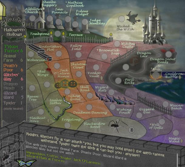
I think this should be a little more subdued so i've done so....
changed the texture on the ground and various other bits and pieces.
* Pearl Harbour * Waterloo * Forbidden City * Jamaica * Pot Mosbi
-
cairnswk
- Posts: 11510
- Joined: Sat Feb 03, 2007 8:32 pm
- Location: Australia
Re: HALLOWEEN HOLLOWS V12 (P9) - New colours
![]() by edbeard on Mon Aug 25, 2008 4:09 pm
by edbeard on Mon Aug 25, 2008 4:09 pm
It looks cool but I can't really see the difference between death's door and witch's way
-

edbeard
- Posts: 2501
- Joined: Thu Mar 29, 2007 12:41 am


Re: HALLOWEEN HOLLOWS V12 (P9) - New colours
![]() by foregone on Mon Aug 25, 2008 4:13 pm
by foregone on Mon Aug 25, 2008 4:13 pm
Love the mist. Looks great.
I really like the colours as they are now visually. But it seems difficult to distinguish between some of them. Animal Farm and Death's Door isn't hugely clear, but its also not horrifically difficult. I'm struggling a bit to see where Death's Door and Witches' Way end/begin though.
Witches' Way is also a little difficult to read on the legend.
And I know you've addressed this but I thought I'd throw in my 2 cents anyway. The border on the cauldron is a little bright for my liking. It detracts a little bit from the beauty of the rest of the map in my opinion.
The map is definitely emitting the right feeling for me now though.
And I've been fast posted.
-

foregone
- Posts: 289
- Joined: Sun May 11, 2008 1:00 am
- Location: Sydney, NSW, Australia
Re: HALLOWEEN HOLLOWS V13 (P10) - Adjustments
![]() by cairnswk on Mon Aug 25, 2008 4:19 pm
by cairnswk on Mon Aug 25, 2008 4:19 pm
foregone wrote:Love the mist. Looks great.
I really like the colours as they are now visually. But it seems difficult to distinguish between some of them. Animal Farm and Death's Door isn't hugely clear, but its also not horrifically difficult. I'm struggling a bit to see where Death's Door and Witches' Way end/begin though.
Witches' Way is also a little difficult to read on the legend.
And I know you've addressed this but I thought I'd throw in my 2 cents anyway. The border on the cauldron is a little bright for my liking. It detracts a little bit from the beauty of the rest of the map in my opinion.
The map is definitely emitting the right feeling for me now though.
And I've been fast posted.
edbeard wrote:It looks cool but I can't really see the difference between death's door and witch's way
Oh dear, you must be all bloody colour blind.
* Pearl Harbour * Waterloo * Forbidden City * Jamaica * Pot Mosbi
-
cairnswk
- Posts: 11510
- Joined: Sat Feb 03, 2007 8:32 pm
- Location: Australia
Re: HALLOWEEN HOLLOWS V13 (P10) - Adjustments
![]() by edbeard on Mon Aug 25, 2008 4:27 pm
by edbeard on Mon Aug 25, 2008 4:27 pm
cairnswk wrote:Oh dear, you must be all bloody colour blind.
no it's just that you've picked colours that almost blend together. if you really think that undertaker's plot and skeleton closet won't be mistaken for being part of witch's way
that's just what happens when you do the colours with a gradient like that. relatedly, broomstick base is completely different colour than Fallow field and Voodoo Vault. So, this only adds to the problem of people figuring out what territories belong to which continent.
It looks fine if it's just a picture but begs the question what's going on with these colours? And, no offense, but maybe the problem is on your end because that's always been the major issue with this map.
-
edbeard
- Posts: 2501
- Joined: Thu Mar 29, 2007 12:41 am
Re: HALLOWEEN HOLLOWS V13 (P10) - Adjustments
![]() by cairnswk on Mon Aug 25, 2008 4:44 pm
by cairnswk on Mon Aug 25, 2008 4:44 pm
edbeard wrote:cairnswk wrote:Oh dear, you must be all bloody colour blind.
no it's just that you've picked colours that almost blend together. if you really think that undertaker's plot and skeleton closet won't be mistaken for being part of witch's way
that's just what happens when you do the colours with a gradient like that. relatedly, broomstick base is completely different colour than Fallow field and Voodoo Vault. So, this only adds to the problem of people figuring out what territories belong to which continent.
It looks fine if it's just a picture but begs the question what's going on with these colours? And, no offense, but maybe the problem is on your end because that's always been the major issue with this map.
Mmmm. thanks for resounding vote of confidence...unfortunately, as i am doing the map, i don't have any issues with the colours...you're the one who bring this issue to the table so i'd say it's you who's got the challenge. However, i will see what i can do to make is more appealing for you.
Like always edbeard, you're very cutting aren't you.
* Pearl Harbour * Waterloo * Forbidden City * Jamaica * Pot Mosbi
-
cairnswk
- Posts: 11510
- Joined: Sat Feb 03, 2007 8:32 pm
- Location: Australia
Re: HALLOWEEN HOLLOWS V13 (P10) - Adjustments
![]() by edbeard on Mon Aug 25, 2008 5:03 pm
by edbeard on Mon Aug 25, 2008 5:03 pm
sorry to be abrasive but I'm just bringing things up that people will complain about when it goes live (this is really what I focus on with my feedback). better for me to do it here than 20 people after it's quenched!
-
edbeard
- Posts: 2501
- Joined: Thu Mar 29, 2007 12:41 am
Who is online
Users browsing this forum: No registered users
|
|||||||
| Conquer Club is not associated with RISK online in any way. Copyright © 2006-2025 by Big Wham LLC | |||||||