I agree with colored legend numbers.
I really don't like the way the legend looks, the rock texture in the back doesn't like good, and the roof thingy on top isn't centered (can be fixed by shrinking the legend a little so there is room to move it to the right).
Could the text all be made the same size please?
And remove the graphics in the ocean, I don't like them either.
--lanyards
An Ancient Greek Revamp
Moderator: Cartographers
Re: An Ancient Greek Revamp
![]() by lanyards on Wed Aug 27, 2008 3:50 pm
by lanyards on Wed Aug 27, 2008 3:50 pm

WANT AN ADVANTAGE WHILE WORKING TOWARDS MEDALS?
https://www.conquerclub.com/forum/viewtopic.php?f=529&t=226714
-

 lanyards
- Posts: 1378
- Joined: Sat Feb 24, 2007 1:31 am


 2
2


Re: An Ancient Greek Revamp
![]() by Mr. K on Wed Aug 27, 2008 6:05 pm
by Mr. K on Wed Aug 27, 2008 6:05 pm
I will make the numbers on the legend colored too, I just didn't want to go ahead and do that at a stage when the colors weren't definite yet. But It'll be in the next update.
Anyone else have a problem with the rock-legend, other then "I don't like it?"
I'll unify the text labels on the next update as well.
No. Did I not tell you 20 times already to shut the hell up about that? Move on and shut your damn mouth about it. You're the only one who has an issue with it, and frankly, I don't care. At all. I'm making this map for the enjoyment of the Conquer Club community, and so that I have something to fill a little bit of free time. I'm not making this map to please lanyards.
I apologize if some of the words I used above aren't acceptable on Conquer Club, i'm not quite up to date with the rules. But it was called for, as he has been saying the same thing over and over, both in this thread and in-game.
Anyone else have a problem with the rock-legend, other then "I don't like it?"
I'll unify the text labels on the next update as well.
And remove the graphics in the ocean, I don't like them either.
No. Did I not tell you 20 times already to shut the hell up about that? Move on and shut your damn mouth about it. You're the only one who has an issue with it, and frankly, I don't care. At all. I'm making this map for the enjoyment of the Conquer Club community, and so that I have something to fill a little bit of free time. I'm not making this map to please lanyards.
I apologize if some of the words I used above aren't acceptable on Conquer Club, i'm not quite up to date with the rules. But it was called for, as he has been saying the same thing over and over, both in this thread and in-game.
-

Mr. K
- Posts: 291
- Joined: Thu Mar 16, 2006 9:14 pm


Re: An Ancient Greek Revamp
![]() by ZeakCytho on Wed Aug 27, 2008 6:07 pm
by ZeakCytho on Wed Aug 27, 2008 6:07 pm
For what it's worth, which is apparently not very much, I don't like the graphics in the ocean either.
-

ZeakCytho
- Posts: 1251
- Joined: Wed Sep 12, 2007 4:36 pm


Re: An Ancient Greek Revamp
![]() by lanyards on Wed Aug 27, 2008 6:10 pm
by lanyards on Wed Aug 27, 2008 6:10 pm
Frankly, I am part of the ConquerClub community. Also, I don't remember saying anything about the water graphics... You want to ignore me, go ahead. Why I added you to the DOUCHE list. Lol.
--lanyards
--lanyards
WANT AN ADVANTAGE WHILE WORKING TOWARDS MEDALS?
https://www.conquerclub.com/forum/viewtopic.php?f=529&t=226714
-
lanyards
- Posts: 1378
- Joined: Sat Feb 24, 2007 1:31 am
2
Re: An Ancient Greek Revamp
![]() by lanyards on Wed Aug 27, 2008 6:11 pm
by lanyards on Wed Aug 27, 2008 6:11 pm
Don't bother Zeak. If your suggestion doesn't go along with what he's thinking, it is discarded.ZeakCytho wrote:For what it's worth, which is apparently not very much, I don't like the graphics in the ocean either.
--lanyards
WANT AN ADVANTAGE WHILE WORKING TOWARDS MEDALS?
https://www.conquerclub.com/forum/viewtopic.php?f=529&t=226714
-
lanyards
- Posts: 1378
- Joined: Sat Feb 24, 2007 1:31 am
2
Re: An Ancient Greek Revamp
![]() by cena-rules on Wed Aug 27, 2008 6:49 pm
by cena-rules on Wed Aug 27, 2008 6:49 pm
achea needs to be moved up or its army circle moved down
and the water well it sucks
and the water well it sucks
19:41:22 ‹jakewilliams› I was a pedo
-

cena-rules
- Posts: 9740
- Joined: Sat Apr 28, 2007 2:27 am
- Location: Chat


Re: An Ancient Greek Revamp
![]() by Mr. K on Wed Aug 27, 2008 6:50 pm
by Mr. K on Wed Aug 27, 2008 6:50 pm
I assumed by "graphics in the water" you meant, the minotaur, and the ships (you know, the graphics... in the water). If you were talking about the graphic FOR the water, I apologize (though you should have made that clearer). Either way you're still a douche for bringing it up so many times before this.
Yes, you're a member of the Conquer Club community, but you're 1 member amongst many, including myself. Now including Zeak (assuming he meant the graphics in the water, not the graphics of the water, which isn't clear), there have been 2 members total to mention they didn't like them, and at least as many who have mentioned they *do* like them. Your vote doesn't count double, so when your personal preference doesn't get implemented, you have no place continually bitching about it.
I'd call you an idiot, but i'm giving you the benifit of the doubt and assuming you're just being an ass. You know thats not true, and I find it hard to believe you're dense enough to not understand what i'm trying to say.
Yes, you're a member of the Conquer Club community, but you're 1 member amongst many, including myself. Now including Zeak (assuming he meant the graphics in the water, not the graphics of the water, which isn't clear), there have been 2 members total to mention they didn't like them, and at least as many who have mentioned they *do* like them. Your vote doesn't count double, so when your personal preference doesn't get implemented, you have no place continually bitching about it.
Don't bother Zeak. If your suggestion doesn't go along with what he's thinking, it is discarded.
I'd call you an idiot, but i'm giving you the benifit of the doubt and assuming you're just being an ass. You know thats not true, and I find it hard to believe you're dense enough to not understand what i'm trying to say.
-
Mr. K
- Posts: 291
- Joined: Thu Mar 16, 2006 9:14 pm
Re: An Ancient Greek Revamp
![]() by lanyards on Wed Aug 27, 2008 6:54 pm
by lanyards on Wed Aug 27, 2008 6:54 pm
Well, now people are starting to speak up. So you better do something about it. All my posts in this thread have contained constructive comments, so far you've managed to blow most of them off.
Your mountains, I agree, look like broccoli.
And I was referring to the water. But I did also say the graphics are bad, so really I think both are bad. I only said one so you wouldn't explode.
--lanyards
Your mountains, I agree, look like broccoli.
And I was referring to the water. But I did also say the graphics are bad, so really I think both are bad. I only said one so you wouldn't explode.
--lanyards
WANT AN ADVANTAGE WHILE WORKING TOWARDS MEDALS?
https://www.conquerclub.com/forum/viewtopic.php?f=529&t=226714
-
lanyards
- Posts: 1378
- Joined: Sat Feb 24, 2007 1:31 am
2
Re: An Ancient Greek Revamp
![]() by Mr. K on Wed Aug 27, 2008 7:06 pm
by Mr. K on Wed Aug 27, 2008 7:06 pm
lanyards wrote:Well, now people are starting to speak up. So you better do something about it. All my posts in this thread have contained constructive comments, so far you've managed to blow most of them off.
No, I have not. As you can see from your last post, I took 3 of your 4 points seriously, and mentioned that I was following 2 of them. The 3rd I asked for more opinions. The fourth, was a repeat of something i've responded to multiple times.
Your mountains, I agree, look like broccoli.
Others have said they liked them. I'm wondering if you realize that you can't please everyone. If something is unanimously hated, I'll change it. If its nearing a 50/50 split, i'm going to go with what I like, not with what lanyards likes.
-
Mr. K
- Posts: 291
- Joined: Thu Mar 16, 2006 9:14 pm
Re: An Ancient Greek Revamp
![]() by Mr. Squirrel on Wed Aug 27, 2008 7:10 pm
by Mr. Squirrel on Wed Aug 27, 2008 7:10 pm
I don't know if it will make a difference, but I personally like the graphics in the water while I think that the mountains look horrible. Just my opinion...
-

Mr. Squirrel
- Posts: 157
- Joined: Fri Nov 02, 2007 3:18 pm
- Location: up a tree

Re: An Ancient Greek Revamp
![]() by lanyards on Wed Aug 27, 2008 7:15 pm
by lanyards on Wed Aug 27, 2008 7:15 pm
Usually when there are a few people that don't like something, the mapmaker would try other things to satisfy a good majority. So far, since the broccoli update, I have only seen one comment on the mountain, which was a negative comment. Unless of course you were refering to this:
Right now, I think putting up a few examples of how the mountains could look would help you get the best results. I have seen other cartographers do that.
There you go. Opinions. All of them should be respected.
--lanyards
Georgerx7di wrote:lol nice
Right now, I think putting up a few examples of how the mountains could look would help you get the best results. I have seen other cartographers do that.
Mr. Squirrel wrote:I don't know if it will make a difference, but I personally like the graphics in the water while I think that the mountains look horrible. Just my opinion...
There you go. Opinions. All of them should be respected.
--lanyards
WANT AN ADVANTAGE WHILE WORKING TOWARDS MEDALS?
https://www.conquerclub.com/forum/viewtopic.php?f=529&t=226714
-
lanyards
- Posts: 1378
- Joined: Sat Feb 24, 2007 1:31 am
2
Re: An Ancient Greek Revamp
![]() by wcaclimbing on Wed Aug 27, 2008 7:19 pm
by wcaclimbing on Wed Aug 27, 2008 7:19 pm
I really like the graphics on the water. It helps fill in the empty space and brings a bit of life into the map.
But the mountains? I thought they were trees....
Maybe a little more grey/brown color would help them out.
But the mountains? I thought they were trees....
Maybe a little more grey/brown color would help them out.

-

wcaclimbing
- Posts: 5598
- Joined: Fri May 12, 2006 10:09 pm
- Location: In your quantum box....Maybe.


Re: An Ancient Greek Revamp
![]() by pepperonibread on Wed Aug 27, 2008 7:24 pm
by pepperonibread on Wed Aug 27, 2008 7:24 pm
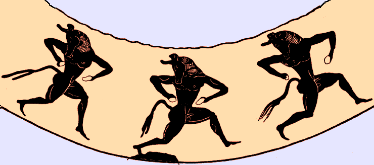
Regarding the water graphics... I personally like the ships you've placed in the northern half of the map, the minotaurs not as much. Maybe you could try adding a third ship to replace the minotaurs, just to see how it looks.
As for the mountains, possibly pushing to the left the ones that go off the water's edge and thinning down the entire range slightly could make them work better.
And this map needs an [Official] tag in the thread title (a mod should add one soon). Gimil, get to it!
As for the mountains, possibly pushing to the left the ones that go off the water's edge and thinning down the entire range slightly could make them work better.
And this map needs an [Official] tag in the thread title (a mod should add one soon). Gimil, get to it!

-

pepperonibread
- Posts: 954
- Joined: Sun Jan 28, 2007 4:33 pm
- Location: The Former Confederacy


Re: An Ancient Greek Revamp
![]() by Mr. K on Wed Aug 27, 2008 7:38 pm
by Mr. K on Wed Aug 27, 2008 7:38 pm
lanyards wrote:Usually when there are a few people that don't like something, the mapmaker would try other things to satisfy a good majority. So far, since the broccoli update, I have only seen one comment on the mountain, which was a negative comment.
When have I said I wasn't considering changing the mountains? Since I've posted them i've been letting people comment. Next time I open it, I will in fact give them another try. You're right, now that I look no one has said they liked the mountains, but that had nothing to do with my point about not being able to please everyone.
Mr. Squirrel wrote:I don't know if it will make a difference, but I personally like the graphics in the water while I think that the mountains look horrible. Just my opinion...
There you go. Opinions. All of them should be respected.
I don't believe you're really this dense. When in this thread have I not respected people's opinions? The only problem I have is when people state their own opinions as fact, and not following those opinions as a broken law. And really, the only person to have done that is you.
This is not about the mountains, I never said I wouldn't try them again. The only time I defended them was when I was explaining why they were green. They are green because the actual mountains there are green, and however they end up, they will be green.
The only thing i've *somewhat* refused to waiver on is the minotaurs. And I didn't even say that I didn't want people to comment on them, I said I don't want YOU commenting on it, because you had already done so multiple times. Everyone is allowed to share their opinions, and they will all be heard and considered. I've made that clear many times. What should be crystal clear to you by now, is that YOUR opinion is no more important than that of everyone else's. Share it, and as I have with everyone's suggestions so far, I will consider it! I will try it, and I will see how it looks. For the little things that are purely a matter of taste (not a matter of quality - eg. someone likes blue more then red), I may make an executive decision to veto your suggestion. I'll try it, i'll look at it, and if it really has little effect on the map, and I prefer one way rather then the other, i'm going to go with the way I like.
Don't try and paint me as someone who doesn't listen to the community suggestions, because the only thing I've refused to listen to so far is your repeated suggestion to remove the minotuars. And the only reason I refused that is because you (rudely) said it so many times and ignored my responses.
-
Mr. K
- Posts: 291
- Joined: Thu Mar 16, 2006 9:14 pm
Re: An Ancient Greek Revamp
![]() by AndyDufresne on Wed Aug 27, 2008 8:19 pm
by AndyDufresne on Wed Aug 27, 2008 8:19 pm
Lets all play nice, yes? I don't want to come in here and have to start enforcing rules. 
--Andy
--Andy
-

AndyDufresne
- Posts: 24935
- Joined: Fri Mar 03, 2006 8:22 pm
- Location: A Banana Palm in Zihuatanejo


Re: An Ancient Greek Revamp
![]() by Bones2484 on Wed Aug 27, 2008 8:28 pm
by Bones2484 on Wed Aug 27, 2008 8:28 pm
I understand this is your map, Mr K, but you've basically told half the people who have offered their thoughts to f*ck off. It might help to learn to take criticism better as that is the entire point of this section of the forums. Do you honestly want input, or are you here to basically wait for someone to tell you it looks perfect and everything you do is amazing?
Anyways... as for your question about the legend. I like the background... but is there a way to make it look like the text is "carved into" the background like it's a tablet? I think that would be cool and fit in perfect with Ancient Greece.
Anyways... as for your question about the legend. I like the background... but is there a way to make it look like the text is "carved into" the background like it's a tablet? I think that would be cool and fit in perfect with Ancient Greece.
-

Bones2484
- Posts: 2307
- Joined: Mon Sep 17, 2007 11:24 am
- Location: Los Angeles, CA (G1)


Re: An Ancient Greek Revamp
![]() by Mr. K on Wed Aug 27, 2008 10:41 pm
by Mr. K on Wed Aug 27, 2008 10:41 pm
Bones2484 wrote:I understand this is your map, Mr K, but you've basically told half the people who have offered their thoughts to f*ck off. It might help to learn to take criticism better as that is the entire point of this section of the forums. Do you honestly want input, or are you here to basically wait for someone to tell you it looks perfect and everything you do is amazing?
Wrong, I told lanyards to f*ck off. And for good reason. Honestly, did you read anything I said? Apparently not a word. I'll say it again, i'll try to be clearer.
I appreciate everyone's input, and I request it whole-heartedly. I will take everything into consideration, and I will give it a shot (as I have this entire thread, have a look). The only time I will ask you to kindly shut your mouth is: if you've made your request, I've tried it, didn't like it, explained it in this thread, asked you to move on, and you continually ignore my response. You people are treating me like I don't have respect and am not listening to the community. I find it very disrespectful the way lanyards ignored *my* opinion continually, did not respond to what I said, and just re-stated his complaint, even though I already answered.
I'm also finding it disrespectful that people aren't reading what i'm saying, and are continually saying that I don't listen to the communities' opinions. I never said I wouldn't retry the mountains, which seem to be unanimously disliked. I never shot down any other suggestions either, infact i've continually requested them. The reason I haven't posted an update is because I have less free time now then I did the first two days when I got the bulk of the work done, but I never said "this is done and its my way no changes." This thread sunk and for days had no responses, until I topped it asking for MORE suggestions from the community.
I never asked anyone not to tell me what they think of the mountains, or the water, or the font, or anything else. The only person and the only subject i've asked to stop is that of the minotaurs - and not because I find the minotaurs so overwhelmingly amazing and they MUST be in this map, but because the request was entirely disrespectful and rude and repetitive.
I'm more then happy to continue this thread as it has gone, taking opinions, making changes, and ultimately sending the fresh new and improved map into action. So if you have suggestions, please, make them, I never asked anyone not to. But, if you'd rather continue to ignore what i'm saying (which is what got me upset in the first place), and tell me that i'm NOT listening to the community, when clearly I have been, i'm not opposed to dropping this all together. I'm not as eager to kiss butt as some people may be, getting my map onto conquer club isn't quite the greatest honor I can envision. So for as long as i'm providing this free service to the community, I plan to listen and respect everything every one has to say, but you better believe I expect the same courtesies.
Anyways... as for your question about the legend. I like the background... but is there a way to make it look like the text is "carved into" the background like it's a tablet? I think that would be cool and fit in perfect with Ancient Greece.
That sounds pretty sharp, i'll give it a shot with my next update
-
Mr. K
- Posts: 291
- Joined: Thu Mar 16, 2006 9:14 pm
Re: An Ancient Greek Revamp
![]() by Mjinga on Wed Aug 27, 2008 11:42 pm
by Mjinga on Wed Aug 27, 2008 11:42 pm
I like this revamp! It already looks better than your old map.  I love the silhouettes in the land, and the colours that you use. I especially love Asia Minor and Boreia Ellada.
There are some things that I would like to throw out for your consideration, though, since you’re revamping it and all. They are:
But overall, two thumbs way, way up! Lukkin’ good.
There are some things that I would like to throw out for your consideration, though, since you’re revamping it and all.
- Samos-Lydia: This is my biggest issue with this map. You have no idea how many times I thought there was a connection there and it turned out there wasn’t, and barely avoided disaster. It’s pretty clear in this revamp that they don’t connect, except that the troops will be right on the divide. Is it at all possible to move the army circle off the place where they don’t connect, so as to make it clear?
- Minotaurs: I actually wouldn’t know they were minotaurs except that I read the comments. They look like dancing devils to me. I’m not opposed to minotaurs on principle, but I do like the boats better. Another thought would be Olympic athletes or spear-wielding types… I do like the energy of the silhouettes, I just have a hard time identifying them as minotaurs. Maybe, if they have to be minotaurs, make them more obviously minotaurs?
- Mountains: Umm… well, er, these ones don’t look so very great. Maybe try making them like rotated versions of the “C” in Corinth? It might work… or if you have some other idea, try that. Just… please don’t go with these ones.
- Ocean: I like the ripple effect in the ocean. I think the opacity is a bit high, though. It distracts from the silhouettes on the land a little bit, and since I really like those, I’d rather it didn’t. Maybe turn down the opacity of the ripple-effect a tiny bit?
- Territ Names: Some are larger than others. I personally would rather they were all the same size. It seems a bit odd to have, for example, the tiny little territ Lemnos with a bigger font size than the bigger territ of Troy.
But overall, two thumbs way, way up! Lukkin’ good.
Reputation cleared. Never let it be said that Team CC don't investigate fairly.
Although they take bloody forever to do it...
Although they take bloody forever to do it...
-
Mjinga
- Posts: 251
- Joined: Fri Sep 14, 2007 2:36 pm
Re: An Ancient Greek Revamp
![]() by Mr. K on Thu Aug 28, 2008 12:29 am
by Mr. K on Thu Aug 28, 2008 12:29 am
Just for the record, Mjinga's above post is a perfect model for a respectful, helpful post.
I really didn't plan on changing the XML at all, but i'm confused about what you mean. Isn't there a currently existing sea-connection between Samos and Lydia? Am I misunderstanding?
I'll give some other graphics another try but i'm pretty partial to the ones that are there. The reason I chose Minotaurs is because the story of the Minotaur takes place on the islands (Krete if I remember right). That particular depiction of the Minotaur reminds me more of a drawing that would come from the islands then from something that would come from the mainland. I don't really know the origin, but thats the feeling I get from it. (original image: http://www.mlahanas.de/Greeks/Mythology ... rDance.gif). Olympic Athletes are a good idea, but sticking them on the islands there doesn't make much sense to me because the Olympic Games aren't known especially for their Island origins. Of course another ship would make sense, but that idea bores me, and I much prefer getting into the mythology instead. The minotaur seems to work perfect in my opinion.
I'll try some new ones on the next update.
I already toned it down a notch since last time, but i'll try even more. But I really do like the pattern, it reminds me a lot of the simplistic depiction of ocean you might see on an old ancient map with sea monsters popping their heads out and so on. So I definitely want to stick with this pattern, but i'll try toning it down another notch.
Also, in regards to the ocean, I put a bit of a lightness around the land to portray a shallower sea around the landmasses, but its starting to bother me. I'm going to tone that down a bit also because it seems to go out to far and too strong. Do people agree?
Right, as i've said I'm going to have them all be uniform upon the next update.
* Samos-Lydia: This is my biggest issue with this map. You have no idea how many times I thought there was a connection there and it turned out there wasn’t, and barely avoided disaster. It’s pretty clear in this revamp that they don’t connect, except that the troops will be right on the divide. Is it at all possible to move the army circle off the place where they don’t connect, so as to make it clear?
I really didn't plan on changing the XML at all, but i'm confused about what you mean. Isn't there a currently existing sea-connection between Samos and Lydia? Am I misunderstanding?
* Minotaurs: I actually wouldn’t know they were minotaurs except that I read the comments. They look like dancing devils to me. I’m not opposed to minotaurs on principle, but I do like the boats better. Another thought would be Olympic athletes or spear-wielding types… I do like the energy of the silhouettes, I just have a hard time identifying them as minotaurs. Maybe, if they have to be minotaurs, make them more obviously minotaurs?
I'll give some other graphics another try but i'm pretty partial to the ones that are there. The reason I chose Minotaurs is because the story of the Minotaur takes place on the islands (Krete if I remember right). That particular depiction of the Minotaur reminds me more of a drawing that would come from the islands then from something that would come from the mainland. I don't really know the origin, but thats the feeling I get from it. (original image: http://www.mlahanas.de/Greeks/Mythology ... rDance.gif). Olympic Athletes are a good idea, but sticking them on the islands there doesn't make much sense to me because the Olympic Games aren't known especially for their Island origins. Of course another ship would make sense, but that idea bores me, and I much prefer getting into the mythology instead. The minotaur seems to work perfect in my opinion.
* Mountains: Umm… well, er, these ones don’t look so very great. Maybe try making them like rotated versions of the “C” in Corinth? It might work… or if you have some other idea, try that. Just… please don’t go with these ones.
I'll try some new ones on the next update.
* Ocean: I like the ripple effect in the ocean. I think the opacity is a bit high, though. It distracts from the silhouettes on the land a little bit, and since I really like those, I’d rather it didn’t. Maybe turn down the opacity of the ripple-effect a tiny bit?
I already toned it down a notch since last time, but i'll try even more. But I really do like the pattern, it reminds me a lot of the simplistic depiction of ocean you might see on an old ancient map with sea monsters popping their heads out and so on. So I definitely want to stick with this pattern, but i'll try toning it down another notch.
Also, in regards to the ocean, I put a bit of a lightness around the land to portray a shallower sea around the landmasses, but its starting to bother me. I'm going to tone that down a bit also because it seems to go out to far and too strong. Do people agree?
* Territ Names: Some are larger than others. I personally would rather they were all the same size. It seems a bit odd to have, for example, the tiny little territ Lemnos with a bigger font size than the bigger territ of Troy.
Right, as i've said I'm going to have them all be uniform upon the next update.
-
Mr. K
- Posts: 291
- Joined: Thu Mar 16, 2006 9:14 pm
Re: An Ancient Greek Revamp
![]() by barterer2002 on Thu Aug 28, 2008 5:44 am
by barterer2002 on Thu Aug 28, 2008 5:44 am
Mjinga wrote:
[*]Minotaurs: I actually wouldn’t know they were minotaurs except that I read the comments. They look like dancing devils to me. I’m not opposed to minotaurs on principle, but I do like the boats better. Another thought would be Olympic athletes or spear-wielding types… I do like the energy of the silhouettes, I just have a hard time identifying them as minotaurs. Maybe, if they have to be minotaurs, make them more obviously minotaurs?
I have to say that when I started reading this thread this was exactly my thought as well. My first reaction was the same as lanyards in that I wondered what dancing indians were doing in Greece.
Instead of doing three like that, how about one that clearly shows the bull head. That could work well with ships (although you could make the ship heading towards Thebes have black sails-but that's just a part of the story).


-

barterer2002
- Posts: 6311
- Joined: Mon Jul 02, 2007 11:51 am


Re: An Ancient Greek Revamp
![]() by Mjinga on Thu Aug 28, 2008 1:51 pm
by Mjinga on Thu Aug 28, 2008 1:51 pm
Mr. K wrote:Mjinga wrote: * Samos-Lydia: This is my biggest issue with this map. You have no idea how many times I thought there was a connection there and it turned out there wasn’t, and barely avoided disaster. It’s pretty clear in this revamp that they don’t connect, except that the troops will be right on the divide. Is it at all possible to move the army circle off the place where they don’t connect, so as to make it clear?
I really didn't plan on changing the XML at all, but i'm confused about what you mean. Isn't there a currently existing sea-connection between Samos and Lydia? Am I misunderstanding?
This is what I get for writing late at night.
Mr. K wrote:Mjinga wrote: * Minotaurs: I actually wouldn’t know they were minotaurs except that I read the comments. They look like dancing devils to me. I’m not opposed to minotaurs on principle, but I do like the boats better. Another thought would be Olympic athletes or spear-wielding types… I do like the energy of the silhouettes, I just have a hard time identifying them as minotaurs. Maybe, if they have to be minotaurs, make them more obviously minotaurs?
I'll give some other graphics another try but i'm pretty partial to the ones that are there. The reason I chose Minotaurs is because the story of the Minotaur takes place on the islands (Krete if I remember right). That particular depiction of the Minotaur reminds me more of a drawing that would come from the islands then from something that would come from the mainland. I don't really know the origin, but thats the feeling I get from it. (original image: http://www.mlahanas.de/Greeks/Mythology ... rDance.gif). Olympic Athletes are a good idea, but sticking them on the islands there doesn't make much sense to me because the Olympic Games aren't known especially for their Island origins. Of course another ship would make sense, but that idea bores me, and I much prefer getting into the mythology instead. The minotaur seems to work perfect in my opinion.
I like the minotaurs, and now that I see where they came from, I like them better. The only thing is, I can tell they're minotaurs in the original because I can see the line of the muzzle. It's turning back over the shoulder. In the pure silhouette that can't really be told, and hence it's difficult to tell that they're not devils with slanting heads. An easy fix would be to add a one-pixel wide white line where the muzzle is, in the silhouette. Then they'd be almost the same, but you could tell they were cow heads.
Mr. K wrote:I already toned it down a notch since last time, but i'll try even more. But I really do like the pattern, it reminds me a lot of the simplistic depiction of ocean you might see on an old ancient map with sea monsters popping their heads out and so on. So I definitely want to stick with this pattern, but i'll try toning it down another notch.
Also, in regards to the ocean, I put a bit of a lightness around the land to portray a shallower sea around the landmasses, but its starting to bother me. I'm going to tone that down a bit also because it seems to go out to far and too strong. Do people agree?
That's why I like it too. I'm 100% behind you with the decision to stick with the pattern.
And yes, I agree with toning down the shallow-coast effect. Don't lose it entirely though; it looks good, just too strong at the moment.
Reputation cleared. Never let it be said that Team CC don't investigate fairly.
Although they take bloody forever to do it...
Although they take bloody forever to do it...
-
Mjinga
- Posts: 251
- Joined: Fri Sep 14, 2007 2:36 pm
Re: An Ancient Greek Revamp
![]() by lanyards on Thu Aug 28, 2008 3:09 pm
by lanyards on Thu Aug 28, 2008 3:09 pm
Thank you for responding to everything Mr. K. I was in no way trying to be dense or annoy you. And I still don't see how I was anyways. But yes, you completly shot down the idea of not having minotars after the very first update. I didn't like them, you did. You went your own way. I am totaly for having graphics in the water, it is a great way to fill up the empty space. What I am saying is that I don't like the way the ones now look in this certain type of water. Maybe try some other types of water and graphics, and see what everyone likes best.
The mountains look fine in my opinion, although I think the green isn't the way to go. I see were your going with trying to get them to match up with what some of them really do look like, but maybe making it gray or brown like Ed suggested earlier (which wasn't taken care of either if I recall correctly).
Carved text for the legend would be nice. Continue please.
--lanyards
WANT AN ADVANTAGE WHILE WORKING TOWARDS MEDALS?
https://www.conquerclub.com/forum/viewtopic.php?f=529&t=226714
-
lanyards
- Posts: 1378
- Joined: Sat Feb 24, 2007 1:31 am
2
Re: An Ancient Greek Revamp
![]() by lanyards on Thu Aug 28, 2008 3:18 pm
by lanyards on Thu Aug 28, 2008 3:18 pm
By the way, since you don't like dealing with XML obviosly, I could do it for you if you have trouble with it or something.
--lanyards
--lanyards
WANT AN ADVANTAGE WHILE WORKING TOWARDS MEDALS?
https://www.conquerclub.com/forum/viewtopic.php?f=529&t=226714
-
lanyards
- Posts: 1378
- Joined: Sat Feb 24, 2007 1:31 am
2
Re: An Ancient Greek Revamp
![]() by LinK89 on Sun Sep 14, 2008 6:30 pm
by LinK89 on Sun Sep 14, 2008 6:30 pm
I mostly like the color choice
old map was alright
old map was alright
-

LinK89
- Posts: 5
- Joined: Sun May 18, 2008 6:30 pm
- Location: South Carolina
Re: An Ancient Greek Revamp
![]() by lanyards on Tue Sep 16, 2008 5:16 pm
by lanyards on Tue Sep 16, 2008 5:16 pm
I guess he abandoned it?
--lanyards
--lanyards
WANT AN ADVANTAGE WHILE WORKING TOWARDS MEDALS?
https://www.conquerclub.com/forum/viewtopic.php?f=529&t=226714
-
lanyards
- Posts: 1378
- Joined: Sat Feb 24, 2007 1:31 am
2
Return to Melting Pot: Map Ideas
Who is online
Users browsing this forum: No registered users
|
|||||||
| Conquer Club is not associated with RISK online in any way. Copyright © 2006-2025 by Big Wham LLC | |||||||