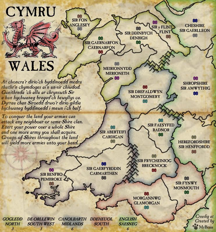
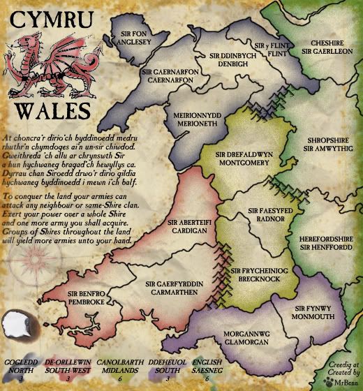
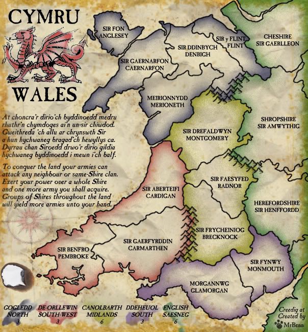
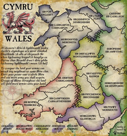
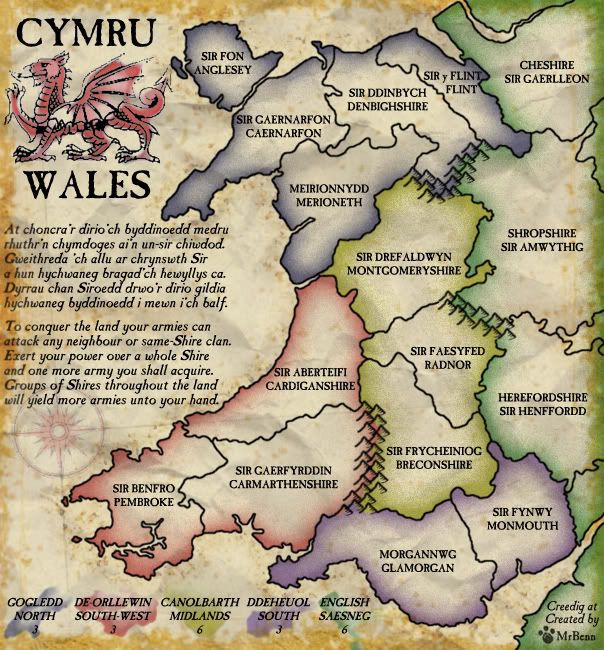
OK... It's been a little while, but here is my first attempt at a grunged-up version...
I've taken a picture of some scrumpled of paper and added that to the background as a feint texture
There is a bit of 'weathering' to the edges, but I've also sprinkled some over the map at random

I'm not wholly convinced by the fold I've put across the middle, but I'll see what others think.
After much playing around, I have learnt a bit about custom brushes and drawn some mountains I am happy with. I'm using PS6, which doesn't have a 'jitter' feature, but I think they look good regardless.
I haven't swapped the colours around as I flattened the colours layer, and will need to see if I can get an untangled copy from an early version

Which order do people think would be better for the colours?
My final comments are about image size; my working copy is bigger than the large image will be - I'll put up the correct size images once I've sorted out the colour-shift

- Click image to enlarge.
