Japan Map [abandoned]
Moderator: Cartographers
Forum rules
Please read the Community Guidelines before posting.
Please read the Community Guidelines before posting.
I love the background for the legend. The font that's used for the mountains and ports messages seems a bit off, though, like it's not really blended right (more anti-aliasing issues?). It could look nicer, but it's not really a big deal, since you only have to read that part once anyway.
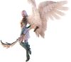
Also, cool artwork. The standing warrior is a little big; he might seem slightly less crowded by the land and legend if he were shrunk a little. But that's just my personal taste, not an objective judgement.
As for the seal, did you add the compass points to it? Maybe something without the compass points would fit better. Or maybe if the shade of yellow were different, it might match the rest of the map slightly better.
[Edit: Also, Yamanashi's caption overlaps its circle a bit. I think it'd look nicer if it didn't.]

Hi,
I thought the map on page 4 was great. Vibrant clear. The latest map you posted was just cluttered. Sometimes removing elements maps things clearer. Also, the text labels for the countries needs to be clearer.
Also, as a general suggestion I reccommend using a vector image editing program so you get clean crisp lines rather than jaggy pixelated ones. Inkscape is a free one.
I have to say I really like this mapo in general. I'm looking forward to it immensely.


-
AndyDufresne

- Posts: 24932
- Joined: Fri Mar 03, 2006 8:22 pm
- Location: A Banana Palm in Zihuatanejo
- Contact:
Well lets see...
---It's coming along rather well. The legend is on its way to being superb. The background texture for it works well for the style of the map. The font is wonderful, it gives it a nice feel of what the map is representing. That black explanations though are rather hard to read. They don't seem to quite mesh with the other areas in the legend. And I'd agree with Marv that the ports are unecessary to be explained. What are the black lines next to the two descriptions? And, I utterly dislike 'directional area' names for continents, but perhaps there aren't any other names for the area due to them being from the same starting region, but I'd surely look into seeing if there are some other names for the respective regions.
---The compass stands out glaringly. It clashes I think too much with the over all appeal of the map right now. Perhaps looking into another design or different colors/toned down colors would be something to investigate. I do like the artwork that is in the map. It helps create the Japanese feel.
---Hokkaido's name looks a little off and different compared to the other names on the map. Just a quick fix there.
---I still dislike the mountains. They seem rather unimaginative and feel like random splotches of brown paint fell onto the map, or perhaps a dozen or so worms decided to make the borders of your map their homes.
---I think your map could be benefitted from perhaps darkening and increasing the borders around the island (just so they are not the same thickness as the internal country borders).
--Andy
Well, there are some regions I can use... I was a bit worried because they weren't exact, does that matter?but perhaps there aren't any other names for the area due to them being from the same starting region, but I'd surely look into seeing if there are some other names for the respective regions.
Taking all of that out...That black explanations though are rather hard to read. They don't seem to quite mesh with the other areas in the legend. And I'd agree with Marv that the ports are unecessary to be explained. What are the black lines next to the two descriptions?
Got some artwork for mountains... forgot completely to use them lolI still dislike the mountains. They seem rather unimaginative and feel like random splotches of brown paint fell onto the map, or perhaps a dozen or so worms decided to make the borders of your map their homes
I'll get right on it...I think your map could be benefitted from perhaps darkening and increasing the borders around the island (just so they are not the same thickness as the internal country borders).
And of course that other long list of additions lol

I was the one who initially suggested an explanation of the ports system, but that was when there were three north and three south ports... now it's fairly self explanatory, so I agree it doesn't need to be there.
I've never found compass directional names to be bad... in some cases people might find it offensive to be lumped into a name for their teritory that they're not actually in.
You could try make the samurai's dark blue like the animals in the africa map, to make them blend better...
Oh and like everyone else the compass has got to go...
Legend is looking very nice.
Frigidus wrote:but now that it's become relatively popular it's suffered the usual downturn in coolness.
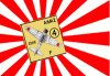


I like the compass, actually. It's very Japanese-looking with a good yellow texture (although, maybe you could dim it a bit to make it mysterious).
But I also partially agree with Nobunaga with the characters to mark the compass points. But if you do that, make sure they are Japanese characters, not Chinese.
I disagree with marv on the legend color. I think it's very becoming to the map, and gives it a little "ancient" hint in there, as if there aren't men with guns fighting to take over; just a battle back in B.C. Keep the color by all means.
I also agree that you make the words on the legend have shadowing to give it a more 3D look, which would also make it easier to read as well.
The color of the continents has to go. Get dimmer colors and put texture into the continents, as if there are very faint mountains you might see....You get the idea.
Change the ocean background. To me it looks like a blue piece of construction paper was crinkled up and then spread back out flat.
Keep up the good work, Haydena!
--Truman

Finally... Here's what I hope is the final version... And the XML is being started on now...

I've:
- Added drop shadowing to territory names.
- Put mountains instead of worms.
- Changed the compass.
- Changed the font in the legend and taken out the black font and explanations
- Thickened outlines of islands.
- Changed white text colour.
I think it's finished now. What does everyone think?
I've:
- Added drop shadowing to territory names.
- Put mountains instead of worms.
- Changed the compass.
- Changed the font in the legend and taken out the black font and explanations
- Thickened outlines of islands.
- Changed white text colour.
I think it's finished now. What does everyone think?

Fabtastic, can't wait to beat you on it.
Positive: Great guy, will always play to his best. Honourable and fun to play with as well. You know you're in for a rough time playing mrdexter Game 31384 Haydena
Positive: Mr D is the golden child of CC, if we had to elect a king he'd get my vote! Game 76700 silus
Positive: Mr D is the golden child of CC, if we had to elect a king he'd get my vote! Game 76700 silus
-
thegrimsleeper

- Posts: 984
- Joined: Thu Jan 26, 2006 10:40 am
- Location: Seattle
- Contact:

-
areyouincahoots

- Posts: 1794
- Joined: Wed Mar 15, 2006 5:34 pm
- Gender: Female
- Location: Arkansas