
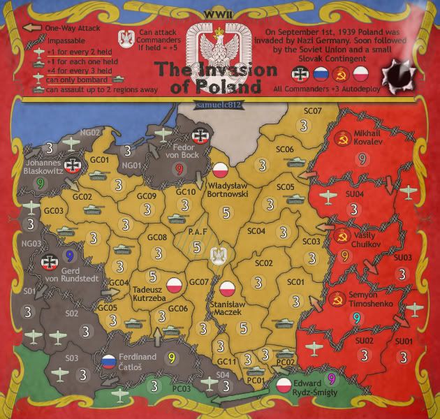
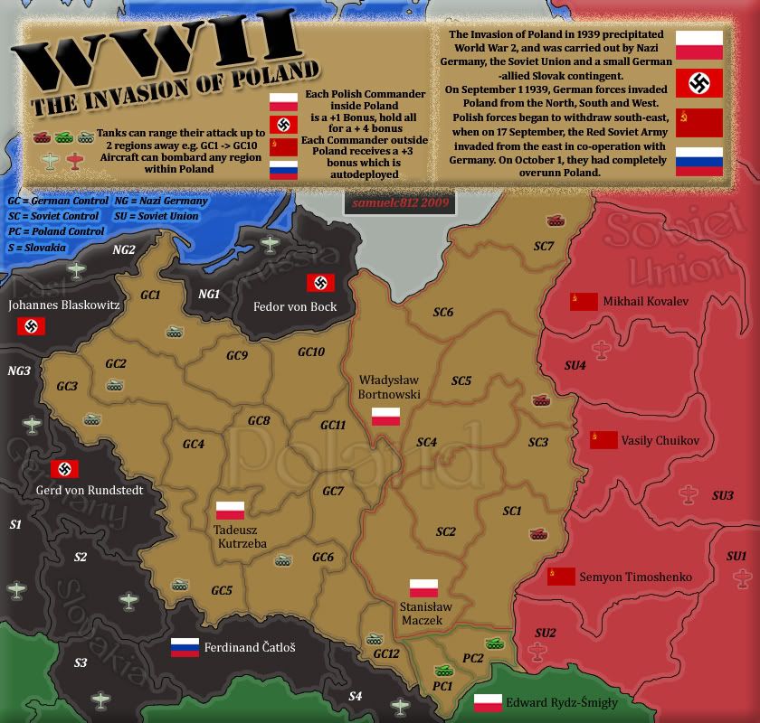
TITLE,FONTS, SYMBOLS & COLORS
The title seems good and appropiate, remember some games i've played on WWII.
Fonts are good, simple and clear.
About symbols:
Germany: you could use the symbol .44 suggested you here
Russia: you used the correct symbol, but this create a strange effect. You could try to remove only the little star on it, so you can center the symbol in the circle.I don't think there's a problem to understand that is the russian army.
Airplanes: I don't like them very much, but it's only for a personal choice.
Colors are good
Author's name: probably you can choice a better position. But in my opinion is clear that this name don't indicate a territory.
LEGEND
the legend is correct developed but you lost some dates in this update:
i see this version: http://i153.photobucket.com/albums/s237 ... landV1.jpg, you added a good description of territories names.
What means NG02?, where can i find the answer now?
I don't like the smoking hole on the right, probably could be better.
--------------------------------------------------------------------------------
For me this map is ready for main foundry.


