Is Tokyo part of the Kaoto bonus?
.44
Japan - pg 1+6 - update 3/01
Moderator: Cartographers
101 posts
• Page 4 of 5 • 1, 2, 3, 4, 5
Re: Japan - pg 1+5 - railways + Tokyo minimap added
![]() by the.killing.44 on Tue Feb 24, 2009 7:33 pm
by the.killing.44 on Tue Feb 24, 2009 7:33 pm
-

 the.killing.44
- Posts: 4724
- Joined: Thu Oct 23, 2008 7:43 pm
- Location: now tell me what got two gums and knows how to spit rhymes


Re: Japan - pg 1+5 - railways + Tokyo minimap added
![]() by InkL0sed on Tue Feb 24, 2009 8:52 pm
by InkL0sed on Tue Feb 24, 2009 8:52 pm
No.
Is that not clear?
Is that not clear?
-

InkL0sed
- Posts: 2370
- Joined: Sat Jun 23, 2007 4:06 pm
- Location: underwater


Re: Japan - pg 1+5 - railways + Tokyo minimap added
![]() by LED ZEPPELINER on Tue Feb 24, 2009 8:53 pm
by LED ZEPPELINER on Tue Feb 24, 2009 8:53 pm
InkL0sed wrote:No.
Is that not clear?
No.
-
LED ZEPPELINER
- Posts: 1088
- Joined: Tue Nov 25, 2008 10:09 pm


Re: Japan - pg 1+5 - railways + Tokyo minimap added
![]() by bryguy on Tue Feb 24, 2009 10:00 pm
by bryguy on Tue Feb 24, 2009 10:00 pm
1) The stations are confusing. How do you get to them? Where does the tokyo railway go/connect to? If you look around closely you can see where you tell about the railway stations, but the font is so small on it that it is easy to miss.
2) The Tokyo and Chugoku bonuses blend in to their respective bonus backgrounds to much. Maybe if you add a slight outer glow to each bonus? That would make them easier to see overall.
3) The font for the stations isn't the best. It is all rough and pixely, and overall does not seem to fit. Maybe pm cairns and see what font he used for Rail USA?
4) There is a little island off of Osaka, and another off of Niigata. Do these islands do anything?
5) Do KGW and Chitba connect? It is a little hard for me to tell, as they are so close to touching that I cannot really tell.
6) In the Station mini-map, you may want to put a box around the Tokyo part, otherwise people may get confused (I know I did, when I saw it I started to wonder where that giant island came from)
7) The Kyushu & Okidawa bonus box should be moved down to halfway between the names IMO
8 ) Are stations and mini-map territories starting neutral? I think they should, as otherwise a player could get around the map very fast by getting a lucky drop and having most mini-map station territories.
Overall this is a very good map. I cannot wait to watch the progress on this
-
bryguy
- Posts: 4381
- Joined: Tue Aug 07, 2007 8:50 am
- Location: Lost in a Jigsaw


Re: Japan - pg 1+5 - railways + Tokyo minimap added
![]() by wcaclimbing on Wed Feb 25, 2009 6:16 pm
by wcaclimbing on Wed Feb 25, 2009 6:16 pm
Could you make the bonus numbers darker, so they stand out more against the background in each box?
Some of them are difficult to see.
Some of them are difficult to see.

-

wcaclimbing
- Posts: 5598
- Joined: Fri May 12, 2006 10:09 pm
- Location: In your quantum box....Maybe.


Re: Japan - pg 1+4 - tentative bonuses added
![]() by RjBeals on Wed Feb 25, 2009 7:26 pm
by RjBeals on Wed Feb 25, 2009 7:26 pm

I'm not feeling the railway stations connections. I don't know much about Japan - but I'm thinking it's odd that the islands are connected by railroads.
I'm still not liking the patterns you've placed on the lands.
This map needs a little more Japanese feel. What about some bamboo or something?
The font looks a little blurry / washed out. Could you make it a little more crisp?
If Tokyo is blue on the insent map, why is it Brown on the real map?
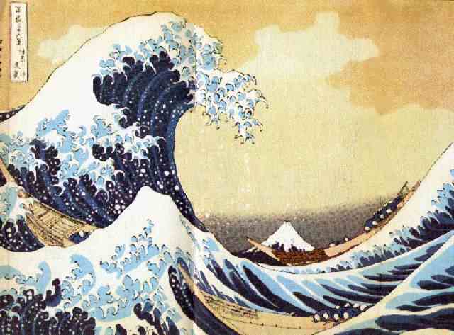
See how this image just calls out Japan? I would like yours to do the same, and it's just not at the moment. Your very close, but I think you need a little more culture in your map.
I'm impartial to the background. I would like to see an ocean option and see what looks better. Maybe with some Waves in the ocean


-

RjBeals
- Posts: 2506
- Joined: Mon Nov 20, 2006 5:17 pm
- Location: South Carolina, USA


Re: Japan - pg 1+5 - railways + Tokyo minimap added
![]() by shakeycat on Wed Feb 25, 2009 10:35 pm
by shakeycat on Wed Feb 25, 2009 10:35 pm
RJ Beals:
Somebody else tried using that wave as a background, and it didn't fly. I'd rather have the parchment. or something else plain.
Japan has a very different transportation culture than America, and for them, it makes sense to go by train. Consider this:
Tokyo to Osaka:
Driving - $120 in tolls + ~$100 in gas, 7 hours
Bullet train - 2:30 hours, $135. No check in.
Local train - 8:30 hours, $88, or $20 in the springtime
Flight - 1 hour + 1-2 hours to check in and out, $600
Bus - 8 hours, $35
Transit there is quite clean and honest. Everybody rides it, it is a very normal thing. Driving only makes sense when you are in a remote place or if you are taking many people along for a trip.
InkL0sed:
Shouldn't Hiroshima connect to Kochi, instead of Kochi connecting to Osaka or Kagoshima? The rail connection is from Okayama to Shikoku, and it is the only rail connection to the island.
-

shakeycat
- Posts: 390
- Joined: Sun Mar 11, 2007 5:13 am
- Location: Vancouver


Re: Japan - pg 1+5 - railways + Tokyo minimap added
![]() by MrBenn on Fri Feb 27, 2009 4:17 am
by MrBenn on Fri Feb 27, 2009 4:17 am
The map feels a bit disjointed, and looks like three maps in one...
Before the map moves ahead, I'd like to see a bit more clarity and less disparity between the three sections.
Before the map moves ahead, I'd like to see a bit more clarity and less disparity between the three sections.

PB: 2661 | He's blue... If he were green he would die | No mod would be stupid enough to do that
-

MrBenn
- Posts: 6880
- Joined: Wed Nov 21, 2007 9:32 am
- Location: Off Duty


Re: Japan - pg 1+5 - railways + Tokyo minimap added
![]() by ga7 on Fri Feb 27, 2009 10:00 am
by ga7 on Fri Feb 27, 2009 10:00 am
I think the Tokyo minimap should stay, but the railways are too much. If you want to increase connectivity I think you should put some ports or airports to connect the islands instead... I see there was this orientation in the previous versions, I don't get why this map needs to be that much more complicated; and while train is widely used there it isn't an excuse to make a massive railway system with giant bridges across the sea etc IMO. It's not a Railway map, it's Japan, we should have a feeling of Zen and not "crap, I need an Aspirin" about it 
I agree it would be more interesting though if the connections were a bit more linear, it might become too alike to Malta else (and I'd hate that ><). But having a couple of connecting devices to do it wouldn't overcrowd the map as it is now.
Splitting Hokkaido in two is a good idea, but these "East" and West" names are a bit bland. Unfortunately the two major cities Sapporo and Hakodate are in the west, but it'd probably fit better to have Sapporo for the West and Asahikawa for the East (although you'd need to change the border a little seeing this map. That way the beer drinker is also reminded that two widespread japanese beers are brewed in Hokkaido! Perfect really
One last thing about Hokkaido, you obviously don't have the place to put it where it belongs but the way it is now feels like it will induce people to think Hokkaido is actually set like that. While it's not CC's purpose to procure education for the geographically challenged, I think it'd be more map-like to have some kind of way to indicate it's not its real position... Not sure if another frame could really work there
If I understand well Tokyo is its own bonus and not part of the Kanto region; the Tokyo on the main map should be blue then; if you don't want to disrupt the color theme you could use one of the Tokyo symbols instead though:
http://en.wikipedia.org/wiki/Insignias_of_Tokyo
http://en.wikipedia.org/wiki/Tokyo_Tower
Which brings me to another important point, in which I agree a lot with what RJbeals said: this map reminds me of Japan about as much as the current Portugal map screams "Here is the land where Fado was born" It lacks flavour cruelly. I kinda like what you did with the region textures but apart from the two northern ones they are pretty much invisible and even a bit like an annoying blurred background in some spots. It doesn't feel enough, especially considering the fact you're going with this brown parchment general background. The huge waves might not fit, but surely several cultural elements could (another reason to get rid of the trains and have more space!). For instance the title could be bigger, have a rising red sun or a temple gate, Fuji-san would be great somewhere, and most important have kanji characters. The font you use is a good choice but it would really add up to have kanji next to it in both main title and maybe Tokyo... Besides the background you use screams for some nice calligraphy putted on it 
In any case, great work, I'm really glad someone is coming up with a quality Japan map after so many years of failed tries!
I agree it would be more interesting though if the connections were a bit more linear, it might become too alike to Malta else (and I'd hate that ><). But having a couple of connecting devices to do it wouldn't overcrowd the map as it is now.
Splitting Hokkaido in two is a good idea, but these "East" and West" names are a bit bland. Unfortunately the two major cities Sapporo and Hakodate are in the west, but it'd probably fit better to have Sapporo for the West and Asahikawa for the East (although you'd need to change the border a little seeing this map. That way the beer drinker is also reminded that two widespread japanese beers are brewed in Hokkaido! Perfect really
One last thing about Hokkaido, you obviously don't have the place to put it where it belongs but the way it is now feels like it will induce people to think Hokkaido is actually set like that. While it's not CC's purpose to procure education for the geographically challenged, I think it'd be more map-like to have some kind of way to indicate it's not its real position... Not sure if another frame could really work there
If I understand well Tokyo is its own bonus and not part of the Kanto region; the Tokyo on the main map should be blue then; if you don't want to disrupt the color theme you could use one of the Tokyo symbols instead though:
http://en.wikipedia.org/wiki/Insignias_of_Tokyo
http://en.wikipedia.org/wiki/Tokyo_Tower
Which brings me to another important point, in which I agree a lot with what RJbeals said: this map reminds me of Japan about as much as the current Portugal map screams "Here is the land where Fado was born"
In any case, great work, I'm really glad someone is coming up with a quality Japan map after so many years of failed tries!
Anarkistsdream wrote:If you guys can't tell that Doom is being forced to post this drivel, you are fools...
-

ga7
- Posts: 5344
- Joined: Fri Nov 03, 2006 1:15 pm
- Location: Pit


Re: Japan - pg 1+5 - railways + Tokyo minimap added
![]() by the.killing.44 on Mon Mar 02, 2009 8:16 pm
by the.killing.44 on Mon Mar 02, 2009 8:16 pm
I like the shading of those lines, but I hate the lines themselves. Maybe take the pen tool, make a semi-circle and stroke it?
.44
.44
-
the.killing.44
- Posts: 4724
- Joined: Thu Oct 23, 2008 7:43 pm
- Location: now tell me what got two gums and knows how to spit rhymes
Re: Japan - pg 1+6 - update 3/01
![]() by InkL0sed on Mon Mar 02, 2009 8:18 pm
by InkL0sed on Mon Mar 02, 2009 8:18 pm
Which lines? The ones around Hokkaido?
-
InkL0sed
- Posts: 2370
- Joined: Sat Jun 23, 2007 4:06 pm
- Location: underwater
Re: Japan - pg 1+6 - update 3/01
![]() by the.killing.44 on Mon Mar 02, 2009 8:20 pm
by the.killing.44 on Mon Mar 02, 2009 8:20 pm
InkL0sed wrote:Which lines? The ones around Hokkaido?
Yeah, I shoulda said so. They seem too straight and blocky for the rest of the map.
.44
-
the.killing.44
- Posts: 4724
- Joined: Thu Oct 23, 2008 7:43 pm
- Location: now tell me what got two gums and knows how to spit rhymes
Re: Japan - pg 1+6 - update 3/01
![]() by captainwalrus on Thu Mar 12, 2009 6:34 pm
by captainwalrus on Thu Mar 12, 2009 6:34 pm
Tokyo should be worth a lot more. It has 8 boarders! And should there be a bonus for holding a cirtain amount of train stations? That would be good.
-

captainwalrus
- Posts: 1018
- Joined: Sun Nov 11, 2007 3:19 pm
- Location: Finnmark


Re: Japan - pg 1+6 - update 3/01
![]() by sailorseal on Thu Mar 12, 2009 6:42 pm
by sailorseal on Thu Mar 12, 2009 6:42 pm
captainwalrus wrote:Tokyo should be worth a lot more. It has 8 boarders! And should there be a bonus for holding a cirtain amount of train stations? That would be good.
I kind of agree but at the same time I feel it is crowded
-
sailorseal
- Posts: 2735
- Joined: Sun May 25, 2008 1:49 pm
- Location: conquerclub.com


Re: Japan - pg 1+6 - update 3/01
![]() by InkL0sed on Thu Mar 12, 2009 10:27 pm
by InkL0sed on Thu Mar 12, 2009 10:27 pm
captainwalrus wrote:Tokyo should be worth a lot more. It has 8 boarders! And should there be a bonus for holding a cirtain amount of train stations? That would be good.
Yeah, but if you hold Tokyo along with Kanto, you get a +11 bonus.
-
InkL0sed
- Posts: 2370
- Joined: Sat Jun 23, 2007 4:06 pm
- Location: underwater
Re: Japan - pg 1+6 - update 3/01
![]() by Dublanous1 on Sat Mar 14, 2009 6:34 pm
by Dublanous1 on Sat Mar 14, 2009 6:34 pm
I like it, but I think maybe making the title "Japan" at the top instead of the bottom right would make a difference, (you need a bigger title)
-
Dublanous1
- Posts: 77
- Joined: Thu Sep 18, 2008 3:00 pm
- Location: NYC
Re: Japan - pg 1+6 - update 3/01
![]() by zimmah on Wed Mar 18, 2009 10:16 am
by zimmah on Wed Mar 18, 2009 10:16 am
i think you should fix the note and the territories that have a rail station, it's very hard to read them.
- Click image to enlarge.

-

zimmah
- Posts: 1652
- Joined: Fri Jun 01, 2007 12:43 pm
- Location: VDLL


Re: Japan - pg 1+6 - update 3/01
![]() by jarrett155 on Fri Mar 20, 2009 4:56 pm
by jarrett155 on Fri Mar 20, 2009 4:56 pm
i dont see okinawa on the map why is it in the key?
-
jarrett155
- Posts: 226
- Joined: Tue Nov 27, 2007 6:25 pm


Re: Japan - pg 1+6 - update 3/01
![]() by tlane on Thu Mar 26, 2009 10:48 pm
by tlane on Thu Mar 26, 2009 10:48 pm
This map looks great so far! 
I agree with zimmah though, about the note and rail stations, the text is to hard to read.
The mini-map looks great, but could you increase the opacity on the railroad just a little bit.
Also, could you move the army numbers and the name on Aomori, so that the name is moved a little to the left and up, and the numbers are moved to the bottom left.
(i realize this is really nit-picking, sorry)
tlane
I agree with zimmah though, about the note and rail stations, the text is to hard to read.
zimmah wrote:i think you should fix the note and the territories that have a rail station, it's very hard to read them.
The mini-map looks great, but could you increase the opacity on the railroad just a little bit.
Also, could you move the army numbers and the name on Aomori, so that the name is moved a little to the left and up, and the numbers are moved to the bottom left.
(i realize this is really nit-picking, sorry)
tlane
-
tlane
- Posts: 309
- Joined: Wed Oct 22, 2008 7:11 pm
- Location: NYC - sint maarten(sometimes)
Re: Japan - pg 1+6 - update 3/01
![]() by captainwalrus on Tue Mar 31, 2009 2:51 pm
by captainwalrus on Tue Mar 31, 2009 2:51 pm
This looks good, and I like the trains, but it seems a little crouded. Either try to cram less territories on a rather small map, or make the map larger.
~
~
~ CaptainWalrus
-
captainwalrus
- Posts: 1018
- Joined: Sun Nov 11, 2007 3:19 pm
- Location: Finnmark
Re: Japan - pg 1+6 - update 3/01
![]() by whitestazn88 on Tue Mar 31, 2009 4:02 pm
by whitestazn88 on Tue Mar 31, 2009 4:02 pm
wow, you know i haven't been in the foundry in a while when the next attempt at japan is already up to its 6th version without knowing...
anyways. it looks pretty good. I like the idea of putting tokyo as a big area blown up. furthermore, i like the train stations, it adds another layer that is actually good looking. I would say though, maybe change the name of the station to something other than "fuk"... could be deemed inappropriate.
alright, well thats all for now. keep up the good work. hope this one is the one to get japan out of the foundry for good (and into live play, that is.)
-
whitestazn88
- Posts: 3128
- Joined: Mon Feb 05, 2007 2:59 pm
- Location: behind you
Re: Japan - pg 1+6 - update 3/01
![]() by thenobodies80 on Mon Apr 06, 2009 7:12 am
by thenobodies80 on Mon Apr 06, 2009 7:12 am
Good map. Look interesting
Probably an oversight on station.
In the minimap seems missed the CHIBA station.
TNBDS
Probably an oversight on station.
In the minimap seems missed the CHIBA station.
TNBDS
-

thenobodies80
- Posts: 5400
- Joined: Wed Sep 05, 2007 4:30 am
- Location: Milan


Re: Japan - pg 1+6 - update 3/01
![]() by thenobodies80 on Mon Apr 06, 2009 1:48 pm
by thenobodies80 on Mon Apr 06, 2009 1:48 pm
Come back with other few suggestions :
1. The Kansai zone is a bit much compressed ( i know you have few space )
2. Same for Tokio zone, and here you have some space to use
3. Shikoku zone color is too similar to Kyusu & Okinawa one, try to switch the two zones colors.
4. Same (point 3) for Chugoku and kansai
5. Try to put the kyushu & okinawa names in the last positon in the legend, could be nicer, simply switch it with the "tokio line".
On the whole a good map, in my opinion could be moved in the main foundry in few time.
Good work
TNBDS
1. The Kansai zone is a bit much compressed ( i know you have few space
2. Same for Tokio zone, and here you have some space to use
3. Shikoku zone color is too similar to Kyusu & Okinawa one, try to switch the two zones colors.
4. Same (point 3) for Chugoku and kansai
5. Try to put the kyushu & okinawa names in the last positon in the legend, could be nicer, simply switch it with the "tokio line".
On the whole a good map, in my opinion could be moved in the main foundry in few time.
Good work
TNBDS
-
thenobodies80
- Posts: 5400
- Joined: Wed Sep 05, 2007 4:30 am
- Location: Milan
Re: Japan - pg 1+6 - update 3/01
![]() by rjz115dude on Sat Apr 11, 2009 2:06 pm
by rjz115dude on Sat Apr 11, 2009 2:06 pm
i like this map alot, the only thing i dont get is why there's railroads on the minimap...doesn't make sense for me
-
rjz115dude
- Posts: 52
- Joined: Sun Dec 07, 2008 7:10 pm
101 posts
• Page 4 of 5 • 1, 2, 3, 4, 5
Return to Melting Pot: Map Ideas
Who is online
Users browsing this forum: No registered users
|
|||||||
| Conquer Club is not associated with RISK online in any way. Copyright © 2006-2025 by Big Wham LLC | |||||||