[Abandoned] - Alaska
Moderator: Cartographers
88 posts
• Page 1 of 4 • 1, 2, 3, 4
[Abandoned] - Alaska
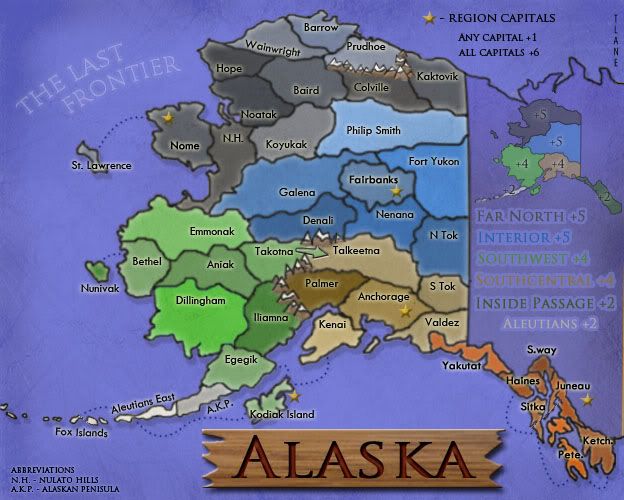
Alaska
Territories:44
Continents: 6
Created by: tlane
All comments are welcomed!!
Changed:
-colors
-mountains(took out river)
-added a shperize effect
and some more little changes
Working on:
-spherize effect - in response to oak's comment I tired putting some effect of the map to make it look more like it was bigger(more on top of the world). After experimenting with this, I found that the sherize effect seemed to work the best(even though it causes problems with changes in the future), but now after talking WM about the great lakes map he told me another way. To do this it would mean an almost complete overhaul of the map and I am not sure how necessary it is. Any Comments
-I am also working on the mountains, still dont know if they fit in perfectly well
Some info:
-I made the current region capital symbols stars to represent the Alaska flag(these symbols are probably going to change).
-I am not going to have army circles on the small version but I will on the big(any objections please post).
-all region capitals will start with 3 neutral(if people think they should start with more, like 4 or something, please post).
-I am thinking about adding in something about the oil pipeline, comments.
v5
http://i424.photobucket.com/albums/pp322/conquerlane/alaska5.jpg
v4.1
http://i424.photobucket.com/albums/pp322/conquerlane/alaska41.jpg
v4
http://i424.photobucket.com/albums/pp322/conquerlane/alaska4-1.jpg
v3.1
http://i424.photobucket.com/albums/pp322/conquerlane/alaska3-1.jpg
with numbers
http://i424.photobucket.com/albums/pp322/conquerlane/alaska3s.jpg
v3
http://i424.photobucket.com/albums/pp322/conquerlane/alaska3.jpg
v2
http://i424.photobucket.com/albums/pp322/conquerlane/alaskav2.jpg
original:
with no background
http://i424.photobucket.com/albums/pp322/conquerlane/alaska2.jpg
with background
http://i424.photobucket.com/albums/pp322/conquerlane/alaska.jpg
hope people like it!
tlane
Last edited by tlane on Thu May 28, 2009 3:13 pm, edited 13 times in total.
-
 tlane
tlane
- Posts: 309
- Joined: Wed Oct 22, 2008 7:11 pm
- Location: NYC - sint maarten(sometimes)


Re: Alaska V1
can you get rid of straight edge for edge of continents
-

 miniwally
- Posts: 257
- Joined: Sat Jul 19, 2008 2:56 pm


Re: Alaska V1
Well i based it off this pic (see link)
http://www.travelalaska.com/images/maps/Alaska_Regional.jpg
but if u still think i should change it i will
tlane
http://www.travelalaska.com/images/maps/Alaska_Regional.jpg
but if u still think i should change it i will
tlane
-
 tlane
tlane
- Posts: 309
- Joined: Wed Oct 22, 2008 7:11 pm
- Location: NYC - sint maarten(sometimes)


Re: Alaska V1
Ok, you need to write out the bonuses and put your name somewhere on it, but good atempt tlane
-
 Dublanous1
- Posts: 77
- Joined: Thu Sep 18, 2008 3:00 pm
- Location: NYC


Re: Alaska V1
Dublanous1 wrote:Ok, you need to write out the bonuses and put your name somewhere on it, but good atempt tlane
Trying to figure out what you mean by "write out the bonuses". If you don't see, I have the names of the bonuses on the right side of the map(i don't have the numbers yet though, still working those out). Also i am hoping this is better then a "atempt".
tlane
-
 tlane
tlane
- Posts: 309
- Joined: Wed Oct 22, 2008 7:11 pm
- Location: NYC - sint maarten(sometimes)


Re: Alaska V1
Ok, Yeah, I meant the bonus #s. Also, there is another issue. If you see the bottom right of the map there is a blue area, its really confusing because there is another Green that looks alot similar and u might think its the same thing, you might want to change that.
-
 Dublanous1
- Posts: 77
- Joined: Thu Sep 18, 2008 3:00 pm
- Location: NYC


Re: Alaska V1
i will take that into consideration.
I am trying to think of a better background and if anyone has ideas on that, it would be much appreciated.
tlane
I am trying to think of a better background and if anyone has ideas on that, it would be much appreciated.
tlane
-
 tlane
tlane
- Posts: 309
- Joined: Wed Oct 22, 2008 7:11 pm
- Location: NYC - sint maarten(sometimes)


Re: Alaska V1
The divisions look really unnatural. Also, I think you could use beter colors that more represent Alaska. More blues, greens, and greys.
-
 el-presidente
- Posts: 158
- Joined: Fri Sep 19, 2008 2:14 pm


Re: Alaska V1
el-presidente wrote:The divisions look really unnatural. Also, I think you could use beter colors that more represent Alaska. More blues, greens, and greys.
working on that. I had made a mistake with the current geography and i am working on that, i am also working on the color scheme.
tlane
-
 tlane
tlane
- Posts: 309
- Joined: Wed Oct 22, 2008 7:11 pm
- Location: NYC - sint maarten(sometimes)


Re: Alaska V1
You're making it on photo shop? Correct me if I am wrong, where did you get your backround? Did you make it on photo shop? And I think a simple non-wavy just plain blue background would work. The waves arent totally necessary.
-

 pinkflaminko
- Posts: 111
- Joined: Wed Oct 01, 2008 12:35 pm
- Location: the tenderloin


Re: Alaska V1
pinkflaminko wrote:You're making it on photo shop? Correct me if I am wrong, where did you get your backround? Did you make it on photo shop? And I think a simple non-wavy just plain blue background would work. The waves arent totally necessary.
i have a new background on the way and i should have an update by tonight.
there are also many other up-dates coming.
-
 tlane
tlane
- Posts: 309
- Joined: Wed Oct 22, 2008 7:11 pm
- Location: NYC - sint maarten(sometimes)


Re: Alaska V1
i am away on vacation now so i am not fully done with the update, but i wanted to post this up so i could get some feedback
changed:
background
continent borders
working on:
new colors
(have another theme in mind that i may try)
any comments are welcome as long as they will improve the map.
tlane
changed:
background
continent borders
working on:
new colors
(have another theme in mind that i may try)
any comments are welcome as long as they will improve the map.
tlane
sailorseal wrote:come on, now i am all sticky
-
 tlane
tlane
- Posts: 309
- Joined: Wed Oct 22, 2008 7:11 pm
- Location: NYC - sint maarten(sometimes)


Re: Alaska V2 - pg1
need to decide if i make the continents all one color or keep it how it is with different shades
-
 tlane
tlane
- Posts: 309
- Joined: Wed Oct 22, 2008 7:11 pm
- Location: NYC - sint maarten(sometimes)


Re: Alaska V2 - pg1
tlane wrote:need to decide if i make the continents all one color or keep it how it is with different shades
i'd prefer different shades
-

 miniwally
- Posts: 257
- Joined: Sat Jul 19, 2008 2:56 pm


Re: Alaska V2 - pg1
Each continent needs its own color, and i like the idea of different shades, since this map has few enough terits. This makes borders more clear. But i think the Southwest continent and the Inside Passage continent look like they are the same color. Changing either of them would be a plus.
Oh, and are the region capitals a +1 or an autodeploy of 1? just curiosity. It looks like the former, but i wanted to check.
Oh, and are the region capitals a +1 or an autodeploy of 1? just curiosity. It looks like the former, but i wanted to check.
-

 ustus
ustus
- Posts: 291
- Joined: Thu Nov 20, 2008 3:49 pm


Re: Alaska V2 - pg1
You need to change a few things, which everyone else have already said.
Otherwise, it looks pretty good.
Take off the background though, that just makes it look cheesy. The background on the original map is good.
Otherwise, it looks pretty good.
Take off the background though, that just makes it look cheesy. The background on the original map is good.
Remember Them
-

 Simon Viavant
- Posts: 328
- Joined: Thu Jan 24, 2008 9:17 pm
- Location: Alaska


Re: Alaska V2 - pg1
ustus wrote:Each continent needs its own color, and i like the idea of different shades, since this map has few enough terits. This makes borders more clear. But i think the Southwest continent and the Inside Passage continent look like they are the same color. Changing either of them would be a plus.
Oh, and are the region capitals a +1 or an autodeploy of 1? just curiosity. It looks like the former, but i wanted to check.
I am working on changing the color of inside passage to brown(if there is another color people like i will use it).
I currently have the region capitals as +1 but if people want it to be an auto-deploy of one i will make it that.
What do people think of the background? There are no other maps currently quenched that have a background anything like it so it is a new idea, and i don't know if people like it or not.
tlane
-
 tlane
tlane
- Posts: 309
- Joined: Wed Oct 22, 2008 7:11 pm
- Location: NYC - sint maarten(sometimes)


Re: Alaska V2 - pg1
Simon Viavant wrote:You need to change a few things, which everyone else have already said.
Otherwise, it looks pretty good.
Take off the background though, that just makes it look cheesy. The background on the original map is good.
i made the post before your post.
Do you mean the blue background or just white.
Anyways i will try to come up with another idea(for background)
tlane
sailorseal wrote:come on, now i am all sticky
-
 tlane
tlane
- Posts: 309
- Joined: Wed Oct 22, 2008 7:11 pm
- Location: NYC - sint maarten(sometimes)


Re: Alaska V2 - pg1
You've made a good start here.
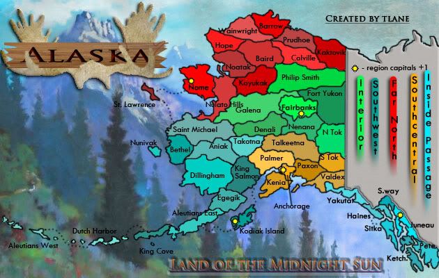
The whole map feels a bit compressed, and you have lots of empty space that hasn't been utilised very well. The territories feel a lot too small, and I'm not too sure you're going to fit army numbers in there very easily
I'm not sold on the background - it feels a bit overwhelming, and I dislike the blurriness of it.
The design element that jumps out the most is the vertical stripes on the right-hand side... Am I right in thinking that this is just a marker that indicates the names of the capitals, and isn't relevant to gameplay?
I'd be interested to see the other colour-scheme you have in mind. Hopefully it captures the heart of the 'Land of the Midnight Sun' theme of your tagline?
The whole map feels a bit compressed, and you have lots of empty space that hasn't been utilised very well. The territories feel a lot too small, and I'm not too sure you're going to fit army numbers in there very easily

I'm not sold on the background - it feels a bit overwhelming, and I dislike the blurriness of it.
The design element that jumps out the most is the vertical stripes on the right-hand side... Am I right in thinking that this is just a marker that indicates the names of the capitals, and isn't relevant to gameplay?
I'd be interested to see the other colour-scheme you have in mind. Hopefully it captures the heart of the 'Land of the Midnight Sun' theme of your tagline?

PB: 2661 | He's blue... If he were green he would die | No mod would be stupid enough to do that
-

 MrBenn
- Posts: 6880
- Joined: Wed Nov 21, 2007 9:32 am
- Location: Off Duty


Re: Alaska V2 - pg1
I guess I'm alone so far, but I really like the background!
I agree that the space is not used very well, and there is a lot of empty space since the Aleutian Islands stretch so far.
The current color scheme of the territories doesn't thrill me, and I think the font could be spiced up a bit. Also, watch out for areas like "st" in St. Lawrence because the black font is on top of a dark tree and its hard to see. Similarly Nelato Hills is hard to read because it overlaps the territory borders. Those are minor concerns though, compared to the overall look and feel of the map which you need to finalize first.
-

 sully800
- Posts: 4978
- Joined: Wed Jun 14, 2006 5:45 pm
- Location: Bethlehem, Pennsylvania


Re: Alaska V2 - pg1
MrBenn wrote:You've made a good start here.
thanks
sully800 wrote:I guess I'm alone so far, but I really like the background!
MrBenn wrote:I'm not sold on the background - it feels a bit overwhelming, and I dislike the blurriness of it.
I am working on a new background and there are more people that think it is overwhelming then people that like it, so I am going to try not to make it overwhelming but also something that the people who like the current background may like too.
MrBenn wrote:The whole map feels a bit compressed, and you have lots of empty space that hasn't been utilised very well. The territories feel a lot too small, and I'm not too sure you're going to fit army numbers in there very easily
I am working on expanding the land a little(making use of the empty space), which will help with fit in the army numbers, but I am also going to take out a few territories.
sully800 wrote:I agree that the space is not used very well, and there is a lot of empty space since the Aleutian Islands stretch so far.
You are right about the Aleutian Islands, they are making it hard for me to use all the space, but I have a few ideas to use that space up(possibly an insert of the inside passage), but i have to see how these ideas will look.
MrBenn wrote:The design element that jumps out the most is the vertical stripes on the right-hand side... Am I right in thinking that this is just a marker that indicates the names of the capitals, and isn't relevant to gameplay?
no, the names are the names of the bonus regions, I just haven't come up with bonus numbers, so it is(will be) relevant to gameplay, but if i should change it to something else i will(any ideas).
(i have not been able to start on the next version yet, so when i do and I make use the empty space this may change^^)
MrBenn wrote:I'd be interested to see the other colour-scheme you have in mind. Hopefully it captures the heart of the 'Land of the Midnight Sun' theme of your tagline?
sully800 wrote:The current color scheme of the territories doesn't thrill me, and I think the font could be spiced up a bit. Also, watch out for areas like "st" in St. Lawrence because the black font is on top of a dark tree and its hard to see. Similarly Nelato Hills is hard to read because it overlaps the territory borders. Those are minor concerns though, compared to the overall look and feel of the map which you need to finalize first.
i am working on it
tlane
sailorseal wrote:come on, now i am all sticky
-
 tlane
tlane
- Posts: 309
- Joined: Wed Oct 22, 2008 7:11 pm
- Location: NYC - sint maarten(sometimes)


Re: Alaska V2 - pg1
There are some places where it is hard to read the territory names against that background. Also, in the southeastern region it is hard to tell where things border. If you clear those things up, add some mountains and rivers and make it a little more wilderness-ish. then you will have a pretty good map. The colors aren't that great IMO so you should fool around a bit with them. Have you ever been to Alaska? It might help if you have, and it is beutifull, so go now! It could also be a little bigger so it is less crouded.
-

 captainwalrus
- Posts: 1018
- Joined: Sun Nov 11, 2007 3:19 pm
- Location: Finnmark


Re: Alaska V2 - pg1
So I was really excited about this map since I was born in Alaska. That said, there are a few grammatical/geographic errors.
"Kenia" is actually spelled "Kenai", also "Valdex" should be "Valdez". Technically speaking "Prudhoe" should be "Prudhoe Bay" & "Hope" should be "Point Hope". Where did you get the name "Philip Smith" from? The village of St. Michael is actually outside of the region you named "St. Michael". Maybe "Emmonak" (a village on the coast) as an alternate name? Lastly, & this is a big stickler since I went to school in King Salmon... The village of King Salmon is actually located in the region "Egegik" (though Egegik is located there too so that name isn't a problem". Maybe you could rename the "King Salmon" region "Iliamna" (the name of a village and also of a very large lake within that region)?
But, even aside from my issues, I'm totally stoked for this map! Keep up the good work!
-
 anglophileRVK
- Posts: 6
- Joined: Sat Jan 28, 2006 1:55 am
- Location: Chicago


Re: Alaska V2 - pg1
the background is killing me
also, the south west and inside passage look too similar to me.
also, the south west and inside passage look too similar to me.
-
 whitestazn88
- Posts: 3128
- Joined: Mon Feb 05, 2007 2:59 pm
- Location: behind you


Re: Alaska V2 - pg1
I am working on all of this,
Thanks anglophile for the info, hope you like the map
i have a lot of school work on my plate so it may be a few more days until a new version,
tlane
Thanks anglophile for the info, hope you like the map
i have a lot of school work on my plate so it may be a few more days until a new version,
tlane
sailorseal wrote:come on, now i am all sticky
-
 tlane
tlane
- Posts: 309
- Joined: Wed Oct 22, 2008 7:11 pm
- Location: NYC - sint maarten(sometimes)


88 posts
• Page 1 of 4 • 1, 2, 3, 4
Who is online
Users browsing this forum: No registered users


