Um...wow? This is a positively enormous improvement from Version 1 to Version 2. Bravo sir, bravo. Keep the good work up based on the feedback you get (which should increase over time, no worries).
Graphics- The textures technically work, though I don't think the picked grunge texture fits best with the parchment look you're aiming for. Fiddle around with textures to get a paper-looking texture, even a dirty one.
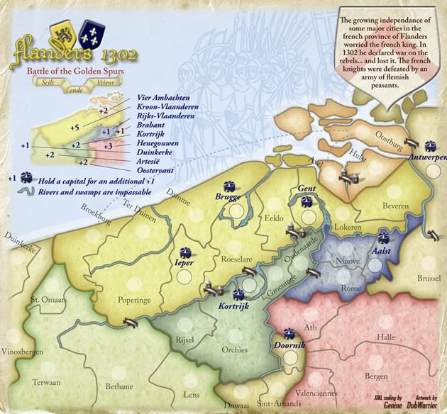
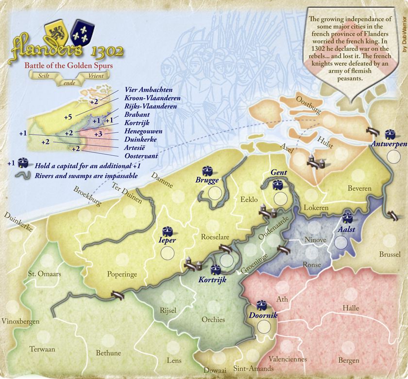
- The parchment border clashes with the rest of the map in places, particularly the middle right and top right. Try to work in the paper more with the rest of the map. Oaktown just finished a paper-like map (Indian Empire), ask him for some tips.
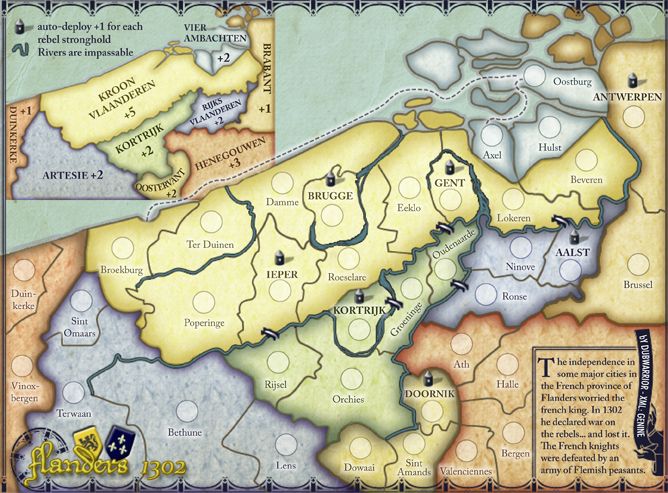
- The capitals look like circus tents. While a 3D symbol is nice, I think the original ivy leaf (or whatever plant that was, not a botanist

) looked better. Perhaps fiddle with the look of the ivy leaf symbol so it changes with continent, or is slightly raised above the map, or what-have-you.
- The assumed borders on the impassables I don't think works with the map, mostly because the impassable outline color differs from the border color. I would suggest changing the border color to match the impassable outline. Try doing a small sample and seeing if that fits better, as right now I have to remind myself that the impassables terminate a country border as well as the normal border lines.
- The bridges work with the map quite well, the different bridge seems out of place. It may be more special in history, but gameplay-wise it seems to note a special element that doesn't exist (i.e., source of confusion).
Gameplay- The legend is a confusing mess. It would do much better to move the title over (on top of the outline picture on the sea, which adds to flavor quite nicely), and enlarge the minimap to the point that you can stick region names on it, as well as the bonus if at all possible. If not that, try re-adding regions to the map proper. I think that worked, but the way the text was made it hard to read.
- Is it a +1 bonus for a capital or a +1 autodeploy? I would suggest the latter, or have neutral start capitals due to the number of them.
- Continuity-wise, you have different signatures in the small and large. I prefer the large version's signature.
I promised, and I delivered. You got

.