hm... too much like Canada? I can see that, though it wasn't my intention. Dublin Doogey had suggested the current direction in our PMs...
feedback for the map seems good. a lot of it was what i've been thinking since starting a game on it the other day. a lot of circles need to be moved and there're definitely several areas that can be more clear.
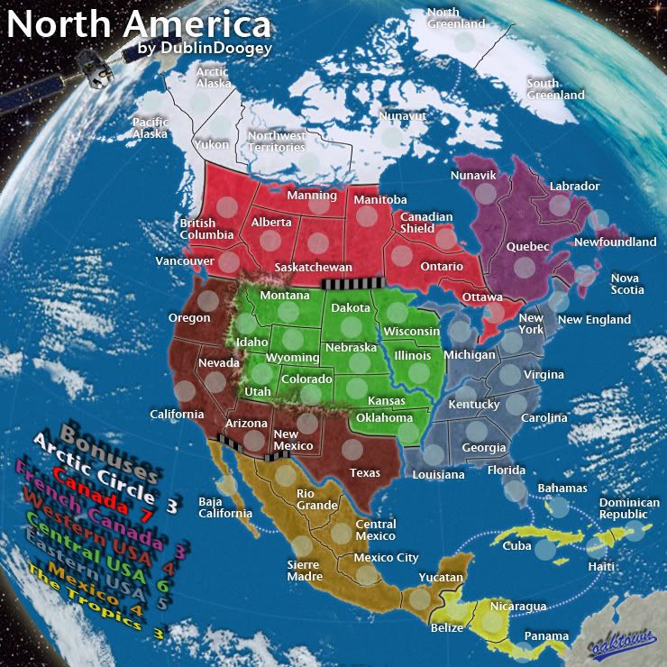
i'm assuming it's still here but i liked the bright look of the africa map, maybe for colors we could go in that direction. i dunno how far the graphic redesign was going to go but i think it could be good to redraw the map over a satellite image, maybe something like the google map terrain option? it doesn't really have good proportions but yeah.
So, satellite image, with more traditional CC colors. As you all know, I'm more into making maps that have a vintage feel to them, so trying to make a satellite image map has been a bit outside of my comfort zone. I personally think this looks pretty good for a first draft of something I've never done before, but where I'm having trouble is reconciling the photo-realistic elements like the oceans and clouds with the region colors, borders, and other elements necessary for a CC map. Recreating a photo is easy, and making a CC is no problem, but putting the two together is proving a challenge.
As I write this, I'm having a thought. What about keeping this shape, but making it into a desk globe?


Why does every photo of a globe show Africa??