Japan - 日本 - Quenched
Moderator: Cartographers
Re: Japan - 日本 (D, Gp) V7.6 (Updated 10-1) pg20 Ready for love'n
![]() by ender516 on Thu Oct 01, 2009 11:16 am
by ender516 on Thu Oct 01, 2009 11:16 am
All good changes, fine looking map.
-

 ender516
- Posts: 4455
- Joined: Wed Dec 17, 2008 6:07 pm
- Location: Waterloo, Ontario


Re: Japan - 日本 (D, Gp) V7.6 (Updated 10-1) pg20 Ready for love'n
![]() by RedBaron0 on Thu Oct 01, 2009 12:45 pm
by RedBaron0 on Thu Oct 01, 2009 12:45 pm
Oh yeah, I fixed that mountain and border by Sendai too. 


-

RedBaron0
- Posts: 2657
- Joined: Sun Aug 19, 2007 12:59 pm
- Location: Pennsylvania


Re: Japan - 日本 (D, Gp) V7.6 (Updated 10-1) pg20 Ready for love'n
![]() by jefjef on Thu Oct 01, 2009 12:49 pm
by jefjef on Thu Oct 01, 2009 12:49 pm
The flag & color fix... 100% better. It really makes the map jump out. Let's play!
This post was made by jefjef who should be on your ignore list.

drunkmonkey wrote:I'm filing a C&A report right now. Its nice because they have a drop-down for "jefjef".
-

jefjef
- Posts: 6026
- Joined: Mon Feb 23, 2009 8:41 pm
- Location: on my ass


Re: Japan - 日本 (D, Gp) V7.6 (Updated 10-1) pg20 Ready for love'n
![]() by porkenbeans on Thu Oct 01, 2009 5:33 pm
by porkenbeans on Thu Oct 01, 2009 5:33 pm
- Click image to enlarge.
Maybe you might consider a change to something like this on the flag.

-

porkenbeans
- Posts: 2546
- Joined: Mon Sep 10, 2007 4:06 pm


Re: Japan - 日本 (D, Gp) V7.6 (Updated 10-1) pg20 Ready for love'n
![]() by jefjef on Thu Oct 01, 2009 5:46 pm
by jefjef on Thu Oct 01, 2009 5:46 pm
Porkenbeans flag works too (If the color would be fixed)
This post was made by jefjef who should be on your ignore list.
drunkmonkey wrote:I'm filing a C&A report right now. Its nice because they have a drop-down for "jefjef".
-
jefjef
- Posts: 6026
- Joined: Mon Feb 23, 2009 8:41 pm
- Location: on my ass
Re: Japan - 日本 (D, Gp) V7.6 (Updated 10-1) pg20 Ready for love'n
![]() by porkenbeans on Thu Oct 01, 2009 7:08 pm
by porkenbeans on Thu Oct 01, 2009 7:08 pm
jefjef wrote:Porkenbeans flag works too (If the color would be fixed)
Do you mean lie this ?
- Click image to enlarge.
I also farted around with the contrast and saturation levels a tiny bit. It is a slightly different look with the colors just a touch more vibrant. I think it works, but it is a matter of individual taste I guess.
Also, I think that the black text under the flag could stand to be lowered about 1/2 inch.
Also, I think that the bushito tag would work better if all 3 lines were aligned on the right.
Last edited by porkenbeans on Thu Oct 01, 2009 7:25 pm, edited 1 time in total.
-
porkenbeans
- Posts: 2546
- Joined: Mon Sep 10, 2007 4:06 pm
Re: Japan - 日本 (D, Gp) V7.6 (Updated 10-1) pg20 Ready for love'n
![]() by jefjef on Thu Oct 01, 2009 7:21 pm
by jefjef on Thu Oct 01, 2009 7:21 pm
Spectacular! Love the brightness. Both versions are sweet. (I'd clap but my smiley's aren't working) Lets play
This post was made by jefjef who should be on your ignore list.
drunkmonkey wrote:I'm filing a C&A report right now. Its nice because they have a drop-down for "jefjef".
-
jefjef
- Posts: 6026
- Joined: Mon Feb 23, 2009 8:41 pm
- Location: on my ass
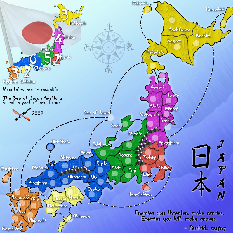
Re: Japan - 日本 (D, Gp) V7.7 (Updated 10-2) pg21 Ready for love'n
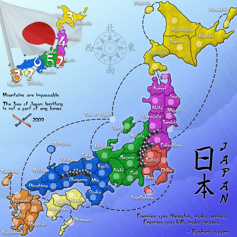
![]() by RedBaron0 on Thu Oct 01, 2009 11:23 pm
by RedBaron0 on Thu Oct 01, 2009 11:23 pm
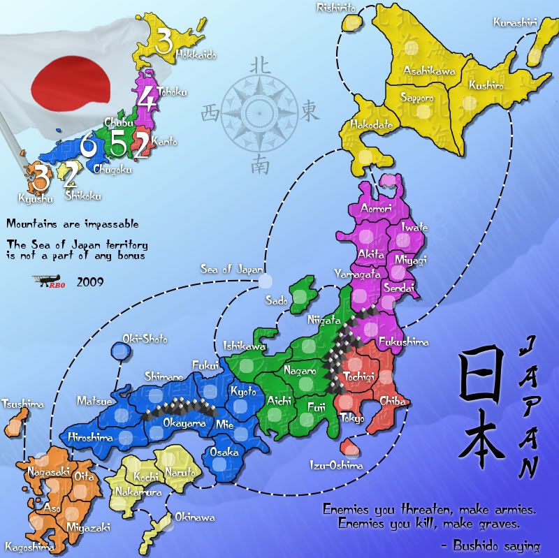
Version 7.7
Small - 601x600
Large - 800x799
I pretty much replicated what you've got pork, I didn't go quite as bright when fiddling with the contrast. I think the red in Kanto and the circle in the flag, you have in particular is bordering on too bright. I did not move the text. I really like the centered look. I think it reads much better than either a right or left margin.
Ugh... we're going to change every little thing 5 different times until I get a look in from the Foundry team.](./images/smilies/eusa_wall.gif "Brick wall")
Small - 601x600
- Click image to enlarge.
Large - 800x799
- Click image to enlarge.
I pretty much replicated what you've got pork, I didn't go quite as bright when fiddling with the contrast. I think the red in Kanto and the circle in the flag, you have in particular is bordering on too bright. I did not move the text. I really like the centered look. I think it reads much better than either a right or left margin.
Ugh... we're going to change every little thing 5 different times until I get a look in from the Foundry team.
-
RedBaron0
- Posts: 2657
- Joined: Sun Aug 19, 2007 12:59 pm
- Location: Pennsylvania
Re: Japan - 日本 (D, Gp) V7.7 (Updated 10-2) pg21 Ready for love'n
![]() by ender516 on Fri Oct 02, 2009 1:01 am
by ender516 on Fri Oct 02, 2009 1:01 am
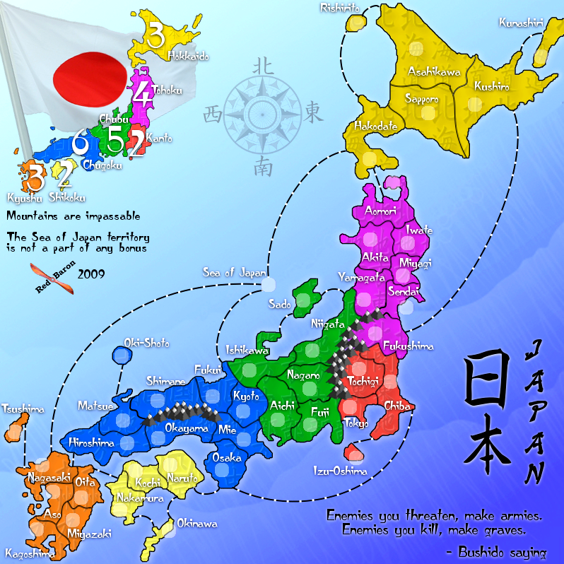
Well, for the sake of separating the red dot from the minimap, which I don't think was necessary, you have now lost the details of the folds on the white field of the flag, which is now too washed out. I prefer version 7.6.
-
ender516
- Posts: 4455
- Joined: Wed Dec 17, 2008 6:07 pm
- Location: Waterloo, Ontario
Re: Japan - 日本 (D, Gp) V7.7 (Updated 10-2) pg21 Ready for love'n
![]() by porkenbeans on Fri Oct 02, 2009 2:09 am
by porkenbeans on Fri Oct 02, 2009 2:09 am
Red,
I have never seen a mapmaker that is so keen at accepting good suggestions as you. Most of them are so protective of their maps, that they do not want to alter anything, for fear that it would somehow be less "their" map. You have a very good eye, and know a good idea when you see it. It has been a wonderful experience working on your map with you. I think this baby is one of the best that I have seen come out of the foundry lately.
I have added your name to The Map Makers Guild. viewforum.php?f=409&start=0
Come by and check us out. I know that you will be a welcomed member. Feel free to browse around, and contribute as much or as little as you wish. If for any reason you do not want to be a member, tell me and I will delete your name.
-
porkenbeans
- Posts: 2546
- Joined: Mon Sep 10, 2007 4:06 pm
Re: Japan - 日本 (D, Gp) V7.7 (Updated 10-2) pg21 Ready for love'n
![]() by MrBenn on Fri Oct 02, 2009 2:17 pm
by MrBenn on Fri Oct 02, 2009 2:17 pm
Man of much patience reap reward (or something?)
I've had a brief scan over the map, and have the following observations:
1. The borders are a vast improvement on the fatter lines you had before, and the resizing has mostly smoothed them out on the small map, but they're noticeably pixellated on the large map. The key to getting smooth borders is to use a round paintbrush tool (not a pencil) and zoom in really close. You may be alright to increase the width of the lines by a pixel, which may help produce a smoother line. I know it's a pain (I redrew the borders on Europa far too many times), but it'll be worth it in the end
2. I can;t quite put my finger on it, but there is something about the map that feels a bit too "floaty". The background looks like it should be sea, but I still ger the impression that the island(s) of Japan have been superimposed onto it, rather than rising out of the water. I wonder if it's the gradient of the background that puts the map off balance? - there's no lighting effects on the land at all... I'll have a bit of a think and see if I can come up with something that might help..
3. I'd be inclined to make your signature a bit smaller/subtler
I've had a brief scan over the map, and have the following observations:
1. The borders are a vast improvement on the fatter lines you had before, and the resizing has mostly smoothed them out on the small map, but they're noticeably pixellated on the large map. The key to getting smooth borders is to use a round paintbrush tool (not a pencil) and zoom in really close. You may be alright to increase the width of the lines by a pixel, which may help produce a smoother line. I know it's a pain (I redrew the borders on Europa far too many times), but it'll be worth it in the end
2. I can;t quite put my finger on it, but there is something about the map that feels a bit too "floaty". The background looks like it should be sea, but I still ger the impression that the island(s) of Japan have been superimposed onto it, rather than rising out of the water. I wonder if it's the gradient of the background that puts the map off balance? - there's no lighting effects on the land at all...
I'll have a bit of a think and see if I can come up with something that might help..3. I'd be inclined to make your signature a bit smaller/subtler

PB: 2661 | He's blue... If he were green he would die | No mod would be stupid enough to do that
-

MrBenn
- Posts: 6880
- Joined: Wed Nov 21, 2007 9:32 am
- Location: Off Duty


Re: Japan - 日本 (D, Gp) V7.7 (Updated 10-2) pg21 Ready for love'n
![]() by porkenbeans on Fri Oct 02, 2009 2:57 pm
by porkenbeans on Fri Oct 02, 2009 2:57 pm
Mr. benn,
I agree that the land has a floating effect going on, but I don't think that this map is trying to be a realistic 3D model. It does not have the usual bevels and shading that you would see on a model, and the sea is not at all realistic to nature. The colors are very vivid, and goes more to what you might see in Asian art. This map is not by any means, "cookie cutter". I think that it stands alone in style and feel. The very bright colors are unique, and are NOT trying to be a realistic representation of land and water at all, as evidenced by the Japanese text for the land texture, and the highly stylized water texture as well.
I agree that the land has a floating effect going on, but I don't think that this map is trying to be a realistic 3D model. It does not have the usual bevels and shading that you would see on a model, and the sea is not at all realistic to nature. The colors are very vivid, and goes more to what you might see in Asian art. This map is not by any means, "cookie cutter". I think that it stands alone in style and feel. The very bright colors are unique, and are NOT trying to be a realistic representation of land and water at all, as evidenced by the Japanese text for the land texture, and the highly stylized water texture as well.
-
porkenbeans
- Posts: 2546
- Joined: Mon Sep 10, 2007 4:06 pm
Re: Japan - 日本 (D, Gp) V7.7 (Updated 10-2) pg21 Ready for love'n
![]() by RedBaron0 on Sat Oct 03, 2009 7:39 am
by RedBaron0 on Sat Oct 03, 2009 7:39 am
I'll get on the borders on the big map, I'll try the paths tool again there, or just do the same thing I did to redraw the country outline. I've thrown a bevel onto the colored region, see if you like that otherwise I'll fiddle around with the background some and see if I can come up with something. I've go something in mind for a signature, I kinda waffled around with ideas there, first I had a red iron cross with a 0 in the middle, and eh, I just couldn't really find anything I liked.
- Click image to enlarge.
-
RedBaron0
- Posts: 2657
- Joined: Sun Aug 19, 2007 12:59 pm
- Location: Pennsylvania
Re: Japan - 日本 (D, Gp) V7.7 (Updated 10-2) pg21 Ready for love'n
![]() by ender516 on Sat Oct 03, 2009 8:07 am
by ender516 on Sat Oct 03, 2009 8:07 am
When it comes to making the land connect with the ocean, the only thing I could think of was to continue the colour of the land into the ocean, fading it out so that it looks like it is being gradually submerged, but my meager GIMP skills could not get me there.
-
ender516
- Posts: 4455
- Joined: Wed Dec 17, 2008 6:07 pm
- Location: Waterloo, Ontario
Re: Japan - 日本 (D, Gp) V7.7 (Updated 10-2) pg21 Ready for love'n
![]() by RedBaron0 on Sat Oct 03, 2009 8:15 am
by RedBaron0 on Sat Oct 03, 2009 8:15 am
I've never seen colors bleed or blend into the background ocean on any other map, usually you'll see concentric outlines or ripples around the land surface, so it seems like the land has been dropped onto the ocean with ripples starting to move away from the land. I do have a light white outline of the country around the edge, it's tougher to spot in areas where the background is light but its easily visible where the background is bluer along the eastern shoreline.
-
RedBaron0
- Posts: 2657
- Joined: Sun Aug 19, 2007 12:59 pm
- Location: Pennsylvania
Re: Japan - 日本 (D, Gp) V7.7 (Updated 10-2) pg21 Ready for love'n
![]() by porkenbeans on Sat Oct 03, 2009 4:15 pm
by porkenbeans on Sat Oct 03, 2009 4:15 pm
Sorry but, I do not like it as much as I do w/out the inside bevel.
Try this if you have the time-
Give the land an outside bevel instead. Try to make it appear as if the land is like some puzzle pieces setting on a flat surface. And get rid of the pillowy inside bevel. I think that it might be an interesting look. I believe that if you try to make it look more realistic to life, it will just seem odd with all the stylistic textures going on.
-
porkenbeans
- Posts: 2546
- Joined: Mon Sep 10, 2007 4:06 pm
Re: Japan - 日本 (D, Gp) V7.7 (Updated 10-2) pg21 Ready for love'n
![]() by jefjef on Sat Oct 03, 2009 9:14 pm
by jefjef on Sat Oct 03, 2009 9:14 pm
Well if it's really an issue you could always do the borders like on Madagascar.
As Porkenbeans pointed out with the coloring dynamics and shades of the 7.7 version it resembles Japanese art styling which is great. It's a map of Japan. It has it's own style.....
Nice map!
EDIT: Leave it as Japanese art styling is my vote.
As Porkenbeans pointed out with the coloring dynamics and shades of the 7.7 version it resembles Japanese art styling which is great. It's a map of Japan. It has it's own style.....
Nice map!
EDIT: Leave it as Japanese art styling is my vote.
Last edited by jefjef on Sun Oct 04, 2009 12:07 pm, edited 1 time in total.
This post was made by jefjef who should be on your ignore list.
drunkmonkey wrote:I'm filing a C&A report right now. Its nice because they have a drop-down for "jefjef".
-
jefjef
- Posts: 6026
- Joined: Mon Feb 23, 2009 8:41 pm
- Location: on my ass
Re: Japan - 日本 (D, Gp) V7.7 (Updated 10-2) pg21 Ready for love'n
![]() by porkenbeans on Sat Oct 03, 2009 10:25 pm
by porkenbeans on Sat Oct 03, 2009 10:25 pm
Yes, Madagascar is close to what I am suggesting. Notice how the land stands up from the surface. You could even stand it up a little more than that, but leave the land itself flat on top. Like a puzzle piece. You can experiment with a drop shadow to see if that works to this end, as well.jefjef wrote:Well if it's really an issue you could always do the borders like on Madagascar.
As Porkenbeans pointed out with the coloring dynamics and shades of the 7.7 version it resembles Japanese art styling which is great. It's a map of Japan. It has it's own style.....
Nice map!
-
porkenbeans
- Posts: 2546
- Joined: Mon Sep 10, 2007 4:06 pm
Re: Japan - 日本 (D, Gp) V7.7 (Updated 10-2) pg21 Ready for love'n
![]() by RedBaron0 on Sun Oct 04, 2009 1:46 pm
by RedBaron0 on Sun Oct 04, 2009 1:46 pm
Gimp is a little bit different than photoshop, to gimp in their filters, a bevel is a bevel, it doesn't give an option for inside or outside. While eventually I could probably figure out how to replicate the outside bevel. I think I may have something else that might work out pretty well too and still give a kinda-sort-of similar effect. I'm going to finish out MrBenn's suggestions and I'll have an update either tonight or tomorrow at the latest.(I hope)


MrBenn wrote:Man of much patience reap reward (or something?)
-
RedBaron0
- Posts: 2657
- Joined: Sun Aug 19, 2007 12:59 pm
- Location: Pennsylvania
Re: Japan - 日本 (D, Gp) V7.7 (Updated 10-2) pg21 Ready for love'n
![]() by porkenbeans on Sun Oct 04, 2009 1:55 pm
by porkenbeans on Sun Oct 04, 2009 1:55 pm
Like I said, Just nix the bevel, and try a drop shadow. That should raise the land and give it the desired effect. The main thing is to keep it flat on top and get rid of the pillow effect going on.RedBaron0 wrote:Gimp is a little bit different than photoshop, to gimp in their filters, a bevel is a bevel, it doesn't give an option for inside or outside. While eventually I could probably figure out how to replicate the outside bevel. I think I may have something else that might work out pretty well too and still give a kinda-sort-of similar effect. I'm going to finish out MrBenn's suggestions and I'll have an update either tonight or tomorrow at the latest.(I hope)MrBenn wrote:Man of much patience reap reward (or something?)
ps. These are only my opinions on what I think would look best. Try it, and if you do not like the look, then just keep experimenting. I am sure that sooner or later you WILL find the right effect.
-
porkenbeans
- Posts: 2546
- Joined: Mon Sep 10, 2007 4:06 pm
Re: Japan - 日本 (D, Gp) V7.8 (Updated 10-5) pg22 Ready for love'n
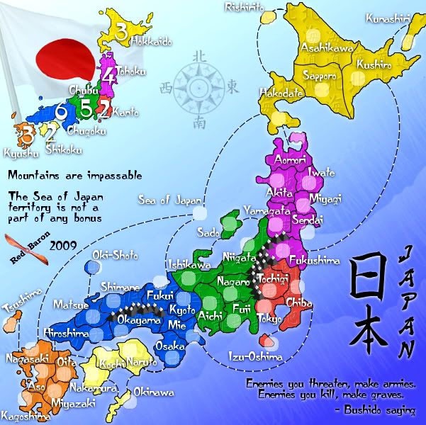
![]() by RedBaron0 on Mon Oct 05, 2009 9:49 am
by RedBaron0 on Mon Oct 05, 2009 9:49 am
Version 7.8
Small - 601x600
Large - 800x799
Little fixes done:
redrew the borders on the big map
repositioned the flag a little bit so you can see the folds, could possibly see moving the mini-map over a bit to the right to so only the top of the pole goes off the image, but I'm okay with it either way.
New signature
The slightly more important issue:
I think the floatyness issue I've done a 180 on, instead of taking it out, I've tried to emphasis it instead. In the process you get this 3-Dish effect most noticeable on the main island of Honshu between the bonuses there. You kinda get a puzzle piece effect there, but in 3-D, where it's like one bonus steps up(or down) to the next. Thought it was worth a try, and I like the way it looks, I just wasn't having much luck trying to get a outer bevel.
Small - 601x600
- Click image to enlarge.
Large - 800x799
- Click image to enlarge.
Little fixes done:
redrew the borders on the big map
repositioned the flag a little bit so you can see the folds, could possibly see moving the mini-map over a bit to the right to so only the top of the pole goes off the image, but I'm okay with it either way.
New signature
The slightly more important issue:
I think the floatyness issue I've done a 180 on, instead of taking it out, I've tried to emphasis it instead. In the process you get this 3-Dish effect most noticeable on the main island of Honshu between the bonuses there. You kinda get a puzzle piece effect there, but in 3-D, where it's like one bonus steps up(or down) to the next. Thought it was worth a try, and I like the way it looks, I just wasn't having much luck trying to get a outer bevel.
-
RedBaron0
- Posts: 2657
- Joined: Sun Aug 19, 2007 12:59 pm
- Location: Pennsylvania
Re: Japan - 日本 (D, Gp) V7.8 (Updated 10-5) pg22 Ready for love'n
![]() by porkenbeans on Mon Oct 05, 2009 3:03 pm
by porkenbeans on Mon Oct 05, 2009 3:03 pm
I like where its going.
A couple of suggs. - Combine the bonus areas into 1 layer, then lay down that drop shadow, but pull the distance back a hair. I think it looks much better without that pillow bevel.
A couple of suggs. - Combine the bonus areas into 1 layer, then lay down that drop shadow, but pull the distance back a hair. I think it looks much better without that pillow bevel.
-
porkenbeans
- Posts: 2546
- Joined: Mon Sep 10, 2007 4:06 pm
Re: Japan - 日本 (D, Gp) V7.8 (Updated 10-5) pg22 Ready for love'n
![]() by jefjef on Mon Oct 05, 2009 4:54 pm
by jefjef on Mon Oct 05, 2009 4:54 pm
Sendai. Would it hurt to reposition name & circle? Or just move the circle more over land. Thinking it may look better if you did.
And if you go with the shadow effect could ya do that with the bonus map too? I think that would look good.
Did you know you Fukui flipped flopped from big map vs. small map?
And if you go with the shadow effect could ya do that with the bonus map too? I think that would look good.
Did you know you Fukui flipped flopped from big map vs. small map?
This post was made by jefjef who should be on your ignore list.
drunkmonkey wrote:I'm filing a C&A report right now. Its nice because they have a drop-down for "jefjef".
-
jefjef
- Posts: 6026
- Joined: Mon Feb 23, 2009 8:41 pm
- Location: on my ass
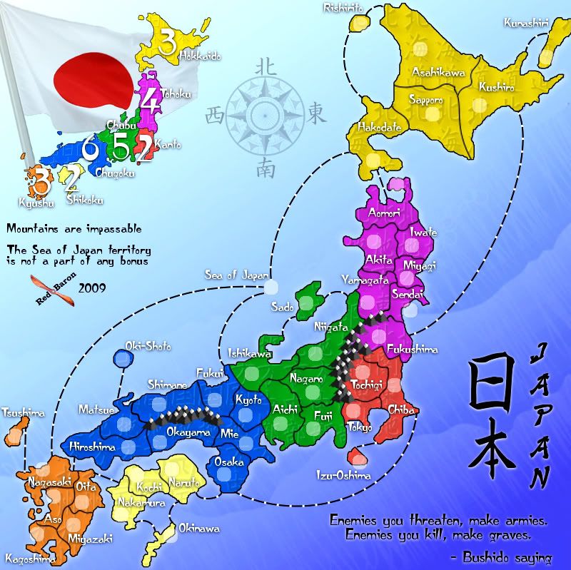
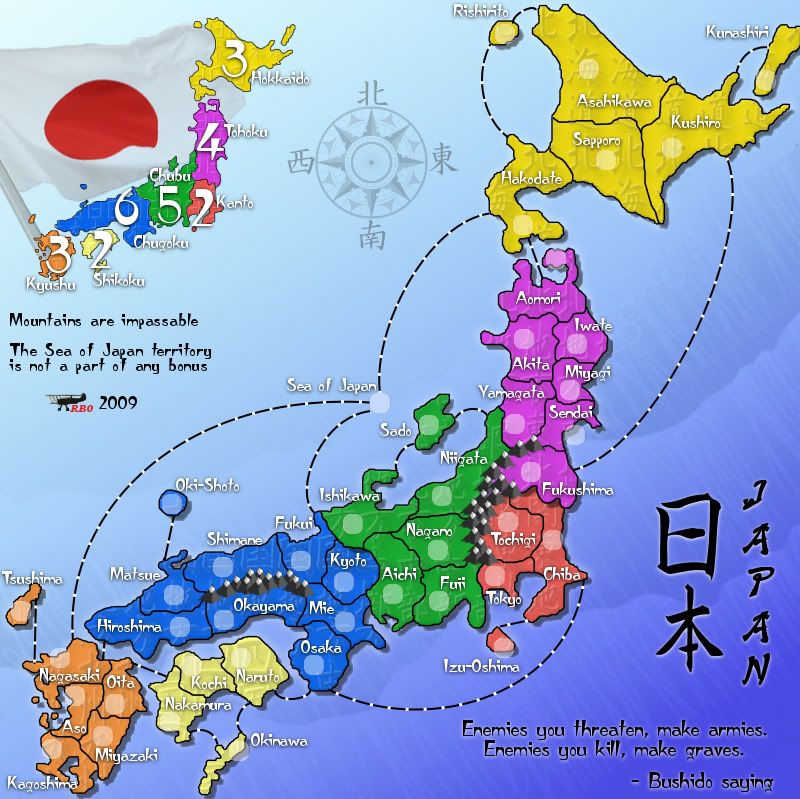
Re: Japan - 日本 (D, Gp) V8.0 (Upd 10-6) pg22 Domo Arigato MrBenn!
![]() by RedBaron0 on Mon Oct 05, 2009 11:20 pm
by RedBaron0 on Mon Oct 05, 2009 11:20 pm
Version 8.0
Small - 601x600
Large - 800x799
8.0 is the way to go!
Sendai circle moved to the left on big and small map
Fukui name and circle reversed on small map to match the big map
bonus layers combined, shadow effect used on the entire land surface
shadow effect also used on the mini-map
XML file updated to reflect changes in the army circle placement, coordinates are correct.
Keep'um coming guys... I'll addressing comments till I get that bloody blue stamp(then the orange one and those Forge stars... )
Small - 601x600
- Click image to enlarge.
Large - 800x799
- Click image to enlarge.
8.0 is the way to go!
Sendai circle moved to the left on big and small map
Fukui name and circle reversed on small map to match the big map
bonus layers combined, shadow effect used on the entire land surface
shadow effect also used on the mini-map
XML file updated to reflect changes in the army circle placement, coordinates are correct.
Keep'um coming guys... I'll addressing comments till I get that bloody blue stamp(then the orange one and those Forge stars...
-
RedBaron0
- Posts: 2657
- Joined: Sun Aug 19, 2007 12:59 pm
- Location: Pennsylvania
Re: Japan - 日本 (D, Gp) V8.0 (Upd 10-6) pg22 Domo Arigato MrBenn!
![]() by jefjef on Mon Oct 05, 2009 11:34 pm
by jefjef on Mon Oct 05, 2009 11:34 pm
OK.. You asked for it.. Nitpicking time!!
Circles that bother my chick:
Izu-Oshima
Okinawa
Aso
Kagoshima
Nice work RB0!! Look forward to playing this one and seeing your next project!
Circles that bother my chick:
Izu-Oshima
Okinawa
Aso
Kagoshima
Nice work RB0!! Look forward to playing this one and seeing your next project!
This post was made by jefjef who should be on your ignore list.
drunkmonkey wrote:I'm filing a C&A report right now. Its nice because they have a drop-down for "jefjef".
-
jefjef
- Posts: 6026
- Joined: Mon Feb 23, 2009 8:41 pm
- Location: on my ass
Who is online
Users browsing this forum: No registered users
|
|||||||
| Conquer Club is not associated with RISK online in any way. Copyright © 2006-2025 by Big Wham LLC | |||||||