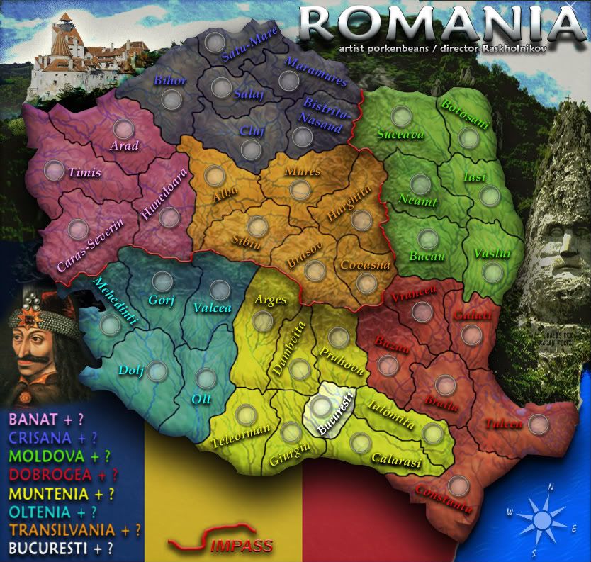
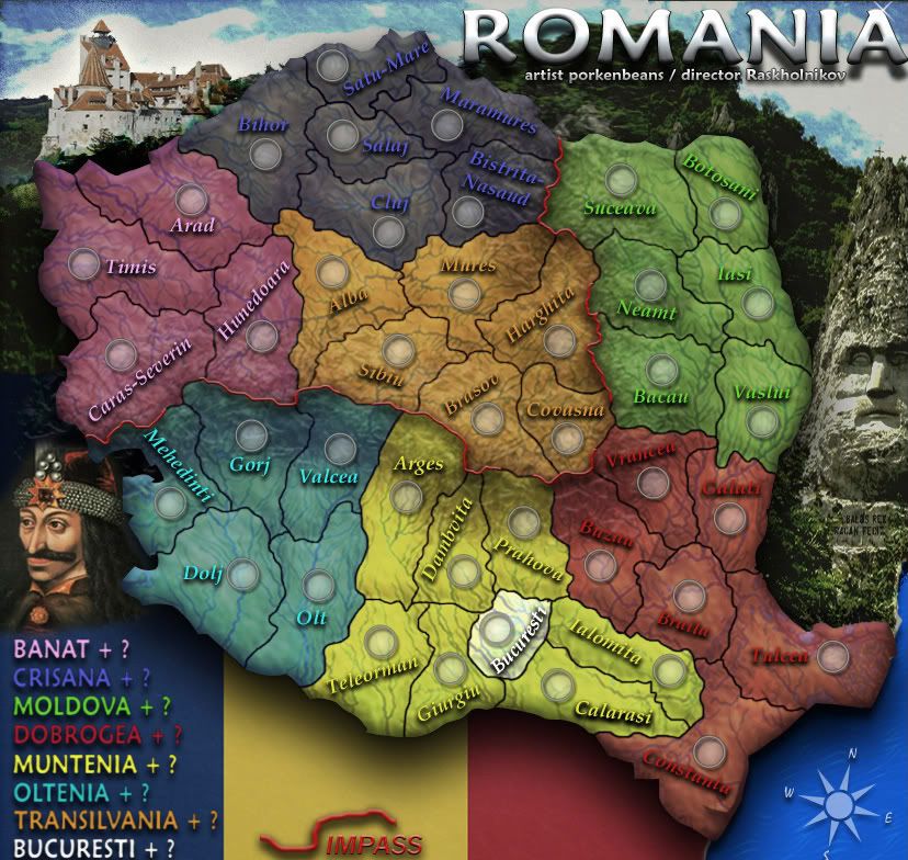
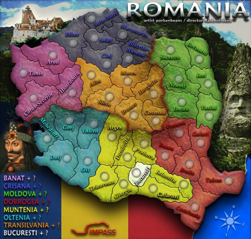
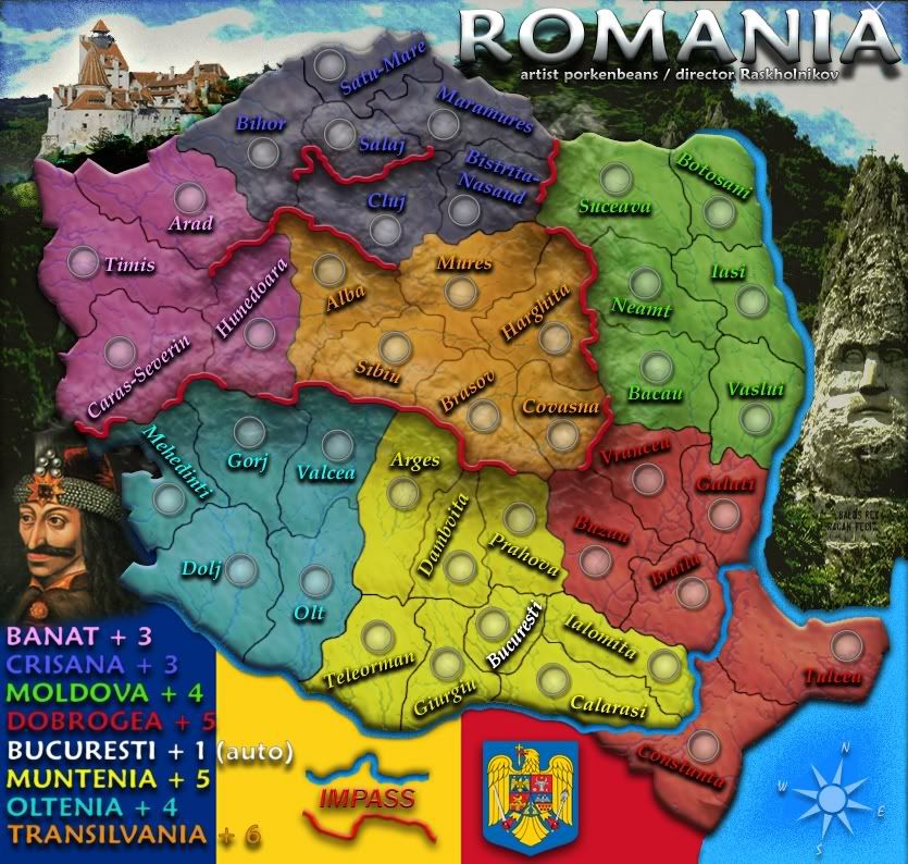
I like the second one better. Arges and Teleorman are part of Muntenia, not Oltenia. I also think Bucharest should be part of Muntenia, since I don't see how one can hold Muntenia without Bucharest. And Bucharest should have a +1, like Moscow on the USSR map.
Monday and Tuesdays are busy work days for me - so apologies for not having done the map. I'll work on it tonight on Photoshop.
Just keep in mind that since we adopted a different map with diferent regions from what I proposed initially (which maximised use of rivers and mountains) this one will have practically no rivers (all are external borders or no longer interal borders. So we're left mainly with the Carpathian mountains around Crisana, Transilvania and Banat.
Romania map
Moderator: Cartographers
Re: Romania map
![]() by Raskholnikov on Tue Oct 20, 2009 11:33 am
by Raskholnikov on Tue Oct 20, 2009 11:33 am
-
 Raskholnikov
- Posts: 638
- Joined: Fri Sep 11, 2009 3:40 pm


Re: Romania map
![]() by porkenbeans on Tue Oct 20, 2009 2:27 pm
by porkenbeans on Tue Oct 20, 2009 2:27 pm
About the territory names-SuicidalSnowman wrote:Right now, the territory names are distracting the way they are all headed in different directions. I like the font and colours, though.
Of course, I have no idea how you make them fit. But I am thinking if they could at least run at similar angles/directions, so that Mehedinti is heading the same way as Dambviti, that is up and to the right.
To say a little more, the colors are bright and lively, and the prominent army circles show that there are creative ways to work in the CC requirements to a map. Bravo on this. But with so much already going on, the names heading off all over the place, in my opinion, take away from the overall look.
I personally like the prominent background image, but I would like to see perhaps a thicker line around the outside edge of the map.
Most are able to be placed horizontally. But some are not, unless I allow them to cross out from their borders. I wanted to keep everything clean, and have all names within their borders. So here was my dilemma, with most names in a uniformed horizontal fashion, the ones that were not, seemed out of place and inharmonious with the rest of the map. This was fighting the clean look I was after, so I decided to just make them all in a "randomesk" pattern. I know that I have not quit got it yet, but I thought that I would wait until I have added all the mountains and rivers and such, before I spend any more time on name placements, as this will affect the available space to do so.
About the "thicker line"-
Do you mean around the land, or around the entire map ?

-

porkenbeans
- Posts: 2546
- Joined: Mon Sep 10, 2007 4:06 pm


Re: Romania map
![]() by porkenbeans on Tue Oct 20, 2009 2:31 pm
by porkenbeans on Tue Oct 20, 2009 2:31 pm
By the "second one", do you mean version 2 or 3 ?Raskholnikov wrote:I like the second one better. Arges and Teleorman are part of Muntenia, not Oltenia. I also think Bucharest should be part of Muntenia, since I don't see how one can hold Muntenia without Bucharest. And Bucharest should have a +1, like Moscow on the USSR map.
Monday and Tuesdays are busy work days for me - so apologies for not having done the map. I'll work on it tonight on Photoshop.
Just keep in mind that since we adopted a different map with diferent regions from what I proposed initially (which maximised use of rivers and mountains) this one will have practically no rivers (all are external borders or no longer interal borders. So we're left mainly with the Carpathian mountains around Crisana, Transilvania and Banat.
-
porkenbeans
- Posts: 2546
- Joined: Mon Sep 10, 2007 4:06 pm
Re: Romania map
![]() by SuicidalSnowman on Tue Oct 20, 2009 4:19 pm
by SuicidalSnowman on Tue Oct 20, 2009 4:19 pm
porkenbeans wrote:
About the "thicker line"-
Do you mean around the land, or around the entire map ?
I mean the land that is the part of the map... I was addressing concerns about the background images (flag, castle, ocean, statute?) being too prominent. I think they look nice without transparency or opacity or whatever special thing you PS and GIMP guys use, but I think a dark or thick line around the outside of the playable map would help set it off.
More concerned with territory names though. Good luck, I'm interested to see what you come up with.
-

SuicidalSnowman
- Posts: 1022
- Joined: Fri Aug 22, 2008 7:40 am


Re: Romania map
![]() by natty dread on Tue Oct 20, 2009 4:22 pm
by natty dread on Tue Oct 20, 2009 4:22 pm
I like v2 better than v3. Easier on the eyes. v3 is so bright it burns holes on my retinas...

-

natty dread
- Posts: 12877
- Joined: Fri Feb 08, 2008 8:58 pm
- Location: just plain fucked


Re: Romania map
![]() by jefjef on Tue Oct 20, 2009 8:42 pm
by jefjef on Tue Oct 20, 2009 8:42 pm
V2 looks prettty good. V3 is bright.
I have to agree on the tert name angles. Perhaps you can find a way that all names in each region have the same slant. Repositioning some circles should get ya there.
I have to agree on the tert name angles. Perhaps you can find a way that all names in each region have the same slant. Repositioning some circles should get ya there.
This post was made by jefjef who should be on your ignore list.

drunkmonkey wrote:I'm filing a C&A report right now. Its nice because they have a drop-down for "jefjef".
-

jefjef
- Posts: 6026
- Joined: Mon Feb 23, 2009 8:41 pm
- Location: on my ass


Re: Romania map
![]() by porkenbeans on Wed Oct 21, 2009 12:07 am
by porkenbeans on Wed Oct 21, 2009 12:07 am
- Click image to enlarge.
version 4
- Click image to enlarge.
version 5
I think that I need to make the red line for the impasses wider. Rask, I need for you to decide just where the passes will be. I threw up an example, but you know much better than I, at where they should actually go.
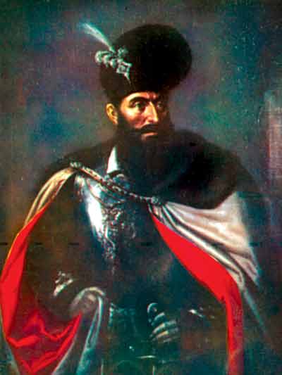
also I am not lovin Vlad. The art does not seem to go with the style of everything else. A photo of something would be better I imagine.
I found a river system map. I was struck by how many there are. So, I decided to have them represented in the texture.
-
porkenbeans
- Posts: 2546
- Joined: Mon Sep 10, 2007 4:06 pm
Re: Romania map
![]() by jefjef on Wed Oct 21, 2009 12:30 am
by jefjef on Wed Oct 21, 2009 12:30 am
Like the topographical styling with the rivers. BUT they kinda have a vein look.
This post was made by jefjef who should be on your ignore list.
drunkmonkey wrote:I'm filing a C&A report right now. Its nice because they have a drop-down for "jefjef".
-
jefjef
- Posts: 6026
- Joined: Mon Feb 23, 2009 8:41 pm
- Location: on my ass
Re: Romania map
![]() by porkenbeans on Wed Oct 21, 2009 12:36 am
by porkenbeans on Wed Oct 21, 2009 12:36 am
If I want to keep all the names within their own borders, am afraid that the shapes of the territs are NOT going to allow for any uniformity in angle placement. That said, I think that the only solution left is to try and make them as un-uniformed as possible. I will work more on this.jefjef wrote:V2 looks prettty good. V3 is bright.
I have to agree on the tert name angles. Perhaps you can find a way that all names in each region have the same slant. Repositioning some circles should get ya there.
-
porkenbeans
- Posts: 2546
- Joined: Mon Sep 10, 2007 4:06 pm
Re: Romania map
![]() by Raskholnikov on Wed Oct 21, 2009 4:48 am
by Raskholnikov on Wed Oct 21, 2009 4:48 am
Use the pic in this link - Mihai Viteazul (Mihai the Brave) who united Romania for the first time (1559-1601).
I like the rivers too. Too bad we can't use any for borders.
I'll post the map with the passes in the morning.
Great job so far!! Love it...
I like the rivers too. Too bad we can't use any for borders.
I'll post the map with the passes in the morning.
Great job so far!! Love it...
-
Raskholnikov
- Posts: 638
- Joined: Fri Sep 11, 2009 3:40 pm
Re: Romania map
![]() by Duality. on Wed Oct 21, 2009 2:43 pm
by Duality. on Wed Oct 21, 2009 2:43 pm
I really like the look of this map - and I can't say that for most in the Drafting Room. Nice job.
-

Duality.
- Posts: 331
- Joined: Sat Oct 10, 2009 4:38 pm


Re: Romania map
![]() by natty dread on Wed Oct 21, 2009 5:25 pm
by natty dread on Wed Oct 21, 2009 5:25 pm
BUT they kinda have a vein look.
That's exactly what I thought when I first saw them... I thought, "those look so much like the veins on my feet, porkenbeans has probably sneaked in at night just to look at my feet..."
Then I realized that would be silly, because he would have triggered my milk-&-cookies-trap.
Seriously, great job. Maybe you could fade the smaller rivers out a bit more though?
-
natty dread
- Posts: 12877
- Joined: Fri Feb 08, 2008 8:58 pm
- Location: just plain fucked
Re: Romania map
![]() by porkenbeans on Wed Oct 21, 2009 6:45 pm
by porkenbeans on Wed Oct 21, 2009 6:45 pm
Well, they ARE the actual rivers. Although their placement is off in some places, just a hair or two. I will post an example with them faded out some more. You should see it with full opacity.natty_dread wrote:BUT they kinda have a vein look.
That's exactly what I thought when I first saw them... I thought, "those look so much like the veins on my feet, porkenbeans has probably sneaked in at night just to look at my feet..."
Then I realized that would be silly, because he would have triggered my milk-&-cookies-trap.
Seriously, great job. Maybe you could fade the smaller rivers out a bit more though?
De-veined, so to speak
- Click image to enlarge.
version 6
Last edited by porkenbeans on Thu Oct 22, 2009 4:40 pm, edited 2 times in total.
-
porkenbeans
- Posts: 2546
- Joined: Mon Sep 10, 2007 4:06 pm
Re: Romania map
![]() by targetman377 on Wed Oct 21, 2009 10:58 pm
by targetman377 on Wed Oct 21, 2009 10:58 pm
the background i like alot better then the first the romaninan flag is well portioned and i like the pic you got for that eara thanxs keep up the good work
VOTE AUTO/TARGET in 12
-

targetman377
- Posts: 2223
- Joined: Wed Jan 17, 2007 9:52 pm


Re: Romania map
![]() by Raskholnikov on Thu Oct 22, 2009 3:12 am
by Raskholnikov on Thu Oct 22, 2009 3:12 am
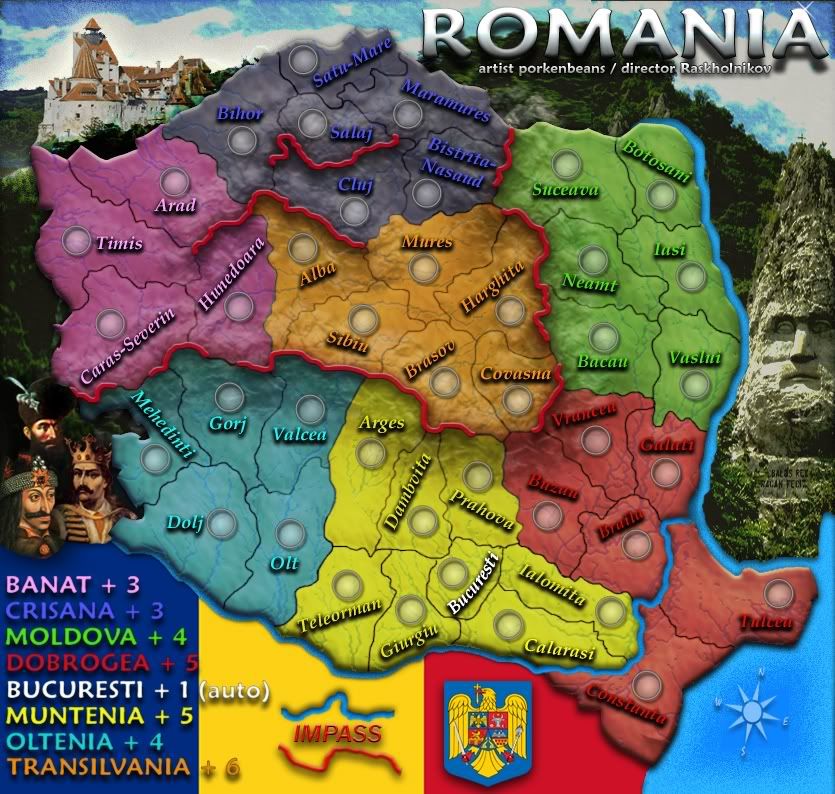
Hi Pork,
I worked on both the map and the bonus distribution (with the Foundry spreadsheet used to ckeck these things).
This is what I came up with:

The thick brown borders are the mountains. The white breaks are the passes.
I covered your bonus question marks with what I (and the CC spreadsheet) think the bonuses should be for each region.
Please include Bucuresti in the Muntenia region, and give it a +1 autodeploy army.
Please add to the map the Danube and Prut rivers. It places Romania geographically much better, and provides a frame for the vertical part of the Danumbe splitting Dobrogea in two.
The short black lines across the Danube are bridges.
I hope this helps. I can't wait to see the next draft
I worked on both the map and the bonus distribution (with the Foundry spreadsheet used to ckeck these things).
This is what I came up with:
The thick brown borders are the mountains. The white breaks are the passes.
I covered your bonus question marks with what I (and the CC spreadsheet) think the bonuses should be for each region.
Please include Bucuresti in the Muntenia region, and give it a +1 autodeploy army.
Please add to the map the Danube and Prut rivers. It places Romania geographically much better, and provides a frame for the vertical part of the Danumbe splitting Dobrogea in two.
The short black lines across the Danube are bridges.
I hope this helps. I can't wait to see the next draft
-
Raskholnikov
- Posts: 638
- Joined: Fri Sep 11, 2009 3:40 pm
Re: Romania map
![]() by porkenbeans on Thu Oct 22, 2009 11:25 am
by porkenbeans on Thu Oct 22, 2009 11:25 am
OK, will do. 
While I am working on this next update, maybe you will take a look at this.
viewtopic.php?f=63&t=99299&p=2265724#p2265724
also could you post that link for the picture of mihai the brave ?
While I am working on this next update, maybe you will take a look at this.
viewtopic.php?f=63&t=99299&p=2265724#p2265724
also could you post that link for the picture of mihai the brave ?
-
porkenbeans
- Posts: 2546
- Joined: Mon Sep 10, 2007 4:06 pm
Re: Romania map
![]() by Raskholnikov on Thu Oct 22, 2009 12:22 pm
by Raskholnikov on Thu Oct 22, 2009 12:22 pm
Mihai Viteazul: http://www.crestinortodox.ro/admin/_fil ... teazul.jpg
If you don't like it, try Stefan cel Mare (also a very famous Romanian / Moldavian king, in fact cousin with Vlad Tepes (Dracula). They fought the Turks together. http://akasha.solitarydesign.com/cata/p ... elMare.jpg
Will do re: the Jamaica map.
If you don't like it, try Stefan cel Mare (also a very famous Romanian / Moldavian king, in fact cousin with Vlad Tepes (Dracula). They fought the Turks together
Will do re: the Jamaica map.
-
Raskholnikov
- Posts: 638
- Joined: Fri Sep 11, 2009 3:40 pm
Re: Romania map
![]() by SuicidalSnowman on Thu Oct 22, 2009 2:50 pm
by SuicidalSnowman on Thu Oct 22, 2009 2:50 pm
Man are you guys long lost twin brothers or something? Such teamwork! Such grace! Such speed!
-
SuicidalSnowman
- Posts: 1022
- Joined: Fri Aug 22, 2008 7:40 am
-

Gilligan
- Posts: 12478
- Joined: Thu May 11, 2006 4:59 pm
- Location: Providence, RI


Re: Romania map
![]() by porkenbeans on Thu Oct 22, 2009 5:46 pm
by porkenbeans on Thu Oct 22, 2009 5:46 pm
Wow, looks like foregone put a lot of work into that map. Oh well, we WILL have a Romania map rolling out soon, I hope.Gilligan wrote:http://www.conquerclub.com/forum/viewtopic.php?f=242&t=57987
Would have been live, too, if he didn't leave...
-
porkenbeans
- Posts: 2546
- Joined: Mon Sep 10, 2007 4:06 pm
Re: Romania map
![]() by Raskholnikov on Thu Oct 22, 2009 6:01 pm
by Raskholnikov on Thu Oct 22, 2009 6:01 pm
Hurray for version 7. Are we leaving Vlad, or replacing him with Mihai / Stefan?
I like the coat of arms
I like the coat of arms
-
Raskholnikov
- Posts: 638
- Joined: Fri Sep 11, 2009 3:40 pm
Re: Romania map
![]() by Gilligan on Thu Oct 22, 2009 6:03 pm
by Gilligan on Thu Oct 22, 2009 6:03 pm
porkenbeans wrote:Wow, looks like foregone put a lot of work into that map. Oh well, we WILL have a Romania map rolling out soon, I hope.Gilligan wrote:http://www.conquerclub.com/forum/viewtopic.php?f=242&t=57987
Would have been live, too, if he didn't leave...
Figured I'd throw it out there if you wanted some extra ideas already worked out.

-
Gilligan
- Posts: 12478
- Joined: Thu May 11, 2006 4:59 pm
- Location: Providence, RI
Re: Romania map
![]() by porkenbeans on Thu Oct 22, 2009 6:50 pm
by porkenbeans on Thu Oct 22, 2009 6:50 pm
- Click image to enlarge.
version 8
If you like the local peanut gallery, I have room for 3 or 4 more
-
porkenbeans
- Posts: 2546
- Joined: Mon Sep 10, 2007 4:06 pm
Return to Melting Pot: Map Ideas
Who is online
Users browsing this forum: No registered users
|
|||||||
| Conquer Club is not associated with RISK online in any way. Copyright © 2006-2025 by Big Wham LLC | |||||||