- Click image to enlarge.
version 9
Moderator: Cartographers
![]() by porkenbeans on Thu Oct 22, 2009 7:09 pm
by porkenbeans on Thu Oct 22, 2009 7:09 pm


![]() by targetman377 on Thu Oct 22, 2009 9:24 pm
by targetman377 on Thu Oct 22, 2009 9:24 pm


![]() by Raskholnikov on Fri Oct 23, 2009 7:16 am
by Raskholnikov on Fri Oct 23, 2009 7:16 am


![]() by porkenbeans on Fri Oct 23, 2009 4:57 pm
by porkenbeans on Fri Oct 23, 2009 4:57 pm
![]() by Industrial Helix on Fri Oct 23, 2009 5:13 pm
by Industrial Helix on Fri Oct 23, 2009 5:13 pm


![]() by Raskholnikov on Fri Oct 23, 2009 6:26 pm
by Raskholnikov on Fri Oct 23, 2009 6:26 pm
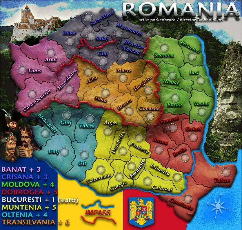
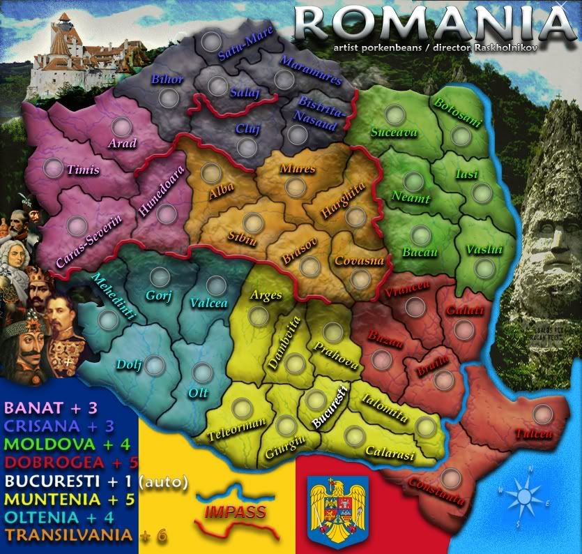
The red lines, what are they representing? If its mountains or something I think it would be best to represent them with actual mountains rather than an abstract red line.
Yes, they are mountains. Good idea, but that might interfere with Pork's graphics.
Do those army circles accommodate 3 numbers?
I'm sure they do.
The sea and blue bits of the sky look a little pixelated.
Pork will have a look at that...
Looks like you're going to need a bridge to Constanza and Tulcea.
Yes. There is one between Braila and Tulcea.
I find it hard to read some of the names when they're at a tilt and it seems some are unnecessarily tilted. It might make the map easier to work with as a player if some of the names were level.
I'm not sure how much of that can be fixed and still keep each Judet's name within its borders...
The coat of arms and flag seem a little flat in comparison with the other graphics, I think you could add a gradient or something to make those fit in a little better. Maybe another rendition of the coat of arms that has some bevel or something to it.
http://stemaromaniei.files.wordpress.co ... e-buna.jpg
http://www.bfdconf2008.univagora.ro/bdf ... polrom.gif
Is the Bucharesti terr. part of the yellow bonus? If not, perhaps it should be white as well.
Yes it is. That's why it's yellow. But it also gets a +1 autodeploy, which is why the name on the map is white.
![]() by porkenbeans on Fri Oct 23, 2009 6:48 pm
by porkenbeans on Fri Oct 23, 2009 6:48 pm
Industrial Helix wrote:Looking good!
The red lines, what are they representing? If its mountains or something I think it would be best to represent them with actual mountains rather than an abstract red line.
Do those army circles accommodate 3 numbers?
The sea and blue bits of the sky look a little pixelated.
Looks like you're going to need a bridge to Constanza and Tulcea.
I find it hard to read some of the names when they're at a tilt and it seems some are unnecessarily tilted. It might make the map easier to work with as a player if some of the names were level.
The coat of arms and flag seem a little flat in comparison with the other graphics, I think you could add a gradient or something to make those fit in a little better. Maybe another rendition of the coat of arms that has some bevel or something to it.
Is the Bucharesti terr. part of the yellow bonus? If not, perhaps it should be white as well.
![]() by captainwalrus on Fri Oct 23, 2009 7:27 pm
by captainwalrus on Fri Oct 23, 2009 7:27 pm


![]() by Industrial Helix on Sat Oct 24, 2009 10:09 am
by Industrial Helix on Sat Oct 24, 2009 10:09 am
![]() by porkenbeans on Sun Oct 25, 2009 10:33 pm
by porkenbeans on Sun Oct 25, 2009 10:33 pm
![]() by isaiah40 on Sun Oct 25, 2009 11:39 pm
by isaiah40 on Sun Oct 25, 2009 11:39 pm


![]() by porkenbeans on Mon Oct 26, 2009 12:31 am
by porkenbeans on Mon Oct 26, 2009 12:31 am
![]() by SuicidalSnowman on Mon Oct 26, 2009 2:02 am
by SuicidalSnowman on Mon Oct 26, 2009 2:02 am


![]() by porkenbeans on Mon Oct 26, 2009 3:25 am
by porkenbeans on Mon Oct 26, 2009 3:25 am
![]() by isaiah40 on Mon Oct 26, 2009 11:20 am
by isaiah40 on Mon Oct 26, 2009 11:20 am
porkenbeans wrote:@ S.S.,
Yeah, I noticed that too. That line between Cara. and Mehe. is not needed. It WILL be nixed.
Thanx Snow, I am very glad to see you here. I know you to be a pretty wise nut.and please feel free to offer any comments that you might have. Rask and I truly need the brightest minds on board.
Ya know what, I just had an idea. What if I nixed the red lines, and instead add some snow caps to represent the impasses ? That way I can work it in to the existing mountain range. Hmmmmmmmm.
![]() by targetman377 on Mon Oct 26, 2009 1:51 pm
by targetman377 on Mon Oct 26, 2009 1:51 pm
porkenbeans wrote:Thank you Isaiah,
I appreciate your input on both projects that I am working on. Rask and I have a few more in the idea stages. Hope to see you there as well when I have something up.
Yeah, I was thinking of something along those lines with the mountains. I already have 3 layers of mountain range textures built up. I guess I could just add more and see if I can build some visual peeks.
![]() by captainwalrus on Mon Oct 26, 2009 2:13 pm
by captainwalrus on Mon Oct 26, 2009 2:13 pm
![]() by porkenbeans on Mon Oct 26, 2009 2:16 pm
by porkenbeans on Mon Oct 26, 2009 2:16 pm
Thanks targ.,targetman377 wrote:porkenbeans wrote:Thank you Isaiah,
I appreciate your input on both projects that I am working on. Rask and I have a few more in the idea stages. Hope to see you there as well when I have something up.
Yeah, I was thinking of something along those lines with the mountains. I already have 3 layers of mountain range textures built up. I guess I could just add more and see if I can build some visual peeks.
would would make ih happy lol
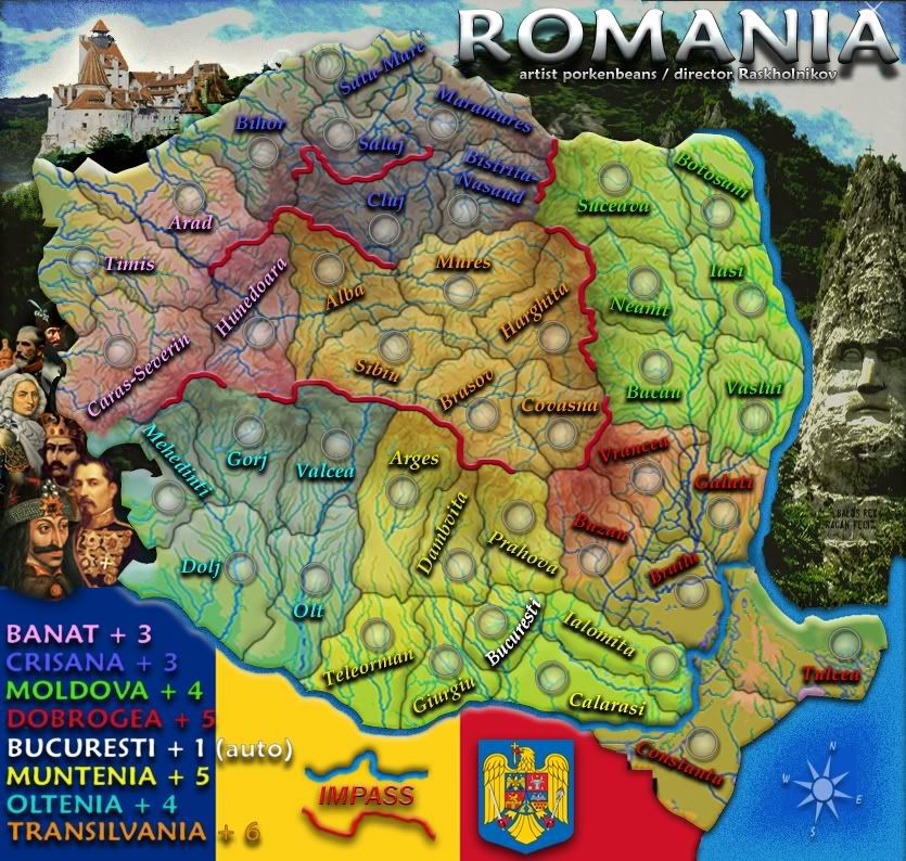
on the top of your map the black regin i think is just a little too dark i am sure u were going to fix it but i like this map and that's all i really had.
![]() by porkenbeans on Tue Oct 27, 2009 12:16 am
by porkenbeans on Tue Oct 27, 2009 12:16 am

![]() by isaiah40 on Tue Oct 27, 2009 8:14 am
by isaiah40 on Tue Oct 27, 2009 8:14 am
![]() by thenobodies80 on Fri Oct 30, 2009 6:19 am
by thenobodies80 on Fri Oct 30, 2009 6:19 am
isaiah40 wrote:Um, no! It looks like Romania has varicose veins nowIt was good the previous version!


![]() by AndyDufresne on Fri Oct 30, 2009 11:21 am
by AndyDufresne on Fri Oct 30, 2009 11:21 am


![]() by porkenbeans on Fri Oct 30, 2009 7:13 pm
by porkenbeans on Fri Oct 30, 2009 7:13 pm
![]() by captainwalrus on Fri Oct 30, 2009 9:10 pm
by captainwalrus on Fri Oct 30, 2009 9:10 pm
![]() by porkenbeans on Fri Oct 30, 2009 9:42 pm
by porkenbeans on Fri Oct 30, 2009 9:42 pm
Thanx, me too, I was just messin around with the last update. Just thought I would throw up, to gauge a response or two.captainwalrus wrote:yeah, no. It was better when it was simple without the excessive rivers. It had a nice simple style before that I liked a lot.
Return to Melting Pot: Map Ideas
Users browsing this forum: No registered users
|
|||||||
| Conquer Club is not associated with RISK online in any way. Copyright © 2006-2025 by Big Wham LLC | |||||||