Land of Tiuri: ABANDONED
Moderator: Cartographers
91 posts
• Page 2 of 4 • 1, 2, 3, 4
![]() by Guiscard on Fri Feb 16, 2007 2:20 pm
by Guiscard on Fri Feb 16, 2007 2:20 pm
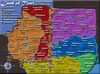
I really don't know what the hell I'm looking at at the moment. Very very confusing.
qwert wrote:Can i ask you something?What is porpose for you to open these Political topic in ConquerClub? Why you mix politic with Risk? Why you not open topic like HOT AND SEXY,or something like that.
-

 Guiscard
- Posts: 4103
- Joined: Fri Dec 08, 2006 7:27 pm
- Location: In the bar... With my head on the bar

![]() by Wisse on Fri Feb 16, 2007 2:22 pm
by Wisse on Fri Feb 16, 2007 2:22 pm
Guiscard wrote:I really don't know what the hell I'm looking at at the moment. Very very confusing.
yup let it see when you have it ready we can't decide with the north east corner still normal


-

Wisse
- Posts: 4448
- Joined: Fri Oct 13, 2006 2:59 pm
- Location: The netherlands, gelderland, epe


![]() by Qwert on Sat Feb 17, 2007 11:48 am
by Qwert on Sat Feb 17, 2007 11:48 am
bedplay wrote
The map needs at least 6 continents I would say...
it's coming along nicely, next time, export the image and post the image as a jpeg, much smaller than png, and no1 can steal it!I especially like the mountains, great job!
oh and what about a black arrow?
What you men "and no1 can steal it"?
The map needs at least 6 continents I would say...
it's coming along nicely, next time, export the image and post the image as a jpeg, much smaller than png, and no1 can steal it!I especially like the mountains, great job!
oh and what about a black arrow?
What you men "and no1 can steal it"?

-

Qwert
- SoC Training Adviser
- Posts: 9262
- Joined: Tue Nov 07, 2006 5:07 pm
- Location: VOJVODINA


![]() by Guiscard on Sat Feb 17, 2007 12:04 pm
by Guiscard on Sat Feb 17, 2007 12:04 pm
needs toning down and making more simple. Very very busy at the minute. The black is horrid, and the font is pretty unreadable...
The texture for the sea is Ok though, and I'd like to see a lighter blue colour for it.
Sort out the graphics and then we can comment on layout / playability.
The texture for the sea is Ok though, and I'd like to see a lighter blue colour for it.
Sort out the graphics and then we can comment on layout / playability.
qwert wrote:Can i ask you something?What is porpose for you to open these Political topic in ConquerClub? Why you mix politic with Risk? Why you not open topic like HOT AND SEXY,or something like that.
-
Guiscard
- Posts: 4103
- Joined: Fri Dec 08, 2006 7:27 pm
- Location: In the bar... With my head on the bar
![]() by Lt.Mustard on Sat Feb 17, 2007 12:28 pm
by Lt.Mustard on Sat Feb 17, 2007 12:28 pm
theres a couple small territories with long names (City of Unauwon. City of the South) that i just cant see where the army circles are going to fit. thats definitely going to need some adjusting... may i suggest cleaning up the arrows a little bit? they look a little sloppy to me. also, i think the bridges could be made more uniform, right now they are all different sizes and just look like boulders to me. maybe some little wooden bridges? i dont know just some suggestions to think about.
i think this is a good idea that can turn into a great map with a little work
i think this is a good idea that can turn into a great map with a little work
Okay, lecture's over - time for some Feedback!
-
Lt.Mustard
- Posts: 86
- Joined: Sat Nov 25, 2006 5:08 pm
![]() by santon836 on Sat Feb 17, 2007 1:55 pm
by santon836 on Sat Feb 17, 2007 1:55 pm
Ok, thanks for the feedback all.
Here is an update again:

Things that are done:
- Made different fonts
- Changed the sea texture and color
- Changed the dead territory texture
- Made the long names shorter, so there is now place to army shadows
- Softened the land texture a bit
I must say I liked the font.
It looks like an old-parchment font, and i want this map to look like an old parchment.
But now, choose the font you like best.
I like the North-Dagonaut font even more as the older font...
Also, choose "your" sea-color. (upper and lower)
Maybe I'm gonna put a picture in the dead territory, like in the mongol map.
But let me know what you think so far.
Here is an update again:
Things that are done:
- Made different fonts
- Changed the sea texture and color
- Changed the dead territory texture
- Made the long names shorter, so there is now place to army shadows
- Softened the land texture a bit
I must say I liked the font.
It looks like an old-parchment font, and i want this map to look like an old parchment.
But now, choose the font you like best.
I like the North-Dagonaut font even more as the older font...
Also, choose "your" sea-color. (upper and lower)
Maybe I'm gonna put a picture in the dead territory, like in the mongol map.
But let me know what you think so far.
-
santon836
- Posts: 126
- Joined: Mon Nov 06, 2006 9:44 am

![]() by AndyDufresne on Sat Feb 17, 2007 2:01 pm
by AndyDufresne on Sat Feb 17, 2007 2:01 pm
I...I...don't even know where to begin. It hurts my eyes too much.
--Andy
--Andy
-

AndyDufresne
- Posts: 24935
- Joined: Fri Mar 03, 2006 8:22 pm
- Location: A Banana Palm in Zihuatanejo


![]() by Qwert on Sat Feb 17, 2007 2:57 pm
by Qwert on Sat Feb 17, 2007 2:57 pm
Visualy its wery bright,put darken colors, put real ocean look, neutral teritory put some pictures. Try to create 40-45 terittory split in 6 country, and you have 4-5 diferent text style, try to put 1 style.
-
Qwert
- SoC Training Adviser
- Posts: 9262
- Joined: Tue Nov 07, 2006 5:07 pm
- Location: VOJVODINA
![]() by Nikita_2006 on Sat Feb 17, 2007 3:16 pm
by Nikita_2006 on Sat Feb 17, 2007 3:16 pm
One word, simplicity.
I know that it is not easy.
Make it simple and sometimes it is necessary to shorten some of the names.
And the fonts have to much shadow.
Use one fontcolor for the countries of the same region, and not all white.
I know that it is not easy.
Make it simple and sometimes it is necessary to shorten some of the names.
And the fonts have to much shadow.
Use one fontcolor for the countries of the same region, and not all white.
-
Nikita_2006
- Posts: 486
- Joined: Thu Oct 19, 2006 8:35 am
![]() by Bad Speler on Sat Feb 17, 2007 3:20 pm
by Bad Speler on Sat Feb 17, 2007 3:20 pm
The first thing that pops to my mind is its too crowded. Shrink the fonts a bit. Textures for land are good. And last thing is that red line dividing some continents is irritating
Highest Score: 2532
Highest Position: 69 (a long time ago)
Highest Position: 69 (a long time ago)
-

Bad Speler
- Posts: 1027
- Joined: Fri Jun 02, 2006 8:16 pm
- Location: Ottawa


![]() by Coleman on Sat Feb 17, 2007 4:22 pm
by Coleman on Sat Feb 17, 2007 4:22 pm
I think you need darker colors for all the territories and the names could be grayed slightly to make things seem less bright and, well, painful. Also what Bad Speler said about shrinking the fonts. (Green is the only continent where I don't think the font needs to shrink).
-

Coleman
- Posts: 5402
- Joined: Tue Jan 02, 2007 10:36 pm
- Location: Midwest


![]() by KEYOGI on Sat Feb 17, 2007 4:39 pm
by KEYOGI on Sat Feb 17, 2007 4:39 pm
I'm going to comment on the visuals first, because I can't look at it long enough to get a good gauge of the map. 
At the moment it looks like a big mess of colour and text, I think you just need to tone everything down. So some things to consider:
- Tone down the colours, in particular red.
- Choose one font for the whole map and reduce the size of it.
- Your textures for the water and unplayable part of the map are very dominant, try reducing their impact by toning them down some.
- I really don't like those mountains, that's something for you to look into at some point. Personally I find mountains one of the hardest parts to do for a map, so good luck.
- I'm not sure the embossing look on the rivers works, perhaps look into a different approach for them.
- The thick border lines between territory and continents could really use some shrinking. I think you only really need a 1 or 2 pixel border, it looks like you have anywhere from 3 to 5.
-
KEYOGI
- Posts: 1632
- Joined: Tue Oct 10, 2006 6:09 am

![]() by Nikita_2006 on Sat Feb 17, 2007 4:51 pm
by Nikita_2006 on Sat Feb 17, 2007 4:51 pm
I think that it will work the right way, it is a process.
If you look at the latest map and compare it to the first map it is a great improvement
If you look at the latest map and compare it to the first map it is a great improvement
-
Nikita_2006
- Posts: 486
- Joined: Thu Oct 19, 2006 8:35 am
![]() by Wisse on Sat Feb 17, 2007 5:33 pm
by Wisse on Sat Feb 17, 2007 5:33 pm
Nikita_2006 wrote:I think that it will work the right way, it is a process.
If you look at the latest map and compare it to the first map it is a great improvement
yup, and btw i like the mountains
-
Wisse
- Posts: 4448
- Joined: Fri Oct 13, 2006 2:59 pm
- Location: The netherlands, gelderland, epe
91 posts
• Page 2 of 4 • 1, 2, 3, 4
Return to Melting Pot: Map Ideas
Who is online
Users browsing this forum: No registered users
|
|||||||
| Conquer Club is not associated with RISK online in any way. Copyright © 2006-2025 by Big Wham LLC | |||||||