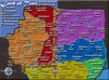
fontwise i would go with north dagonauts or Evelyn's(except a little bolder). I think the deltalands is too hard to read.
the rivers running through south City are very confusing as a river seems to divide it into two yet it seems to connect pass of evellyn to the countries above it though this is very confusing. possibly take the river dividing south city in two out and put a bridge over the river to the south
i'm also not so much of a fan of the black arrows and would personally prefer some other way to connect the territories across the mountains
other than that i thiink the map is looking great style wise
Land of Tiuri: ABANDONED
Moderator: Cartographers
91 posts
• Page 4 of 4 • 1, 2, 3, 4
![]() by lord twiggy1 on Mon Feb 19, 2007 9:44 pm
by lord twiggy1 on Mon Feb 19, 2007 9:44 pm
what program did you use to make this map
Back in Black
'Cause I'm back/Yes, I'm back/Well, I'm back/Yes, I'm back/Well, I'm back, back/
Well I'm back in black/Yes, I'm back in black
That's right, I'M BACK! hopefully to stay this time!
'Cause I'm back/Yes, I'm back/Well, I'm back/Yes, I'm back/Well, I'm back, back/
Well I'm back in black/Yes, I'm back in black
That's right, I'M BACK! hopefully to stay this time!
-
 lord twiggy1
- Posts: 1574
- Joined: Wed Feb 14, 2007 2:26 pm
- Location: at exacltly 15 degrees N lattitud and...Ahh who the hell am i kidding I have no idea
![]() by santon836 on Tue Feb 20, 2007 1:46 am
by santon836 on Tue Feb 20, 2007 1:46 am
Thanks all for commenting.

And I use photoshop CS2.
Someone knows what I could have done to my brush?
I have to paint over 3 times to get a good color....
Anyone?
Things that are done:
- Removed the black seaborder
- Changed the pass-througs
- Cleared up South City
- Moved the Small Town text
- Deltaland font as legend font
And, the Eviellan font cannot be made bolder.
It's the Fine Hand font, and there is no option for bold or anything like that.
I'm sorry.
-
santon836
- Posts: 126
- Joined: Mon Nov 06, 2006 9:44 am


![]() by KEYOGI on Tue Feb 20, 2007 2:52 am
by KEYOGI on Tue Feb 20, 2007 2:52 am
Sounds like you've adjusted the opacity of the brush. Have a look up the top under the drop-down menus for File, Edit, etc.
Onto the map. It's a lot easier to look at now the colours are toned down and the text has been reduced. I personally think the font of purple is best. It's the easiest on the eyes for me.
I'm still not really a fan of the map though. While I've seen plenty of maps that have looked worse, it all looks rather uninspired. I haven't read the books, but is there a way you can carry some sort of theme over?
I'd lose the embossing look you've got going all over the map, I'm really not a fan of it. It's overused and adds nothing to the map.
Perhaps look into a more natural shape for your borders as well. They are currently very straight. If you can get more shape to them like the rivers I think they would look better.
See what others say. I think your map has potential, but IMO it still has a long way to go.
-
KEYOGI
- Posts: 1632
- Joined: Tue Oct 10, 2006 6:09 am


![]() by Molacole on Tue Feb 20, 2007 10:03 pm
by Molacole on Tue Feb 20, 2007 10:03 pm
I think a big part of the maps looks could be fixed if you witched the colors of each continent around.
Red just doesn't look good next to purple and blue to purple isn't so pleasent either. this is a good start for combining groups of colors together.
The triangle works directly across from each other.
ex:
yellow - purple (LA Lakers)
orange - blue (denver broncos)
red - green (christmas)
these are just common mixes of the colors together so you'd have to find what works best for you. Right now this maps colors do not gel one bit.
I would also change the font of your territories because the words on the mpa completely overshadow the actual map. The mountains look dull also.
Red just doesn't look good next to purple and blue to purple isn't so pleasent either.
this is a good start for combining groups of colors together.
The triangle works directly across from each other.
ex:
yellow - purple (LA Lakers)
orange - blue (denver broncos)
red - green (christmas)
these are just common mixes of the colors together so you'd have to find what works best for you. Right now this maps colors do not gel one bit.
I would also change the font of your territories because the words on the mpa completely overshadow the actual map. The mountains look dull also.
-

Molacole
- Posts: 552
- Joined: Fri Jun 23, 2006 8:19 am
- Location: W 2.0 map by ZIM


![]() by coolst on Wed Feb 21, 2007 2:31 pm
by coolst on Wed Feb 21, 2007 2:31 pm
you need more colors if you ask me, i mean you really put
or more Sub continents,
or the existing sub continents need another place,
like red takes that whole territorie from the mountens, and that beige color can be hit by blue if you play the game,
i mean, on the map you must can play now it looks an little bit on the Indo-china map, only is that map much smaller.
I hope you get what i mean cause the map is now to hard to play, if you ask me
look to the land you have rainbowland and south rainbow land but it is another sub continent, that looks me confusing to play.
people who can dutch can read the things under thit you can't? it isnt bad it goes not over the map.
nou dat was mn commentaar als je iets niet snapt vraag je top sgool maar
-

coolst
- Posts: 10
- Joined: Thu Nov 09, 2006 12:00 pm


![]() by santon836 on Fri Feb 23, 2007 1:31 am
by santon836 on Fri Feb 23, 2007 1:31 am
coolst wrote:you need more colors if you ask me, i mean you really put
or more Sub continents,
or the existing sub continents need another place,
like red takes that whole territorie from the mountens, and that beige color can be hit by blue if you play the game,
i mean, on the map you must can play now it looks an little bit on the Indo-china map, only is that map much smaller.
I hope you get what i mean cause the map is now to hard to play, if you ask me
look to the land you have rainbowland and south rainbow land but it is another sub continent, that looks me confusing to play.
people who can dutch can read the things under thit you can't? it isnt bad it goes not over the map.
nou dat was mn commentaar als je iets niet snapt vraag je top sgool maar
hulmey wrote:no offence but your map lloks like a square and its very diagnol!!!
sorry
I'm very sorry but I don't see a thing in both of these posts...
Can I have some comments again?
There is noone still commenting....
-
santon836
- Posts: 126
- Joined: Mon Nov 06, 2006 9:44 am
![]() by reverend_kyle on Fri Feb 23, 2007 7:25 pm
by reverend_kyle on Fri Feb 23, 2007 7:25 pm
needs mountain and texture revamp.
DANCING MUSTARD FOR POOP IN '08!
-

reverend_kyle
- Posts: 9250
- Joined: Tue Mar 21, 2006 4:08 pm
- Location: 1000 post club


![]() by Molacole on Sat Feb 24, 2007 11:01 am
by Molacole on Sat Feb 24, 2007 11:01 am
for now you could probably just take the font off of the map until you get the colors right. It just doesn't have a good look to it. I would try changing the colors around and try using different textures for each bonus also.
just a start get another draft up and I'll tyr to help out more.
just a start get another draft up and I'll tyr to help out more.
-
Molacole
- Posts: 552
- Joined: Fri Jun 23, 2006 8:19 am
- Location: W 2.0 map by ZIM
![]() by luckiekevin on Sat Feb 24, 2007 12:06 pm
by luckiekevin on Sat Feb 24, 2007 12:06 pm
I find that reading the borders between countries is a bit confusing. Each one is clear but there are so many bridges and arrows that I just find myself a little discombobulated looking at the map
-

luckiekevin
- Posts: 272
- Joined: Fri Oct 13, 2006 10:08 pm
- Location: California

![]() by santon836 on Mon Feb 26, 2007 2:11 pm
by santon836 on Mon Feb 26, 2007 2:11 pm
Well, bad news for the maplovers.
This map is abandoned.
I don't have rights to use the map, which I dó need.
If I ever may get those rights, I will continue the map.
Until then, I will work on the Conquerclub City map.
This map is abandoned.
I don't have rights to use the map, which I dó need.
If I ever may get those rights, I will continue the map.
Until then, I will work on the Conquerclub City map.
-
santon836
- Posts: 126
- Joined: Mon Nov 06, 2006 9:44 am
91 posts
• Page 4 of 4 • 1, 2, 3, 4
Return to Melting Pot: Map Ideas
Who is online
Users browsing this forum: No registered users
|
|||||||
| Conquer Club is not associated with RISK online in any way. Copyright © 2006-2025 by Big Wham LLC | |||||||