I originally thought of the idea to make a 3D boat cut into deck sections. However, there were at least 2 reasons I did not.
--First, I did not want to spend tons of time making a ship that no one wanted to play. I already have a lot of time in the flat version. If everyone thinks the map is a good idea I don't have any issues with making it 3D for that reason anymore. (However, there will probably be no update for some time) Even if we all decide to go 3D, the layout and attack routs wil be done on flat decks. It will be easier to edit and debate changes. After the layout is good I would move to 3D.
--Now the second reason was due to th epotential of unlcear attack routes. The perspective isssue and being able to see what stairwell attacks what stariwell or elevatro/elevator might be confusing. Plus looking at the map with perspective could cause issues with boarders and pathways on the map.
I like the idea and it would help with the size. If that is th edirection everyone wants then we can proceed but I want to do all of the development with the curernt picture to better setup all bonus/movement/playablilty issues.
Thanks
P.S. please start analyzing the curent layout for recommendations on total number of territories, routes and gameplay.
New Map Idea-Cruise Control [Vacation]
Moderator: Cartographers
56 posts
• Page 2 of 3 • 1, 2, 3
![]() by WidowMakers on Fri Feb 23, 2007 10:48 am
by WidowMakers on Fri Feb 23, 2007 10:48 am
-
 WidowMakers
- Posts: 2774
- Joined: Mon Nov 20, 2006 9:25 am
- Location: Detroit, MI


![]() by Guilty_Biscuit on Fri Feb 23, 2007 11:57 am
by Guilty_Biscuit on Fri Feb 23, 2007 11:57 am
Looks good - I'd like to play on a map like this. Perhaps with less decks though!
-

Guilty_Biscuit
- Posts: 825
- Joined: Thu Feb 15, 2007 10:33 am
- Location: N53:32 W02:39 Top Biscuits: Bourbon, HobNob, Tunnocks Wafer, Ginger Nut Evil_Biscuit: Malted Milk


![]() by max is gr8 on Fri Feb 23, 2007 2:09 pm
by max is gr8 on Fri Feb 23, 2007 2:09 pm
I like it QUENCH IT ROFL
only joking the graphical element needs improving but that's All I think need changing and maybe a few territories
only joking the graphical element needs improving but that's All I think need changing and maybe a few territories
‹max is gr8› so you're a tee-total healthy-eating sex-addict?
‹New_rules› Everyone has some bad habits
(4th Jan 2010)
‹New_rules› Everyone has some bad habits
(4th Jan 2010)
-

max is gr8
- Posts: 3720
- Joined: Sat Jan 21, 2006 6:44 am
- Location: In a big ball of light sent from the future


![]() by btownmeggy on Fri Feb 23, 2007 7:44 pm
by btownmeggy on Fri Feb 23, 2007 7:44 pm
I hate World 2.0.
I don't want to play games that last months upon months upon months. If this map ended up being as big as World 2.0, I wouldn't play it.
That's just me.
I don't want to play games that last months upon months upon months. If this map ended up being as big as World 2.0, I wouldn't play it.
That's just me.
-

btownmeggy
- Posts: 2042
- Joined: Thu Jan 04, 2007 1:43 am


![]() by Jarunik on Sat Feb 24, 2007 3:58 pm
by Jarunik on Sat Feb 24, 2007 3:58 pm
I see your points and agree that it's easier develop it first in 2d. You can do the 3d thing at the end if you got the time for it. 
Could you colour the different elevators in different colours. I just think it is a bit too much brainwork to play this map, when you have to compare the above image with the below one to find the attack paths.
And what should that white room in the atrium be?
Could you colour the different elevators in different colours. I just think it is a bit too much brainwork to play this map, when you have to compare the above image with the below one to find the attack paths.
And what should that white room in the atrium be?
-

Jarunik
- Posts: 7
- Joined: Thu Jan 04, 2007 9:56 am
- Location: Switzerland
![]() by WidowMakers on Sun Feb 25, 2007 8:50 am
by WidowMakers on Sun Feb 25, 2007 8:50 am
Jarunik wrote:I see your points and agree that it's easier develop it first in 2d. You can do the 3d thing at the end if you got the time for it.
I agree. If people want it that is the way to go. I will make a decks only pic so we can all discuss the layout. Look for it on Monday night (EST)
Jarunik wrote:Could you colour the different elevators in different colours. I just think it is a bit too much brainwork to play this map, when you have to compare the above image with the below one to find the attack paths.
The only attack routes up and down are elevators and stairs. I don't mind coloring each elevator shaft different colors thought
Jarunik wrote:And what should that white room in the atrium be?
The atrium in ships is a large open area. That was just to shown the area below. It was really rough. I just forgot to explain. So basically it is not an area. The 3d map would show it better.
-
WidowMakers
- Posts: 2774
- Joined: Mon Nov 20, 2006 9:25 am
- Location: Detroit, MI
![]() by WidowMakers on Mon Feb 26, 2007 3:16 pm
by WidowMakers on Mon Feb 26, 2007 3:16 pm
Does anyone have any suggestions on the layout? Or is it perfect and all I need to do is make the XML and 3d map? 
Let me know. If there is no interest in this I will start something else. Let me know. My King of the Mountians map is nearly done. I want something else to work on.
Let me know. If there is no interest in this I will start something else. Let me know. My King of the Mountians map is nearly done. I want something else to work on.
-
WidowMakers
- Posts: 2774
- Joined: Mon Nov 20, 2006 9:25 am
- Location: Detroit, MI
![]() by Wisse on Mon Feb 26, 2007 3:44 pm
by Wisse on Mon Feb 26, 2007 3:44 pm
WidowMakers wrote:Does anyone have any suggestions on the layout? Or is it perfect and all I need to do is make the XML and 3d map?
Let me know. If there is no interest in this I will start something else. Let me know. My King of the Mountians map is nearly done. I want something else to work on.
only make it a bit smaller because its seems like world map 2 now


-

Wisse
- Posts: 4448
- Joined: Fri Oct 13, 2006 2:59 pm
- Location: The netherlands, gelderland, epe


![]() by WidowMakers on Mon Feb 26, 2007 3:52 pm
by WidowMakers on Mon Feb 26, 2007 3:52 pm
Not Visual Layout, Playability Layout. Number of territories,boarders etc. I want to know how people wan the map to play. Not the size. That will be handled later once the map is in playable form.
So again. What does everyone think about the decks, the number of boarders, territories and everything else.
Thanks
So again. What does everyone think about the decks, the number of boarders, territories and everything else.
Thanks
-
WidowMakers
- Posts: 2774
- Joined: Mon Nov 20, 2006 9:25 am
- Location: Detroit, MI
![]() by Molacole on Mon Feb 26, 2007 4:34 pm
by Molacole on Mon Feb 26, 2007 4:34 pm
I don't like the stairs and elevators combo. It looks good and all, but it's going to create a lot of borders if I'm understanding it right.
I would keep the elevators so you can attack the top floor or middle floor from the bottum directly and delete the stairs. I would also try to put the elevator shaft in the middle of a room. Prefferably a room that is already a border.
on the green floor (lido deck fore) you have it perfect because the stairs is only bordering 1 spot and actually sharing a border. They have 1 border to protect and that works good for a small bonus reward.
for red floor (sun deck fore) it's all messed up and really bad too. If I read everything right you would have to protect all 3 of those territorie for a bonus of 1 because both the elevator shaft and stairs are adjacent to two "territories"...
if conquering all of red (complete sun deck) you get a bonus of 3, but you have to have troops on four different locations to protect it. That wont make for a good balance. If that wasn't enough now you have to worry about 2 different elevator shafts going straight up to your bonus. If somebody wanted to break up your bonus it would be extremely easy to do so.
Basically the way I see it now is the two most desired bonuses will be purple (riviera deck) and yellowish (main deck) because all you have is 2 borders. You'll have 2 borders with the ability to attack every floor with purple and every floor, but one with yellowish.
playability is way out of wack, but can easily be fixed with relocating the elevators and maybe even dropping the stairs.
-

Molacole
- Posts: 552
- Joined: Fri Jun 23, 2006 8:19 am
- Location: W 2.0 map by ZIM


![]() by WidowMakers on Thu Mar 01, 2007 10:19 pm
by WidowMakers on Thu Mar 01, 2007 10:19 pm
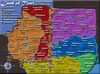
OK here is a new layout with names.

I know it is rough but I took out some of the rooms and made the boarders more consistent with the size of the deck.
I know it is rough but I took out some of the rooms and made the boarders more consistent with the size of the deck.
Last edited by WidowMakers on Tue Sep 18, 2007 5:41 am, edited 1 time in total.
-
WidowMakers
- Posts: 2774
- Joined: Mon Nov 20, 2006 9:25 am
- Location: Detroit, MI
![]() by ViscountGort on Fri Mar 02, 2007 6:07 am
by ViscountGort on Fri Mar 02, 2007 6:07 am
I still really like this idea, but i'm not a big fan of the newest look. Are you planning to keep the dark grey background in place of the nice colourful graphic you had in the first version? i hope not, as it looked really nice before.
i'm also not keen on the big table on the left showing no. of territories, this doesn't seem like the sort of info that needs to be displayed on the board. if you are going to keep it though, just wanted to point out that you spelt 'borders' wrong.
(you also spelt 'theatre' wrong as far as i'm concerned, but i guess i'll have to let that one go )
)
i think this will be a great map, keep up the good work
i'm also not keen on the big table on the left showing no. of territories, this doesn't seem like the sort of info that needs to be displayed on the board. if you are going to keep it though, just wanted to point out that you spelt 'borders' wrong.
(you also spelt 'theatre' wrong as far as i'm concerned, but i guess i'll have to let that one go
i think this will be a great map, keep up the good work
-

ViscountGort
- Posts: 35
- Joined: Mon Jan 22, 2007 7:21 am
- Location: University of Durham, England
![]() by Molacole on Fri Mar 02, 2007 7:44 am
by Molacole on Fri Mar 02, 2007 7:44 am
ok first thging I noticed was it seems like it's going to be very difficult finding room for the armies in certain areas.
sun foyer - red
kitchen - green
empress foyer - l,blue
casino entrance - l,blue
main querter 4 - yellow
main quarter 5 - yellow
plus the elevator shafts and stairs might be clustered up when it comes time for armies. Visuals as of now make it a lot easier to understand the map.
all in all a very good update.
-
Molacole
- Posts: 552
- Joined: Fri Jun 23, 2006 8:19 am
- Location: W 2.0 map by ZIM
![]() by WidowMakers on Fri Mar 02, 2007 10:47 am
by WidowMakers on Fri Mar 02, 2007 10:47 am
No. This picture is just to make sure the layout and gameplay (boarders, deck plans, etc) are correct. After we all agree on this I will build a 3D cutaway/layered model. It will be more efficient and allow the map to be smaller. The background is just gray becasue I made it gray.
IGNORE THE ASTETICS, BACKGROUNDS, TEXT FONTS AND SHAPES. THIS MAP IS USED FOR GAMEPLAY DEVELOPMENT ONLY.
I know and have thought about that. On the final 3D map the names and circles will need to be positioned off of the particular rooms. We will come to that once the gameplay is good.
Does the new nunmber of territories/boarders make better sense? What do people feel about the bonus. I will use the bonus calcualtor I wfound on the Underground map to make prelim values and add them to this post later. Thanks[/quote]
IGNORE THE ASTETICS, BACKGROUNDS, TEXT FONTS AND SHAPES. THIS MAP IS USED FOR GAMEPLAY DEVELOPMENT ONLY.
Molacole wrote:ok first thging I noticed was it seems like it's going to be very difficult finding room for the armies in certain areas.
I know and have thought about that. On the final 3D map the names and circles will need to be positioned off of the particular rooms. We will come to that once the gameplay is good.
Does the new nunmber of territories/boarders make better sense? What do people feel about the bonus. I will use the bonus calcualtor I wfound on the Underground map to make prelim values and add them to this post later. Thanks[/quote]
-
WidowMakers
- Posts: 2774
- Joined: Mon Nov 20, 2006 9:25 am
- Location: Detroit, MI
![]() by yamahafazer on Sat Oct 13, 2007 5:41 am
by yamahafazer on Sat Oct 13, 2007 5:41 am
I think that this could be cool. If you want more interest you probably need to make it look more interesting / cool. I think this can work. If it doesn't already have it maybe some way of jumping floors other that the stare wells. Maybe have the ship sinking sowly.... something like that.
-

yamahafazer
- Posts: 211
- Joined: Fri Aug 24, 2007 9:56 am
![]() by WidowMakers on Sat Oct 13, 2007 8:20 am
by WidowMakers on Sat Oct 13, 2007 8:20 am
I might bring it back later. I have several other projects I am working on now. Plus this map would be hard to get within th esize requirements for as big as it is now.
Probably remove a floor and make the rooms smaller.
Plus the elevators allow attack to any floor they touch. There is your attack other than stairs.
WM
Probably remove a floor and make the rooms smaller.
yamahafazer wrote:maybe some way of jumping floors other that the stare wells
Plus the elevators allow attack to any floor they touch. There is your attack other than stairs.
WM

-
WidowMakers
- Posts: 2774
- Joined: Mon Nov 20, 2006 9:25 am
- Location: Detroit, MI
56 posts
• Page 2 of 3 • 1, 2, 3
Return to Melting Pot: Map Ideas
Who is online
Users browsing this forum: No registered users
|
|||||||
| Conquer Club is not associated with RISK online in any way. Copyright © 2006-2025 by Big Wham LLC | |||||||