Conquer Club

Reconquista

Have an idea for a map? Discuss ideas and concepts here.

Moderator: Cartographers

Forum rules
Please read the Community Guidelines before posting.

Re: Reconquista

Postby theBastard on Wed Mar 17, 2010 5:51 pm

porkenbeans wrote:OK, so I was having so much fun working on the file that you sent me, that I stayed up all night till the sun came up. :lol:

I will send the psd file back to you so you can see exactly what I did.

I hope that you will like at least something that I did. If not, that's OK because I really enjoyed the time spent. :D


woow, I have not words... =D> =D>

great. I will spent much time for looking on it. you "must" teach me this ;) :D...
show


maybe I will have some little notices. thanks, realy.
User avatar
Corporal 1st Class theBastard
 
Posts: 994
Joined: Sat Jan 09, 2010 9:05 am

Re: Reconquista

Postby natty dread on Wed Mar 17, 2010 5:53 pm

Wow Porky, that actually looks really nice. You really improved the rivers, they are much more noticeable now.

I don't like the legend colour though, the legends looked better grey. Now they're kinda too dark...

The dark sea works, but it could be desaturated somewhat.

The shields are too dark.

Other than that, nice work.
Image
User avatar
Sergeant 1st Class natty dread
 
Posts: 12877
Joined: Fri Feb 08, 2008 8:58 pm
Location: just plain fucked

Re: Reconquista

Postby Industrial Helix on Wed Mar 17, 2010 6:56 pm

it's a nice improvement but it gives off the Vegas Neon feel too strongly. Something that could be easily altered i think. But the contrast certainly helps.
Sketchblog [Update 07/25/11]: http://indyhelixsketch.blogspot.com/
Living in Japan [Update 07/17/11]: http://mirrorcountryih.blogspot.com/
Russian Revolution map for ConquerClub [07/20/11]: viewtopic.php?f=241&t=116575
User avatar
Cook Industrial Helix
 
Posts: 3462
Joined: Mon Jul 14, 2008 6:49 pm
Location: Ohio

Re: Reconquista

Postby theBastard on Wed Mar 17, 2010 6:58 pm

o.k. I look at the map and have some notices. I agree with natty with some.
1, sea is too dark for me
2, also legends are too dark, and maybe they should have another colour/tone
3, the same for border around map
4, maybe all map needs less opacity...?
5, some shields are too dark (aragon, badajoz...)
6, do not know what is with navarra shield by Tudela, looks as has less opacity as others
7, the pink religious icons are great, but blue and yellow needs be darker...?

it is on you if you send me file with layers and I will try to edit it, or you will do some changes if you agree with any of notices.

it is amazing what you did with settlements icons in legend, I love them ;)

all at all again great work.
User avatar
Corporal 1st Class theBastard
 
Posts: 994
Joined: Sat Jan 09, 2010 9:05 am

Re: Reconquista

Postby porkenbeans on Wed Mar 17, 2010 7:01 pm

natty_dread wrote:Wow Porky, that actually looks really nice. You really improved the rivers, they are much more noticeable now.

I don't like the legend colour though, the legends looked better grey. Now they're kinda too dark...

The dark sea works, but it could be desaturated somewhat.

The shields are too dark.

Other than that, nice work.
The legend is that color for a reason. Making it dark and a similar color as the sea is necessary.
1.) They produce the needed contrast between the land and sea. The outside border of the map is also in the same color scheme, so as to lay back with the background, and allow the land to pop.

If you look closer you will see that the whole map is less saturated in color than the original.
The lighter colored land on top of the darker and similar colored background, allows the focus to be drawn towards the center of the map, and your attention is demanded to move to the colorful play area.

These colors were not just willy-nilly chosen. They are complimentary colors, and lie on the opposite sides of the color wheel. So the colors as well as the light and dark shades are meant to give the needed contrast that I am always talking about.

You and I are in agreement about one thing. The shields are too dark. I would have fixed that, But it would have taken some time, because they are all on the same layer as the buildings icons. So I just picked a setting that was a compromise. They will need to be redone on their own layer to eventually remedy this. ;)
Image
User avatar
Lieutenant porkenbeans
 
Posts: 2546
Joined: Mon Sep 10, 2007 4:06 pm

Re: Reconquista

Postby porkenbeans on Wed Mar 17, 2010 7:17 pm

theBastard wrote:o.k. I look at the map and have some notices. I agree with natty with some.
1, sea is too dark for me
2, also legends are too dark, and maybe they should have another colour/tone
3, the same for border around map
4, maybe all map needs less opacity...?
5, some shields are too dark (aragon, badajoz...)
6, do not know what is with navarra shield by Tudela, looks as has less opacity as others
7, the pink religious icons are great, but blue and yellow needs be darker...?

it is on you if you send me file with layers and I will try to edit it, or you will do some changes if you agree with any of notices.

it is amazing what you did with settlements icons in legend, I love them ;)

all at all again great work.
The Tudela is the only shield that I redid on its own layer. It is the same as the one in the legend. All of the shields need to be done to match their legend counterparts.

The buildings also need to be done so as to match the ones in the legend. I wanted to get your opinion first, and if you liked them that way, I could then do the rest like that.

I would be happy to make these fixes. Like I said, I am having a blast working on this map. I think that it could become one of CC's prettiest maps. :D
Image
User avatar
Lieutenant porkenbeans
 
Posts: 2546
Joined: Mon Sep 10, 2007 4:06 pm

Re: Reconquista

Postby porkenbeans on Wed Mar 17, 2010 7:43 pm

OK, thanx for the new file with the separate layers, I will see if I can make the fixes. Meantime here is a version with the sea a tad lighter, and the saturation reduced overall.
Click image to enlarge.
image
Image
User avatar
Lieutenant porkenbeans
 
Posts: 2546
Joined: Mon Sep 10, 2007 4:06 pm

Re: Reconquista

Postby theBastard on Wed Mar 17, 2010 8:07 pm

the graphic and all small things are beautifull, but the look of map is too modern. the colours have much light, the legends and border of map needs another colour, I think.

look here, I know my map is not close to this one, but I like this old style where colours looks simply, without any effects. hm, I´m not able to explain what I think, damned my bad poor English...
Click image to enlarge.
image
User avatar
Corporal 1st Class theBastard
 
Posts: 994
Joined: Sat Jan 09, 2010 9:05 am

Re: Reconquista

Postby TaCktiX on Thu Mar 18, 2010 10:13 pm

Agreed that the colors are TOO desaturated to the point that I bet it'll be a colorblindness problem. Raising the saturation seems like the best idea.
User avatar
Corporal 1st Class TaCktiX
 
Posts: 2392
Joined: Mon Dec 17, 2007 8:24 pm
Location: Rapid City, SD

Re: Reconquista

Postby porkenbeans on Fri Mar 19, 2010 12:41 am

Click image to enlarge.
image

The file that you gave me still had all of the icons on the same layer, so I just made new layers for all. I have been working on it all day, and I still have work to do, but here is what I have so far. :D
Image
User avatar
Lieutenant porkenbeans
 
Posts: 2546
Joined: Mon Sep 10, 2007 4:06 pm

Re: Reconquista

Postby porkenbeans on Fri Mar 19, 2010 2:02 am

With nautical lines.
Click image to enlarge.
image
Image
User avatar
Lieutenant porkenbeans
 
Posts: 2546
Joined: Mon Sep 10, 2007 4:06 pm

Re: Reconquista

Postby fumandomuerte on Fri Mar 19, 2010 2:33 am

You have some skills porken. The rivers look pixelated. Other than that I'd love to see if the text is legible on the small version.
Image
Thanks to the CC staff for the perma-ban on ۩░▒▓₪№™℮₪▓▒░۩!
User avatar
Captain fumandomuerte
 
Posts: 620
Joined: Sat Dec 29, 2007 1:27 am
Location: The Cinderella of the Pacific

Re: Reconquista

Postby theBastard on Fri Mar 19, 2010 3:08 am

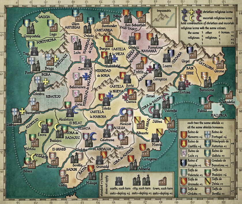
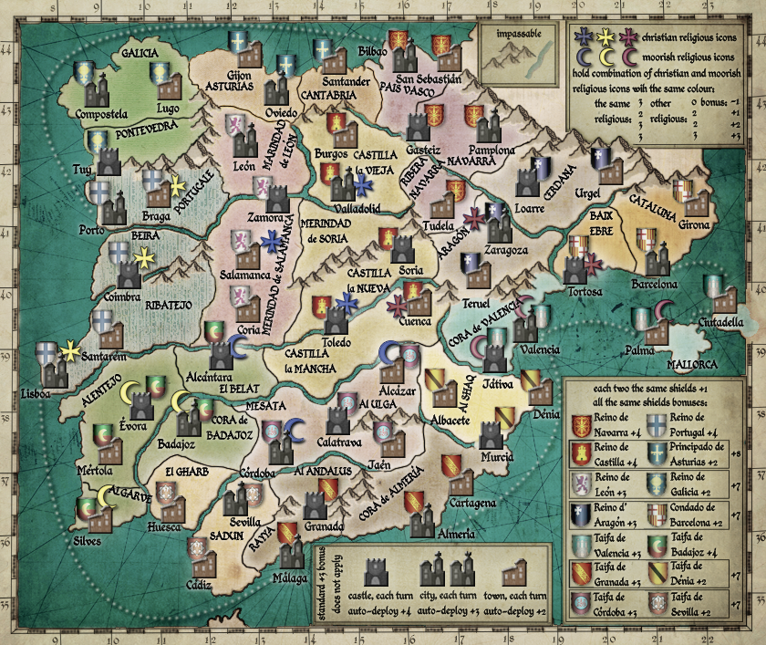
much, much better. I have some notices and than it should be perfect for me :)

1, I like as Portugal is coloured. is possible use this style for all regions? and maybe for sea? if not than Portugal needs looks as others...
2, GALICIA, PONTEVEDRA are too green
3, some colours have still much "neon" light...maybe playing with Hue/Saturation could helps.
4, the river by Coimbra is disconected, but it must be conected with castle. now it could confused player because it looks as you can attack region RIBATEJO directly from BEIRA, so you do not use castle Coimbra as rivercross.
5, also castles Játiva, Tortosa, Gasteiz must lie in both regions and disconecting rivers. these castles are rivercrossings. all these castles/rivers should looks as Zamora/river...
5, castle Calatrava must bordering with upper river and mountains. so it will be not possible attack region MESATA directly from Al ULGA
6, the blue christian icon by Salamanca should by more behind town, the pink christian icon by Zaragoza shoul be more behind city
7, some shields need more opacity, or more colour

hm, just now looking at file which I sent you and I have separate layers. do not know why you have not, sorry :)
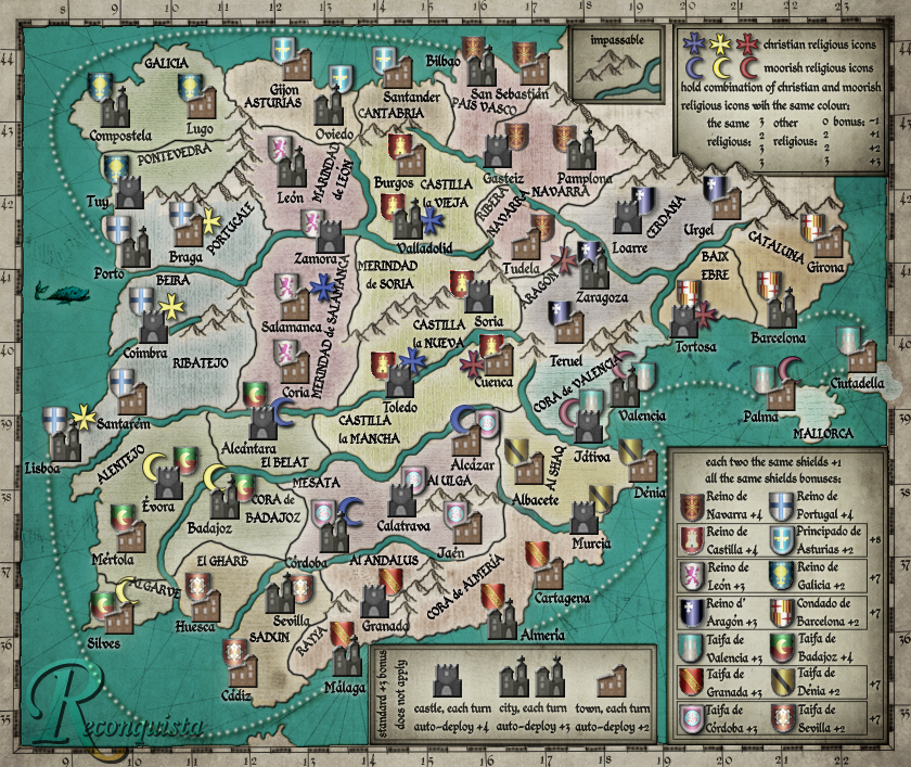
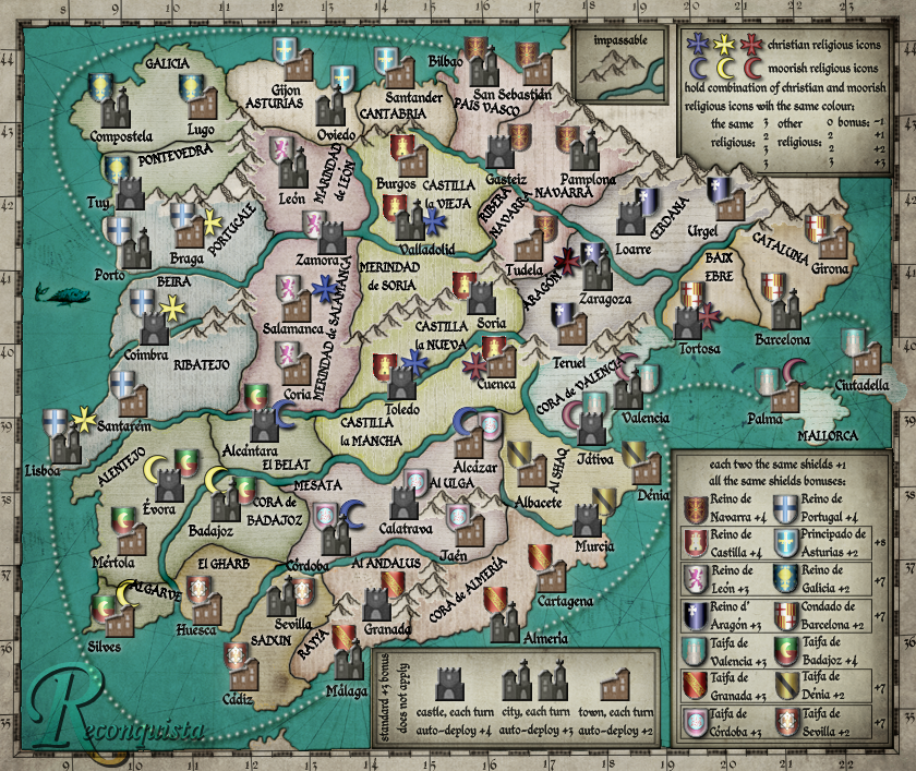
great work :D . I like also version with nautical lines, maybe more as without.
User avatar
Corporal 1st Class theBastard
 
Posts: 994
Joined: Sat Jan 09, 2010 9:05 am

Re: Reconquista

Postby porkenbeans on Fri Mar 19, 2010 11:34 am

Bast,
Could you post a copy of the 14 shields without any effects. Then I could clean them up a bit.

Yes the Port. texture can be used for the rest of the territs. I just wanted to get your opinion on it, before I spent all the time in doing so.

About the naut. lines, what do you mean "more as without" ?
Image
User avatar
Lieutenant porkenbeans
 
Posts: 2546
Joined: Mon Sep 10, 2007 4:06 pm

Re: Reconquista

Postby porkenbeans on Fri Mar 19, 2010 11:44 am

fumandomuerte wrote:You have some skills porken. The rivers look pixelated. Other than that I'd love to see if the text is legible on the small version.
Thanx fum. Yes I see that now. They are because of the naut. lines. Should be easy enough to erase them. And thank you very much for the kind words, I am very happy to know that someone likes my work. :D

After I make the latest fixes, I will post a small version as well. ;)
Image
User avatar
Lieutenant porkenbeans
 
Posts: 2546
Joined: Mon Sep 10, 2007 4:06 pm

Re: Reconquista

Postby theBastard on Fri Mar 19, 2010 12:32 pm

porkenbeans wrote:Bast,
Could you post a copy of the 14 shields without any effects. Then I could clean them up a bit.


here they are. WinRAR file or PNG file

http://www.2shared.com/file/12220873/e5 ... genda.html
show


porkenbeans wrote:Yes the Port. texture can be used for the rest of the territs. I just wanted to get your opinion on it, before I spent all the time in doing so.


thats great. I realy like Portugal texture and I think it should be nice to see all map in this texture...

porkenbeans wrote:About the naut. lines, what do you mean "more as without" ?


I more like map with nautical lines as map without them.
pork, I also like your work, my notices are only as help for have great and nice map... and also a little be close to my idea, I avow :oops:
User avatar
Corporal 1st Class theBastard
 
Posts: 994
Joined: Sat Jan 09, 2010 9:05 am

Re: Reconquista

Postby porkenbeans on Fri Mar 19, 2010 9:33 pm

Bast,
Do you have a copy of the shields without any effects ? (no shading).
Image
User avatar
Lieutenant porkenbeans
 
Posts: 2546
Joined: Mon Sep 10, 2007 4:06 pm

Re: Reconquista

Postby the.killing.44 on Fri Mar 19, 2010 10:45 pm

Click image to enlarge.
image


One of the nicest- and most authentic-looking maps I've seen in a long time, awesome work to both.
Last edited by the.killing.44 on Sat Mar 20, 2010 9:45 am, edited 1 time in total.
User avatar
Captain the.killing.44
 
Posts: 4724
Joined: Thu Oct 23, 2008 7:43 pm
Location: now tell me what got two gums and knows how to spit rhymes

Re: Reconquista

Postby theBastard on Sat Mar 20, 2010 1:37 am

to pork, no this is only what I have. they will be good, do not worry :)
could you upload somewhere your version (the last) with layers? thanks.

to the.killing.44, thanks for your kind words.
User avatar
Corporal 1st Class theBastard
 
Posts: 994
Joined: Sat Jan 09, 2010 9:05 am

Re: Reconquista

Postby Industrial Helix on Sat Mar 20, 2010 9:44 am

It is indeed a good looking map... I'd like to see those rivers on Baltic Crusades, theBastard.

Now somebody make a Design Brief and get this thing moving! Seven pages of development has no place in the Foundry.
Sketchblog [Update 07/25/11]: http://indyhelixsketch.blogspot.com/
Living in Japan [Update 07/17/11]: http://mirrorcountryih.blogspot.com/
Russian Revolution map for ConquerClub [07/20/11]: viewtopic.php?f=241&t=116575
User avatar
Cook Industrial Helix
 
Posts: 3462
Joined: Mon Jul 14, 2008 6:49 pm
Location: Ohio

Re: Reconquista

Postby TaCktiX on Sat Mar 20, 2010 9:55 am

Industrial Helix wrote:Now somebody make a Design Brief and get this thing moving! Seven pages of development has no place in the Melting Pot.


Fixed, and I agree with Helix's sentiments.
User avatar
Corporal 1st Class TaCktiX
 
Posts: 2392
Joined: Mon Dec 17, 2007 8:24 pm
Location: Rapid City, SD

Re: Reconquista

Postby theBastard on Sat Mar 20, 2010 11:04 am

Industrial Helix wrote:It is indeed a good looking map... I'd like to see those rivers on Baltic Crusades, theBastard.


ou, Helix there is more things which I´d like to see on Baltic Crusades :D . I will looking what I´m able to do...

PS: or, pork, if you have interest and good will :oops: , could you look here viewtopic.php?f=241&t=107186&start=135
User avatar
Corporal 1st Class theBastard
 
Posts: 994
Joined: Sat Jan 09, 2010 9:05 am

Re: Reconquista

Postby porkenbeans on Sat Mar 20, 2010 3:25 pm

I like the way the mountains blend in better with the "edge glow" but I like the overall feel of the "center glow". Maybe a poll is in order ? (that will also bring in more people to the thread). ;)

Edge glow on territs-
Click image to enlarge.
image

Center glow on territs-
Click image to enlarge.
image
Image
User avatar
Lieutenant porkenbeans
 
Posts: 2546
Joined: Mon Sep 10, 2007 4:06 pm

Re: Reconquista

Postby theBastard on Sat Mar 20, 2010 4:18 pm

sorry pork, but I do not like as shields are done...or better said, the shield of Asturias and Cordoba do not looks fine.
it is great now, I like Moby Dick :lol: and texture. maybe you should take Saturation a little bit.

hm, poll. I have no problems with this, I think now is map more on you as me :D ... but I will be happy to have it finished and moved so quickly as is possible. I have a lot work on Baltic Crusades (maybe you should help me :-s ) and now I am working on the next map about all world...
User avatar
Corporal 1st Class theBastard
 
Posts: 994
Joined: Sat Jan 09, 2010 9:05 am

Re: Reconquista

Postby natty dread on Sat Mar 20, 2010 4:43 pm

I don't like the watermark title... doesn't fit the style of the map IMO.

Can't find anything else to criticize atm. Nice work :)
Image
User avatar
Sergeant 1st Class natty dread
 
Posts: 12877
Joined: Fri Feb 08, 2008 8:58 pm
Location: just plain fucked

PreviousNext

Return to Melting Pot: Map Ideas

Who is online

Users browsing this forum: No registered users