Conquer 4: Back in Development [Abandoned Again?]
Moderator: Cartographers
Forum rules
Please read the Community Guidelines before posting.
Please read the Community Guidelines before posting.

-
Bad Speler

- Posts: 1027
- Joined: Fri Jun 02, 2006 8:16 pm
- Gender: Male
- Location: Ottawa
- Contact:
-
AndyDufresne

- Posts: 24932
- Joined: Fri Mar 03, 2006 8:22 pm
- Location: A Banana Palm in Zihuatanejo
- Contact:


I still prefer the original clean CC style image without texture, but since everyone's having fun with texturing my map I thought I'd do the same. 
I also added a Sherman Tank diagram in the background from http://en.wikipedia.org/wiki/Image:M4A4_cutaway.png.
I've removed the Bonus Guide and game description because I'm considering redoing these to try and help clarify the gameplay and bonus system.


I also added a Sherman Tank diagram in the background from http://en.wikipedia.org/wiki/Image:M4A4_cutaway.png.
I've removed the Bonus Guide and game description because I'm considering redoing these to try and help clarify the gameplay and bonus system.


-
Bad Speler
- Posts: 1027
- Joined: Fri Jun 02, 2006 8:16 pm
- Gender: Male
- Location: Ottawa
- Contact:
-
Bad Speler
- Posts: 1027
- Joined: Fri Jun 02, 2006 8:16 pm
- Gender: Male
- Location: Ottawa
- Contact:

-
Captain Crash

- Posts: 252
- Joined: Thu Feb 01, 2007 7:06 pm
- Location: Melbourne
I liked it best when it looked like the plastic connect four 'board', except grey to give it the army feel.
I don't see the need for texture, but if I had to pick 1 I'd pick the first one that Wisse put up.
I think the tank outline detracts from that simple plastic frame look.
Of your two textures Keyogi, I like the first one more.

I don't see the need for texture, but if I had to pick 1 I'd pick the first one that Wisse put up.
I think the tank outline detracts from that simple plastic frame look.
Of your two textures Keyogi, I like the first one more.


-
Bad Speler
- Posts: 1027
- Joined: Fri Jun 02, 2006 8:16 pm
- Gender: Male
- Location: Ottawa
- Contact:

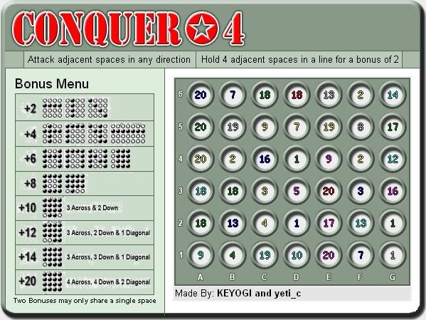
Update - March 14

Changes made this update:
- Back to the old clean CC style
- Changed Bonus Guide
- Changed attack description
- Removed bonus description from under title
Comments:
I hate the new Bonus Guide with a passion, I just thought I'd offer something new to try and clear up the confusion. The saying goes that "a picture is worth a thousand words" and I tend to think that theory worked well for the Bonus Guide. I've taken an alternative option of trying to explain the system in plain English, but now we don't have the space to demonstrate a wide range of bonuses. I feel this is just going to create more problems.


I agree you should use graphics, but you still need to simplify. You have just two rules: 1) you need four-in-a-row to get a bonus. 2) two bonuses cannot share more than one territory.KEYOGI wrote:I hate the new Bonus Guide with a passion, I just thought I'd offer something new to try and clear up the confusion. The saying goes that "a picture is worth a thousand words" and I tend to think that theory worked well for the Bonus Guide.
I had something like this in mind:
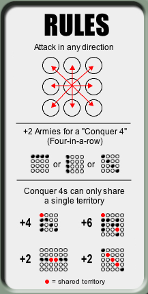
It is important that you show examples of how NOT to get a bonus.
Maybe someone can improve on this further?

i like what otto has done. Giving the bonus a name adds clarity, and the arrows make attack routes obvious at a glance.
The line about how two lines may intersect but only have one common circle is odd, in that two intersecting lines would only be able to share one point anyway. It's really only there to explain how two groups of four on teh same line can't overlap, so it's redundant to also have the piece at the bottom about no bonus for 5 or 6.
Maybe this has already been discussed, but will every bonus and negative have the same name in the xml? It would be great to knock the bonuses down to just one line. You know...
Keyogi receives 2 armies for holding Conquer-4s
or
Keyogi receives 16 armeis for holding Conquer-4s.