Netherlands [Quenched]
Moderator: Cartographers


![]() by Qwert on Wed Feb 21, 2007 12:27 pm
by Qwert on Wed Feb 21, 2007 12:27 pm
boberz-these only my opinion and if he dont want to change, i dont mine, i just say that these map will be better with some colored neutral terittory, these not a order, just sugestion.
-

 Qwert
Qwert
- SoC Training Adviser
- Posts: 9262
- Joined: Tue Nov 07, 2006 5:07 pm
- Location: VOJVODINA


![]() by spinwizard on Wed Feb 21, 2007 12:40 pm
by spinwizard on Wed Feb 21, 2007 12:40 pm
lone has been on...just not on this thread, and the pic's at the bottom made it look cluttered and a tacky attemt 2 jazz up a gr8 looking map, i like the bright/sleek feel 2 maps, like the ausse map!

-

spinwizard
- Posts: 5016
- Joined: Sun Dec 10, 2006 9:52 am


![]() by bonobo`s son on Sat Feb 24, 2007 10:36 am
by bonobo`s son on Sat Feb 24, 2007 10:36 am
earet to lone, when do you think to do something to this map


-
bonobo`s son
- Posts: 420
- Joined: Thu Jan 04, 2007 11:27 am
- Location: Amsterdam - Artis


![]() by Lone.prophet on Sun Feb 25, 2007 6:27 am
by Lone.prophet on Sun Feb 25, 2007 6:27 am
the only problem seemed to be on the small version so i smootened it up anyt comments?


-
Lone.prophet
- Posts: 1467
- Joined: Thu Oct 12, 2006 4:37 pm
- Location: Your basement Muahaha


![]() by KEYOGI on Sun Feb 25, 2007 7:16 am
by KEYOGI on Sun Feb 25, 2007 7:16 am
Sorry I haven't paid attention to this topic for a while, just kind of got lost in the mix.
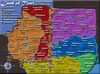
I like the title, looks very nice. It's probably too late to be coming in suggesting changes but here it goes anyway.
The colours are a bit average for me, I think if you worked with some new colours you would dramatically improve the look of the map. It wouldn't really be much work involved. I just find that colours should sort of complement each other while providing good contrast. You've got the contrast but the colours are a bit hard on the eye. It sort of seems you've got a mix of pastel and primary colours, then some odd one's thrown in as well. Sorry to rant, I'm just trying to get my point across but not sure how to put it.
The river in the dead territory seems to sit below the surface, but not through the game board. I think this is mainly because that black line is missing in the brown dead territory. If you were to fix that I think it'd look more consistent and remove that issue.
I'm really not a fan of the legend. Maybe in part due to the colour issues with the map, but I don't like that flag behind there either. Also, your legend interfering with the map in West-Friesland looks bad IMO. I'm sure you could reduce the text size a point or two to fix this. Perhaps just stick with the font for the map or the title in the legend as well, I think you've got too many fonts at present.
Some things to consider, or not if you're absolutely set on it how it is. I just think it could look so much better with just a little bit of work.
I like the title, looks very nice. It's probably too late to be coming in suggesting changes but here it goes anyway.
The colours are a bit average for me, I think if you worked with some new colours you would dramatically improve the look of the map. It wouldn't really be much work involved.
The river in the dead territory seems to sit below the surface, but not through the game board. I think this is mainly because that black line is missing in the brown dead territory. If you were to fix that I think it'd look more consistent and remove that issue.
I'm really not a fan of the legend. Maybe in part due to the colour issues with the map, but I don't like that flag behind there either. Also, your legend interfering with the map in West-Friesland looks bad IMO. I'm sure you could reduce the text size a point or two to fix this. Perhaps just stick with the font for the map or the title in the legend as well, I think you've got too many fonts at present.
Some things to consider, or not if you're absolutely set on it how it is. I just think it could look so much better with just a little bit of work.
-
KEYOGI
- Posts: 1632
- Joined: Tue Oct 10, 2006 6:09 am


![]() by Contrickster on Sun Feb 25, 2007 9:26 am
by Contrickster on Sun Feb 25, 2007 9:26 am
I love the coloured bridges.
This map looks great! Clean, bright, colourful.
I do like the key - simple is best. However as KEYOGI said, it does eat into West Freisland.
My one comment would be the river doesn't look right going through the brown area. Maybe something can be done with the "dead territory"? Perhaps it can be shaded? Different texture to play area?
-
Contrickster
- Posts: 261
- Joined: Tue Jan 23, 2007 7:24 pm


![]() by Enigma on Wed Feb 28, 2007 1:18 pm
by Enigma on Wed Feb 28, 2007 1:18 pm
i agree with wisse, 5 could use a tiny bit more cleaning, and also with keyogi about middle nederland overlapping the map. is there any way to fix that?
other than that it looks great. i was just thinking today that i wish it were finished so i could start a game on it
other than that it looks great. i was just thinking today that i wish it were finished so i could start a game on it
Do you need an excuse to have a war? I mean, who for? Can't you just say "You got lots of cash and land, but I've got a big sword, so divy up right now, chop chop."
Terry Pratchet
Terry Pratchet
-

Enigma
- Posts: 367
- Joined: Mon Jul 03, 2006 10:23 pm
- Location: Classified


![]() by Lt. Valerian on Wed Feb 28, 2007 2:09 pm
by Lt. Valerian on Wed Feb 28, 2007 2:09 pm
I think that this map looks finished. I don't think you should change anything. The colors are perfect because they are dark and stand out well. Further, the river looks really nice because of the sunken effect that you used. It looks ready for xml testing to me!
-

Lt. Valerian
- Posts: 36
- Joined: Fri Feb 09, 2007 11:24 am
- Location: United States

![]() by Nikita_2006 on Fri Mar 16, 2007 4:33 pm
by Nikita_2006 on Fri Mar 16, 2007 4:33 pm
When will this map be good anough to play.
What more must there be done to get it where in belongs, in the map-directory.
So Andy did you have any remarks left for us.
gr. Nikita
What more must there be done to get it where in belongs, in the map-directory.
So Andy did you have any remarks left for us.
gr. Nikita
-
Nikita_2006
- Posts: 486
- Joined: Thu Oct 19, 2006 8:35 am
![]() by AndyDufresne on Fri Mar 16, 2007 6:28 pm
by AndyDufresne on Fri Mar 16, 2007 6:28 pm
Well it'd surely be nice to see the latest versions of the map. I don't know if it's been worked on.
--Andy
--Andy
-

AndyDufresne
- Posts: 24935
- Joined: Fri Mar 03, 2006 8:22 pm
- Location: A Banana Palm in Zihuatanejo


![]() by Lone.prophet on Mon Mar 19, 2007 12:23 pm
by Lone.prophet on Mon Mar 19, 2007 12:23 pm
here is latest found an 1337 legand font

the biggest were already finished it only has a differnet font in the legend now
the biggest were already finished it only has a differnet font in the legend now
-
Lone.prophet
- Posts: 1467
- Joined: Thu Oct 12, 2006 4:37 pm
- Location: Your basement Muahaha


Who is online
Users browsing this forum: No registered users
|
|||||||
| Conquer Club is not associated with RISK online in any way. Copyright © 2006-2025 by Big Wham LLC | |||||||