[Official] Middle East REVAMP [Quenched]
Moderator: Cartographers
![]() by sully800 on Tue Mar 27, 2007 11:35 am
by sully800 on Tue Mar 27, 2007 11:35 am
I just had another thought- you could move the burn hole in the lower left side so that it covers up the 4 way corner. Then you wouldn't need that little lake to do the job for you (I think that corner looks a little strange as it is anyway).
-

 sully800
- Posts: 4978
- Joined: Wed Jun 14, 2006 5:45 pm
- Location: Bethlehem, Pennsylvania


![]() by KEYOGI on Tue Mar 27, 2007 11:55 am
by KEYOGI on Tue Mar 27, 2007 11:55 am

I tried toning down the edges, but I'm still not convinced. I think a large part of it is to do with the fact that the rest of the map is so pristine apart from the ragged edges. I attempted to fix this with some creases on the map, but I'm getting out of my league here.
-
KEYOGI
- Posts: 1632
- Joined: Tue Oct 10, 2006 6:09 am


![]() by DiM on Tue Mar 27, 2007 1:26 pm
by DiM on Tue Mar 27, 2007 1:26 pm
maybe do something like this. the edges are less ... edgy. 
a more gentle rip
a more serious rip
a more gentle rip
a more serious rip
“In the beginning God said, the four-dimensional divergence of an antisymmetric, second rank tensor equals zero, and there was light, and it was good. And on the seventh day he rested.”- Michio Kaku
-

DiM
- Posts: 10415
- Joined: Wed Feb 14, 2007 6:20 pm
- Location: making maps for scooby snacks


![]() by Guiscard on Tue Mar 27, 2007 2:41 pm
by Guiscard on Tue Mar 27, 2007 2:41 pm
Clean edges look the best for me... I think your right in that such a pristine and smart map looks wrong with jagged edges.
qwert wrote:Can i ask you something?What is porpose for you to open these Political topic in ConquerClub? Why you mix politic with Risk? Why you not open topic like HOT AND SEXY,or something like that.
-

Guiscard
- Posts: 4103
- Joined: Fri Dec 08, 2006 7:27 pm
- Location: In the bar... With my head on the bar


![]() by Lt. Valerian on Wed Mar 28, 2007 10:42 am
by Lt. Valerian on Wed Mar 28, 2007 10:42 am
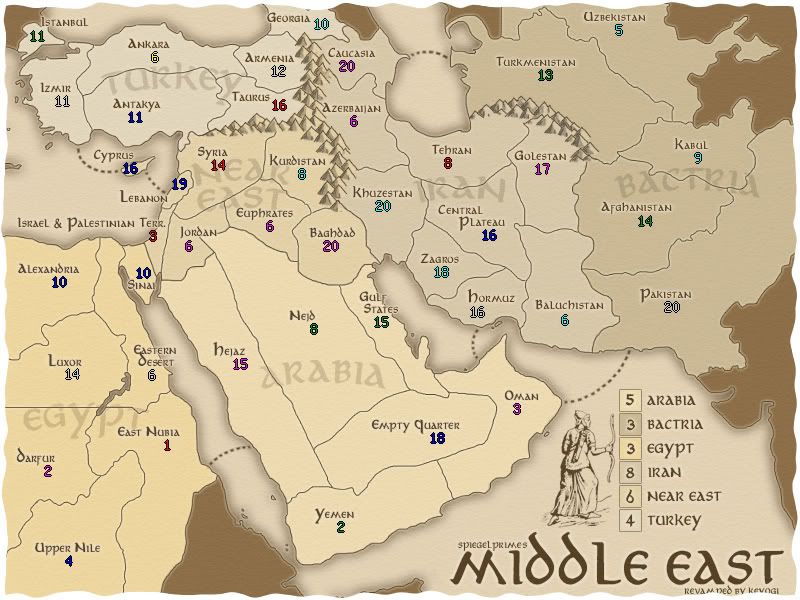
Personally, I don't like the tattered edges much. Also, I noticed a mistake on the continent bonus legend. You accidentally switched the bonuses for the Near East and Iran. That would really screw up the game-play of the map. Thanks.
-

Lt. Valerian
- Posts: 36
- Joined: Fri Feb 09, 2007 11:24 am
- Location: United States


![]() by sully800 on Wed Mar 28, 2007 11:28 am
by sully800 on Wed Mar 28, 2007 11:28 am
Well, I really like the versions with the tattered edges and I still think a burn hole would be a better way to get rid of the 4 way corner. But I understand if I'm in the minority and I think the clean edges look good as well.
-
sully800
- Posts: 4978
- Joined: Wed Jun 14, 2006 5:45 pm
- Location: Bethlehem, Pennsylvania
![]() by Enigma on Wed Mar 28, 2007 11:51 am
by Enigma on Wed Mar 28, 2007 11:51 am
sully800 wrote:Well, I really like the versions with the tattered edges and I still think a burn hole would be a better way to get rid of the 4 way corner. But I understand if I'm in the minority and I think the clean edges look good as well.
ditto
Do you need an excuse to have a war? I mean, who for? Can't you just say "You got lots of cash and land, but I've got a big sword, so divy up right now, chop chop."
Terry Pratchet
Terry Pratchet
-

Enigma
- Posts: 367
- Joined: Mon Jul 03, 2006 10:23 pm
- Location: Classified


![]() by fluffybunnykins on Wed Mar 28, 2007 3:59 pm
by fluffybunnykins on Wed Mar 28, 2007 3:59 pm
personally I prefer the unburnt edges
burnt would probably work best on an island map, then you only lose sea!
burnt would probably work best on an island map, then you only lose sea!
Superman wears 'Fluffybunnykins' pyjamas
-

fluffybunnykins
- Posts: 385
- Joined: Tue May 02, 2006 6:43 am
- Location: Liverpool, UK
![]() by Nikolai on Wed Mar 28, 2007 4:42 pm
by Nikolai on Wed Mar 28, 2007 4:42 pm
Wow, Keyogi, I'm in love! It's beautiful!
Valerian's right about that continent bonus switch. I haven't got time to re read the thread right now, so if it's deliberate, say so, but he does have a point. And as far as the edges go... I do kind of get the feeling they need something, because the sharp chop sort of makes the map look less legit, but I don't know if torn or burtn edges is it. Have you considered some sort of frame - possibly a wood texture?
Valerian's right about that continent bonus switch. I haven't got time to re read the thread right now, so if it's deliberate, say so, but he does have a point. And as far as the edges go... I do kind of get the feeling they need something, because the sharp chop sort of makes the map look less legit, but I don't know if torn or burtn edges is it. Have you considered some sort of frame - possibly a wood texture?
-
Nikolai
- Posts: 423
- Joined: Wed Jun 28, 2006 9:11 pm

![]() by Ruben Cassar on Wed Mar 28, 2007 4:45 pm
by Ruben Cassar on Wed Mar 28, 2007 4:45 pm
It really is beautiful. I hope you grace us with more maps in the future Keyogi. Can I make a list of maps for you to create? 


-

Ruben Cassar
- Posts: 2160
- Joined: Thu Nov 16, 2006 6:04 am
- Location: Civitas Invicta, Melita, Evropa


![]() by KEYOGI on Wed Mar 28, 2007 5:20 pm
by KEYOGI on Wed Mar 28, 2007 5:20 pm
Nikolai wrote:Wow, Keyogi, I'm in love! It's beautiful!
Valerian's right about that continent bonus switch. I haven't got time to re read the thread right now, so if it's deliberate, say so, but he does have a point. And as far as the edges go... I do kind of get the feeling they need something, because the sharp chop sort of makes the map look less legit, but I don't know if torn or burtn edges is it. Have you considered some sort of frame - possibly a wood texture?
Yes, the bonus switch is a mistake. Something I did when coming up with a new legend.
I think the main problem with edges is the fact that this map is zoomed in more than the original. I did this because the map is quite cramped in some places, so I wanted territories to be a bit bigger. The side effect is it hasn't given me enough room for an edge effect. I will try something again in a future upate though, perhaps a more simple border would be more appropriate. I'm currently working the XML for the small version so I'll post that before I do any more visual changes.
Ruben Cassar wrote:It really is beautiful. I hope you grace us with more maps in the future Keyogi. Can I make a list of maps for you to create?
You sure can, I'm welcome to suggestions. Napoleans invasion of Russia was a good one and a map I'm looking into. Only in the rough planning stages at this point though.
I've asked Andy to contact the original cartographer of Montreal to see if a revamp is possible. It is a map I've only played very recently and I like it. I just avoided it in the past because of its appearance.
I've also started a number of other projects since completing Australia, but I often come across some sort of problem in early development and abandon the idea before it gets to a stage where I would post it in the foundry. I still have plenty of ideas I'd like to maybe one day pursue, it's just this map making is a slow business. So yes, more ideas are welcome. Just don't expect to see them anytime soon.
-
KEYOGI
- Posts: 1632
- Joined: Tue Oct 10, 2006 6:09 am
![]() by Ruben Cassar on Wed Mar 28, 2007 6:36 pm
by Ruben Cassar on Wed Mar 28, 2007 6:36 pm
Well I think you will be busy with Napoleon's invasion of Russia for a while.
Once you finish that you could always make a map of modern day Russia which many people have started but never finished. The largest country in the world deserves a map!
On Montreal I think it's a good map but I agree with you that it needs to be visually revamped. I would definitely play it more then!
-
Ruben Cassar
- Posts: 2160
- Joined: Thu Nov 16, 2006 6:04 am
- Location: Civitas Invicta, Melita, Evropa
![]() by Ruben Cassar on Wed Mar 28, 2007 6:37 pm
by Ruben Cassar on Wed Mar 28, 2007 6:37 pm
Nikolai wrote:Can we start by having him update the classic map?
Classic? People would kill you if you touched that one! Hehe.
-
Ruben Cassar
- Posts: 2160
- Joined: Thu Nov 16, 2006 6:04 am
- Location: Civitas Invicta, Melita, Evropa
![]() by KEYOGI on Wed Mar 28, 2007 7:25 pm
by KEYOGI on Wed Mar 28, 2007 7:25 pm
I think Classic could use some minor modifications. I wouldn't want to see the visual style change. However, I would like to see:
- New army shadows
- Oceania and Asia having more colour difference
- Army shadows not overlapping text
- New army shadows
- Oceania and Asia having more colour difference
- Army shadows not overlapping text
-
KEYOGI
- Posts: 1632
- Joined: Tue Oct 10, 2006 6:09 am


![]() by sully800 on Wed Mar 28, 2007 8:36 pm
by sully800 on Wed Mar 28, 2007 8:36 pm
KEYOGI wrote:I think Classic could use some minor modifications. I wouldn't want to see the visual style change. However, I would like to see:
- New army shadows
- Oceania and Asia having more colour difference
- Army shadows not overlapping text
If you do decide to update classic in that manor, be sure to add to line on the map between Great Britain and Scandanavia. There is a route there, as there should be, but the line isn't on the map.
Also, you may want to look into changing the Kamchatka/Irkutsk/Mongolia area. In most Risk games Mongolia and Kamchatka border. Here for some reason Irkutsk plunges to the sea and eliminates that border. I've heard complaints about that.
Anyway, that's just some food for thought. Back to the topic at hand!
-
sully800
- Posts: 4978
- Joined: Wed Jun 14, 2006 5:45 pm
- Location: Bethlehem, Pennsylvania
![]() by Spockers on Wed Mar 28, 2007 9:14 pm
by Spockers on Wed Mar 28, 2007 9:14 pm
I haven't been following this map, but on first look i'm having a LOT of trouble matching the continent colours to the colours on the key.
Unfortunately, the colours look great, and to change them so that they are more distinguishable would probably ruin the map.
so yeah.. just sayin'.....
Unfortunately, the colours look great, and to change them so that they are more distinguishable would probably ruin the map.
so yeah.. just sayin'.....
-

Spockers
- Posts: 390
- Joined: Mon Oct 02, 2006 11:11 pm


Who is online
Users browsing this forum: No registered users
|
|||||||
| Conquer Club is not associated with RISK online in any way. Copyright © 2006-2025 by Big Wham LLC | |||||||