This is looking great (the version without the easter egg paint swipes). A solid representation of the state.
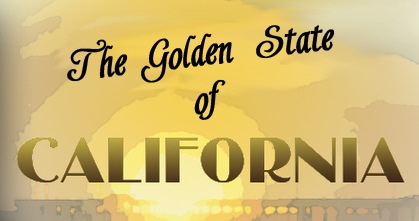
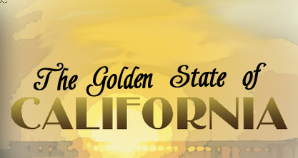
My only criticism is the fonts used for the titles. They seem rather flat and brush script is a very recognizable font. I feel like California could using something bolder.
Dafont.com has a wide selection of free fonts you can download. I bet you can find a font there that really suits this map.
California [Quenched]
Moderator: Cartographers
Re: California 3.8
![]() by lostatlimbo on Fri Apr 08, 2011 12:56 am
by lostatlimbo on Fri Apr 08, 2011 12:56 am
-

 lostatlimbo
- Posts: 1386
- Joined: Wed Mar 28, 2007 3:56 pm
- Location: Portland, OR


Re: California 3.9
![]() by lostatlimbo on Fri Apr 08, 2011 1:06 am
by lostatlimbo on Fri Apr 08, 2011 1:06 am
Retro might be a good place to start - I saw several browsing through here that might work.
http://www.dafont.com/theme.php?cat=115 ... California
Some interesting ones:
http://www.dafont.com/oldgatelaneoutlin ... California
http://www.dafont.com/uncle-bob-mf-shad ... California
http://www.dafont.com/facets-nf.font?text=California
http://www.dafont.com/theme.php?cat=115 ... California
Some interesting ones:
http://www.dafont.com/oldgatelaneoutlin ... California
http://www.dafont.com/uncle-bob-mf-shad ... California
http://www.dafont.com/facets-nf.font?text=California
-
lostatlimbo
- Posts: 1386
- Joined: Wed Mar 28, 2007 3:56 pm
- Location: Portland, OR
Re: California 3.9
![]() by isaiah40 on Fri Apr 08, 2011 6:02 am
by isaiah40 on Fri Apr 08, 2011 6:02 am
jefjef wrote:Nice. But why is the bay brown on the main map? Why not have the inset solid bordered for SF?
Because they brown nose Sacramento!
Okay seriously, the water in the insets need to be toned down like the rest of the background is. Also can you swap the seal and your names around. It seems funny that the names are in a highly visual part of the map but the seal isn't. The names should be seen but not right in the players vision. If you put them in that same corner under the seal that would be great.
Those are my 2 cents for now.
-
isaiah40
- Posts: 3990
- Joined: Mon Aug 27, 2007 7:14 pm


Re: California 3.9
![]() by The Bison King on Fri Apr 08, 2011 7:09 pm
by The Bison King on Fri Apr 08, 2011 7:09 pm
- Click image to enlarge.

- Click image to enlarge.

Ok here's the changes requested by Isiah. Concerning the font's suggested by Lostatlimbo, there are some cool font's that you posted. Some might work. I'm happy with the font that I have now but I'll try a few on for size, and see if they work.
Last edited by The Bison King on Sat Apr 09, 2011 12:45 pm, edited 3 times in total.

-

The Bison King
- Posts: 1957
- Joined: Thu Aug 27, 2009 5:06 pm
- Location: the Mid-Westeros


Re: California 4.0
![]() by Industrial Helix on Sat Apr 09, 2011 9:47 am
by Industrial Helix on Sat Apr 09, 2011 9:47 am
Two Concerns:
Someone mentioned something recently about the logo... the current logo doesn't seem to fit, imo. That other copyrighted font was perfect though... could you somehow replicate it? Perhaps integrating the seal into the logo could work as well... I think it needs some playing with.
The colors still seem blown out to me. I understand you want colorful and vibrant... but I think they're blown out.
Sketchblog [Update 07/25/11]: http://indyhelixsketch.blogspot.com/
Living in Japan [Update 07/17/11]: http://mirrorcountryih.blogspot.com/
Russian Revolution map for ConquerClub [07/20/11]: viewtopic.php?f=241&t=116575
Living in Japan [Update 07/17/11]: http://mirrorcountryih.blogspot.com/
Russian Revolution map for ConquerClub [07/20/11]: viewtopic.php?f=241&t=116575
-

Industrial Helix
- Posts: 3462
- Joined: Mon Jul 14, 2008 6:49 pm
- Location: Ohio


Re: California 4.0
![]() by The Bison King on Sat Apr 09, 2011 10:45 am
by The Bison King on Sat Apr 09, 2011 10:45 am
Someone mentioned something recently about the logo... the current logo doesn't seem to fit, imo. That other copyrighted font was perfect though... could you somehow replicate it? Perhaps integrating the seal into the logo could work as well... I think it needs some playing with.
When you say "logo" do you mean "title"?
The colors still seem blown out to me. I understand you want colorful and vibrant... but I think they're blown out.
I purposefully made them brighter because the upload process always seems to dull the colors down a bit. I'm trying to counter act that.
-
The Bison King
- Posts: 1957
- Joined: Thu Aug 27, 2009 5:06 pm
- Location: the Mid-Westeros
Re: California 4.0
![]() by natty dread on Sat Apr 09, 2011 11:19 am
by natty dread on Sat Apr 09, 2011 11:19 am
The Bison King wrote:I purposefully made them brighter because the upload process always seems to dull the colors down a bit. I'm trying to counter act that.
Try saving the images as PNG:s. PNG is a lossless format and supports gamma correction so your images should show up exactly as they show on your computer.
Anyway, you could try desaturating the colours a bit.

-

natty dread
- Posts: 12877
- Joined: Fri Feb 08, 2008 8:58 pm
- Location: just plain fucked


Re: California 4.0
![]() by The Bison King on Sat Apr 09, 2011 12:10 pm
by The Bison King on Sat Apr 09, 2011 12:10 pm
Anyway, you could try desaturating the colours a bit.
I have tried desaturating it. Older version were much less vivid. I brightened up the colors because I wanted them to be bright. We'll see how they look after upload. If they need tweeking then, then tweeking they will need.
Try saving the images as PNG:s. PNG is a lossless format and supports gamma correction so your images should show up exactly as they show on your computer.
I thought I did that, for one of my other maps... maybe not... I can't remember.
-
The Bison King
- Posts: 1957
- Joined: Thu Aug 27, 2009 5:06 pm
- Location: the Mid-Westeros
Re: California 4.0
![]() by The Bison King on Sat Apr 09, 2011 12:43 pm
by The Bison King on Sat Apr 09, 2011 12:43 pm
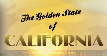
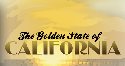
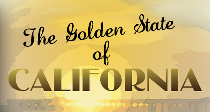
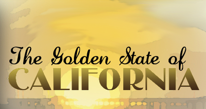
1
2
3
4
5
6
A veritable buffet of different fonts.
- Click image to enlarge.
2
- Click image to enlarge.

3
- Click image to enlarge.

4
- Click image to enlarge.

5
- Click image to enlarge.

6
- Click image to enlarge.

A veritable buffet of different fonts.
-
The Bison King
- Posts: 1957
- Joined: Thu Aug 27, 2009 5:06 pm
- Location: the Mid-Westeros
Re: California 4.0
![]() by Vlasov on Sat Apr 09, 2011 5:41 pm
by Vlasov on Sat Apr 09, 2011 5:41 pm
Maybe you could make some kind of slanting boundary line, extending from Napa Valley to Monterey, to better define the BAY AREA region?
So as to make "Bay Area" more of a clear submap, like the one for Los Angeles?
(and gray out the waters in between)
So as to make "Bay Area" more of a clear submap, like the one for Los Angeles?
(and gray out the waters in between)
-

Vlasov
- Posts: 244
- Joined: Sun Apr 16, 2006 2:45 pm
- Location: Baker's Field


Re: California 4.0
![]() by The Bison King on Sat Apr 09, 2011 11:05 pm
by The Bison King on Sat Apr 09, 2011 11:05 pm
I like how the inset sits under the main map. I would have done that for LA but I didn't have room.
-
The Bison King
- Posts: 1957
- Joined: Thu Aug 27, 2009 5:06 pm
- Location: the Mid-Westeros
Re: California 4.0
![]() by The Bison King on Sat Apr 09, 2011 11:54 pm
by The Bison King on Sat Apr 09, 2011 11:54 pm
Honestly I'm still liking font #1 the best. #4's not bad though.
-
The Bison King
- Posts: 1957
- Joined: Thu Aug 27, 2009 5:06 pm
- Location: the Mid-Westeros
Re: California 4.0
![]() by Victor Sullivan on Sun Apr 10, 2011 2:17 pm
by Victor Sullivan on Sun Apr 10, 2011 2:17 pm
The Bison King wrote:Honestly I'm still liking font #1 the best. #4's not bad though.
I agree on both accounts. I like 5 a lot, given it's quite an iconic font, but it really doesn't fit with the graphical theme.
Beckytheblondie: "Don't give us the dispatch, give us a mustache ride."
Scaling back on my CC involvement...
Scaling back on my CC involvement...
-

Victor Sullivan
- Posts: 6010
- Joined: Mon Feb 08, 2010 8:17 pm
- Location: Columbus, OH


Re: California 4.0
![]() by InsomniaRed on Sun Apr 10, 2011 3:20 pm
by InsomniaRed on Sun Apr 10, 2011 3:20 pm
Definitely #1 looks the best.
- I will always love you Nick, Forever.

- I will always love you Nick, Forever.
-

InsomniaRed
- Posts: 2246
- Joined: Sun Dec 30, 2007 2:58 am
- Location: In Nick's heart


Re: California 4.0
![]() by lostatlimbo on Sun Apr 10, 2011 3:40 pm
by lostatlimbo on Sun Apr 10, 2011 3:40 pm
Even if you keep your original font for California, will you consider changing the font for "The Golden State of"?
Here's some suggestions:
Ballpark
Lauren Script
Shardee
Plenty of other scripty fonts to choose from if you want to stick with that style:
http://www.dafont.com/theme.php?cat=601 ... n+State+of
$.02
Here's some suggestions:
Ballpark
Lauren Script
Shardee
Plenty of other scripty fonts to choose from if you want to stick with that style:
http://www.dafont.com/theme.php?cat=601 ... n+State+of
$.02
-
lostatlimbo
- Posts: 1386
- Joined: Wed Mar 28, 2007 3:56 pm
- Location: Portland, OR
Re: California 4.0
![]() by The Bison King on Mon Apr 11, 2011 6:24 pm
by The Bison King on Mon Apr 11, 2011 6:24 pm
Consider it I will, but I rather like the one I have. Some of those scripty fonts are just too much, and become a little distracting.
As of right now it looks like #1 is still the most popular so I'm probably just going to end up keeping that as well. I'll give it a day or 2 more.
As of right now it looks like #1 is still the most popular so I'm probably just going to end up keeping that as well. I'll give it a day or 2 more.
-
The Bison King
- Posts: 1957
- Joined: Thu Aug 27, 2009 5:06 pm
- Location: the Mid-Westeros
Re: California 4.0
![]() by The Bison King on Mon Apr 11, 2011 6:51 pm
by The Bison King on Mon Apr 11, 2011 6:51 pm
I don't especially. It looks too loopy, and musical. I just get the wrong vibe from it.
-
The Bison King
- Posts: 1957
- Joined: Thu Aug 27, 2009 5:06 pm
- Location: the Mid-Westeros
Re: California 4.0
![]() by natty dread on Mon Apr 11, 2011 6:51 pm
by natty dread on Mon Apr 11, 2011 6:51 pm
I would suggest tweaking the colour scheme of the map more into this direction:
I also played with some other things here, but the main point is the colour scheme... see the dark and saturated background, with increased contrast that accentuates the sunset while still keeping it in the background, not competing with the actual map... versus the somewhat faded, desaturated yet bright and "glowy" land area. See how it creates a sort of depth to the map?
- Click image to enlarge.

I also played with some other things here, but the main point is the colour scheme... see the dark and saturated background, with increased contrast that accentuates the sunset while still keeping it in the background, not competing with the actual map... versus the somewhat faded, desaturated yet bright and "glowy" land area. See how it creates a sort of depth to the map?
-
natty dread
- Posts: 12877
- Joined: Fri Feb 08, 2008 8:58 pm
- Location: just plain fucked
Re: California 4.0
![]() by InsomniaRed on Mon Apr 11, 2011 6:56 pm
by InsomniaRed on Mon Apr 11, 2011 6:56 pm
Something about that, Natty, just isn't making my eyes completely happy. Can't put my finger on it.
- I will always love you Nick, Forever.
- I will always love you Nick, Forever.
-
InsomniaRed
- Posts: 2246
- Joined: Sun Dec 30, 2007 2:58 am
- Location: In Nick's heart
Re: California 4.0
![]() by natty dread on Mon Apr 11, 2011 6:59 pm
by natty dread on Mon Apr 11, 2011 6:59 pm
InsomniaRed wrote:Something about that, Natty, just isn't making my eyes completely happy. Can't put my finger on it.
Well it's no wonder, because I don't have the layered file to work on... I'm sure TBK can implement it much better on his end. It's just an illustration, a sketch if you will, to show the general direction I'm suggesting to take the colour scheme of the map.
-
natty dread
- Posts: 12877
- Joined: Fri Feb 08, 2008 8:58 pm
- Location: just plain fucked
Re: California 4.0
![]() by The Bison King on Tue Apr 12, 2011 6:32 pm
by The Bison King on Tue Apr 12, 2011 6:32 pm
natty_dread wrote:I would suggest tweaking the colour scheme of the map more into this direction:
- Click image to enlarge.
I also played with some other things here, but the main point is the colour scheme... see the dark and saturated background, with increased contrast that accentuates the sunset while still keeping it in the background, not competing with the actual map... versus the somewhat faded, desaturated yet bright and "glowy" land area. See how it creates a sort of depth to the map?
 I don't know, that kind of makes it look pretty dreary don't cha' think? far from the bright and sunny California, that is the popular image.
-
The Bison King
- Posts: 1957
- Joined: Thu Aug 27, 2009 5:06 pm
- Location: the Mid-Westeros
Re: California 4.0
![]() by Victor Sullivan on Tue Apr 12, 2011 10:58 pm
by Victor Sullivan on Tue Apr 12, 2011 10:58 pm
I was thinking the same things, Bison. Dreary. I think everything's fine as is.
Beckytheblondie: "Don't give us the dispatch, give us a mustache ride."
Scaling back on my CC involvement...
Scaling back on my CC involvement...
-
Victor Sullivan
- Posts: 6010
- Joined: Mon Feb 08, 2010 8:17 pm
- Location: Columbus, OH
Who is online
Users browsing this forum: No registered users
|
|||||||
| Conquer Club is not associated with RISK online in any way. Copyright © 2006-2025 by Big Wham LLC | |||||||