Conquer Club

France-Update 20=no texture

Have an idea for a map? Discuss ideas and concepts here.

Moderator: Cartographers

Forum rules
Please read the Community Guidelines before posting.

Postby KEYOGI on Mon Apr 02, 2007 9:11 pm

Ok, I've been following this thread closely for the last couple of days. The map has come a long way since your first draft, but there are still some things that concern me or could use some improvement.

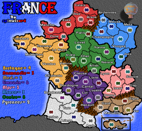
It might just be me, but I'm not a fan of the bright lime green continent you have at the bottom of the map. It stands out quite a lot in relation to the other continent colours.

Partly to do with your choice of colours, partly to do with texture... I don't like how the textures look on this map. It appears as if you have a uniform texture across the map, but it is hard to tell because it is quite strong in some areas and not visible in others. I'd look at toning down the texture so it appears more consistent across the whole map. Unless you have some sort of attachment to the water texture, I'd look into a new one there was well. :wink:

Your font is quite large, which is a good thing, it makes it easier to read. You could probably get away with a smaller size font though, especially considering this is the smaller map (I presume). This would free up some space and reduce some of the overlapping.

I'm going to have to say that your continent borders are a mess. Your territory borders seem fine, but the continent borders are of various thickness all over the map. Just look at Paris/Eure for an example.

I have other things to comment on, but I don't want to overwhelm you... or write a novel. :wink:

Last thing I will mention for now is the scope of the map itself. I agree with some of the others that Corse is out of place. I think you could solve this by "zooming out" and giving yourself enough room to have the island in its actual geographical location. If this is too much to ask, I would much prefer to see the island in it's correct orientation. :)
Sergeant 1st Class KEYOGI
 
Posts: 1632
Joined: Tue Oct 10, 2006 6:09 am

Postby Ruben Cassar on Tue Apr 03, 2007 5:09 am

luckiekevin wrote:the fighter jets don't work.. what do they have to do with France? they are American. Why not incorporate something French? Or something relative to French Military?


I have already pointed that out in a post that I posted twice in this thread and which seems to have been ignored.

However I am going to give him another idea. Use a hot air balloon instead of the planes.

They were invented in France by the Montgolfier brothers and they are very err...French! :) Here is an image of the one they created which you can use in your map:

Image
Last edited by Ruben Cassar on Tue Apr 03, 2007 5:18 am, edited 3 times in total.
ImageImageImageImageImage
User avatar
Colonel Ruben Cassar
 
Posts: 2160
Joined: Thu Nov 16, 2006 6:04 am
Location: Civitas Invicta, Melita, Evropa

Postby spinwizard on Tue Apr 03, 2007 5:10 am

cool i will try 2 sift through the comments and make a large update
User avatar
Private 1st Class spinwizard
 
Posts: 5016
Joined: Sun Dec 10, 2006 9:52 am

Postby spinwizard on Tue Apr 03, 2007 5:18 am

that balloon is the wrong perspective. have u got 1 that is from above?
User avatar
Private 1st Class spinwizard
 
Posts: 5016
Joined: Sun Dec 10, 2006 9:52 am

Postby Ruben Cassar on Tue Apr 03, 2007 5:20 am

spinwizard wrote:that balloon is the wrong perspective. have u got 1 that is from above?


Do a search on google for Montgolfier and look for pictures. I am sure you will find more images of their famous balloon.

Edit: Btw why is it in the wrong perspective?
ImageImageImageImageImage
User avatar
Colonel Ruben Cassar
 
Posts: 2160
Joined: Thu Nov 16, 2006 6:04 am
Location: Civitas Invicta, Melita, Evropa

Postby spinwizard on Tue Apr 03, 2007 5:24 am

i need 1 form above 4 it 2 work...i will try this 1

ps i liked the jets
User avatar
Private 1st Class spinwizard
 
Posts: 5016
Joined: Sun Dec 10, 2006 9:52 am

Postby spinwizard on Tue Apr 03, 2007 5:37 am

update 17-
added new colours/ textures
new sea colour/tezture
smaller names
no fighter planes
added the balloon (i don't like it)
new clearer borders


Image


what do u think?
User avatar
Private 1st Class spinwizard
 
Posts: 5016
Joined: Sun Dec 10, 2006 9:52 am

Postby cairnswk on Tue Apr 03, 2007 6:52 am

SpinWizard...u could really stir things up...put an image of the Statue of LIberty there. The French gave to the USA as a present. :twisted:
Image
* Pearl Harbour * Waterloo * Forbidden City * Jamaica * Pot Mosbi
User avatar
Private cairnswk
 
Posts: 11510
Joined: Sat Feb 03, 2007 8:32 pm
Location: Australia

Postby spinwizard on Tue Apr 03, 2007 6:54 am

cairnswk wrote:SpinWizard...u could really stir things up...put an image of the Statue of LIberty there. The French gave to the USA as a present. :twisted:


any non political comments on the map?
User avatar
Private 1st Class spinwizard
 
Posts: 5016
Joined: Sun Dec 10, 2006 9:52 am

Postby nagerous on Tue Apr 03, 2007 6:59 am

hey I preferred the old legend with the woody background :(
User avatar
Captain nagerous
 
Posts: 7513
Joined: Sat Feb 03, 2007 7:39 am

Postby Guiscard on Tue Apr 03, 2007 7:01 am

The jets looked way better than the balloon. Could you not try the Dassault Rafale or something? Specifically French.
qwert wrote:Can i ask you something?What is porpose for you to open these Political topic in ConquerClub? Why you mix politic with Risk? Why you not open topic like HOT AND SEXY,or something like that.
User avatar
Private 1st Class Guiscard
 
Posts: 4103
Joined: Fri Dec 08, 2006 7:27 pm
Location: In the bar... With my head on the bar

Postby spinwizard on Tue Apr 03, 2007 7:05 am

Guiscard wrote:The jets looked way better than the balloon. Could you not try the Dassault Rafale or something? Specifically French.


i agree there
User avatar
Private 1st Class spinwizard
 
Posts: 5016
Joined: Sun Dec 10, 2006 9:52 am

Postby Ruben Cassar on Tue Apr 03, 2007 7:43 am

Well you could always use some French jets. But the Montgolfier balloon is something typically French and more picturesque. I mean this is France...la plus belle France.

France is not about crude power...it's about beauty, aesthetics, la joie de vivre.

What I would do is make like three balloons instead of one and use a top down perspective as you suggested. I would also add Marianne (the national symbol of the French republic) somewhere.

http://en.wikipedia.org/wiki/Marianne

I don't know if others share my views...but I am passionate about France. ;)
ImageImageImageImageImage
User avatar
Colonel Ruben Cassar
 
Posts: 2160
Joined: Thu Nov 16, 2006 6:04 am
Location: Civitas Invicta, Melita, Evropa

Postby Lone.prophet on Tue Apr 03, 2007 7:45 am

what is it with putting things on it when it does look good already?

and what is that black box around the island?
Image
Captain Lone.prophet
 
Posts: 1467
Joined: Thu Oct 12, 2006 4:37 pm
Location: Your basement Muahaha

Postby spinwizard on Tue Apr 03, 2007 7:48 am

Lone.prophet wrote:what is it with putting things on it when it does look good already?

and what is that black box around the island?


it is because corse is not actualy there (much lower and i different direction but ppl wanted me 2 add it...

oh and thanks 4 the complement btw
User avatar
Private 1st Class spinwizard
 
Posts: 5016
Joined: Sun Dec 10, 2006 9:52 am

Postby spinwizard on Tue Apr 03, 2007 7:52 am

Image
different planes as this is all u r complaining about, they r french
User avatar
Private 1st Class spinwizard
 
Posts: 5016
Joined: Sun Dec 10, 2006 9:52 am

Postby Ruben Cassar on Tue Apr 03, 2007 7:56 am

Hmm did you at least consider my previous post?

Anyway new planes are a bit too blurred...
ImageImageImageImageImage
User avatar
Colonel Ruben Cassar
 
Posts: 2160
Joined: Thu Nov 16, 2006 6:04 am
Location: Civitas Invicta, Melita, Evropa

Postby spinwizard on Tue Apr 03, 2007 7:58 am

yes i did consider it and i am looking 4 traditional images
User avatar
Private 1st Class spinwizard
 
Posts: 5016
Joined: Sun Dec 10, 2006 9:52 am

Postby spinwizard on Tue Apr 03, 2007 10:21 am

any1 got a comment?
User avatar
Private 1st Class spinwizard
 
Posts: 5016
Joined: Sun Dec 10, 2006 9:52 am

Postby mibi on Tue Apr 03, 2007 12:47 pm

the relief for the water texture is too high.
User avatar
Captain mibi
 
Posts: 3350
Joined: Thu Mar 01, 2007 8:19 pm
Location: The Great State of Vermont

Postby Wisse on Tue Apr 03, 2007 2:18 pm

can you make the white continent a bit more gray so it isn't shiny?
Image Image
User avatar
Sergeant Wisse
 
Posts: 4448
Joined: Fri Oct 13, 2006 2:59 pm
Location: The netherlands, gelderland, epe

Postby Qwert on Tue Apr 03, 2007 3:05 pm

Too bright, and what point have these birds in corner?
Image
NEW REVOLUTION-NEW RANKS PRESS THESE LINK viewtopic.php?f=471&t=47578&start=0
User avatar
Major Qwert
SoC Training Adviser
 
Posts: 9262
Joined: Tue Nov 07, 2006 5:07 pm
Location: VOJVODINA

Postby ga7 on Tue Apr 03, 2007 3:21 pm

Heheh funny to see my department surrounded by mountains :lol:
I think you should just put off the planes and replace them with a barrel or a bottle of wine. It would look far more french :P
User avatar
Lieutenant ga7
 
Posts: 5344
Joined: Fri Nov 03, 2006 1:15 pm
Location: Pit

Postby Ruben Cassar on Tue Apr 03, 2007 4:58 pm

ga7 wrote:Heheh funny to see my department surrounded by mountains :lol:
I think you should just put off the planes and replace them with a barrel or a bottle of wine. It would look far more french :P


I already gave him some alternate ideas. Hopefully he will follow the suggestions that people have already given him and then ask for more!
ImageImageImageImageImage
User avatar
Colonel Ruben Cassar
 
Posts: 2160
Joined: Thu Nov 16, 2006 6:04 am
Location: Civitas Invicta, Melita, Evropa

Postby sam_levi_11 on Tue Apr 03, 2007 5:00 pm

i like the silver colour, dont change it
User avatar
Sergeant 1st Class sam_levi_11
 
Posts: 2872
Joined: Mon Dec 11, 2006 2:48 pm

PreviousNext

Return to Melting Pot: Map Ideas

Who is online

Users browsing this forum: No registered users