-Sully
SteamWorks
Moderator: Cartographers
Re: [IDEA] SteamWorks - V4 - pg.1&3 - The Island of Dr.DiM
![]() by Victor Sullivan on Sat Jun 25, 2011 5:57 am
by Victor Sullivan on Sat Jun 25, 2011 5:57 am
I love it!  ...though you no longer have names for your bonus areas! Maybe you misunderstood me, but I meant make the continent name text more readable and add one for the blue island. Also, you should adjust the colors on the mini map as well.
-Sully
-Sully
Beckytheblondie: "Don't give us the dispatch, give us a mustache ride."
Scaling back on my CC involvement...
Scaling back on my CC involvement...
-

 Victor Sullivan
- Posts: 6010
- Joined: Mon Feb 08, 2010 8:17 pm
- Location: Columbus, OH


Re: [IDEA] SteamWorks - V4 - pg.1&3 - The Island of Dr.DiM
![]() by DiM on Sat Jun 25, 2011 6:05 am
by DiM on Sat Jun 25, 2011 6:05 am
Victor Sullivan wrote:I love it!
-Sully
i decided to remove the continent names because they were not essential. continents can be easily identified via the colours and now the map is less cluttered. as for the legend i didn't adjust the colours because they become to hard to see. or at least i start having difficulties seeing them
PS: what do i have to do to get this moved to the next step?
“In the beginning God said, the four-dimensional divergence of an antisymmetric, second rank tensor equals zero, and there was light, and it was good. And on the seventh day he rested.”- Michio Kaku
-

DiM
- Posts: 10415
- Joined: Wed Feb 14, 2007 6:20 pm
- Location: making maps for scooby snacks


Re: [IDEA] SteamWorks - V5 - pg.1&4 - The Island of Dr.DiM
![]() by Victor Sullivan on Sat Jun 25, 2011 6:10 am
by Victor Sullivan on Sat Jun 25, 2011 6:10 am
I imagine you'll be moving soon  Industrial Helix is working a double shift in Graphics and the Drafting Room for nobodies and Ben, so I think he might be a little overworked. Give it time
-Sully
-Sully
Beckytheblondie: "Don't give us the dispatch, give us a mustache ride."
Scaling back on my CC involvement...
Scaling back on my CC involvement...
-
Victor Sullivan
- Posts: 6010
- Joined: Mon Feb 08, 2010 8:17 pm
- Location: Columbus, OH
Re: [IDEA] SteamWorks - V5 - pg.1&4 - The Island of Dr.DiM
![]() by DiM on Sat Jun 25, 2011 6:17 am
by DiM on Sat Jun 25, 2011 6:17 am
Victor Sullivan wrote:I imagine you'll be moving soon
-Sully
ah that's great. i don't know what conditions have to be met in order to get moved and that's why i was asking
“In the beginning God said, the four-dimensional divergence of an antisymmetric, second rank tensor equals zero, and there was light, and it was good. And on the seventh day he rested.”- Michio Kaku
-
DiM
- Posts: 10415
- Joined: Wed Feb 14, 2007 6:20 pm
- Location: making maps for scooby snacks
Re: [IDEA] SteamWorks - V5 - pg.1&4 - The Island of Dr.DiM
![]() by Victor Sullivan on Sat Jun 25, 2011 6:23 am
by Victor Sullivan on Sat Jun 25, 2011 6:23 am
It's not entirely set-in-stone. It's basically once the cartos feel you have a well laid out map with the core concepts and gameplay elements mostly hammered out and they feel you have the means necessary to complete the project.
-Sully
-Sully
Beckytheblondie: "Don't give us the dispatch, give us a mustache ride."
Scaling back on my CC involvement...
Scaling back on my CC involvement...
-
Victor Sullivan
- Posts: 6010
- Joined: Mon Feb 08, 2010 8:17 pm
- Location: Columbus, OH
Re: [IDEA] SteamWorks - V5 - pg.1&4 - The Island of Dr.DiM
![]() by DiM on Sat Jun 25, 2011 6:48 am
by DiM on Sat Jun 25, 2011 6:48 am
Victor Sullivan wrote:It's not entirely set-in-stone. It's basically once the cartos feel you have a well laid out map with the core concepts and gameplay elements mostly hammered out and they feel you have the means necessary to complete the project.
-Sully
thanks for the clarification. i was afraid it might be something like spend X days in drafting room, get at least Y posts from Z users and that kind of stuff
“In the beginning God said, the four-dimensional divergence of an antisymmetric, second rank tensor equals zero, and there was light, and it was good. And on the seventh day he rested.”- Michio Kaku
-
DiM
- Posts: 10415
- Joined: Wed Feb 14, 2007 6:20 pm
- Location: making maps for scooby snacks
Re: [IDEA] SteamWorks - V5 - pg.1&4 - The Island of Dr.DiM
![]() by Victor Sullivan on Sat Jun 25, 2011 7:15 am
by Victor Sullivan on Sat Jun 25, 2011 7:15 am
Not that I'm aware of. I know natty_dread's Yugoslavia was moved pretty quick.
-Sully
-Sully
Beckytheblondie: "Don't give us the dispatch, give us a mustache ride."
Scaling back on my CC involvement...
Scaling back on my CC involvement...
-
Victor Sullivan
- Posts: 6010
- Joined: Mon Feb 08, 2010 8:17 pm
- Location: Columbus, OH
Re: [IDEA] SteamWorks - V5 - pg.1&4 - The Island of Dr.DiM
![]() by natty dread on Sat Jun 25, 2011 8:11 am
by natty dread on Sat Jun 25, 2011 8:11 am
I think you're going to need some kind of names for the continents... people need to know what continent is refered to in the game log.

-

natty dread
- Posts: 12877
- Joined: Fri Feb 08, 2008 8:58 pm
- Location: just plain fucked


Re: [IDEA] SteamWorks - V5 - pg.1&4 - The Island of Dr.DiM
![]() by Industrial Helix on Sat Jun 25, 2011 11:16 am
by Industrial Helix on Sat Jun 25, 2011 11:16 am
In your case, I'm just looking to see that everything is labeled.
I mean, i look for other stuff, like concept, ect. But you've got that by the bucket.
So put some continent names on there and we'll move it, in the meantime, lets sticky this.
And why did you choose areas of England for the territory names? It seems awkward.
I mean, i look for other stuff, like concept, ect. But you've got that by the bucket.
So put some continent names on there and we'll move it, in the meantime, lets sticky this.
And why did you choose areas of England for the territory names? It seems awkward.
Sketchblog [Update 07/25/11]: http://indyhelixsketch.blogspot.com/
Living in Japan [Update 07/17/11]: http://mirrorcountryih.blogspot.com/
Russian Revolution map for ConquerClub [07/20/11]: viewtopic.php?f=241&t=116575
Living in Japan [Update 07/17/11]: http://mirrorcountryih.blogspot.com/
Russian Revolution map for ConquerClub [07/20/11]: viewtopic.php?f=241&t=116575
-

Industrial Helix
- Posts: 3462
- Joined: Mon Jul 14, 2008 6:49 pm
- Location: Ohio


Re: [IDEA] SteamWorks - V5 - pg.1&4 - The Island of Dr.DiM
![]() by DiM on Sat Jun 25, 2011 11:38 am
by DiM on Sat Jun 25, 2011 11:38 am
Industrial Helix wrote:So put some continent names on there and we'll move it, in the meantime, lets sticky this.
will do
Industrial Helix wrote:And why did you choose areas of England for the territory names? It seems awkward.
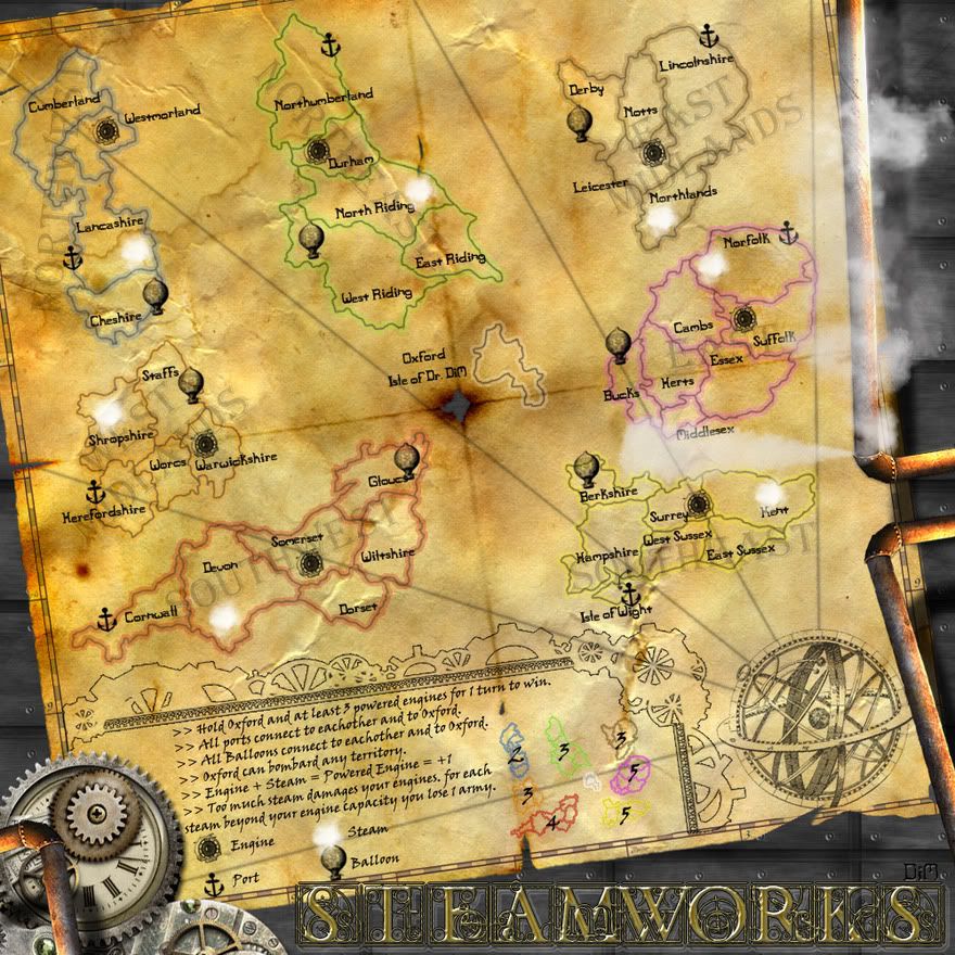
i was sure i explained this. steampunk is usually set in a fantasy steam-powered victorian era Britain. naturally i chose england and the story is that evil Dr. DiM split apart England with the use of a terrible machine found in his lab at Oxford. now all he needs is to gather enough power from at least 3 engines to complete his malefic plan of destroying England.
“In the beginning God said, the four-dimensional divergence of an antisymmetric, second rank tensor equals zero, and there was light, and it was good. And on the seventh day he rested.”- Michio Kaku
-
DiM
- Posts: 10415
- Joined: Wed Feb 14, 2007 6:20 pm
- Location: making maps for scooby snacks
 Re: [IDEA] SteamWorks - V5 - pg.1&4 - The Island of Dr.DiM
![]() by DiM on Sat Jun 25, 2011 12:04 pm
by DiM on Sat Jun 25, 2011 12:04 pm
just added continent names. nothing else. but to be honest i don't really like having the continent names cluttering the map.
people can clearly see the continent bonuses from the minimap and in the log it can appear like this:
"X receives 2troops for holding the Nortwest (Blue continent)"
people can clearly see the continent bonuses from the minimap and in the log it can appear like this:
"X receives 2troops for holding the Nortwest (Blue continent)"
- Click image to enlarge.
“In the beginning God said, the four-dimensional divergence of an antisymmetric, second rank tensor equals zero, and there was light, and it was good. And on the seventh day he rested.”- Michio Kaku
-
DiM
- Posts: 10415
- Joined: Wed Feb 14, 2007 6:20 pm
- Location: making maps for scooby snacks
Re: [IDEA] SteamWorks - V5 - pg.1&4 - The Island of Dr.DiM
![]() by cairnswk on Sat Jun 25, 2011 2:37 pm
by cairnswk on Sat Jun 25, 2011 2:37 pm
DiM. for me at least, the continent names are lost among everything else, tbh it looks untidy.
If people insist they be there, can't you wrap the names around the edges of each continent so that they can be more clearly visisble; perhaps in smaller text.
Also i think the radiating lines from the mechanical globe are too strong, can these be softened?
If people insist they be there, can't you wrap the names around the edges of each continent so that they can be more clearly visisble; perhaps in smaller text.
Also i think the radiating lines from the mechanical globe are too strong, can these be softened?
Last edited by cairnswk on Sat Jun 25, 2011 2:50 pm, edited 1 time in total.

* Pearl Harbour * Waterloo * Forbidden City * Jamaica * Pot Mosbi
-

cairnswk
- Posts: 11510
- Joined: Sat Feb 03, 2007 8:32 pm
- Location: Australia


Re: [IDEA] SteamWorks - V5 - pg.1&4 - The Island of Dr.DiM
![]() by koontz1973 on Sat Jun 25, 2011 2:48 pm
by koontz1973 on Sat Jun 25, 2011 2:48 pm
Agree with you and cairnswk DiM. continent names look truly out of place on the map. Why would the UK, after being smashed up by that evil Dr. DiM, keep the regional names anyway.
I know this is a small thing but it has bugged me for a bit. On the right side under the bottom steam pipe, you have a bit of the maps edge showing. Is it me or it it out of scale and at the wrong angle?
I know this is a small thing but it has bugged me for a bit. On the right side under the bottom steam pipe, you have a bit of the maps edge showing. Is it me or it it out of scale and at the wrong angle?

-

koontz1973
- Posts: 6960
- Joined: Thu Jan 01, 2009 10:57 am


Re: [IDEA] SteamWorks - V5 - pg.1&4 - The Island of Dr.DiM
![]() by Boler on Sat Jun 25, 2011 8:19 pm
by Boler on Sat Jun 25, 2011 8:19 pm
koontz1973 wrote:I know this is a small thing but it has bugged me for a bit. On the right side under the bottom steam pipe, you have a bit of the maps edge showing. Is it me or it it out of scale and at the wrong angle?
Optical Illusion, it's looks like that because of the angle of the pipe.
-
Boler
- Posts: 55
- Joined: Sun May 15, 2011 10:20 pm

Re: [IDEA] SteamWorks - V5 - pg.1&4 - The Island of Dr.DiM
![]() by DiM on Sat Jun 25, 2011 8:41 pm
by DiM on Sat Jun 25, 2011 8:41 pm
cairnswk wrote:DiM. for me at least, the continent names are lost among everything else, tbh it looks untidy.
If people insist they be there, can't you wrap the names around the edges of each continent so that they can be more clearly visisble; perhaps in smaller text.
wrapping them might work. i'll try that. thanks for the suggestion.
cairnswk wrote:Also i think the radiating lines from the mechanical globe are too strong, can these be softened?
sure. i will also make them a bit thinner as i think they're too bold.
“In the beginning God said, the four-dimensional divergence of an antisymmetric, second rank tensor equals zero, and there was light, and it was good. And on the seventh day he rested.”- Michio Kaku
-
DiM
- Posts: 10415
- Joined: Wed Feb 14, 2007 6:20 pm
- Location: making maps for scooby snacks
Re: [IDEA] SteamWorks - V5 - pg.1&4 - The Island of Dr.DiM
![]() by DiM on Sat Jun 25, 2011 8:44 pm
by DiM on Sat Jun 25, 2011 8:44 pm
koontz1973 wrote:Agree with you and cairnswk DiM. continent names look truly out of place on the map. Why would the UK, after being smashed up by that evil Dr. DiM, keep the regional names anyway.
i will try and implement cairnswk's idea of wrapping the names. i hope that will help.
as for the actual names i guess they could be changed if others thought so. i'm open for suggestions.
Boler wrote:koontz1973 wrote:I know this is a small thing but it has bugged me for a bit. On the right side under the bottom steam pipe, you have a bit of the maps edge showing. Is it me or it it out of scale and at the wrong angle?
Optical Illusion, it's looks like that because of the angle of the pipe.
Boler is right. the map is a whole vertical piece that i simply twisted at an angle.
“In the beginning God said, the four-dimensional divergence of an antisymmetric, second rank tensor equals zero, and there was light, and it was good. And on the seventh day he rested.”- Michio Kaku
-
DiM
- Posts: 10415
- Joined: Wed Feb 14, 2007 6:20 pm
- Location: making maps for scooby snacks
Re: [IDEA] SteamWorks - V5 - pg.1&4 - The Island of Dr.DiM
![]() by DiM on Sat Jun 25, 2011 9:25 pm
by DiM on Sat Jun 25, 2011 9:25 pm
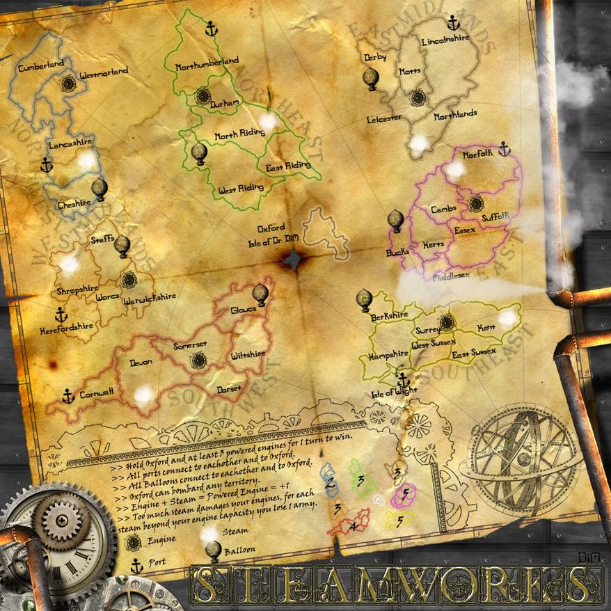
V6
DONE:
*added wrapped continent names - i think it looks much better than before. thanks for the suggestion cairns.
*made thinner radiating lines
*moved around terit names and icons to make room for army numbers
DONE:
*added wrapped continent names - i think it looks much better than before. thanks for the suggestion cairns.
*made thinner radiating lines
*moved around terit names and icons to make room for army numbers
- Click image to enlarge.
“In the beginning God said, the four-dimensional divergence of an antisymmetric, second rank tensor equals zero, and there was light, and it was good. And on the seventh day he rested.”- Michio Kaku
-
DiM
- Posts: 10415
- Joined: Wed Feb 14, 2007 6:20 pm
- Location: making maps for scooby snacks
Re: [IDEA] SteamWorks - V6 - pg.1&5 - The Island of Dr.DiM
![]() by natty dread on Sun Jun 26, 2011 4:39 am
by natty dread on Sun Jun 26, 2011 4:39 am
I think it'd be better if the continent names didn't cling so tightly to the shorelines... you have plenty of room to draw the text on smoother paths.
-
natty dread
- Posts: 12877
- Joined: Fri Feb 08, 2008 8:58 pm
- Location: just plain fucked
Re: [IDEA] SteamWorks - V6 - pg.1&5 - The Island of Dr.DiM
![]() by Industrial Helix on Sun Jun 26, 2011 7:52 am
by Industrial Helix on Sun Jun 26, 2011 7:52 am
Moving this as all requirements are satisfied.

Sketchblog [Update 07/25/11]: http://indyhelixsketch.blogspot.com/
Living in Japan [Update 07/17/11]: http://mirrorcountryih.blogspot.com/
Russian Revolution map for ConquerClub [07/20/11]: viewtopic.php?f=241&t=116575
Living in Japan [Update 07/17/11]: http://mirrorcountryih.blogspot.com/
Russian Revolution map for ConquerClub [07/20/11]: viewtopic.php?f=241&t=116575
-
Industrial Helix
- Posts: 3462
- Joined: Mon Jul 14, 2008 6:49 pm
- Location: Ohio
Re: [IDEA] SteamWorks - V6 - pg.1&5 - The Island of Dr.DiM
![]() by DiM on Sun Jun 26, 2011 8:23 am
by DiM on Sun Jun 26, 2011 8:23 am
natty_dread wrote:I think it'd be better if the continent names didn't cling so tightly to the shorelines... you have plenty of room to draw the text on smoother paths.
actually i was planning to add some waves some steamships and various graphics on the map so i kinda need the extra room.
“In the beginning God said, the four-dimensional divergence of an antisymmetric, second rank tensor equals zero, and there was light, and it was good. And on the seventh day he rested.”- Michio Kaku
-
DiM
- Posts: 10415
- Joined: Wed Feb 14, 2007 6:20 pm
- Location: making maps for scooby snacks
Re: [IDEA] SteamWorks - V6 - pg.1&5 - The Island of Dr.DiM
![]() by DiM on Sun Jun 26, 2011 8:24 am
by DiM on Sun Jun 26, 2011 8:24 am
Industrial Helix wrote:Moving this as all requirements are satisfied.
woohoo
thanks.
“In the beginning God said, the four-dimensional divergence of an antisymmetric, second rank tensor equals zero, and there was light, and it was good. And on the seventh day he rested.”- Michio Kaku
-
DiM
- Posts: 10415
- Joined: Wed Feb 14, 2007 6:20 pm
- Location: making maps for scooby snacks
Re: [IDEA] SteamWorks - V6 - pg.1&5 - The Island of Dr.DiM
![]() by koontz1973 on Sun Jun 26, 2011 8:33 am
by koontz1973 on Sun Jun 26, 2011 8:33 am
DiM wrote:natty_dread wrote:I think it'd be better if the continent names didn't cling so tightly to the shorelines... you have plenty of room to draw the text on smoother paths.
actually i was planning to add some waves some steamships and various graphics on the map so i kinda need the extra room.
Can you make the text a tad smaller North West almost sits on West Midlands.
DiM wrote:woohoo
thanks.
Congrats.
-
koontz1973
- Posts: 6960
- Joined: Thu Jan 01, 2009 10:57 am
Re: [IDEA] SteamWorks - V6 - pg.1&5 - The Island of Dr.DiM
![]() by natty dread on Sun Jun 26, 2011 10:41 am
by natty dread on Sun Jun 26, 2011 10:41 am
DiM wrote:natty_dread wrote:I think it'd be better if the continent names didn't cling so tightly to the shorelines... you have plenty of room to draw the text on smoother paths.
actually i was planning to add some waves some steamships and various graphics on the map so i kinda need the extra room.
Surely you're not going to fill up all the space you have? It's just that the text looks kinda chunky like that, and the labels are getting all tangled up with each other in Northwest & Westmidlands.
-
natty dread
- Posts: 12877
- Joined: Fri Feb 08, 2008 8:58 pm
- Location: just plain fucked
Re: [IDEA] SteamWorks - V6 - pg.1&5 - The Island of Dr.DiM
![]() by DiM on Sun Jun 26, 2011 11:09 am
by DiM on Sun Jun 26, 2011 11:09 am
ok, i'll see what i can do, especially about the northwest/west midlands part.
“In the beginning God said, the four-dimensional divergence of an antisymmetric, second rank tensor equals zero, and there was light, and it was good. And on the seventh day he rested.”- Michio Kaku
-
DiM
- Posts: 10415
- Joined: Wed Feb 14, 2007 6:20 pm
- Location: making maps for scooby snacks
Re: [IDEA] SteamWorks - V6 - pg.1&5 - The Island of Dr.DiM
![]() by natty dread on Sun Jun 26, 2011 11:11 am
by natty dread on Sun Jun 26, 2011 11:11 am
Maybe try something like I did on this map: viewtopic.php?f=64&t=138910
-
natty dread
- Posts: 12877
- Joined: Fri Feb 08, 2008 8:58 pm
- Location: just plain fucked
Who is online
Users browsing this forum: No registered users
|
|||||||
| Conquer Club is not associated with RISK online in any way. Copyright © 2006-2025 by Big Wham LLC | |||||||