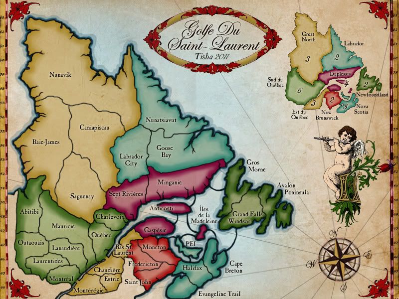
Golfe Du St. Laurent
Moderator: Cartographers
Re: Golfe Du St. Laurent
Looks great! Beta time!
-

 The Bison King
- Posts: 1957
- Joined: Thu Aug 27, 2009 5:06 pm
- Location: the Mid-Westeros


Re: Golfe Du St. Laurent
The Bison King wrote:Looks great! Beta time!
+1
Highest Rank: 26 Highest Score: 3480


-

 Bruceswar
- Posts: 9713
- Joined: Sun Dec 23, 2007 12:36 am
- Location: Cow Pastures


Re: Golfe Du St. Laurent
just a little bit of nitpicking:
1. the whole frame of the map is slightly tilted to the left.
2. the frame seems to be only on the left/right side and nothing on the top/bottom. that would not be such a big problem if there wasn't the tilting mentioned at #1. because of that tilting we can see that in the bottom right corner the border does seem to continue along the bottom side until it slowly fades away. see image:

3. the rose from the singing angel overlaps the map frame and even goes beyond that. perhaps move it to the left a bit to avoid that.
1. the whole frame of the map is slightly tilted to the left.
2. the frame seems to be only on the left/right side and nothing on the top/bottom. that would not be such a big problem if there wasn't the tilting mentioned at #1. because of that tilting we can see that in the bottom right corner the border does seem to continue along the bottom side until it slowly fades away. see image:

3. the rose from the singing angel overlaps the map frame and even goes beyond that. perhaps move it to the left a bit to avoid that.
“In the beginning God said, the four-dimensional divergence of an antisymmetric, second rank tensor equals zero, and there was light, and it was good. And on the seventh day he rested.”- Michio Kaku
-

 DiM
DiM
- Posts: 10415
- Joined: Wed Feb 14, 2007 6:20 pm
- Location: making maps for scooby snacks


Re: Golfe Du St. Laurent
DiM wrote:just a little bit of nitpicking:
1. the whole frame of the map is slightly tilted to the left.
2. the frame seems to be only on the left/right side and nothing on the top/bottom. that would not be such a big problem if there wasn't the tilting mentioned at #1. because of that tilting we can see that in the bottom right corner the border does seem to continue along the bottom side until it slowly fades away. see image:
3. the rose from the singing angel overlaps the map frame and even goes beyond that. perhaps move it to the left a bit to avoid that.
thank you, didn't see that
I like the cherub overlapping the border.. kinda vine like. does it look that bad?
better corners?

-

 Tisha
Tisha
- Posts: 1065
- Joined: Sat Dec 23, 2006 12:41 am


Re: Golfe Du St. Laurent
I know I haven't been commenting on this map, but I'd like to say it looks amazing. THanks for putting in all this effort Tisha.
Even after you fixed it, when I eyeball it (by no means perfect) the border still slants to the left. Maybe I'm seeing things. I'd suggest measuring ht distance at the top and the bottom and try and match those a close as you can together. Also, just stepping back and looking at it can do wonders.
Even after you fixed it, when I eyeball it (by no means perfect) the border still slants to the left. Maybe I'm seeing things. I'd suggest measuring ht distance at the top and the bottom and try and match those a close as you can together. Also, just stepping back and looking at it can do wonders.
-
 QoH
QoH
- Posts: 1817
- Joined: Fri Aug 20, 2010 12:37 pm


Re: Golfe Du St. Laurent
QoH wrote:I know I haven't been commenting on this map, but I'd like to say it looks amazing. THanks for putting in all this effort Tisha.
Even after you fixed it, when I eyeball it (by no means perfect) the border still slants to the left. Maybe I'm seeing things. I'd suggest measuring ht distance at the top and the bottom and try and match those a close as you can together. Also, just stepping back and looking at it can do wonders.
I just checked it closer, not just by eye. It's slants one pixel.. that is close enough for me.

http://h1.ripway.com/Tisha1276/Golfe.xml
-

 Tisha
Tisha
- Posts: 1065
- Joined: Sat Dec 23, 2006 12:41 am


Re: Golfe Du St. Laurent
Slant one pixel. I like the sound of this phrase.
And I like the look of this map, too.
--Andy
And I like the look of this map, too.
--Andy
-

 AndyDufresne
- Posts: 24935
- Joined: Fri Mar 03, 2006 8:22 pm
- Location: A Banana Palm in Zihuatanejo


Re: Golfe Du St. Laurent
when is this coming out in beta????
Its time isnt it?
Its time isnt it?
-
 osujacket
- Posts: 915
- Joined: Fri Jun 23, 2006 9:16 pm
- Location: marion ohio


Re: Golfe Du St. Laurent
A pixel under any other name would smell just as pixelly......

PB: 2661 | He's blue... If he were green he would die | No mod would be stupid enough to do that
-

 MrBenn
- Posts: 6880
- Joined: Wed Nov 21, 2007 9:32 am
- Location: Off Duty


Re: Golfe Du St. Laurent
- Beta - Quenching
---The Final Forge period has concluded for the Golfe Du St. Laurent Map. All objections have had their time. The Foundry and I hereby brand this map with the Foundry Beta Brand. Let it be known that this map is now ready for BETA Play. After an extended period of time in BETA and once all quirks and issues have been resolved, the map will be put into Full Play (barring any Lack vetoes).
Conquer Club, enjoy!

While the map is in BETA Play, there are a couple of administrative tasks that are required of the mapmaker(s) in addition to the initial gameplay testing:
- 1. Please ensure that the first post of the thread contains all the necessary information to help future visitors to the development thread; it's particularly important to ensure the most recent images are there, along with any helpful guides (such as gameplay quirks/nuances or the location/size of any starting neutrals etc.)
2. Please update the Map Information Portal with details of your map
3. Finally, it is the responsibility of the mapmaker(s) to ensure that they respond to further feedback in a timely and constructive manner.
--MrBenn

PB: 2661 | He's blue... If he were green he would die | No mod would be stupid enough to do that
-

 MrBenn
- Posts: 6880
- Joined: Wed Nov 21, 2007 9:32 am
- Location: Off Duty


Re: Golfe Du St. Laurent
Nice! 
-Sully
-Sully
Beckytheblondie: "Don't give us the dispatch, give us a mustache ride."
Scaling back on my CC involvement...
Scaling back on my CC involvement...
-

 Victor Sullivan
- Posts: 6010
- Joined: Mon Feb 08, 2010 8:17 pm
- Location: Columbus, OH


Re: Golfe Du St. Laurent
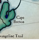
Blue numbers are a bit hard to see on Cape Breton, I suggest to move the coords few pixels down, where you have a lighter color.

-

 thenobodies80
- Posts: 5400
- Joined: Wed Sep 05, 2007 4:30 am
- Location: Milan


Re: Golfe Du St. Laurent
thenobodies80 wrote:Blue numbers are a bit hard to see on Cape Breton, I suggest to move the coords few pixels down, where you have a lighter color.
http://h1.ripway.com/Tisha1276/Golfe.xml
better?
-

 Tisha
Tisha
- Posts: 1065
- Joined: Sat Dec 23, 2006 12:41 am


Re: Golfe Du St. Laurent
This has a vry "Tisha" look about it 
Very nice.
Congrats for Beta, and for perserverence
Very nice.
Congrats for Beta, and for perserverence

* Pearl Harbour * Waterloo * Forbidden City * Jamaica * Pot Mosbi
-

 cairnswk
- Posts: 11510
- Joined: Sat Feb 03, 2007 8:32 pm
- Location: Australia


Re: Golfe Du St. Laurent
cairnswk wrote:This has a vry "Tisha" look about it
Very nice.
Congrats for Beta, and for perserverence
It's pretty
-

 Tisha
Tisha
- Posts: 1065
- Joined: Sat Dec 23, 2006 12:41 am


Re: Golfe Du St. Laurent
OK how can we fix the drops? In 2 of the of 2 games someone has either A started with a bonus or B taken one right out of the gate which is unbreakable. I know not much can be done, but seems like maybe coding different starting positions or something? I am at a loss how to fix it right now.
P.S. very pretty map and well done!
P.S. very pretty map and well done!
Highest Rank: 26 Highest Score: 3480


-

 Bruceswar
- Posts: 9713
- Joined: Sun Dec 23, 2007 12:36 am
- Location: Cow Pastures


Re: Golfe Du St. Laurent
^ Agree 100%, something needs changed. In my team game, team one was dropped 2 bonuses (Labrador & Great North) minus one territory. By round 2 they had both and were unbreakable.

Looking for a clan? Click here to send me a PM and find out how to join The Underworld! *Selective Recruitment*
-

 Orange-Idaho-Dog
- Posts: 555
- Joined: Sun Jan 14, 2007 12:41 pm
- Location: South Carolina


Re: Golfe Du St. Laurent
Well the obvious simple changes are, first, putting a neutral in each of the 3-region bonus zones (New Brunswick, Newfoundland, and Labrador). But that still leaves a 2% chance of anyone in a 3-player game dropping a 4-region bonus zone, and there are three of them: Great North, Est Du Quebec and Nova Scotia. So, perhaps a neutral in each of those as well?
Starting positions might work too, but my first few checks on possible combinations seem to lead to 1v1 games where players start with 12 regions, which is a bad number, as it is too easy for the first player to take one region and reduce the second player's deployable troops.
Starting positions might work too, but my first few checks on possible combinations seem to lead to 1v1 games where players start with 12 regions, which is a bad number, as it is too easy for the first player to take one region and reduce the second player's deployable troops.
-

 ender516
- Posts: 4455
- Joined: Wed Dec 17, 2008 6:07 pm
- Location: Waterloo, Ontario


Re: Golfe Du St. Laurent
i haven`t played this map yet , and i may have said this before but this map shows that we need more female map makers ! This map is so graphically pleasing and by that i mean , the colors and shading are so easy to look at , while the cupid and flowers in the corners add that special touch. Great Job Tisha and i hope to see more maps from you in the near future 
-
 danfrank
- Posts: 611
- Joined: Mon Dec 24, 2007 1:19 am


Re: Golfe Du St. Laurent
ender516 wrote:Well the obvious simple changes are, first, putting a neutral in each of the 3-region bonus zones (New Brunswick, Newfoundland, and Labrador). But that still leaves a 2% chance of anyone in a 3-player game dropping a 4-region bonus zone, and there are three of them: Great North, Est Du Quebec and Nova Scotia. So, perhaps a neutral in each of those as well?
Starting positions might work too, but my first few checks on possible combinations seem to lead to 1v1 games where players start with 12 regions, which is a bad number, as it is too easy for the first player to take one region and reduce the second player's deployable troops.
How about starting with ten terts each on a 2 player game.. i am not too fond of this type of game mechanics , starting positions mean what ? neutrals ? or places where players may have a starting territory . and neutral starting territories are always starting neutral regardless of the amount of players or do these factors change with the amount of players involved ?
-
 danfrank
- Posts: 611
- Joined: Mon Dec 24, 2007 1:19 am


Re: Golfe Du St. Laurent
I haven't even looked in to singles on the map yet. But I know team games are gonna be a problem. Maybe the more players, the better the chance of the bonuses being split up. But the game I mentioned earlier was lost from the drop (literally, not just an excuse for losing..)

Looking for a clan? Click here to send me a PM and find out how to join The Underworld! *Selective Recruitment*
-

 Orange-Idaho-Dog
- Posts: 555
- Joined: Sun Jan 14, 2007 12:41 pm
- Location: South Carolina


Who is online
Users browsing this forum: No registered users


