its deffo a little dark. unless u lighten teh boarder colors maby?
gimil
RuneScape Map [Abandoned]
Moderator: Cartographers


![]() by freezie on Tue Apr 10, 2007 2:01 pm
by freezie on Tue Apr 10, 2007 2:01 pm
gimil wrote:its deffo a little dark. unless u lighten teh boarder colors maby?
gimil
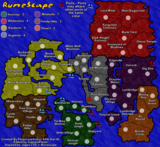
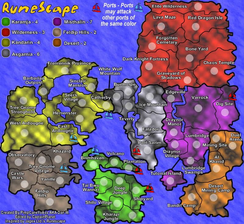
The borders are ok on most continents. Only problem would be Misthalin . Maybe ligthen those up a little.
-
 freezie
- Posts: 3901
- Joined: Fri Apr 06, 2007 12:18 pm
- Location: Somewhere between here and there.


![]() by Coleman on Tue Apr 10, 2007 3:13 pm
by Coleman on Tue Apr 10, 2007 3:13 pm
I'm not going to repeat lighten the textures... But yeah...
More importantly, the legend is now impossible to read. Everything looks black, newbies won't know what continent is what until that part at least is lightened.
I'd go with the lighter army circles solution myself for the continents.
More importantly, the legend is now impossible to read. Everything looks black, newbies won't know what continent is what until that part at least is lightened.
I'd go with the lighter army circles solution myself for the continents.
Warning: You may be reading a really old topic.
-

Coleman
- Posts: 5402
- Joined: Tue Jan 02, 2007 10:36 pm
- Location: Midwest


![]() by PimpCaneYoAss on Tue Apr 10, 2007 3:14 pm
by PimpCaneYoAss on Tue Apr 10, 2007 3:14 pm
Things to change
-Lighten up color
-Light army circles
-Gray borders
-Lighten legend
Anything else...hows the texture choice i cant do anything abount the intensity of it since its an image and not a frieworks texture. If everyone thinks so i could just choose a new one no big deal
-Lighten up color
-Light army circles
-Gray borders
-Lighten legend
Anything else...hows the texture choice i cant do anything abount the intensity of it since its an image and not a frieworks texture. If everyone thinks so i could just choose a new one no big deal
-

PimpCaneYoAss
- Posts: 185
- Joined: Fri Feb 16, 2007 3:04 pm
- Location: Connecticut

![]() by PimpCaneYoAss on Tue Apr 10, 2007 3:39 pm
by PimpCaneYoAss on Tue Apr 10, 2007 3:39 pm
I just attempted to change the border color and its a pain...since the black of the country image fades into the black borders it would be near impossible to easily change the color. I think im just going to create a new backgroud texture. I'll try and fix everything else except the border colors and see how it looks but im not sure how it will come out.
-
PimpCaneYoAss
- Posts: 185
- Joined: Fri Feb 16, 2007 3:04 pm
- Location: Connecticut


![]() by CaptainPlanet on Tue Apr 10, 2007 5:18 pm
by CaptainPlanet on Tue Apr 10, 2007 5:18 pm
ranck3 wrote:I think its a good idea... Runescapes a popular massive online game....
it would be a good idea because i think it would attract players.
I say do it!
You're a little late Chief
-
CaptainPlanet
- Posts: 132
- Joined: Wed Feb 14, 2007 6:21 pm
- Location: Bankhead
![]() by Econ2000 on Tue Apr 10, 2007 8:03 pm
by Econ2000 on Tue Apr 10, 2007 8:03 pm
this map would be sweet, i like the 1 on top better
Rap music is being listened to by 97% of teenagers, if you're one of the 3% of teenagers that actually listen to real music, then put this in your signature.
-
Econ2000
- Posts: 458
- Joined: Tue Jul 25, 2006 10:50 am
- Location: here(Boston, US)


![]() by PimpCaneYoAss on Tue Apr 10, 2007 9:58 pm
by PimpCaneYoAss on Tue Apr 10, 2007 9:58 pm
NEW UPDATE 4/11/07
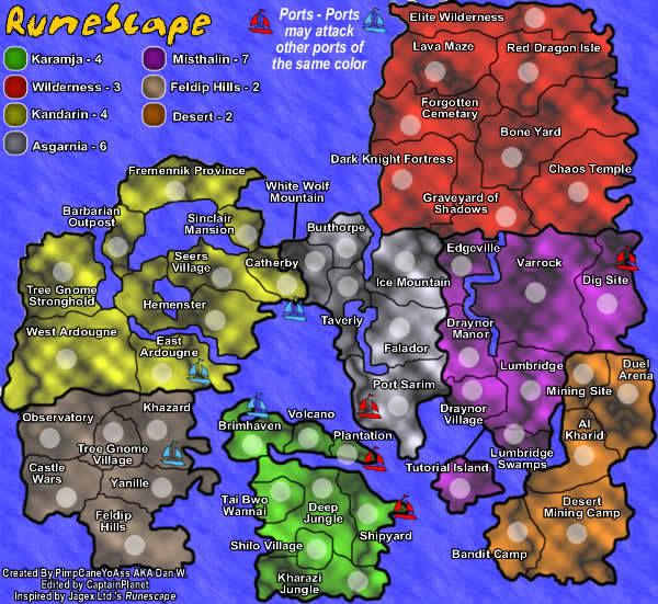
Changes
-New textures
-Lighter colors
-Light Army circles and some locations
-Text Size and location
Comments: I like it. I really think this should be good. The only concern I have is that the colors in the legend for feldip hils and asgarnia seem to be a bit close. Ill try and fix that. Please comment with anything no matter how small. I really want to fix everything so this map will be great. Let me know about the color choice and the borders or any other gameplay aspect. Thanks.
Problems to fix
-Credits on small map in lower left
-Contrast
Last edited by PimpCaneYoAss on Thu Apr 12, 2007 3:17 pm, edited 3 times in total.
-
PimpCaneYoAss
- Posts: 185
- Joined: Fri Feb 16, 2007 3:04 pm
- Location: Connecticut
![]() by CaptainPlanet on Tue Apr 10, 2007 10:14 pm
by CaptainPlanet on Tue Apr 10, 2007 10:14 pm
Not only the legend looks similar. /the colors of Asgarnia and Feldip Hills themselves look really close. Maybe add more red to Feldip
-
CaptainPlanet
- Posts: 132
- Joined: Wed Feb 14, 2007 6:21 pm
- Location: Bankhead
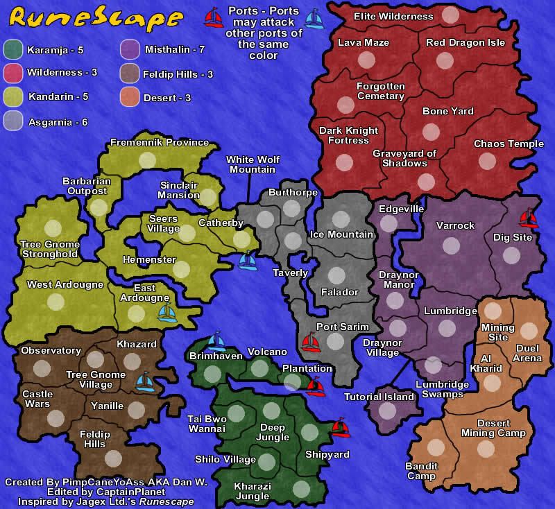
![]() by PimpCaneYoAss on Tue Apr 10, 2007 10:18 pm
by PimpCaneYoAss on Tue Apr 10, 2007 10:18 pm
Better...didnt want to repost the map just altered the colors in the legend
-
PimpCaneYoAss
- Posts: 185
- Joined: Fri Feb 16, 2007 3:04 pm
- Location: Connecticut
![]() by freezie on Tue Apr 10, 2007 11:03 pm
by freezie on Tue Apr 10, 2007 11:03 pm
Looks all good now, though the height is still somewhat a problem..But guess we'll have to do with it anyway 
Small thing: The second text line on the bottom is quite weird on the small map, maybe try and fix it.
Small thing: The second text line on the bottom is quite weird on the small map, maybe try and fix it.

-
freezie
- Posts: 3901
- Joined: Fri Apr 06, 2007 12:18 pm
- Location: Somewhere between here and there.


![]() by PimpCaneYoAss on Thu Apr 12, 2007 4:42 pm
by PimpCaneYoAss on Thu Apr 12, 2007 4:42 pm
NEW UPDATE 4/12/07
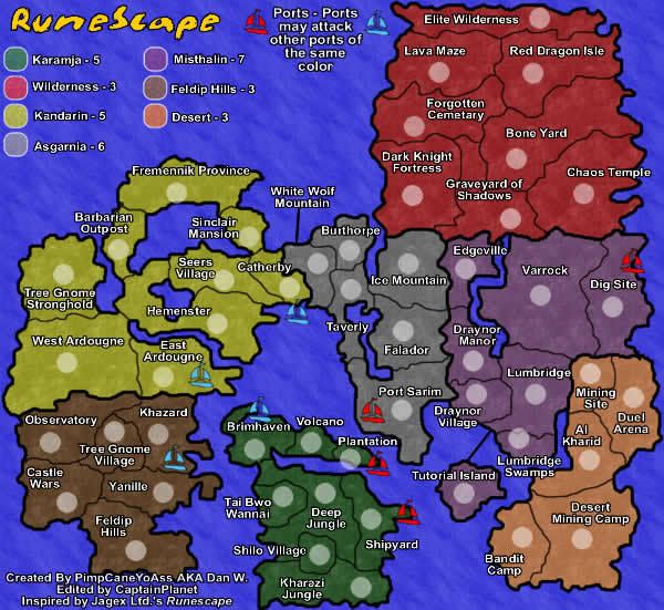
Changes
-Minor font size
-Minor army circle location
-New texture
-Changed the bonuses
Comments:
This texture seems more suitable. I like this one a lot. Leave me feedback so i can edit it once again
Problems to be fixed
-none at the time
Changes
-Minor font size
-Minor army circle location
-New texture
-Changed the bonuses
Comments:
This texture seems more suitable. I like this one a lot. Leave me feedback so i can edit it once again
Problems to be fixed
-none at the time
Last edited by PimpCaneYoAss on Fri Apr 13, 2007 2:20 pm, edited 3 times in total.
-
PimpCaneYoAss
- Posts: 185
- Joined: Fri Feb 16, 2007 3:04 pm
- Location: Connecticut
![]() by CaptainPlanet on Thu Apr 12, 2007 4:43 pm
by CaptainPlanet on Thu Apr 12, 2007 4:43 pm
I love that texture, if everyone else agrees you should use it
-
CaptainPlanet
- Posts: 132
- Joined: Wed Feb 14, 2007 6:21 pm
- Location: Bankhead
![]() by cowshrptrn on Thu Apr 12, 2007 7:06 pm
by cowshrptrn on Thu Apr 12, 2007 7:06 pm
I'm not too keen on the observatory-Khazard-East ardougne-west ardougne border, making it a corner like that is confusing, and people are going to be confused as to whether diagonals border or not, so i suggest shifting the border a bit so there is no corner.

-

cowshrptrn
- Posts: 838
- Joined: Thu Aug 17, 2006 1:15 pm
- Location: wouldn't YOU like to know....
![]() by PimpCaneYoAss on Thu Apr 12, 2007 7:33 pm
by PimpCaneYoAss on Thu Apr 12, 2007 7:33 pm
cowshrptrn wrote:I'm not too keen on the observatory-Khazard-East ardougne-west ardougne border, making it a corner like that is confusing, and people are going to be confused as to whether diagonals border or not, so i suggest shifting the border a bit so there is no corner.
i can be confusing at times but i mean then that shifts the wholegame play from how many territories can attack a bording country which can mess with the bonuses...ill consider it tho thanks
-
PimpCaneYoAss
- Posts: 185
- Joined: Fri Feb 16, 2007 3:04 pm
- Location: Connecticut
Return to Melting Pot: Map Ideas
Who is online
Users browsing this forum: No registered users
|
|||||||
| Conquer Club is not associated with RISK online in any way. Copyright © 2006-2025 by Big Wham LLC | |||||||