Alright, I'm guessing the map on p48 is the latest version so I'll base my comments off that.
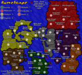
The legend is still something that doesn't sit well with me. I quite like the new font, I actually wouldn't mind seeing more of it, either for the title or on the actual map. The circles and numbers could still use some work though to be honest. Perhaps lose the emboss look behind them and go with a darker border rather than the orange. Also, maybe drop the font size of the numbers so they don't cramp the circles so much.
I agree with reverend_kyle and am sticking to my previous posts that the colours could use some adjusting. It's not a lot of work and I think the difference it would make to the map would be worth it. Just look at the image below for an example of how choosing colours that compliment each other can make all the difference.

I like the sea and dead territory texture, but I'm still not a fan of the texture on the playable part of the map. Maybe it's just the way it clashes with the colours of the map, but I don't think it's doing you any favours. Perhaps just toning it down would help, I'm not really sure.
The problem with the texture in the river is very strange but very noticeable. It's the only part of your map without texture, so it stands out quite a bit. I don't know how it has happened, but the texture just stops slightly before it reaches the dead territory.
The borders do vary in thickness quite a bit over the map. While I understand this is a pain of a thing to fix, if everyone else has to do it you should do the same.

There are a number of army shadows that could probably do with moving around a little. Just see if you can give the army shadows some more space in West Friesland, Overbetuwe, Maaskant, Zuid-Limburg, Tholen and Beveland.
One last little thing is the way Amsterdam is written on the board. It looks like it is two seperate words in Amster dam. Can I suggest putting a - on the end of Amster so it looks like a continuation rather than seperate words.