To make them pop up more, and look more pipelike. Also with higher contrast they function better as dividers for the image, making the whole image clearer.
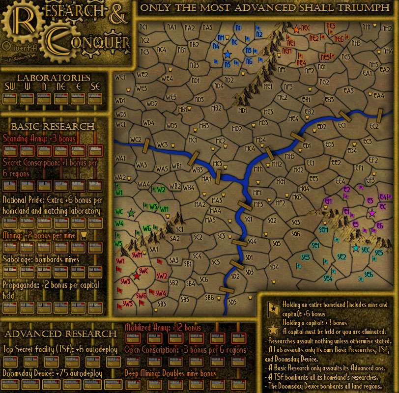
Then, the land area. DiM has a point in that you haven't really done anything to it except make it darker - way too dark in fact, to the point of hurting legibility. I'm betting blue numbers won't show too well on that either...
I however agree with you Tacktix that the land area should retain a relatively simple, clean look. That however doesn't mean it can't be improved.
What I suggest for the land area is, make it lighter again. It should be noticeably lighter than the surrounding areas, to create a contrast for the map. The mountains and water you can keep at the current brightness, though.
Then, try making the territory borders thinner. I think this would reduce clutter in the map, and make for a cleaner style.
Consider changing the territory font. The current one is pretty unclear, and at least one person has complained about not being able to read it. Maybe a pixel font? Idk. Something.
Then... instead of a dark cloud effect, you could try a gradient overlay for the land area. Fill with black, and create 2 white radial gradients, one on the north side and one on the south. Set the layer on soft light and reduce opacity to around 40%, and you have nice, smooth gradient for the land, increasing contrast, giving you some variation in brightness. If you want you can also add a cloud effect, but make it with a much finer, and set the opacity very low.
These are all simple things, but they should work pretty well for the map clarity.
The bridges could be made narrower... again, for a less cluttered look. I'd suggest reducing their width in half.
Oh, and the coloured glows under all the territory names... make them a bit lighter, and spread it around or blur it a bit - this would improve the readability of the labels a lot.
Then, on the research side... I already mentioned the pipes and gave you a visual example for them. Apart from that, I'd only suggest giving the research squares and the smaller pipes some drop shadow.
As for the clarity of attack routes... I don't know. To me they are pretty clear after reading the legend, but it might be that newer players could have problems with them... I don't know. You should at least prepare for the eventuality that you may have to make them clearer in beta.
Best of luck with this map. I'm very much looking forward to playing it.