Conquer Club

Jewel of the Empire coordinates & xml (new xml?)

Have an idea for a map? Discuss ideas and concepts here.

Moderator: Cartographers

Forum rules
Please read the Community Guidelines before posting.

Would you like me to continue with this map?

 
Total votes : 0

Postby Contrickster on Tue Apr 17, 2007 12:14 pm

NOOOOOOOOOOOOOOOOOOOOOOOOOOO! [echo]


Neilhouse wrote:Classic, USA and Canada don't even have titles just to name a few. They play fine. Why is this such a big issue with this map?


It doesn't need a title. Brilliant. It shall be removed.

"Desert and mountains are impassable" can be moved to the top right.
Corporal 1st Class Contrickster
 
Posts: 261
Joined: Tue Jan 23, 2007 7:24 pm

Postby trip on Tue Apr 17, 2007 12:22 pm

Contrickster wrote:It doesn't need a title. Brilliant. It shall be removed.


Perfect.
User avatar
Corporal 1st Class trip
 
Posts: 14
Joined: Thu Jan 25, 2007 11:18 am

Postby Neilhouse on Tue Apr 17, 2007 1:54 pm

It will need to be called something on the Start Your Own Game screen.

But you're welcome. :wink:

Also, I can see why Con would not want to use your image, mibi (although I do like it). If I were making a map I would want it be 100% artistically responsible for it. Despite our help and suggestions, it's his creation.
User avatar
Corporal Neilhouse
 
Posts: 50
Joined: Wed Jan 24, 2007 7:00 pm
Location: Delaware

Postby Contrickster on Tue Apr 17, 2007 3:01 pm

No, it's not that, it looks like a super-raspberry.

But mostly it looks too flashy and thereby out of place on this map which isn't flashy at all. It's too good for my map.

It's an impressive graphic, no issue with the graphic, just hilariously nonononono, doesn't look good on this map.
:wink:

Ed: Neilhouse you define the name in the XML. I've called this Jewel of the Empire.
Corporal 1st Class Contrickster
 
Posts: 261
Joined: Tue Jan 23, 2007 7:24 pm

Postby Contrickster on Tue Apr 17, 2007 10:03 pm

Title removed. Desert and mountains note removed - not necessary. It's obvious you can't attack through those barriers. (There are many maps without this kind of text).

I'm sorry I've changed the background colour again! It's darker but I've rammed up the background image so that it is more visible, even while the colour remains dark.

Finally elephant moved. Think the elephant ought to have a name by now. I'll call it "Bud."

Image

Image
Corporal 1st Class Contrickster
 
Posts: 261
Joined: Tue Jan 23, 2007 7:24 pm

Postby PimpCaneYoAss on Wed Apr 18, 2007 12:00 am

I find it weird how you call it an ocean passage when there is no ocean. Also a title is drastically needed. the legend text seems slightly blured too. I would sharpen that up a bit.
Image
User avatar
Cadet PimpCaneYoAss
 
Posts: 185
Joined: Fri Feb 16, 2007 3:04 pm
Location: Connecticut

Postby Neilhouse on Wed Apr 18, 2007 12:09 am

PimpCaneYoAss wrote:I find it weird how you call it an ocean passage when there is no ocean. Also a title is drastically needed. the legend text seems slightly blured too. I would sharpen that up a bit.


If a cartographer needs good reason to not implement the change suggested to him/her then a suggester should also have a good reason why he/she is suggesting what they do.

I understand the ocean passage comment, but why does this map drastically need a title? Expand some, please?
User avatar
Corporal Neilhouse
 
Posts: 50
Joined: Wed Jan 24, 2007 7:00 pm
Location: Delaware

Postby KEYOGI on Wed Apr 18, 2007 12:17 am

[Official] How to Make a Map thread:
Height is flexible, but it is recommended that you do not exceed 350 px on small maps and 600 px on large maps so that users will not need to scroll down to attack.

Your small map is one pixel shy in height of the recommended limit for the large map. Is there any reason why you've made the map so big? It's not as if you have an abundance of small territories that would be hard to see, so I'd suggest using the small map as your large and make a new small map.
Sergeant 1st Class KEYOGI
 
Posts: 1632
Joined: Tue Oct 10, 2006 6:09 am

Postby reverend_kyle on Wed Apr 18, 2007 12:23 am

this probably sounds bad but the title is the only part I REALLY liked.
DANCING MUSTARD FOR POOP IN '08!
User avatar
Sergeant reverend_kyle
 
Posts: 9250
Joined: Tue Mar 21, 2006 4:08 pm
Location: 1000 post club

Postby DiM on Wed Apr 18, 2007 6:10 am

KEYOGI wrote:[Official] How to Make a Map thread:
Height is flexible, but it is recommended that you do not exceed 350 px on small maps and 600 px on large maps so that users will not need to scroll down to attack.

Your small map is one pixel shy in height of the recommended limit for the large map. Is there any reason why you've made the map so big? It's not as if you have an abundance of small territories that would be hard to see, so I'd suggest using the small map as your large and make a new small map.


if he does that his small map would be a tiny thing 286*350 px.
while modifications to the font and the army circles could be easily made to make everything more clear. i think it would still look like crap. i don't even feel like attacking on a tiny map like this:

Image
“In the beginning God said, the four-dimensional divergence of an antisymmetric, second rank tensor equals zero, and there was light, and it was good. And on the seventh day he rested.”- Michio Kaku
User avatar
Major DiM
 
Posts: 10415
Joined: Wed Feb 14, 2007 6:20 pm
Location: making maps for scooby snacks

Postby KEYOGI on Wed Apr 18, 2007 6:13 am

DiM wrote:if he does that his small map would be a tiny thing 286*350 px.

I think around 450px high would be okay, maybe 500 at the most. I just really see no need for the maps to be so big.
Sergeant 1st Class KEYOGI
 
Posts: 1632
Joined: Tue Oct 10, 2006 6:09 am

Postby DiM on Wed Apr 18, 2007 6:20 am

KEYOGI wrote:
DiM wrote:if he does that his small map would be a tiny thing 286*350 px.

I think around 450px high would be okay, maybe 500 at the most. I just really see no need for the maps to be so big.


at 450-500 it would be ok. by quoting the thingy from the sticky i thought you wanted something strictly inside those measures :)


i like big maps. not all of us have good eyes you know. :shock: :lol:
“In the beginning God said, the four-dimensional divergence of an antisymmetric, second rank tensor equals zero, and there was light, and it was good. And on the seventh day he rested.”- Michio Kaku
User avatar
Major DiM
 
Posts: 10415
Joined: Wed Feb 14, 2007 6:20 pm
Location: making maps for scooby snacks

Postby Contrickster on Wed Apr 18, 2007 8:55 am

PimpCaneYoAss wrote:I find it weird how you call it an ocean passage when there is no ocean. Also a title is drastically needed. the legend text seems slightly blured too. I would sharpen that up a bit.


Indian Ocean?

Title not needed.

Legend was blurred around the edges. That was deliberate, looks better blurred than unblurred.

KEYOGI wrote:Your small map is one pixel shy in height of the recommended limit for the large map. Is there any reason why you've made the map so big?


(Just a guess.)

"Big" is 58% size of the original map as made in Fireworks/GIMP. Small is 48%. It won't be a problem to reduce the size. However small map is a bit small for big - 55%?


reverend_kyle wrote:this probably sounds bad but the title is the only part I REALLY liked.


That sounds bad and really it doesn't make sense either. What specifically do you object to?
Corporal 1st Class Contrickster
 
Posts: 261
Joined: Tue Jan 23, 2007 7:24 pm

Postby Contrickster on Wed Apr 18, 2007 10:55 am

Large 510/624 (50% original)

Image

Small 459/562 (45% original)
Image
Corporal 1st Class Contrickster
 
Posts: 261
Joined: Tue Jan 23, 2007 7:24 pm

Postby Contrickster on Wed Apr 18, 2007 6:28 pm

KEYOGI - are you happy with the above sizes? I know the largest one is 10 pixels above your "max" but if I made it 49% that would skew the original image. It would be nice to have the 50% one; plus there is the argument we do not want maps to be too small for people to read.
Corporal 1st Class Contrickster
 
Posts: 261
Joined: Tue Jan 23, 2007 7:24 pm

Postby Contrickster on Wed Apr 18, 2007 7:04 pm

It's been brought to my attention that I've quoted the width. :oops: KEYOGI actually means the maximum HEIGHT should be 510, whereas mine is 624 (and even that is on the small side).

This is the revised size 500 max height in line with KEYOGI's suggestion for the LARGE version of Jewel of the Empire.

Image

Umm... Clearly the shape of my map requires it to be taller than it is wide... KEYOGI?

Ed: Sorry for the triple post.
Corporal 1st Class Contrickster
 
Posts: 261
Joined: Tue Jan 23, 2007 7:24 pm

Postby Contrickster on Thu Apr 19, 2007 7:11 am

*bump*

Any new comments?

Any specific suggestions?

Anything not already addressed?


What do you like most? What do you like least?
Corporal 1st Class Contrickster
 
Posts: 261
Joined: Tue Jan 23, 2007 7:24 pm

Postby Spritzking on Thu Apr 19, 2007 7:18 am

maybe take down the bonus of the himalyas to 2? it has just 2 frontiers and bengal has 3 but just a 2 bonus... frontiers is more important than number of teritories
Major Spritzking
 
Posts: 117
Joined: Wed Jan 03, 2007 7:19 pm

Postby Contrickster on Thu Apr 19, 2007 7:34 am

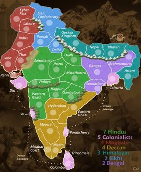
Spritzking wrote:maybe take down the bonus of the himalyas to 2? it has just 2 frontiers and bengal has 3 but just a 2 bonus... frontiers is more important than number of teritories


Don't understand the call for Himalayas to be 2. It's not a straight calculation of three borders, four territories. If that was the case you might make it 2. It's obvious to me it needs to be 3 in the wider scheme of the game.

Himalayas is flanked by 2, 3 territory 2 bonus continent. This should ensure Himalayas is contested territory in the early stages of the game. So worries that Himalayas will be always be got first and dictate the game should be unfounded. Bengal and Sikhs will be got first and rival powers there will contest Himalayas.

Himalayas also needs to be rewarded with 3 bonus armies both to balance Mughals and Sikh power (+6) - this means the strategy "get Punjab, Mughals and Sikhs first" will face resistance from Himalayas - and to provide somewhere for Mughals and Sikh power to develop, because options for development from the NW are otherwise weak.

Hindus (7) + Deccan (4) = 11
Mughals (4) + Sikhs (2) + Himalayas (3) + Bengal (2) = 11

Without the extra bonus army the southern half of the map will be over powered. Deccan, Colonialists and Hindus will always be dominant. With the extra bonus for the Himalayas gameplay should be more balanced and depend on good strategy. Sometimes North will win. Sometimes the south.

Himalayas also enables balanced 3/4 player action - Mughals + Sikhs = 6
Himalayas + Bengal = 5
Colonialists = 5
Deccan or Hindus = 7/4

However the clinching argument really is what I said about Himalayas being flanked by 2 territories that will be got first. Plus border on Colonialists.
Corporal 1st Class Contrickster
 
Posts: 261
Joined: Tue Jan 23, 2007 7:24 pm

Postby Contrickster on Thu Apr 19, 2007 10:03 am

KEYOGI are you going to respond?

You have been online & posted elsewhere. It seems strange, in your position as cartographic help, that you would ask for the image size to be reduced then ignore the thread once it has been reduced. All it takes is a yes or no. Until I get a yes or no I don't know whether I should change the coordinates or not.

I'm trying to add value to this site... my work is for free. Remember that.
Corporal 1st Class Contrickster
 
Posts: 261
Joined: Tue Jan 23, 2007 7:24 pm

Postby mibi on Thu Apr 19, 2007 11:38 am

Contrickster wrote:KEYOGI are you going to respond?

You have been online & posted elsewhere. It seems strange, in your position as cartographic help, that you would ask for the image size to be reduced then ignore the thread once it has been reduced. All it takes is a yes or no. Until I get a yes or no I don't know whether I should change the coordinates or not.

I'm trying to add value to this site... my work is for free. Remember that.


be cool. 8)
User avatar
Captain mibi
 
Posts: 3350
Joined: Thu Mar 01, 2007 8:19 pm
Location: The Great State of Vermont

Postby Guiscard on Thu Apr 19, 2007 12:36 pm

Contrickster wrote:KEYOGI are you going to respond?

You have been online & posted elsewhere. It seems strange, in your position as cartographic help, that you would ask for the image size to be reduced then ignore the thread once it has been reduced. All it takes is a yes or no. Until I get a yes or no I don't know whether I should change the coordinates or not.

I'm trying to add value to this site... my work is for free. Remember that.


His work is for free as well...

Chill out a bit. Why would he be deliberately ignoring your post? He's obviously got a lot on his plate at the moment, as has Andy. Just give it time and stop being so hasty.
qwert wrote:Can i ask you something?What is porpose for you to open these Political topic in ConquerClub? Why you mix politic with Risk? Why you not open topic like HOT AND SEXY,or something like that.
User avatar
Private 1st Class Guiscard
 
Posts: 4103
Joined: Fri Dec 08, 2006 7:27 pm
Location: In the bar... With my head on the bar

Postby Ruben Cassar on Thu Apr 19, 2007 12:43 pm

Contrickster wrote:KEYOGI are you going to respond?

You have been online & posted elsewhere. It seems strange, in your position as cartographic help, that you would ask for the image size to be reduced then ignore the thread once it has been reduced. All it takes is a yes or no. Until I get a yes or no I don't know whether I should change the coordinates or not.

I'm trying to add value to this site... my work is for free. Remember that.


Keyogi works for free, just like Andy and any other cartographer for that matter. Everyone in the foundry tries to add value to the site. Relax man.

For some strange reason I find myself straining my eyes whenever I look at this map.

I think you should start afresh, redesign the map maybe and change the colour schemes because they just do not work as they are right now...
ImageImageImageImageImage
User avatar
Colonel Ruben Cassar
 
Posts: 2160
Joined: Thu Nov 16, 2006 6:04 am
Location: Civitas Invicta, Melita, Evropa

Postby Contrickster on Thu Apr 19, 2007 12:46 pm

Cheers :)

Sorry, the last week or so has been very frustrating for the fact I've done no work at all. I've done virtually nothing on the map. Except take away the title, of course!

I know the poll says 80%+ want me to continue with the map (thanks for your encouragement! :D ) but the presentation is nowhere near as good as Senate, Middle East or Mongels map, to name three. It's better than some published maps but the fact is the presentation can still be improved. I don't really know how to do that though and more importantly I'm not interested in doing that. I didn't want to do this because I'm a graphic artist but because I play the game.

More to the point, after the Fireworks trial runs out, changes would have to be done in GIMP, in which case I'm not sure the map can be finished if major changes were needed. The difference in quality between GIMP and Fireworks is noticable.

I suppose it was asking too much to get all the major issues settled in a month.
Corporal 1st Class Contrickster
 
Posts: 261
Joined: Tue Jan 23, 2007 7:24 pm

Postby Contrickster on Thu Apr 19, 2007 12:49 pm

Ruben Cassar wrote:I think you should start afresh, redesign the map maybe and change the colour schemes because they just do not work as they are right now...


I can change the colours (what do you suggest?) but redesign the map? Can you elaborate on what you mean by "redesign"?
Corporal 1st Class Contrickster
 
Posts: 261
Joined: Tue Jan 23, 2007 7:24 pm

PreviousNext

Return to Melting Pot: Map Ideas

Who is online

Users browsing this forum: No registered users