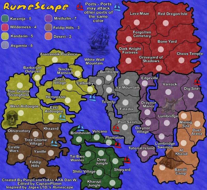
RuneScape Map [Abandoned]
Moderator: Cartographers
![]() by freezie on Wed Apr 18, 2007 4:39 pm
by freezie on Wed Apr 18, 2007 4:39 pm
Ok...but still.
I had great hopes for this map. I would have played it just because it was really the runescape map.
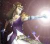
But with those images...and the way they're placed...Only the green dragon looks good.
I don't know anymore.
I had great hopes for this map. I would have played it just because it was really the runescape map.
But with those images...and the way they're placed...Only the green dragon looks good.
I don't know anymore.

-
 freezie
- Posts: 3901
- Joined: Fri Apr 06, 2007 12:18 pm
- Location: Somewhere between here and there.


![]() by DiM on Wed Apr 18, 2007 4:42 pm
by DiM on Wed Apr 18, 2007 4:42 pm
making the pictures transparent does not help. it's all about how you make them blend.
here i added a skull a ship a dragon and a pyramid.
blending in different ways but still blending. your pictures have weird margins.
if you tell me what software you use i might be able to help you and explain how to do it.
here i added a skull a ship a dragon and a pyramid.
blending in different ways but still blending. your pictures have weird margins.
if you tell me what software you use i might be able to help you and explain how to do it.
“In the beginning God said, the four-dimensional divergence of an antisymmetric, second rank tensor equals zero, and there was light, and it was good. And on the seventh day he rested.”- Michio Kaku
-

DiM
- Posts: 10415
- Joined: Wed Feb 14, 2007 6:20 pm
- Location: making maps for scooby snacks


![]() by PimpCaneYoAss on Wed Apr 18, 2007 4:48 pm
by PimpCaneYoAss on Wed Apr 18, 2007 4:48 pm
Fireworks...that looks great
I was thinking about b/w images too.
I was thinking about b/w images too.
-
PimpCaneYoAss
- Posts: 185
- Joined: Fri Feb 16, 2007 3:04 pm
- Location: Connecticut
![]() by DiM on Wed Apr 18, 2007 4:51 pm
by DiM on Wed Apr 18, 2007 4:51 pm
those aren't black and white images. well not all of them. look at the dragon or the pyramid. they still have colour. the pyramid is brown and the dragon is greenish with brown. the skull and the ship are b&w
“In the beginning God said, the four-dimensional divergence of an antisymmetric, second rank tensor equals zero, and there was light, and it was good. And on the seventh day he rested.”- Michio Kaku
-
DiM
- Posts: 10415
- Joined: Wed Feb 14, 2007 6:20 pm
- Location: making maps for scooby snacks
![]() by DiM on Wed Apr 18, 2007 5:10 pm
by DiM on Wed Apr 18, 2007 5:10 pm
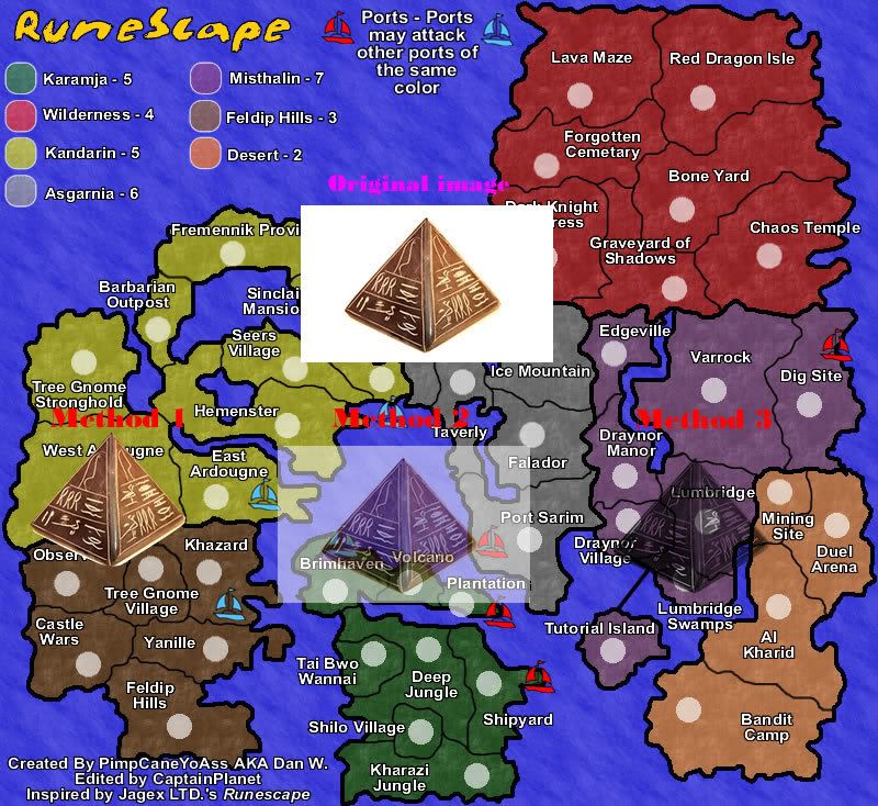
here is a tutorial about different ways to blend the pyramid.
first method:
1. select the magic wand and click the white background (adjust the parameters to your desire)
2. right click inside the selection -> inverse marquee
3. select a white background in the left panel.
4. right click on the selection and select "convert to path" now the pramid is gone
5. shift click both layers to select them. or press ctrl+a
6. go to modify -> mask -> group as mask.
now the 2 layers are joined and the white background is gone, being replaced with a transparent one. copy paste the new image anywhere.
the quality depends on how you set the parameters on the marquee. as you can see i have some white traces at the bottom
second method:
1. get the original image and copy paste it on your map.
2. select it and at the bottom panel next to the transparency setting you have various options. select average. it works best if you already have masked the image. as you can see i still have the full white background.
third method:
1. this one is really simple. just take the original image and at the bottom panel click + to add a filter. then go to other and click on convert to alpha.
the drawback is that it turns the image to b&w.
for best effects combine above methods.
here's the image:
“In the beginning God said, the four-dimensional divergence of an antisymmetric, second rank tensor equals zero, and there was light, and it was good. And on the seventh day he rested.”- Michio Kaku
-
DiM
- Posts: 10415
- Joined: Wed Feb 14, 2007 6:20 pm
- Location: making maps for scooby snacks
![]() by PimpCaneYoAss on Wed Apr 18, 2007 5:47 pm
by PimpCaneYoAss on Wed Apr 18, 2007 5:47 pm
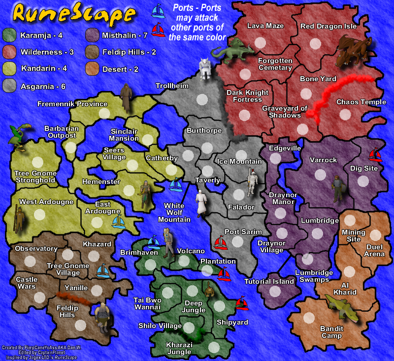
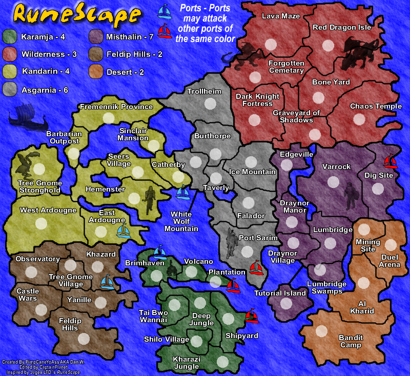
NEW UPDATE 4/18/07
Normal, nontransparent version
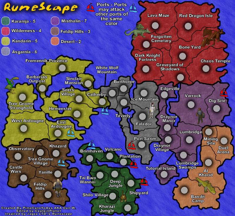
Average, transparent version
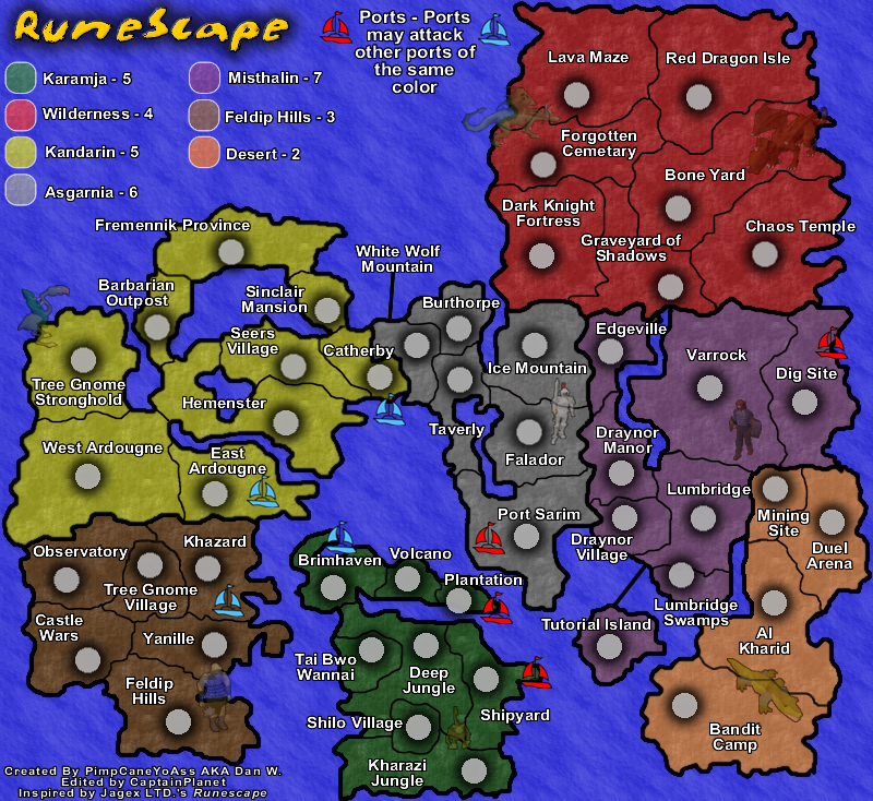
Changes
-New "RuneScape" images
Comments
-Added new images directly from RuneScape
-Seem to blend well
-Open to all suggestions
Normal, nontransparent version
Average, transparent version
Changes
-New "RuneScape" images
Comments
-Added new images directly from RuneScape
-Seem to blend well
-Open to all suggestions
Last edited by PimpCaneYoAss on Wed Apr 18, 2007 6:54 pm, edited 1 time in total.
-
PimpCaneYoAss
- Posts: 185
- Joined: Fri Feb 16, 2007 3:04 pm
- Location: Connecticut
![]() by CaptainPlanet on Wed Apr 18, 2007 6:21 pm
by CaptainPlanet on Wed Apr 18, 2007 6:21 pm
The monkey is taking a shit on the border, there's a crocodile in the desert and the pictures make the ports look low tech
Stopper wrote:I voted Kid_A. I don't why they have the Ku Klux Klan in their avatar, but I like the name.
-
CaptainPlanet
- Posts: 132
- Joined: Wed Feb 14, 2007 6:21 pm
- Location: Bankhead


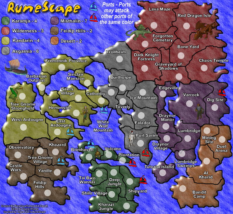
![]() by PimpCaneYoAss on Thu Apr 19, 2007 4:04 pm
by PimpCaneYoAss on Thu Apr 19, 2007 4:04 pm
NEW UPDATE 4/19/07
Changes
-Added Trollheim to Asgarnia
-Added different impassable barriers
-Changed the texture of the land
-Added more images
-Added a drop shadow to the images
-Removed the shadow from the army circles
-Moved the title and added bevel
-Slightly moved some images
-Added black line around the legend parts
-Increased the text size in the legend
Comments
-Trollheim gave me a chance to add mountain to that part of the map. I still need to take a look at the new bonuses however.
-The impassable barriers add a bit more flavor to the map.
-The colors of the land stayed the same but added some texture (No texture was present before this)
-More images will help the feel of the map and the shadow adds a nice touch
-I had to remove the shadows from the army circles for crowding reasons.
-The title is now centered on th legend and the bevel helps emphasize it.
-Some images were moved to make sure they weren't floating on the water.
-The color codes of the legend recieved a black line to help promote their purpose.
-The text size in the legend use to be the same size of the country names but now is one size bigger.
Problems to be addressed
-Blur borders??? Let me know what you think about this
-Bonuses need to be recalculated
-Leave feedback with more issues
-
PimpCaneYoAss
- Posts: 185
- Joined: Fri Feb 16, 2007 3:04 pm
- Location: Connecticut
![]() by DiM on Thu Apr 19, 2007 4:17 pm
by DiM on Thu Apr 19, 2007 4:17 pm
i really don't like how you did the images.
first the images are bad. but since they are from runescape maybe the fans will like them
second. because of the shadow they seem to be floating above the map. not good they're supposed to be on the map not above it.
and finally third. i like subtle blending. the images should complement the map not distract the eye. something like i showed you before.
edit// i also don't like the impassable borders they look like coloured smoke or foam.
“In the beginning God said, the four-dimensional divergence of an antisymmetric, second rank tensor equals zero, and there was light, and it was good. And on the seventh day he rested.”- Michio Kaku
-
DiM
- Posts: 10415
- Joined: Wed Feb 14, 2007 6:20 pm
- Location: making maps for scooby snacks
![]() by freezie on Thu Apr 19, 2007 4:45 pm
by freezie on Thu Apr 19, 2007 4:45 pm
Personally..I think you added too many images.
As for how you can do them, DiM is the expert, so I will shut up on that.
For the boders...
Make them trees in karamja.
Make them rocks in the wilderness.
Make them mountains in trollheim ( which is a nice addition to the map, but you could make it one way to the wild, if that doesn't change gameplay )
-
freezie
- Posts: 3901
- Joined: Fri Apr 06, 2007 12:18 pm
- Location: Somewhere between here and there.
![]() by PimpCaneYoAss on Thu Apr 19, 2007 5:32 pm
by PimpCaneYoAss on Thu Apr 19, 2007 5:32 pm
NEW UPDATE 4/18/07
Changes
-Remove some pictures
-Converted pictures that I left there to alpha
-Removed impassible borders
Comments
-I cut the number of pictures down and added the viking boat back. Comment on the new look.
-The impassible borders is still a major topic to address. I dont know how to add trees, mounntains, rock, walls, or lava easily. Do I have to hand draw the trees and everything or is there an easier way to do this. Please offer feedback and help with this issue.
-
PimpCaneYoAss
- Posts: 185
- Joined: Fri Feb 16, 2007 3:04 pm
- Location: Connecticut
![]() by PimpCaneYoAss on Thu Apr 19, 2007 7:07 pm
by PimpCaneYoAss on Thu Apr 19, 2007 7:07 pm
NEW UPDATE 4/19/07
Changes
-The pictures are back to normal without shadows
-Bevel the map because the 3D images looked out of place
Comments
-Leave me feedback
Changes
-The pictures are back to normal without shadows
-Bevel the map because the 3D images looked out of place
Comments
-Leave me feedback
-
PimpCaneYoAss
- Posts: 185
- Joined: Fri Feb 16, 2007 3:04 pm
- Location: Connecticut
![]() by KEYOGI on Thu Apr 19, 2007 7:25 pm
by KEYOGI on Thu Apr 19, 2007 7:25 pm
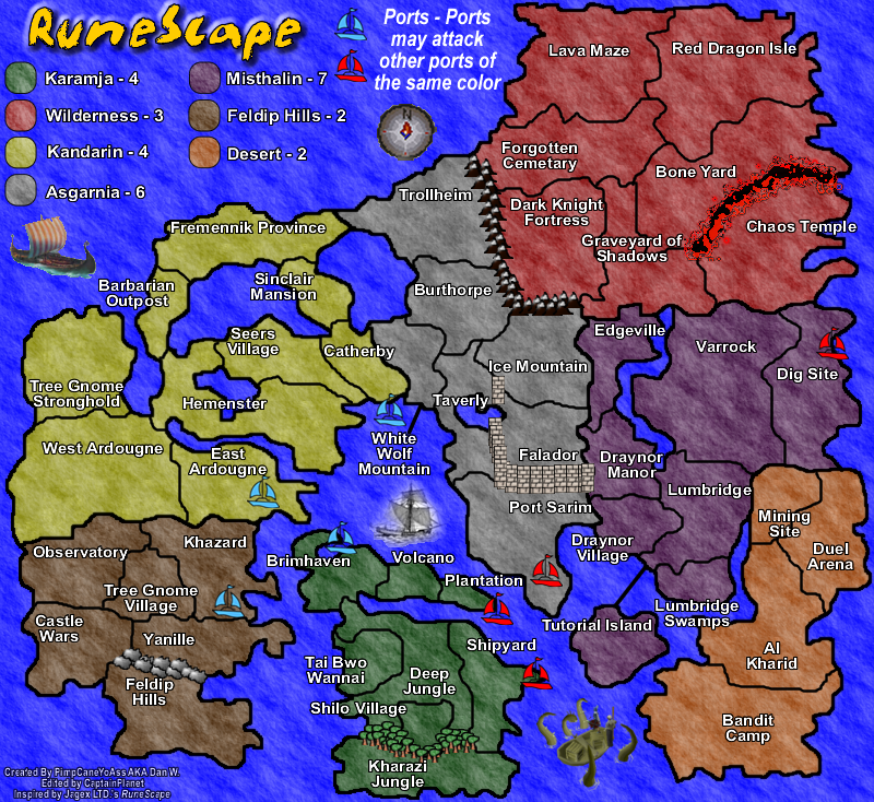
I don't feel the pictures or the bevelled look fit very well with the map. Your Forgotten Cemetary/Graveyard of Shadows border doesn't go all the way to the Dark Knight Fortress border. Hmm... you've got some long names, consider shortening them if you can as it may cause problems the drop-down menu.
-
KEYOGI
- Posts: 1632
- Joined: Tue Oct 10, 2006 6:09 am


![]() by PimpCaneYoAss on Thu Apr 19, 2007 7:46 pm
by PimpCaneYoAss on Thu Apr 19, 2007 7:46 pm
How many characters fit in the drop down menu for one territory?
NEW UPDATE 4/18/07
Changes
-Added Impassible barriers
-Removed almost all of the pictures
-Removed bevel
Comments
-The impassiible barriers are a starting point for gameplay options. I will work on them graphically.
-For the pictures i am going to try removing them all and just sticking to ones that can be placed in the oceans (Compass, boats, etc) I think they crowd the land a bit too much.
Problems to be addressed
-Graveyard of Shadows Border
-I will work on the Impassible borders.
-Adding more pictures to the seas and not the land
-Blur borders and compass
Last edited by PimpCaneYoAss on Thu Apr 19, 2007 10:24 pm, edited 1 time in total.
-
PimpCaneYoAss
- Posts: 185
- Joined: Fri Feb 16, 2007 3:04 pm
- Location: Connecticut
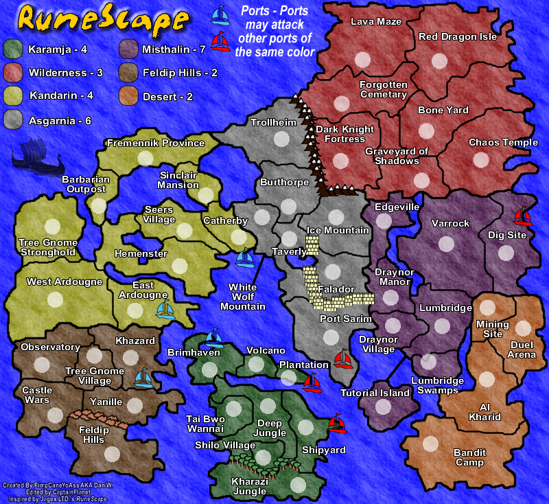
![]() by PimpCaneYoAss on Thu Apr 19, 2007 10:14 pm
by PimpCaneYoAss on Thu Apr 19, 2007 10:14 pm
NEW UPDATE 4/20/07 (WEEED lol)
Changes
-Added impassible lava to Wilderness
-Added more trees to Karamja
-Change the rock in Feldip Hills (Bevel and Gray)
-Changed the mountains between Asgarnia and Wilderness (Bevel and more)
-Changed the wall around Falador
-Fixed the border of Graveyard of Shadows
-Added a RuneScape compass
-Added a RuneScape seamonster by desert
-Added a bost between Karamja and Asgarnia
Comments
-The images still need some help
-I like the impassible borders now
-Compass looks "nub" but thats RuneScape
-Still need to add Army Circles
Problems to be addressed
-Add army circles
-Make Falador's wall look like a single wall
-Blur the compass
-Look into bonuses
-Rocks in Feldip Hills
-Country Names
-Pictures and copyright issues
Last edited by PimpCaneYoAss on Wed Apr 25, 2007 1:43 pm, edited 3 times in total.
-
PimpCaneYoAss
- Posts: 185
- Joined: Fri Feb 16, 2007 3:04 pm
- Location: Connecticut


![]() by freezie on Thu Apr 19, 2007 11:58 pm
by freezie on Thu Apr 19, 2007 11:58 pm
The swamp monster, uh? Good job, very nice additon.
About the compass, you need to change it. I mean, keep it, but make it less ''cutted'' around the edges.
The borders looks good now, except the fallador's walls need to be more singled out as a single wall.
About the compass, you need to change it. I mean, keep it, but make it less ''cutted'' around the edges.
The borders looks good now, except the fallador's walls need to be more singled out as a single wall.
-
freezie
- Posts: 3901
- Joined: Fri Apr 06, 2007 12:18 pm
- Location: Somewhere between here and there.
![]() by KEYOGI on Fri Apr 20, 2007 12:05 am
by KEYOGI on Fri Apr 20, 2007 12:05 am
Which picture version do you like better?
Normal, nontransaprent version
35% [ 5 ]
Average, transparent version
35% [ 5 ]
None, experiment with other options
14% [ 2 ]
None, don't use pictures
7% [ 1 ]
None, these pictures dont work with the map
7% [ 1 ]
Total Votes : 14
Normal, nontransaprent version
35% [ 5 ]
Average, transparent version
35% [ 5 ]
None, experiment with other options
14% [ 2 ]
None, don't use pictures
7% [ 1 ]
None, these pictures dont work with the map
7% [ 1 ]
Total Votes : 14
-
KEYOGI
- Posts: 1632
- Joined: Tue Oct 10, 2006 6:09 am
Return to Melting Pot: Map Ideas
Who is online
Users browsing this forum: No registered users
|
|||||||
| Conquer Club is not associated with RISK online in any way. Copyright © 2006-2025 by Big Wham LLC | |||||||