Conquer Club

The Dungeon of Draknor [Vacation]

Have an idea for a map? Discuss ideas and concepts here.

Moderator: Cartographers

Forum rules
Please read the Community Guidelines before posting.

Postby Jota on Mon Jun 26, 2006 3:44 am

[url=http://grunk.org/risk/maze5-large.jpg]Image
(Click for large version.)[/url]

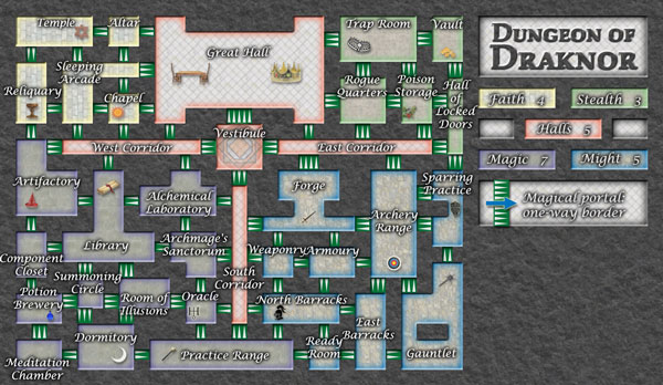
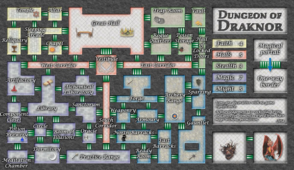
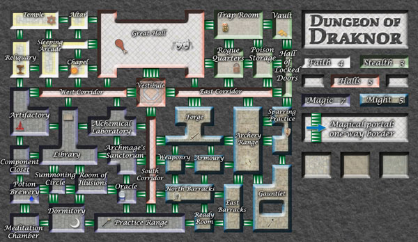
The icons seem to have generally positive feedback, so I added in the rest of them. I didn't make them into shadows since I'm hoping to avoid army shadows altogether on this map. Some of the icons I'm really happy with; others, I'm not so sure about. Feedback is welcome. Also, I haven't heard any other objections to the continent names, so I've kept them.

I returned the borders near the Summoning Circle to the way they were (I think). I tried to find a good way to give the Hall of Locked Doors only one exit, but I couldn't find one that didn't introduce other issues (like changing which continents could attack which or preventing HoLD from reaching the rest of its continent), alas.

I tried the thing about trying to make the floor patterns not look like they were crawling up the walls in Faith. I tried the thing with inverting the bevel in Might. I couldn't find a way to try the thing where you only got the shadow part of the bevel without the other part. I also provided some samples of new floors over below the legend.

Speaking of the legend, does the layout of the title and continent bonuses look alright? Also, I boosted the font size in Stealth, so it's now a bit larger than Magic is. Is that legible enough on the small map, or should I go even further?
User avatar
Sergeant 1st Class Jota
 
Posts: 634
Joined: Wed Mar 29, 2006 7:38 pm

Postby Jota on Tue Jun 27, 2006 2:05 am

No comments at all? If I go ahead and pick a style for something that you don't like, you won't be allowed to complain if you don't give your opinion now...
User avatar
Sergeant 1st Class Jota
 
Posts: 634
Joined: Wed Mar 29, 2006 7:38 pm

Postby Marvaddin on Tue Jun 27, 2006 7:46 am

Ok, so:
Change the continents names.
Remove the little icons or make a note that they are nothing
:wink:

Ah, and make the continent colours more visible, please.
Maybe the arrows (one-way) would be better with only one bigger arrow, tested it already?
Image
User avatar
Major Marvaddin
 
Posts: 2545
Joined: Thu Feb 09, 2006 5:06 pm
Location: Belo Horizonte, Brazil

Postby fluffybunnykins on Tue Jun 27, 2006 9:41 am

the chicken drumstick looks a bit out of place...
maybe it has comedy value?
Superman wears 'Fluffybunnykins' pyjamas
User avatar
Corporal 1st Class fluffybunnykins
 
Posts: 385
Joined: Tue May 02, 2006 6:43 am
Location: Liverpool, UK

Postby Herakilla on Tue Jun 27, 2006 11:16 am

my guess is the great hall is where people eat things such as chicken drumsticks!
Come join us in Live Chat!
User avatar
Lieutenant Herakilla
 
Posts: 4283
Joined: Fri Jun 09, 2006 8:33 pm
Location: Wandering the world, spreading Conquerism

Postby AndyDufresne on Tue Jun 27, 2006 11:47 am

Well lets see...


---As for the little icons:
    Faith looks fine, near perfect. I wouldn't change much there.
    Stealth is also pretty good, but the Rogue Quarters and Trap Room images don't quite feel fitting.
    The Halls' images look don't quite fit at all. Maybe perhaps look into tables and chairs?
    Magic looks pretty good, but the Oracle looks slightly odd, and the Library's book doesn't quite look like a book. Perhaps a scroll instead.
    Might's images are by far the worst. Not in choice, but you can't quite make out what they are. Be it too small or too light.


And to say this...I'm not really in favor of the way the whole floor pattern looks. I prefered near the first version...the thinness. The jutting out of the rooms just feels odd.

As for floor patterns, I think any of those are fine. I'd use light shaded ones, but different ones, like what you have posted. Stay away from Magic's dark.

I'm not sure I like the legend. I've been trying and trying to, but I don't . Maybe it's the same thickness that plagues the rest of the board that I dislike also.


--Andy
User avatar
Corporal 1st Class AndyDufresne
 
Posts: 24935
Joined: Fri Mar 03, 2006 8:22 pm
Location: A Banana Palm in Zihuatanejo

Postby rocksolid on Tue Jun 27, 2006 11:47 am

I don't think the bevel inverting in Might is any more successful. The technique I was suggesting might involve a fair amount of manual labour. Sorry to say they still look like chocolate squares sitting on a carpet, though I do appreciate your efforts.

I like the icons for being little bits of character in the room, but I don't think they're the best way to do this - maybe try doing this with bits of furniture? Like instead of the comedy/tragedy masks, put a little stage? And dinner table instead of drumstick? etc.
User avatar
Lieutenant rocksolid
 
Posts: 625
Joined: Sat Mar 18, 2006 10:00 pm
Location: Mowwwnt Reeeal

Postby Jota on Tue Jun 27, 2006 10:02 pm

AndyDufresne wrote:I'm not sure I like the legend. I've been trying and trying to, but I don't .


Is that mainly the layout or the style that you don't care for?

I'm thinking about giving up on the whole wall-thickness thing, since it sounds like the original version wasn't really more unpopular than what I've got now (just imperfect in different ways).

(Uh, that's "giving up" in a good way... I mean... making a tactical compromise and devoting my attentions elsewhere. Yeah, that's it.)

[Edit] Also, since I didn't see any comments on the Stealth font, can I assume it's now clear enough?
User avatar
Sergeant 1st Class Jota
 
Posts: 634
Joined: Wed Mar 29, 2006 7:38 pm

Postby rocksolid on Tue Jun 27, 2006 10:21 pm

Yeah, flattish might actually do better than what you have now. Then you can also olde-up the look a bit in a way you can't with 3-d effects.
User avatar
Lieutenant rocksolid
 
Posts: 625
Joined: Sat Mar 18, 2006 10:00 pm
Location: Mowwwnt Reeeal

Postby fluffybunnykins on Wed Jun 28, 2006 4:05 am

Herakilla wrote:my guess is the great hall is where people eat things such as chicken drumsticks!

sorry, in the sense that it's food, 'Yes!' it's in its place, but the graphic itself looks out of place on this map... sort of, somehow, to me anyway, and other such disclaimers...
chocolate chunks, that's it, that's what the rooms look like! Rock, where did your eyes go?
Superman wears 'Fluffybunnykins' pyjamas
User avatar
Corporal 1st Class fluffybunnykins
 
Posts: 385
Joined: Tue May 02, 2006 6:43 am
Location: Liverpool, UK

Postby Jota on Wed Jun 28, 2006 8:43 am

[url=http://grunk.org/risk/maze6b-large.jpg]Image
(Click for large version.)[/url]

New version! Restored the original wall thickness, put in new flooring, and revamped some icons. How are they now? (Re: furniture, I did consider using mostly furniture-based icons at one point, but I couldn't see any good way to get across the feel of the different continents that way at such a tiny resolution.)

I also propagated the larger font size to the rest of the map. I'm a bit concerned with stuff fitting now; are any of the portals too obscured by the text?

Now that I've gotten rid of the excess bevelling, how's the current legend looking? I'm waiting to hear back about its layout before I put in any of the stuff below it, so that I'll know how much space I have. Also, does the portal part of it look OK now that the wall issue is over with?

Marvaddin: Now that I fixed the walls, does that make the country colors clear enough, or do you think I should take them a bit further? Also, I didn't use single large arrows since not all the portals are the same size, and I needed something that would look right at different widths.

Did I miss anything that anyone's mentioned so far?
User avatar
Sergeant 1st Class Jota
 
Posts: 634
Joined: Wed Mar 29, 2006 7:38 pm

Postby fluffybunnykins on Wed Jun 28, 2006 9:03 am

looks fine to me!
I think the continents are well distinct. What with the colours, floor textures & being pretty much contiguous.
It's a small point, but, if the wording for 'East Barracks' was shifted right a few pixels it would be better centred on the territory not be on top of 'Ready Room'
On the legend, I think it would be clearer and look nicer if they were just one below the other. I know that means you don't have such a good space at the bottom (for whatever suprise graphic you have in store for us at some point!) but there would be a tall, thin space to the side of it...
Did that make any sense? maybe I'll draw what I mean!
Superman wears 'Fluffybunnykins' pyjamas
User avatar
Corporal 1st Class fluffybunnykins
 
Posts: 385
Joined: Tue May 02, 2006 6:43 am
Location: Liverpool, UK

Postby spiesr on Wed Jun 28, 2006 9:04 am

Do the numbers even possible to fit?
User avatar
Captain spiesr
 
Posts: 2809
Joined: Mon May 08, 2006 10:52 am
Location: South Dakota

Postby spiesr on Wed Jun 28, 2006 9:06 am

Recenter "summoning circle attack routes.
User avatar
Captain spiesr
 
Posts: 2809
Joined: Mon May 08, 2006 10:52 am
Location: South Dakota

Postby fluffybunnykins on Wed Jun 28, 2006 9:53 am

this is what I meant...
Image
obviously the images are just some I threw at it for illustration. I nicked them off a website...
Also, if the wording for 'Armoury' were at the bottom of the room it wouldn't clash with 'Weaponry'
Superman wears 'Fluffybunnykins' pyjamas
User avatar
Corporal 1st Class fluffybunnykins
 
Posts: 385
Joined: Tue May 02, 2006 6:43 am
Location: Liverpool, UK

Postby AndyDufresne on Wed Jun 28, 2006 9:31 pm

Well lets see...
---The little icons are looking much more clearer and identifiable, though Poison Storage's icon is a little tough to see still.

---Few concerns:
  • Archmage's Sanctorum seems to overlap everything just a bit too much.
  • Weaponry and Armoury are just a little to close
  • For Sparring Practice have you considered limiting the name to simply 'Sparring', helps keep down on overlapping
  • I know you probably rather like the name the 'Summoning Circle', but it might be perhaps to long. Maybe look into a variant of similar meaning, or shortening it.
  • And I'm not sold on Magic's floor, it feels more just like a plain gray..any way to add a little more feel maybe?
  • As for the legend, I rather like the layout of Fluffy's idea, perhaps something to experiment with.


--Andy
User avatar
Corporal 1st Class AndyDufresne
 
Posts: 24935
Joined: Fri Mar 03, 2006 8:22 pm
Location: A Banana Palm in Zihuatanejo

Postby Jota on Wed Jun 28, 2006 10:25 pm

AndyDufresne wrote:As for floor patterns, I think any of those are fine.


AndyDufresne wrote:And I'm not sold on Magic's floor, it feels more just like a plain gray..any way to add a little more feel maybe?


Argh...
User avatar
Sergeant 1st Class Jota
 
Posts: 634
Joined: Wed Mar 29, 2006 7:38 pm

Postby AndyDufresne on Wed Jun 28, 2006 10:34 pm

Hehe, I meant they are nearly fine. ;)


--Andy
User avatar
Corporal 1st Class AndyDufresne
 
Posts: 24935
Joined: Fri Mar 03, 2006 8:22 pm
Location: A Banana Palm in Zihuatanejo

Postby Jota on Thu Jun 29, 2006 3:10 am

[url=http://grunk.org/risk/maze7-large.jpg]Image
(Click for large version.)[/url]

I think this one is entering the home stretch. I rather like the way the legend has come out; thanks for the two-column suggestion, fluffy. I know that the text in the lower box is a bit hard to read in the small version, but it's stuff you really only need to read once, so I'm not worried about that. Also, the two "rooms" at the lower right are not part of the map. I figure that'll be obvious enough during gameplay, since they won't have any army numbers or country names on them.

Time to start the XML. Then we can see if the army counts will actually fit.
User avatar
Sergeant 1st Class Jota
 
Posts: 634
Joined: Wed Mar 29, 2006 7:38 pm

Postby fluffybunnykins on Thu Jun 29, 2006 3:22 am

is a sanctorum like a sanctum?
if the 'room' in ready room shifted left a little it could move up a couple of px and still not overlap the 'y', might make it easier to fit the numbers in below...
but it's looking good
Superman wears 'Fluffybunnykins' pyjamas
User avatar
Corporal 1st Class fluffybunnykins
 
Posts: 385
Joined: Tue May 02, 2006 6:43 am
Location: Liverpool, UK

Postby Jota on Thu Jun 29, 2006 3:28 am

Sanctum is Latin for "holy" (neuter form). Sanctorum is the genitive plural of that, so sanctum sanctorum is the "holy of holies," one step beyond sanctum. Sanctorum alone is sometimes used (in English) as an abbreviated form of that.
User avatar
Sergeant 1st Class Jota
 
Posts: 634
Joined: Wed Mar 29, 2006 7:38 pm

Postby rocksolid on Thu Jun 29, 2006 10:25 am

Legend pretty illegible on my wacko screen.

EDIT: Now having squinted harder, I realize my name is in there, and I just wanted to make clear that I'm not complaining because I want my name more legible.

EDIT: I've changed my mind. I want my name in 72 point font.

EDIT: I don't think acknowledgments are necessary/appropriate, though I appreciate the sentiment.
User avatar
Lieutenant rocksolid
 
Posts: 625
Joined: Sat Mar 18, 2006 10:00 pm
Location: Mowwwnt Reeeal

Postby spiesr on Thu Jun 29, 2006 11:48 am

The two "rooms" in thr lower right will just cause confusion and probably should be removed.
User avatar
Captain spiesr
 
Posts: 2809
Joined: Mon May 08, 2006 10:52 am
Location: South Dakota

Postby Machiavelli on Thu Jun 29, 2006 12:50 pm

I dont have anything useful to add but I like the idea.


Keep up the good work :wink:
Sergeant Machiavelli
 
Posts: 2021
Joined: Wed Feb 08, 2006 7:34 pm

Postby AndyDufresne on Thu Jun 29, 2006 1:48 pm

Well lets see...


---Things are looking better. I'd have to agree with rock about the acknowledgements. I think one thing this map could benefit from, is a littl empty space over by the legend. Then it wouldn't feel so buggy and crazy all over. And perhaps with the two rooms, you can get rid of them if you make those images a background in the portal or the other dialogue box. Helps free up space, maybe something to look at.

---Pssst, what IS the icon in the poison storage room?


--Andy
User avatar
Corporal 1st Class AndyDufresne
 
Posts: 24935
Joined: Fri Mar 03, 2006 8:22 pm
Location: A Banana Palm in Zihuatanejo

PreviousNext

Return to Melting Pot: Map Ideas

Who is online

Users browsing this forum: No registered users