koontz1973 wrote:Would it cause a problem if I made it the same as the British side?
Funny, I was going to suggest that - there's nothing majic int he British background colour other than it makes for a good contrast with planes and the ensign!
Moderator: Cartographers
![]() by thehippo8 on Sun Feb 26, 2012 5:41 pm
by thehippo8 on Sun Feb 26, 2012 5:41 pm
koontz1973 wrote:Would it cause a problem if I made it the same as the British side?


![]() by koontz1973 on Sun Apr 01, 2012 11:02 pm
by koontz1973 on Sun Apr 01, 2012 11:02 pm


![]() by Dukasaur on Fri Apr 06, 2012 11:53 pm
by Dukasaur on Fri Apr 06, 2012 11:53 pm


 3
3


 2
2


![]() by koontz1973 on Sat Apr 07, 2012 12:18 am
by koontz1973 on Sat Apr 07, 2012 12:18 am
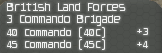
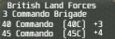
Dukasaur wrote:I can't read the letters in the legend at all. It's not so much that they are small (I understand there's a lot of information to put into a small area) but they seem fuzzy, as if someone airbrushed over top of them. Is there some way to improve the clarity?

![]() by Dukasaur on Sat Apr 07, 2012 10:48 am
by Dukasaur on Sat Apr 07, 2012 10:48 am
koontz1973 wrote:Dukasaur wrote:I can't read the letters in the legend at all. It's not so much that they are small (I understand there's a lot of information to put into a small area) but they seem fuzzy, as if someone airbrushed over top of them. Is there some way to improve the clarity?
The letters/font are what they are. There is no effects in the small (unlike the large). I think this should improve them a bit but unless I get room, I cannot get them any better.
 32
32
![]() by koontz1973 on Sat Apr 07, 2012 11:03 am
by koontz1973 on Sat Apr 07, 2012 11:03 am
![]() by Dukasaur on Sat Apr 07, 2012 5:57 pm
by Dukasaur on Sat Apr 07, 2012 5:57 pm
koontz1973 wrote:Duckasaur, honestly, on the large, I cannot see the problem you are referring to. Not being dishonest here but really? The effect was put in as a request from some of the other map makers, taken out from the small but asked to keep it in the large. If it does prove to be a huge issue, I will remove it ASAP, but right now I will keep it but tone it down some more. If that does not work and someone else says the same thing as you (anyone) I will remove it completely.
32
![]() by koontz1973 on Sat Apr 07, 2012 11:29 pm
by koontz1973 on Sat Apr 07, 2012 11:29 pm
![]() by erazor on Sun Apr 08, 2012 10:06 am
by erazor on Sun Apr 08, 2012 10:06 am


![]() by natty dread on Tue Apr 10, 2012 11:57 am
by natty dread on Tue Apr 10, 2012 11:57 am
Dukasaur wrote:koontz1973 wrote:Duckasaur, honestly, on the large, I cannot see the problem you are referring to. Not being dishonest here but really? The effect was put in as a request from some of the other map makers, taken out from the small but asked to keep it in the large. If it does prove to be a huge issue, I will remove it ASAP, but right now I will keep it but tone it down some more. If that does not work and someone else says the same thing as you (anyone) I will remove it completely.
Sorry, man. Maybe I'm just old and I need new eyes. I was just discussing the other day that I can't read the subtitles on foreign movies any more either. To me the legend is just a blur, but if I really am the only one then you're perfectly right; you can't jump through hoops just for one person.
Still, paradoxically, I can read the small legend on the small version without too much trouble, even though it's smaller, but without the effect.


![]() by Gilligan on Sat Apr 14, 2012 8:16 am
by Gilligan on Sat Apr 14, 2012 8:16 am


![]() by koontz1973 on Sat Apr 14, 2012 9:57 am
by koontz1973 on Sat Apr 14, 2012 9:57 am
Gilligan wrote:I can definitely see where Dukasaur is going with this...It is a little blurred (at least from my eyes...)


![]() by Gilligan on Sat Apr 14, 2012 7:42 pm
by Gilligan on Sat Apr 14, 2012 7:42 pm
![]() by thehippo8 on Sat Apr 14, 2012 9:29 pm
by thehippo8 on Sat Apr 14, 2012 9:29 pm
Gilligan wrote:Personally, more legible...But if you don't think it looks as good, then go back to the other one.
![]() by koontz1973 on Sat Apr 14, 2012 10:41 pm
by koontz1973 on Sat Apr 14, 2012 10:41 pm
thehippo8 wrote:Gilligan wrote:Personally, more legible...But if you don't think it looks as good, then go back to the other one.
Just to throw my spanner in the works ... I liked the earlier version ... this one is just misses the point for me!
![]() by thenobodies80 on Mon Apr 30, 2012 9:01 am
by thenobodies80 on Mon Apr 30, 2012 9:01 am


![]() by koontz1973 on Mon Apr 30, 2012 9:04 am
by koontz1973 on Mon Apr 30, 2012 9:04 am
![]() by DiM on Mon Apr 30, 2012 9:08 am
by DiM on Mon Apr 30, 2012 9:08 am


![]() by DiM on Mon Apr 30, 2012 9:12 am
by DiM on Mon Apr 30, 2012 9:12 am
![]() by koontz1973 on Mon Apr 30, 2012 9:16 am
by koontz1973 on Mon Apr 30, 2012 9:16 am

![]() by DiM on Mon Apr 30, 2012 9:22 am
by DiM on Mon Apr 30, 2012 9:22 am
koontz1973 wrote:DiM, there is late and there is late, this has been sitting here for over two months now waiting for beta. F.off.
koontz1973 wrote:Ask isaiah40 for it, it was given, just never posted in my thread, so could not put on page one.
koontz1973 wrote:Imageshack strikes again a my files do not match those. Here is a clean version hopefully.
Small.
- Click image to enlarge.
![]() by koontz1973 on Mon Apr 30, 2012 9:28 am
by koontz1973 on Mon Apr 30, 2012 9:28 am
isaiah40 wrote:koontz1973 wrote:At one place, there is four rims vertical so to include the frame (5), that is a total of 25 pixels. I really do not want to go larger, but isaiah gave some extra pixels on the understanding that it was for text. Will ask if I can use that for larger borders. That should be enough to give the frame a larger feel to it, then I can space the middle ones out some.
We will allow you up 880x845 on the large and 670x643 on the small. This should give you enough room.
i don't give a flying f*ck about the foundry anymore but i saw tnb80 putting maps into beta and i wanted to see what's coming. nothing personal.
this looks much crisper. see? i may have been late but i caused good changes
Users browsing this forum: No registered users
|
|||||||
| Conquer Club is not associated with RISK online in any way. Copyright © 2006-2025 by Big Wham LLC | |||||||