heavycola wrote:Dukasaur wrote:heavycola wrote:Dukasaur wrote:Very pretty poster, but not really useful, since it perpetuates the myth that Left and Right are meaningful definitions.
I quoted its designer in the OP. You must have missed it so i'll repost:
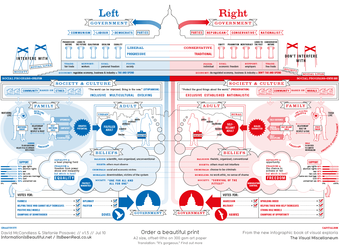
Of course, the political spectrum is not quite so polarised. Actually, it’s more of a diamond shape, apparently. But this is how it’s mostly presented via the media – left wing vs. right wing, liberal vs. conservative, Labour vs Tory. And perhaps in our minds too…
Well, I didn't fail to see that, but I'm not sure I understand the approach. You have that little paragraph saying, "it's not really like this" but then a gigantic graphic that screams "it's exactly like this." It's almost like having a little blurb in fine print that says "I love Chevrolet" and then having a huge Technicolor-and-Surround-Sound commercial for Toyota.
Maybe I didn't take enough Ritalin this morning, but I didn't know what to think after seeing those mixed messages.
A broad brush representation of the major political divide "screams 'it's exactly like this'"? How on earth did you reach that conclusion?
Look - it never pretends to be comprehensive. But left and right are simple enough to be meaningful to most people, and are used as such by reporters and analysts and even politicians. I know what they mean, broadly, and so do you, even if people - and therefore politics - are really much more complex.
The point of this picture is not to polarise and classify everyone as either left- or right-wing. The point is to present the major political divide simplistically and dispassionately, to allow comparisons
and perhaps a greater understanding on the part of those on either side. It's not a political science degree. Why is everything so difficult here? Why am I even explaining this?
From what I read, the underlined won't happen because the left-right dichotomy is false. Instead, you'd need a more specific economic-political spectrum, e.g.
Authoritarian<-------------------->Democratic
Individual Freedom<-------------------->Collectivism
Classical Liberal<-------------------->Progressive
Dove<-------------------->Hawk
Economic Freedom<-------------------->One Ideal Value
That info pic is just crap. It paints too broad a stroke, and its numbers on attitudes of "war" and "gay marriage" etc. don't seem trustworthy.
You could frame questions on war to a "liberal" in a more "liberal internationalist/idealist" fashion, and the liberal would be more supportive of war (e.g. "humanitarian interventionism").


