koontz1973 wrote:Nice stamp by the way.
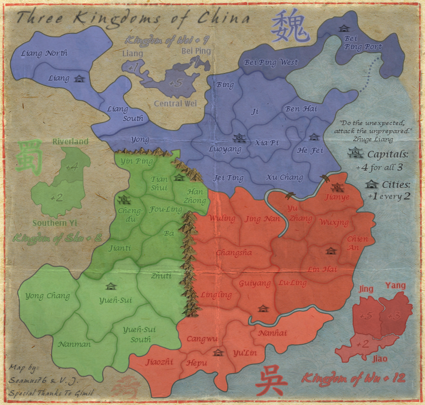
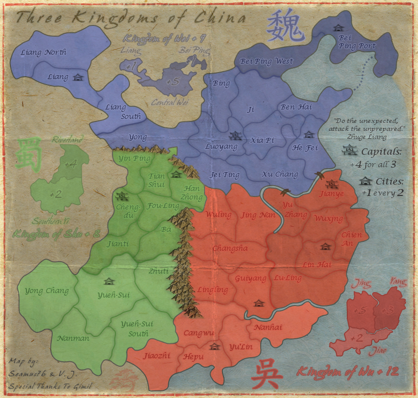
Seamus, some of your names in Chinese are wrong I believe. Can you double check these and correct if so, but it also might be nicer to add the full title either way. Might be nice to see capitals and cities go local as well. No need to name them in the legend as you also have the symbols.
蜀國 = Kingdom of Shu
王國衛 = Kingdom of Wei
吳國 = kingdom of Wu
首都 = Capitals
城市 = Cities
Mountain range between Wu and Shu could do with thickening up a bit. It looks way to straight and unnatural. I know the style of the map is not realistic, but try to give them some life.
Title is very plain.
Try something like this one but you cannot use this one as it is not free to use.
Lastly for now, the sea route, boring.

Any chance of seeing something done here? Maybe a couple of junks added going both ways would be a nice addition.
Thanks Koontz as always.
If you can please provide any names that you believe to be incorrect, and the correct name that would be great. The names I have are what I believe to be the correct names, and were taken from the original map, which if you go through that thread were pretty much confirmed to gimil, and he was provided maps (which were not attached unfortunately). But again if you have some just let me know.
What do you mean by "Full Title"? Of the tert names? I don't think that's going to work since I have a few that are going to be tight for the small map anyway, plus I'm pretty happy with them being on the more simple side, especially for names that to most players will be a little hard to pronounce to begin with. I think full titles will just confuse people even more.
As for the Capitals and Cities label in the legend going local, that might (small might) be something I would consider, but I'm not initially a fan of that either. Even though there are symbols, and the bonus would be spelled out in English, I think the feel and intensity of the words "Capitals" and "Cities" (as well as the connection to the symbols) would be lost on the map as most players would only ever look at them as the symbols, unless they speak/read Chinese.
I will certainly look at the mountains, now that we're rockin' the Graphics phase

, but we did go through a few versions of mountains and these were some of the best I could do with the limited skills I have. Plus I like 'em thin if you know what I mean.
The title font took a long time to find, and I'm sorry to push back again, but I like the simplicity (you say plainess) of the title and map. The gameplay yes, but mainly the overall simplicity of the aesthetics and ease on the eye and mind is what I really like, and what I think a lot of players are wanting these days.
To that "simple" point, I'll look for some different Junks for the sea route, but I feel I would then need to use space to explain them, while the dots are understood to be a connection and nothing else. And while there might be open spaces, I would say those are somewhat necessary to keep the clutter down and allow the mind some free areas.
Thanks for the feedback, good stuff to keep me thinking, and you know I appreciate it.


