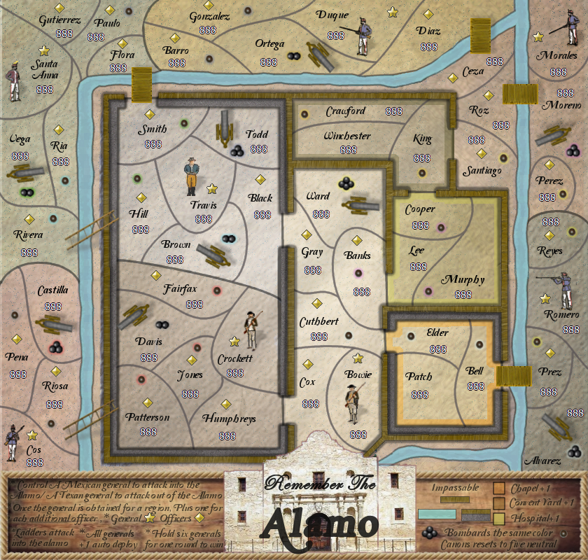
Plus how the new figures look?
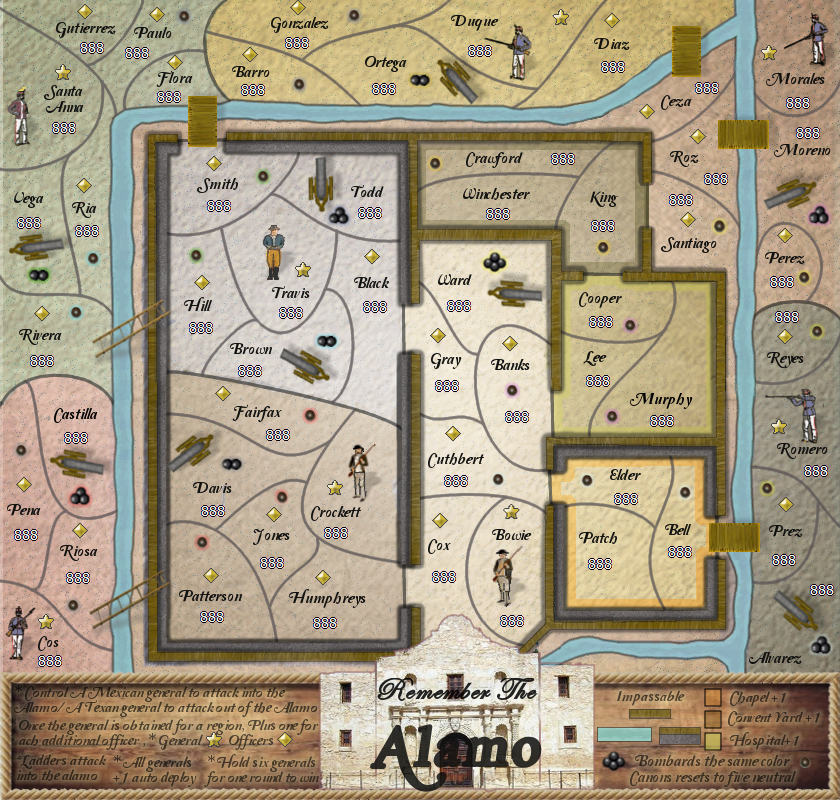
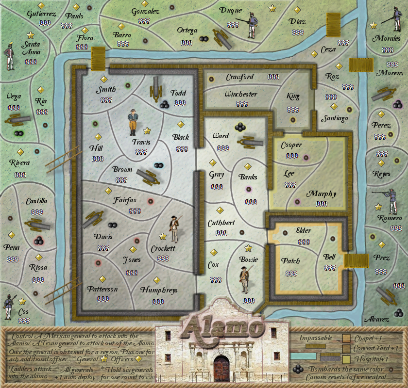
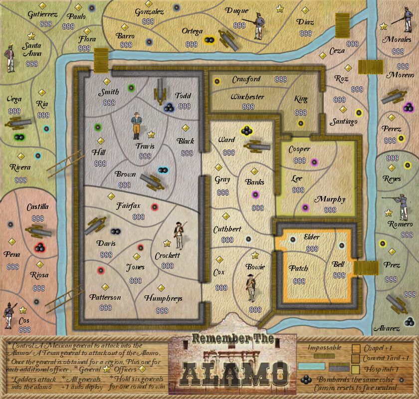
Original map
- Click image to enlarge.
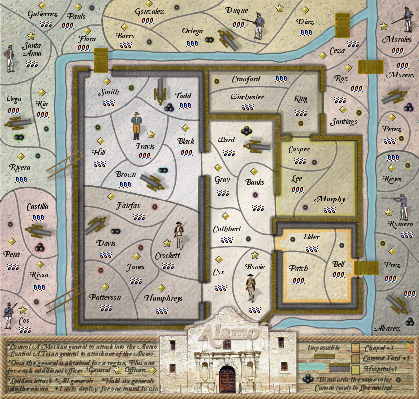
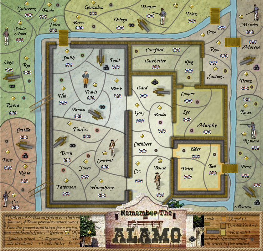
Combined legend map
The reason for this request is because this layout opens the board up and only gives you one place to look for the instructions
I know the glows need worked on and the items in the legend need aligned, but I wanted to see if
this version is liked better before I go too far with it.
- Click image to enlarge.
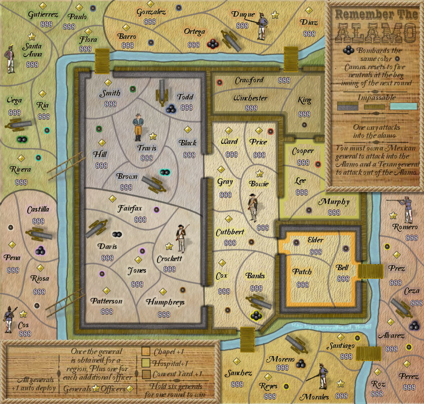
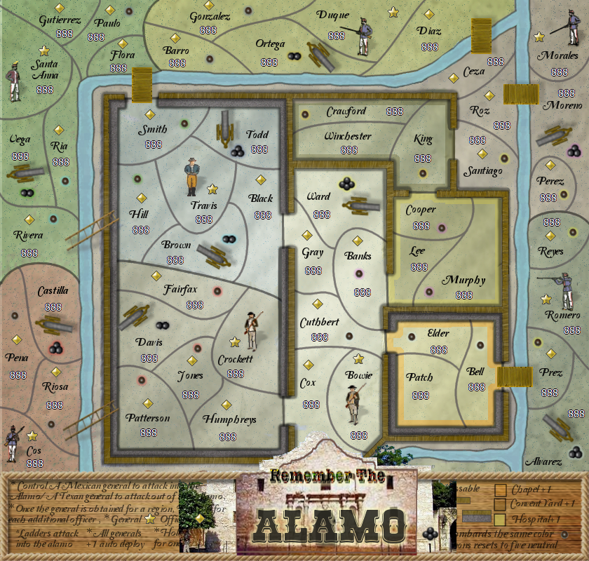
Test
- Click image to enlarge.
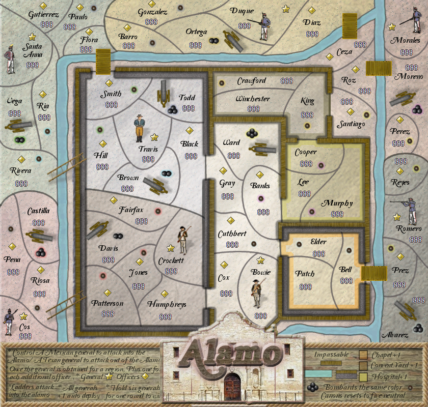
Test
- Click image to enlarge.
test
- Click image to enlarge.