Well jeez louise!

Lets see what we've got here in this map...
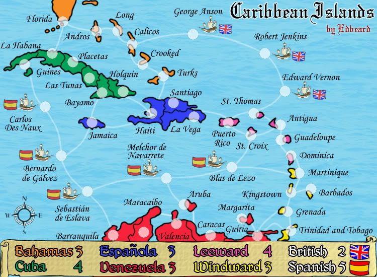
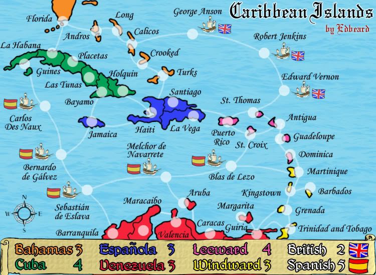
I'm loving the look you've got going. The map has a distinctive colorful feel, which I like. I know there are a number of people who complain about some of the 'darker/hard to read' maps we have currently avialable for live play, so I think this nice bright map will be a welcomed addition.
Regarding the army shadows, does their circumference edge look a little odd or jagged? Would it be possible to make them smoother feeling? Also, have you checked the capability of the army shadows holding coordinates?
Also, concerning the names, I'm not sure it is the font or if it is my eyes, or what, but do they look a little pixely and not as smooth and clean as the map in other places feels?
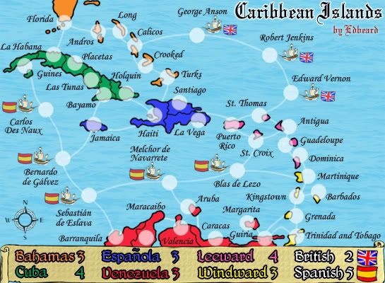
Also, do you have a small map we could look at?
--Andy